.
What kind of fool I
laying paving in such heat
or at all really?
.
by Scooj
.
What kind of fool I
laying paving in such heat
or at all really?
.
by Scooj
This ‘ice dragons’ piece was the second painted by Tizer on his lightening visit to Bristol about a month ago. I was lucky enough to watch him for a while painting both pieces on consecutive days, and while he painted this one I had a chance to chat with him for quite a long time. Tizer likes to talk and is a really friendly guy. He also self-discloses without apology and in just a few minutes I learned a lot about his childhood and what motivated him to pick up a can.
One of the most remarkable things about the two pieces in Bristol is that he paints freestyle, which means that the idea is in his head, but he doesn’t follow a draft drawing or plan. The way he works is to sketch out the fills in different colours before adding hard edges in black, like reverse colouring in. You should be able to make out the letters TIZER so beautifully written.
It is interesting to note also that Tizer seems to work from left to right in a systematic way, when many other artists will approach their work from all sides at once or by colour selection. This is a man who knows what he wants to do and just goes ahead and does it. A giant of a man with a giant heart.
Yabadaba doo! John D’oh is having a little bit of fun up at Purdown Battery with these Fred Flintstone and Barbey Rubble stencils. Certainly these make a bit of a change from his more political stuff and a change is as good as a rest as they say.

Two of the stencils in full colour are of Fred Flintstone and Barney Rubble, while the third is a little bit disturbing depicting a ‘caveman’ body with a Fred Flintstone head carrying a tray of fast food – it messes with my head a little.
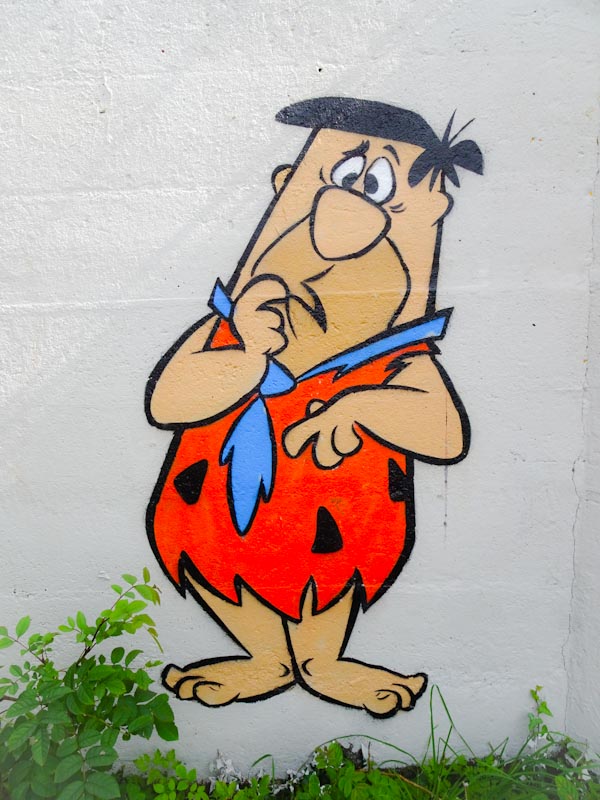
I love it that Barney Rubble, the least rebellious person one can think of, is holding a spray can in a kind of victory salute – although I think he has too many fingers for the style of cartoon (a small matter). Great fun pieces, beautifully executed.
.
Giving it a name
is such small compensation
a new life begins
.
by Scooj
It is always nice to see a new piece from Rapt and I have become rather fond of his little motifs that he incorporates alongside his letters. In this piece he has painted a small yin-yang to the right of the letters that provides extra interest.

The letters are nicely done with three horizontal layers of shading fill in varying hues of pink. Rapt has also included some nice little clusters of coloured circles and stars that I think works really well and is quite an original decoration. A fine piece of work.
Cort is one of Bristol’s regulars who will often be found painting alongside Laic217 but occasionally paints alone. His writing is quite different from other people’s and has a very distinctive font which is perfectly demonstarted in this piece.
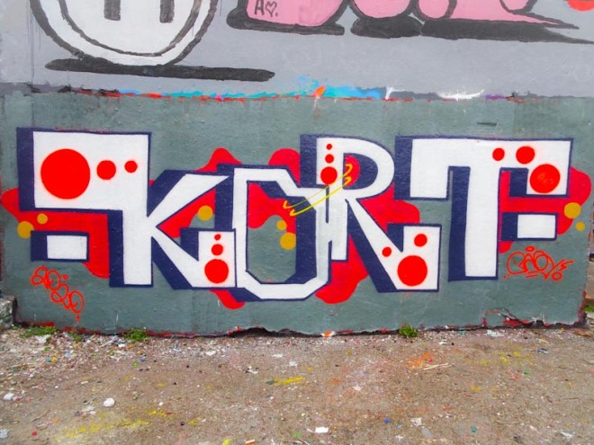
Painted on a grey-buffed wall the letters spell out KORT . These have a nice 3D shading off to the left and contain some nicely painted red dots. Adding a bit of interest behind the lettering is a red splosh and some little orange circles for good measure. A nice touch is the two yellow rings joining the O and R of the piece. Great work.
.
Hard to witness the
slow deterioration
the sharp becomes blunt
.
by Scooj
What the world needs more of in these difficult times is great collaborative happy street art like this magnificent recent collaboration from Soap and Face 1st. These PWA (Pirate Wall Art) friends have been painting together for a long while now and their work is so perfectly in tune. They have their own identities, but when they paint together the work is seamless.

On the left is a classic piece of soapiness from Soap with the characteristic mouths spelling out SOAP. The squiggles between the A and the P are superbly done and the arrows just add that touch of graffitiness about it all. A very fine bit of painting from Soap.
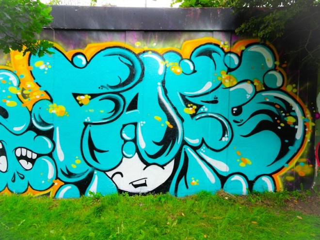
On the right Face 1st treats us to one of his charming cheery faces with big hair spelling out FACE. The matching colours with Soap and white highlights on the curves create teriffic read-across between the artists. A lovely collaboration.
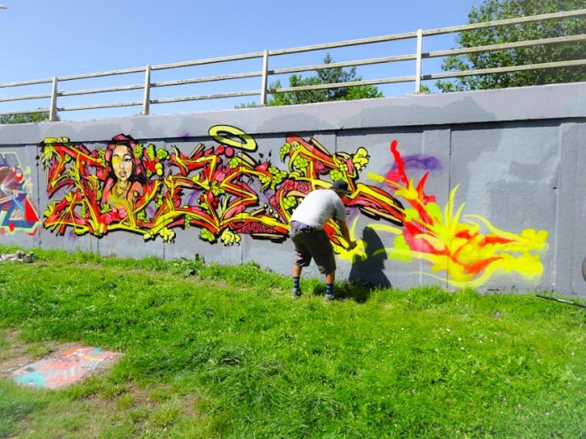
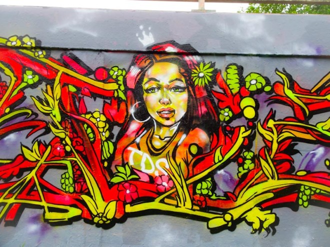
Just when you think you have got your head around all the new artists in Bristol, more seem to appear out of the ether. Some will be one-off visitors, some will be emerging new talent some may have been around for a while but I just haven’t picked up on their work yet. I am not sure which category Elv8 fits into, but this is a lovely recent piiece from under Brunel Way bridge.
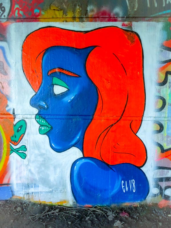
The portrait piece is really striking probably due to its fantastic use of bold colours, the dark blue and red making a very strong statement – no wallflower this piece. There is a simplicity that is attractive, but also some complexity in the white shading that offers some relief on the girl’s face and shoulders. Great to see and I hope there will be more.
.
Buyers and sellers
as eclectic as their wares
all looking for deals
.
by Scooj


