.
I long for those dunes
eyes shut and buzzing insects
in the distance, waves
.
by Scooj
.
I long for those dunes
eyes shut and buzzing insects
in the distance, waves
.
by Scooj
It seems that everywhere I look in Bristol I am coming across new pieces by Bristol newcomer Mudra, and a most pleasurable experience it is too. Incoming artists and new artists keep the whole scene nice and fresh and add to the extraordinary diversity of art in the city.

When I first spotted this one in Dean Lane, I wasn’t too sure who it was by, and guessed it must be from a visiting artist, but then I saw the @ with a hat signature and the penny dropped that this was so obviously a Mudra piece. I guess the letters spelling Mudra and the signature ‘Mudra’ ought to have indicated who the artist was, but it is all about familiarity and context. The piece has some lovely colour combinations and unusual letter shapes. I reckon this would have made a superb 1970s album cover, it has that kind of feel about it. Great work and so much more to share with you.
I am increasingly being drawn to the conclusion that Whos is the same artist as Alos, and if that is not the case, then they hang out together a lot and share a style. So here is a dilemma for me. Do I aggregate all their pieces under one name or do I wait for some kind of certainty and continue to treat them as separate artists until I know better.
Well, I had a little bit of luck half way through writing this… I had an unplanned meeting with Paul in the St Werburghs tunnel and he confirmed for me that they are indeed two separate artists, and that’s that.

I rather like this one from Whos, and consistent with most of his work it painted with only a few colours which gives it a simplicity and honesty. I particularly like the way he sprays the ridged running through the centre of each letter. Unusual but great to see.
.
Daily discipline
a moment of mindfulness
blocking out the noise
.
by Scooj
Taboo has been busy again, this time with an uncharacteristically colourful piece in Dean Lane skate park. As with most Taboo pieces, this one is a graffiti writing and character combination and is certainly eye catching.
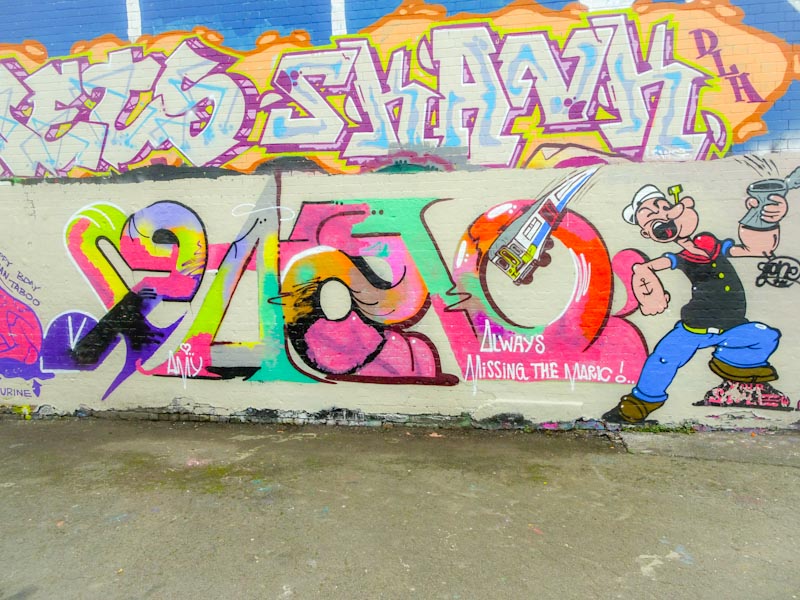
The letters are unruly as always, not following any strict code of script, rather they appear to be crafted on-the-hoof in an organic creative outpouring. The colours and fills are to be admired and the whole thing is really rather attractive.
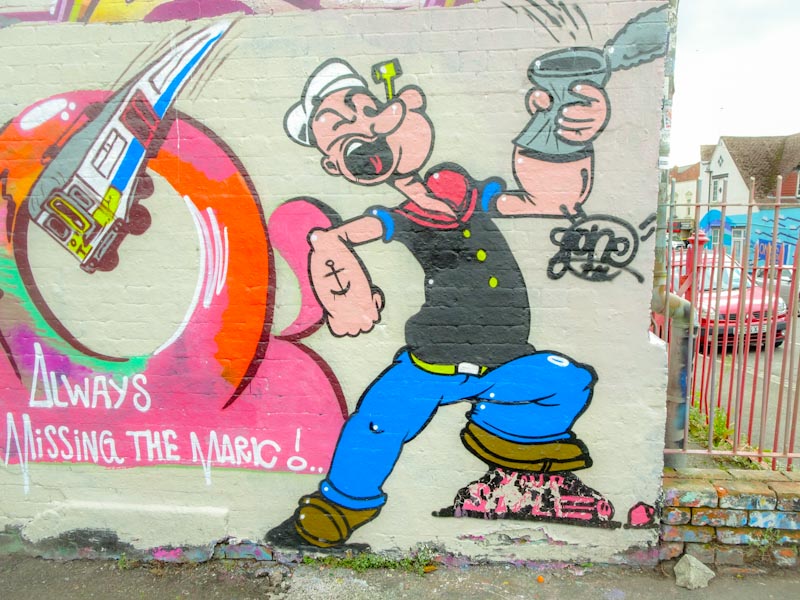
Of course, the eye is drawn to the Popeye Character flipping open a tin of spinach, that rather surprisingly has spewed out a train, arcing over his head. What the f…? Whenever I look at pieces by Taboo, I am drawn into a deeply surreal place where anything is possible. This one is a classic.
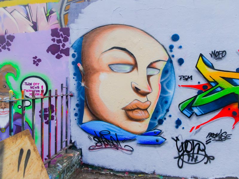
I must admit to being very taken by this piece on the wall facing the river, and I have absolutely no idea who the artist is. If I find out at any time I will add the name in because I don’t like posting pieces by unknown artists, but sometimes they are just too good to leave in the archive.

To me the whole thing simply screams out Matisse with perhaps a touch of Miro, maybe Chagall and is worthy of hanging in any fine art gallery, but is also worthy of a wider reach and audience alongside the Bristol Avon. A lovely piece of abstract street art.
.
The day’s work is done
tea and biscuits round it off
TV with the dog
.
by Scooj
It is truly great to see that Dibz and Shade One seem to be collaborating rather a lot at the moment, and they have absolutely knocked it out of the (skate) park with this recent piece in Dean Lane.
The face is by Shade One and to me represents a great example of a crossover of old school/new school, and what I mean by that is that there are some lines, for example the eyebrows that are quite angular and remind me of old New York style graffiti characters, but the blue frame, bubbles and decoration are much more contemporary in style.
As ever the graffiti writing from Dibz is outstanding, and the sharp clean lines with a complex colour scheme so expertly done demonstrate clearly why Dibz is simply one of the best graffiti writers around. The red object to the right of the piece I believe is a butt plug (although I might be mistaken) and was not part of the original collaboration, unfortunately it doesn’t add much to the piece in my opinion, and is ever so slightly annoying.
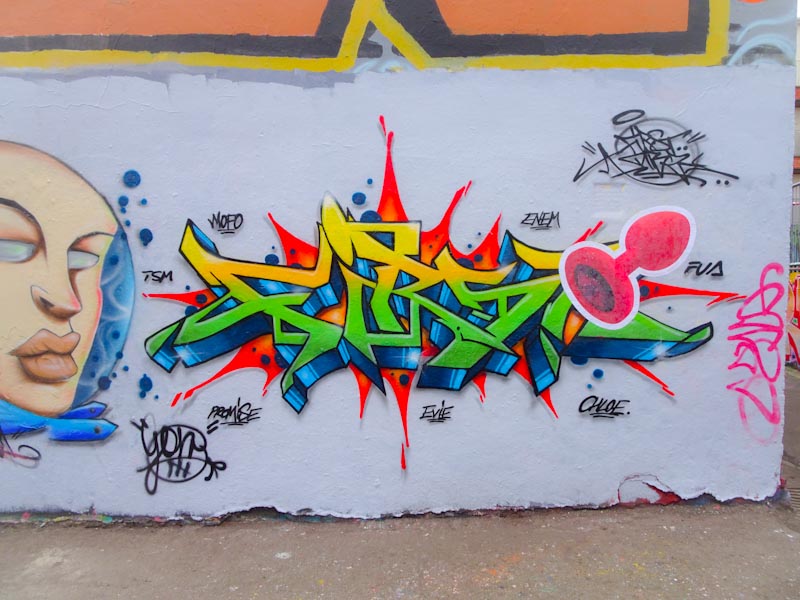
Woah there, steady… A column piece under the M32, who can it possibly be by? Zake of course, but unlike any Zake piece I have seen before. This piece feels like the artist has stepped up a level, having a depth and texture unlike any of his previous pieces, although there have been signs of continuous improvement.
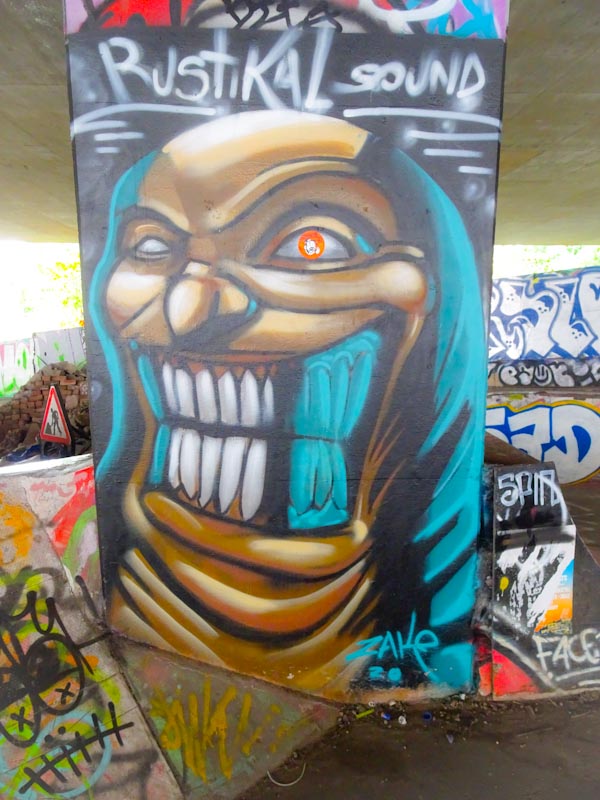
The face (of course a face) is quite scary with bright teeth and a disturbing expression and the whole column certainly stands out. What I like most is that the piece is full of texture and folds, with light and dark and I think that Zake has really nailed it. I am totally annoyed though by the sticker over one of the eyes… I guess these things happen. Looking forward to more from Zake.
.
Dust-covered hero
a survivor of neglect
thrives in the corner
.
by Scooj


