.
Association
man and spade and fork and soil
get close for dinner
.
by Scooj
.
Association
man and spade and fork and soil
get close for dinner
.
by Scooj
This piece from Rtiiika has been around for a while now, but I have only just managed to get round to posting it. I very much like Rtiiika’s work and am setting off this morning to find another recent one in Brislington.

Rtiiika’s highly designed style is very distinctive and features line drawn characters that are fairly abstract in form. These characters are over a checkered wall in various contrasting colours. The inner squares carry the word ‘TOoOT!’ Which is probably a reference to the tooting of trains from Temple Meads station. Something a little different for us to enjoy.
Even the quick pieces by Laic217 are rewarding, and this one is really rather nice, slapped alongside the fabulous Dibz ‘from up above’ piece. Both look destined to hang around for quite some time as scaffolding has gone up on the two skate park elevations of this building which I believe is going to be turned into a hostel. The pop up businesses will all have cleared out of the space by tomorrow and I guess development will begin after that.
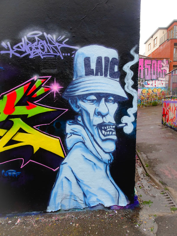
This monochrome character, although rather emaciated, breaks the mould from the skeletons we are so much more used to recently, but of course many of the older Laic217 pieces weren’t skeletons, so there is nothing too unusual in this piece. A nice quick one for all the Laic217 fans.
.
Young chilli plantlets
upgrade accommodation
a countdown to hot
.
by Scooj
Eman is an artist who has been knocking it out of the park recently, and this piece in the little underpass underneath the M32 is a bright, cheerful and exceptional writing/character combination from the artist.

The character part is one that he has been working on recently and has a strong impact thanks to the clean design and great use of colours. The shadows underneath the eyebrows is a really nice touch too.

The writing spells out EMAN and is presented in bright uplifting colours, perfect for this gloomy spot. The cracked letters are filled with various shades of blue in a random pattern, but it is the orange 3D shadow and green decoration dots that add som inch to the overall outcome. A very nice piece indeed.
Face 1st is still painting at full tilt at the moment and every day I feel like I am stumbling across something new from him. This piece was from earlier on this month and is in the style of his most recent theme of what looks like burst bubblegum mess surrounding the smiling girl’s mouth and face.

It is interesting how some artists hit upon an idea or theme and then work on it for a while before moving on to the next thing. Decay is another artist who reinvents his theme roughly annually and then produces lots of versions of the new theme. All fascinating stuff. More of these from Face 1st to come.
Doors 149 – Blaise Hamlet (part 1)
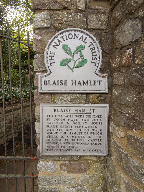
I have been keen to return to Blaise Hamlet ever since my first and only visit when I first settled in Bristol in the 1990s. More recently, that urge has been amplified by the lock-down as it is a place that can be visited safely and is very local. Finally, I managed to get there a week or two back, and this is the first of two posts featuring the quaint (a word I rarely use) cottages, owned and managed by The National Trust.
Blaise Hamlet was a 19th-century housing project and a part of the Blaise Castle estate. The following description is from The National Trust website:
In 1789, John Scandrett Harford, a well-respected Bristol banker and Quaker, bought the estate for £13,000. In 1795, he commissioned an eminent Bristol architect, William Paty, to build a new house for him and his family. The house is substantial but plain, in keeping with Quaker principles. Harford also invited the leading landscape architect of his day, Humphry Repton, to redesign the grounds. In 1796, Repton went into partnership with John Nash, the architect who is best known for designing the Brighton Pavilion. Repton introduced Nash to Harford who commissioned him to design cottages for the estate.
This week I will introduce you to the first three cottages, which although modernised indoors, have all the original exterior features.
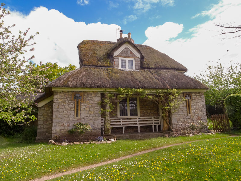
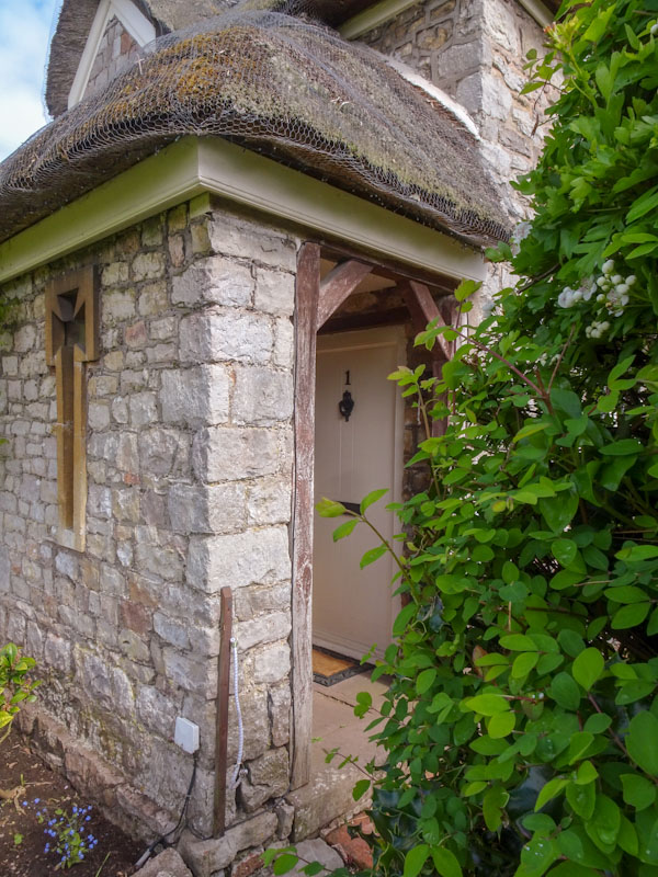
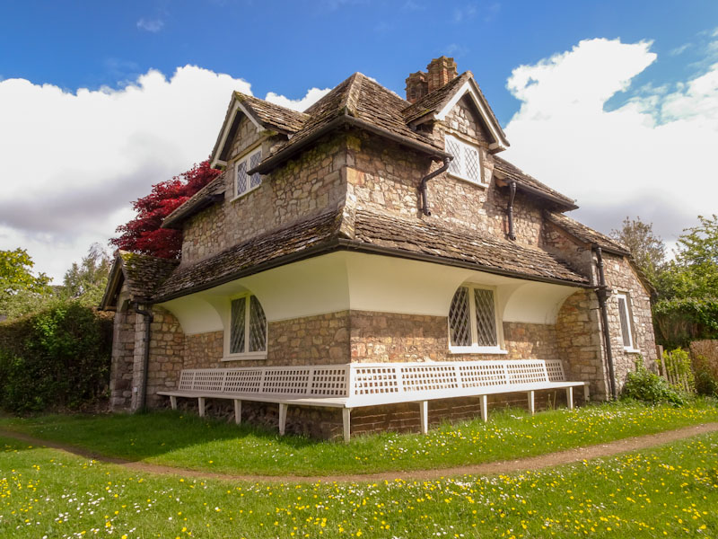

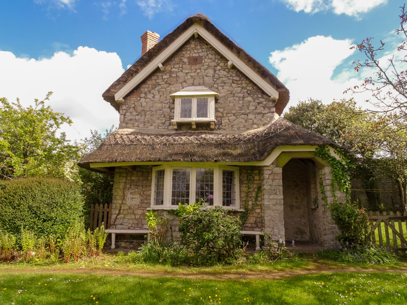
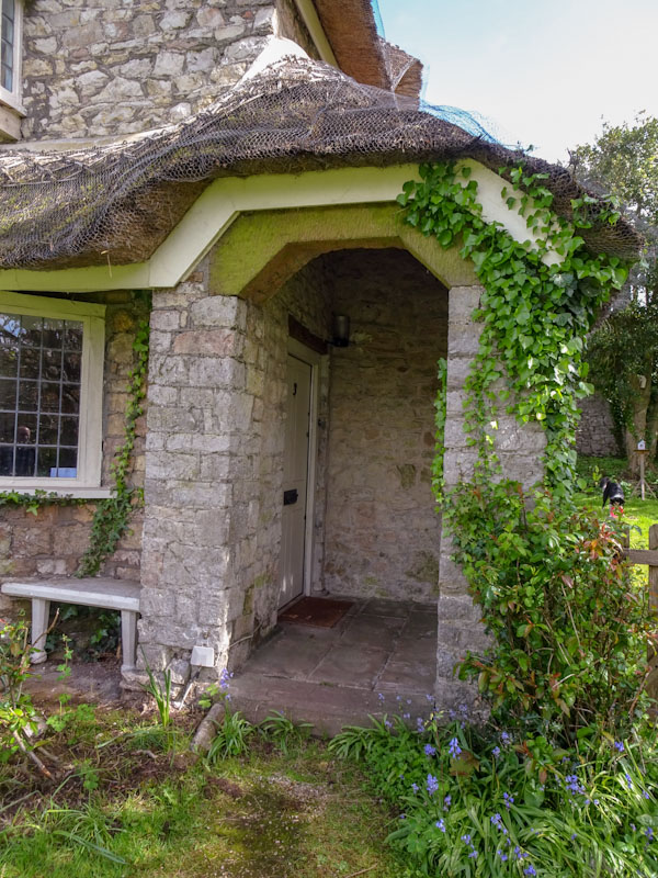
The perfect ‘chocolate box’ hamlet harking back to a time and environment rarely seen in England these days, complete with a village green and water pump. Perfect.
I will conclude this doorscursion next week… Until then may I wish you all a very happy week.
If you have made it this far, you probably like doors, and you really ought to take a look at the No Facilities blog by Dan Anton who has taken over the hosting of Thursday Doors from Norm 2.0 blog. Links to more doorscursions can be found in the comments section of Dan Anton’s Thursday Doors post.
by Scooj
.
Anguis fragilis
hunter of insects and snails
sinuous lizard
.
by Scooj

What a lovely surprise it was to come across this fabulous collaboration from Andy Council and Hemper when doing my rounds a week or so back. Two fabulous artists coming together to create this poignant piece.
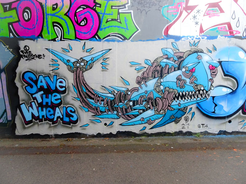
Andy Council has been doing more street (non-commissioned) work at the moment than I can remember for several years, and I am definitely not complaining about that. The collaboration is a tribute piece to artist and friend Wayne, although I am not too sure about the reference ‘save the wheals’. Andy Council has painted a rather sad looking whale with his customary ‘stitching’ together of components to make the whole. Very nice work indeed.
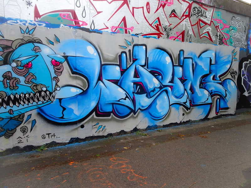
On the right, Hemper has written WAYNE with extraordinary skill with such beautiful letter shapes and and clever fills. There are never enough words to be able to describe Hemper’s work, and he is an artist who seems to be raising his own very high bar. Great to see this amazing collaboration.
When I saw this piece I heard a voice in my head shouting out the word aaciiid! In that rather annoying 1980s way, if you know what I mean. This is a lovely piece from Mr Draws in Dean Lane in which he uses letters other than his customary DRAW. Good to see.
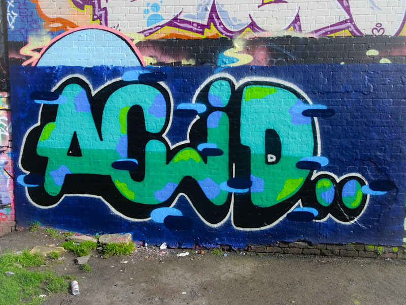
I think that this is a beautifully executed piece with a good solid wall wash, great colour selections and some nice decorations in the form of blue horizontal lines with darker blue shadows. A tight piece from the Bristol stalwart.