

.
Yellow, rising high
stubble encircled island
proud common toadflax
.
by Scooj
.
Yellow, rising high
stubble encircled island
proud common toadflax
.
by Scooj
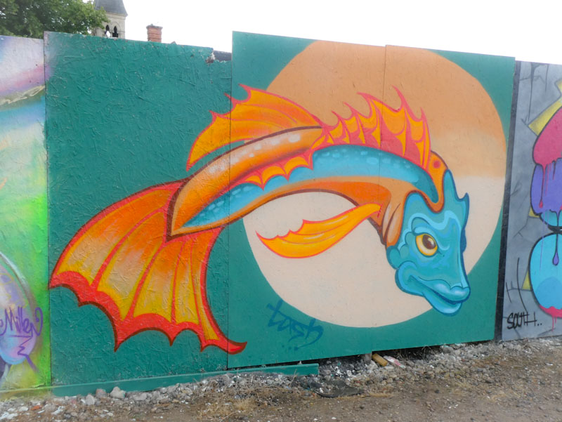
When street art and fish come together it generally makes me very happy. This was one of the first pieces I saw at the Cheltenham Paint Festival and it set the tone of high-interest and high-quality pieces in the town. The colourful piece is by Tash Creates, a self taught artist from Hertfordshire.

The design and proportions of the piece are first class, although of course it is an imaginary fish. It is funny how we can paint or draw a fish, and everyone knows it is a fish, and yet it isn’t a fish we have ever seen before, if you know what I mean. Anyhow, I think it is sufficient to say that I really like this piece. It would be great to see Tash Creates visit Bristol some time.
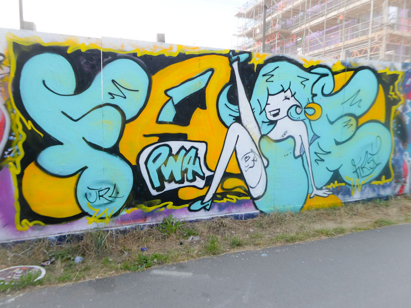
I cannot express how much I am enjoying this ‘happy’ period from Face 1st. There is something new and fresh about his work at the moment, which you might only notice if you have been following his art for a while. Face 1st is concentrating a little more on his characters, nearly always laughing girls, but there is more movement and different poses entering into his work.
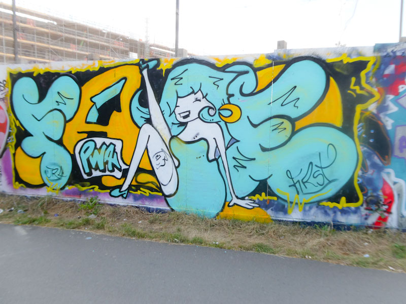
In this piece we have one of Face 1st’s letters and character pieces, with the letters FA and E broken up with a kick-dancing girl obscuring or being the C. The girl is striking a similar pose to one of his other recent pieces, which I posted a short while ago. Gotta love this one.

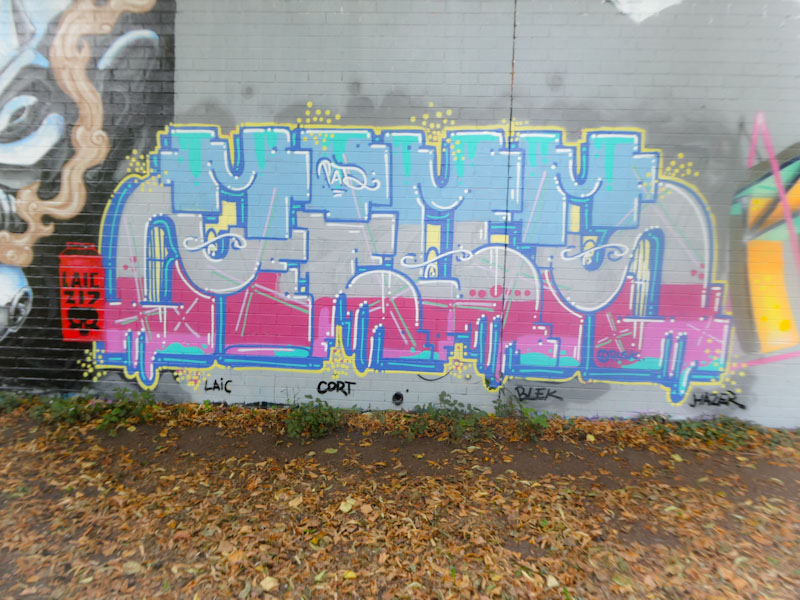
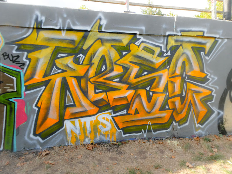
It says ZIOM, but I have to admit that I struggle to see it sometimes, and it looks like there is a different word sitting along the top in blue shades, which looks like MOMM or MAMM, but I think it is just an artefact of the style of the artist. The artist is Trafficity, and his distinctive pieces are consistently well presented.
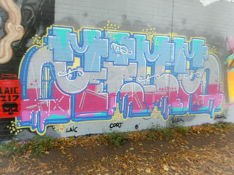
Trafficity is a member of the PAD crew, which includes Laic217 and Cort, although he tends not to paint as frequently as the others. The piece itself is composed of block letters with three discrete horizontal fills, and a little bit of extra ‘melty’ decoration along the bottom edge. Watch this space for something from my archive by Trafficity, coming soon.
I couldn’t start today’s post without paying tribute to HRH Queen Elizabeth II. Irrespective of one’s views about the monarchy, Queen Elizabeth has been a stable constant for our nation and many others, when all around her there has been chaos. It will feel slightly odd not having her around any more.
It is rare for anyone to give up their life to serve others (apart from in the public sector, of course), but to do so with composure, integrity, decency, objectivity and solemnity is special and something that our politicians, the people with the real power, could learn from. The contrast between the Queen’s behaviour and that of Johnson or Truss is stark. RIP QEII.
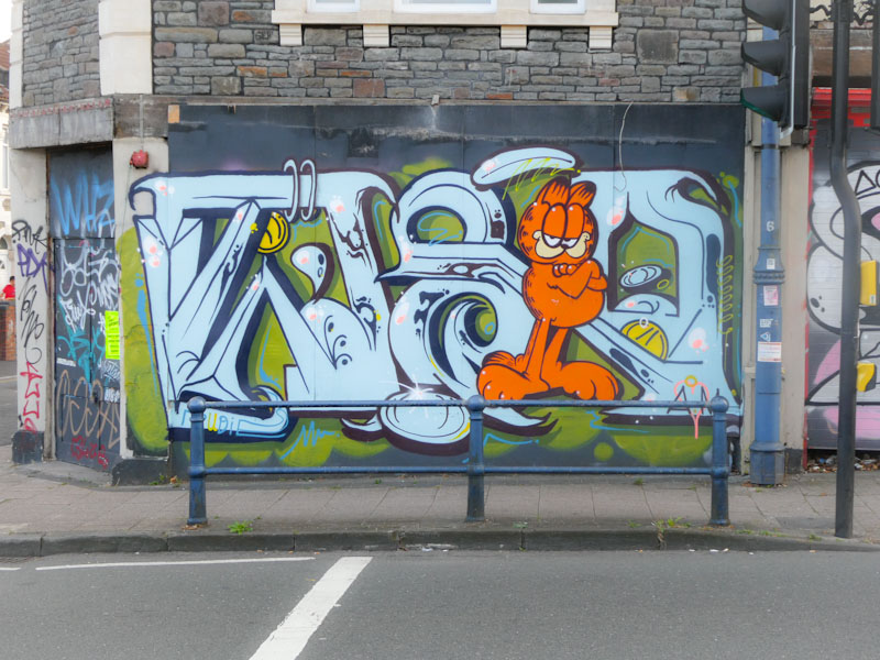
Our lives go on, and there is street art to consider. This is a real beauty from Taboo on an old shopfront that often attracts inferior throw ups, but not in this instance. I drive along this road fairly frequently, and I simply love seeing this writing/character piece, there is a lot of mischief in it.
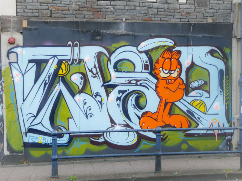
The writing is typically asymmetrical and unconventional, spelling out TABOO, although that might not be entirely obvious at first sight. Of course, it is the Garfield character that steals the show… brilliantly painted and perfectly cheeky. I now have four Garfield pieces in my archives. One more and I might have to do a Garfield special post!
.
Epoch transition
farewell Elizabethan
constant disrupted
.
by Scooj
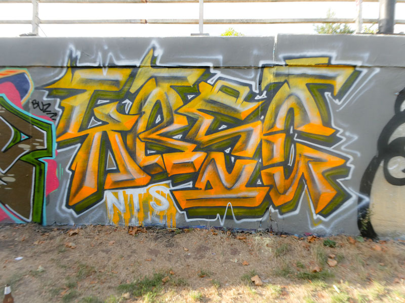
It would appear that Kosc is enjoying his writing at the moment, and why not, with several pieces appearing lately. This one on the M32 roundabout is a classy beauty. Painted with all the confidence of an accomplished artist, the letters KOSC, with the characteristic ‘Kosc’ orange, have a kind of soft metallic look to them.
Letters are nothing new to Kosc, although his old letters were rather different from these, what remains is the class and talent of his work. The transitions are worked really well and the ‘raised’ centre-line of each letter creates a clever 3D effect. Overall a lovely piece, and nice surprise.
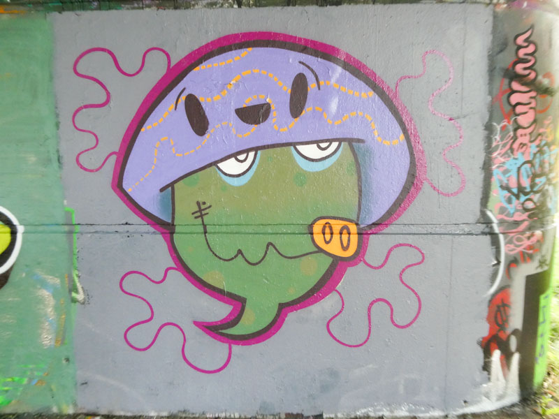
A rather nice, clean and tidy piece from the very productive Mote. In fact, I only post a fraction of his work, not because I don’t appreciate it (I really do) but because I don’t make it out to all the spots that he paints.
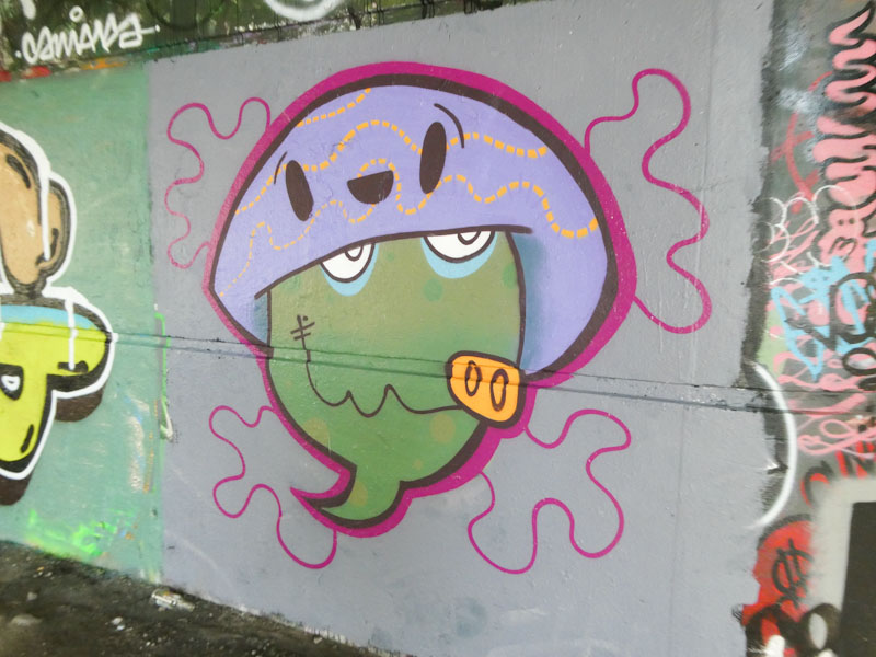
This one, under Brunel Way, is a corker, made all the more enjoyable by being painted on a buffed wall without distractions. Mote’s doodle-character style is constantly developing and growing, and his pieces are becoming more complex and larger. Although it is rather subtle, Mote has filled the character’s face with two shades of green, transitioning horizontally, and exchanging spots/dots. A very nice piece.
Doors 193 – Porto doors (Part 7)
You might have noticed (or might not) that I have taken a bit of a Thursday Doors breather, and haven’t posted for a little over a month. This situation is mostly down to work pressures and holidays, two extremes of the spectrum of available time. Anyhow, I am picking up again now with a continuation of doors from Porto, with this random selection of fabulous doors from a fabulous city. I hope you enjoy them:
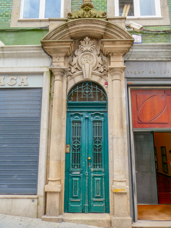

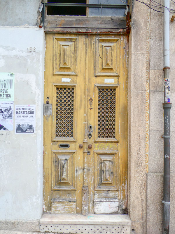
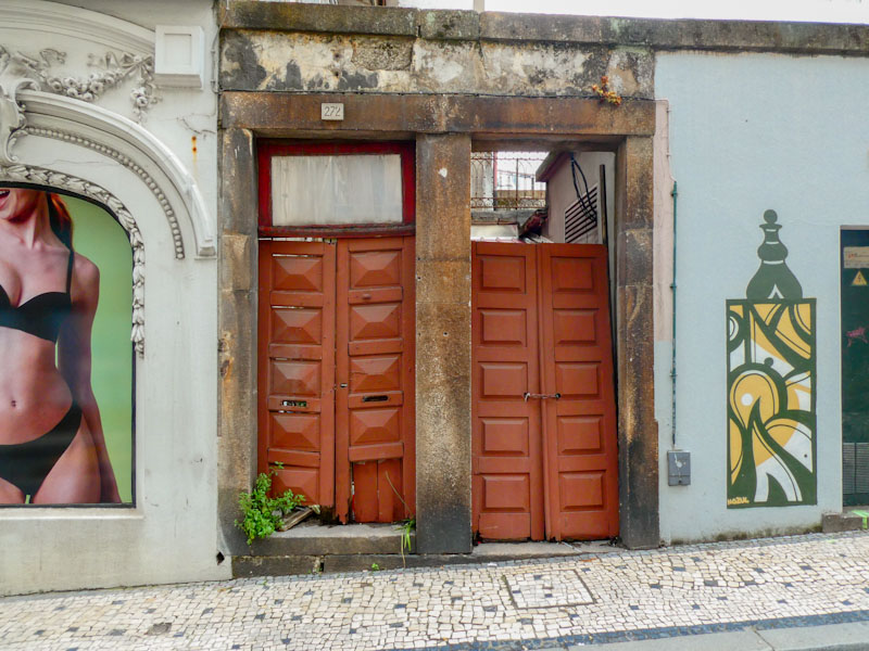


That is about as much as I can muster for this week, and I hope to share more of these Porto doors next week (time permitting, of course). Have a great weekend.
If you have made it this far, you probably like doors, and you really ought to take a look at the No Facilities blog by Dan Anton who has taken over the hosting of Thursday Doors from Norm 2.0 blog. Links to more doorscursions can be found in the comments section of Dan Anton’s Thursday Doors post.
by Scooj
.
Plain for all to see
winter of discontent looms
conservatism
.
by Scooj


