.
Drifts of fluffy seeds
rolling in the gentle breeze
peregrine glides by
.
by Scooj
.
Drifts of fluffy seeds
rolling in the gentle breeze
peregrine glides by
.
by Scooj
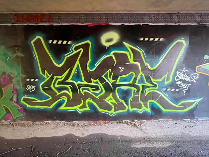
Sait Bare seems to have had a little bit more time on his hands to get out and paint recently. His flurry includes this interesting piece in the long foot tunnel underpass at L Dub. He is definitely in a ‘Bare’ phase at the moment, which is different from the ‘Sait’ period when I first encountered his work back in October 2023.
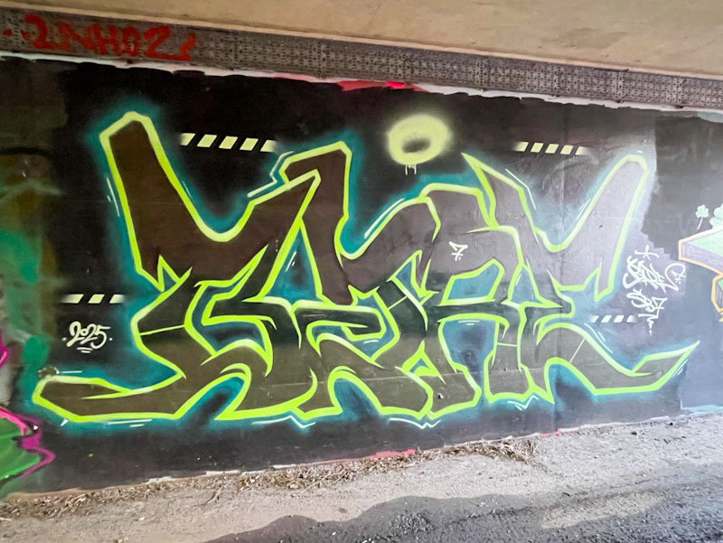
Sait Bare usually paints pieces with plenty of colours and form, but unusually, he has kept this one to a minimum, using black letters bordered with a vibrant lime green outline. There are minimal additional interventions pretty much restricted to some accent lines outside the letters and some stripey lines. All good stuff from Sait Bare – note to self… time for a gallery methinks.
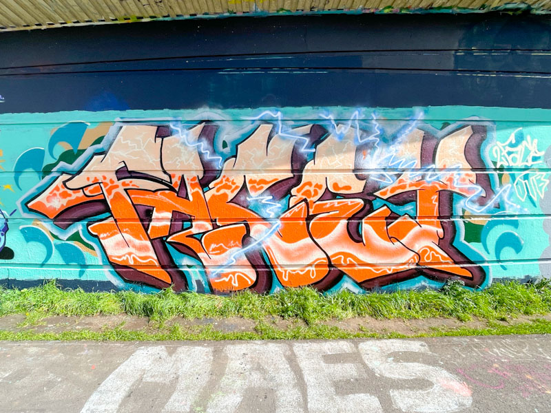
It took me a little while to work out who this piece of graffiti writing was by. I got there in the end, but was slow to figure it out, because the artist, 2Face, doesn’t paint very often. The letters spell FACEY, and it is signed, but even so, difficult to pin down.
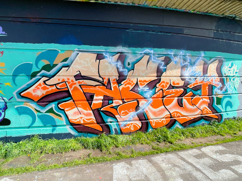
There is quite a lot going on in the orange fills in the lettering, ranging from white cracks at the top through ‘leopard spots’ to a fluid whitish stream of paint running horizontally through the letters. These are all the signs of an experienced artist. 2Face also decorates the piece with a blue plasma bolt, adding another layer to the textured piece. A nicely worked piece of graffiti writing.
.
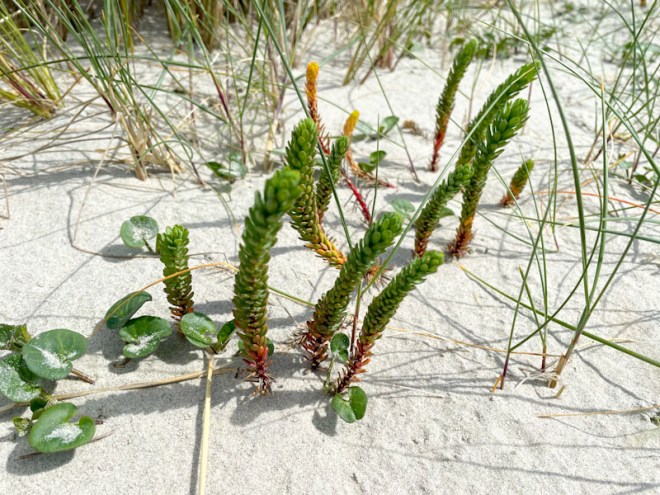
Down on hands and knees
getting a closer look see
Sea Spurge gathering
.
by Scooj
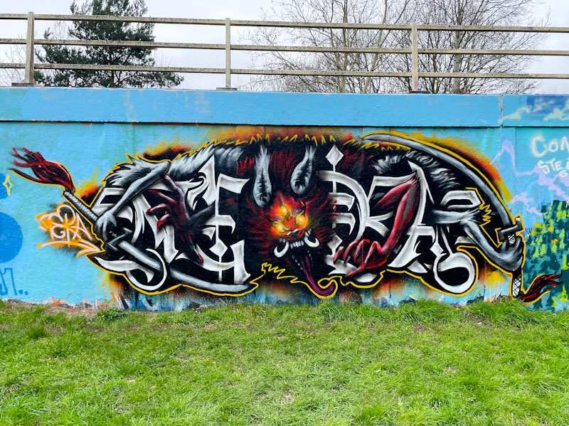
This is a curious piece by Tera painted at a recent paint jam on the roundabout. It doesn’t really matter how much I try to enhance the image, it is difficult to properly see what is going on without getting up really close. I think that Tera was so into creating the piece (perhaps with a tattooist’s mindset) that he has lost some of the clarity and story in the heavy detail. That is not to say it isn’t a fine piece, rather that it is difficult for the viewer to appreciate.
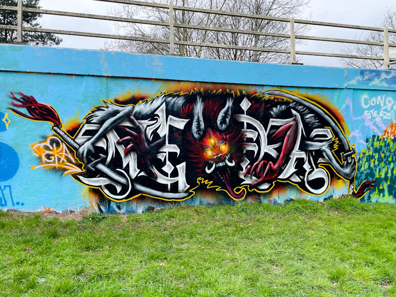
The combination piece has a dark and rather evil demonic character in the centre, with three eyes, large fangs and a long tongue. It is holding two swords that frame the middle section of the piece. The letters either side of the character spell out TERA, in a nicely crafted style. Overall, Tera shows his raw talent with this piece, but for me, it is a little busy and could do with toning down a bit. Lots more to share from him as he has been out and about a fair bit this spring.
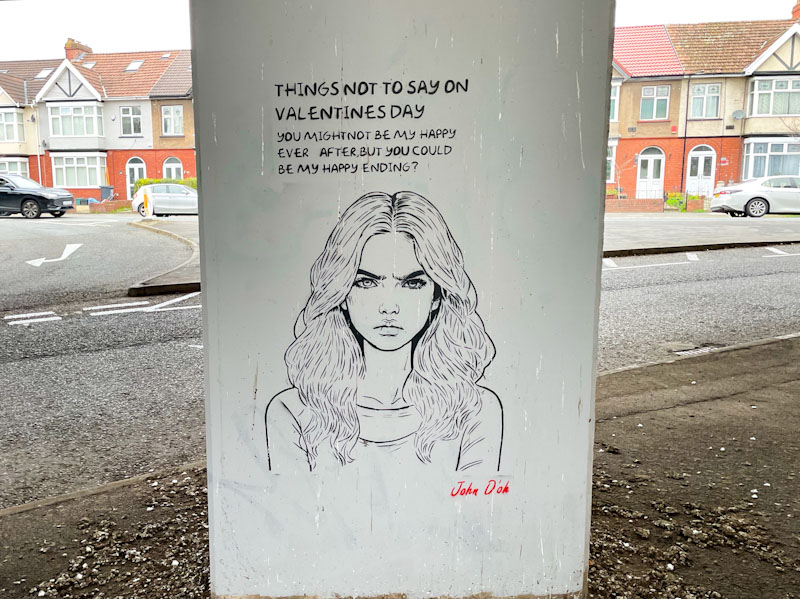
Another piece (and there are so many more to come) from John D’oh’s under-motorway gallery. This is a humorous piece, which leans into smutty, which I guess is all part of the edginess of street art.
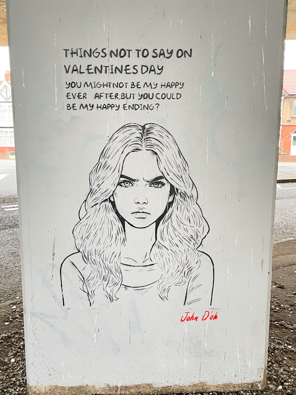
The fine stencil of a young woman is accompanied by the words “Things not to say on Valentine’s day: You might not be my happy ever after, but you could be my happy ending?”. On a picky point, the second half of the sentence doesn’t read as a question, and I think that the ‘you’ and the ‘could’ are the wrong way round. The piece has the potential to cause offence, although I think the emphasis is on humour. Not one of his best ideas, but nonetheless part of his varied portfolio.
.
Sunlight through the blinds
and a pigeon’s hearty coos
tell me to get up
.
by Scooj
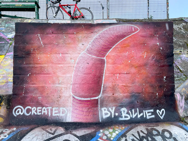
When ever did a worm look so beguiling? This little flat concrete slab in the Dean Lane skate park has had many, many small pieces adorning it, but never one quite like this. It is painted by visiting artist, Created by Billie.
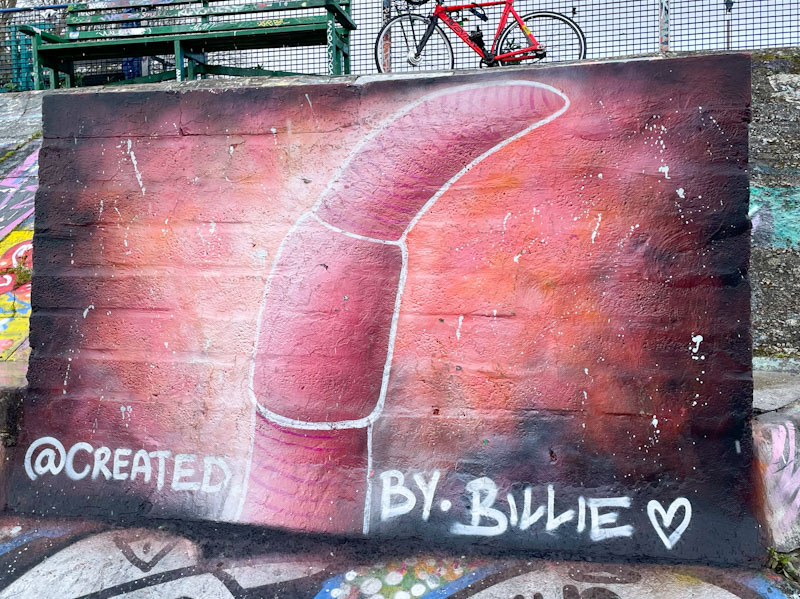
The last time the artist was in town, I met her while she was painting a wall very near this one, and what a lovely lady she is, full of enthusiasm for her work. While this piece has a comforting cartoon feel to it, it also appears to have some accurate anatomical features such as the saddle (clitellum) and segments. Striking and unusual… I love this piece.
It has taken me a long time to figure out the letters in this writing, and I am not too sure I would have done so without Paul H’s recent posting of a piece by the artist. The letters spell VERMO, but you have to study them pretty hard to figure it out, as they are deliberately deceptive. Once you know them you can see them, but it is that first time of working it out that takes the time.
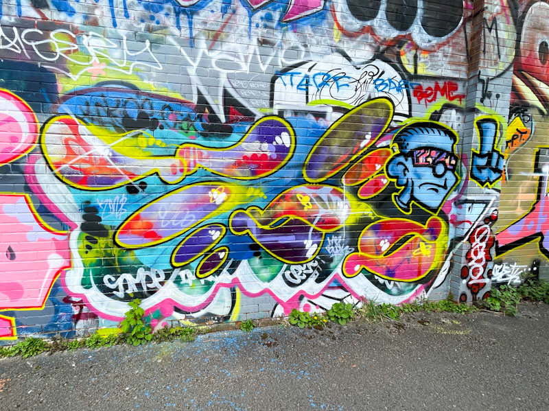
I have a lot of Vermo’s pieces to share from my archives, but I decided to start with this combination piece alongside the river. Unusually this piece of writing includes a character, where most of his pieces contain only the ‘floating’ letters that are made up of component shapes, for example, both the ‘E’ and the ‘M’ are composed of three ovals of increasing size in different orientations. I wouldn’t quite know how to classify Vermo’s writing, but it might fall into the category of abstract graffiti writing, a bit like Mr Klue, but quite different in appearance. Watch this space for more from Vermo.
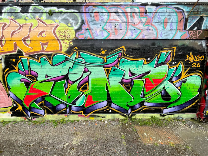
Lately, Zinso has been completely smashing it with his clean and colourful pieces of graffiti writing, and this recent piece serves to confirm his place as a one of the tidiest writers in town.
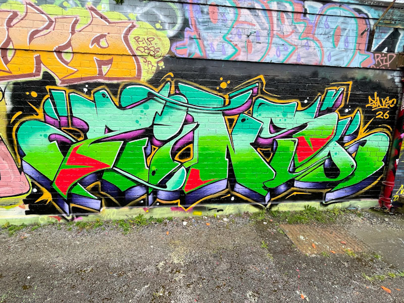
Pretty much hidden from view on the swimming pool wall, this piece deserves to be seen by more passing eyes. The combination of turquoise, light blue, green and red is masterful, and the mauve and black drop shadow have a metallic appearance. I rate this particular piece of artwork very highly and look forward to more this spring/summer.


