I know practically nothing about Jimzina other than that loads of her(?) pasteups appeared on virtually every piece of street furniture at Upfest this year. This is the first of many posts of her work, due to her prolific few days in Bristol.

I know practically nothing about Jimzina other than that loads of her(?) pasteups appeared on virtually every piece of street furniture at Upfest this year. This is the first of many posts of her work, due to her prolific few days in Bristol.
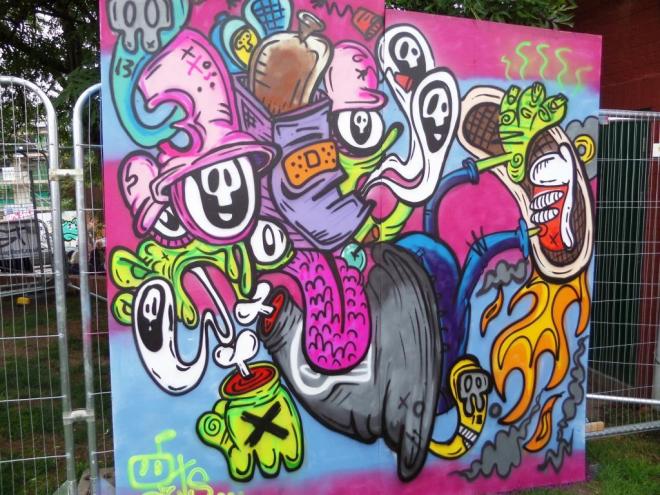
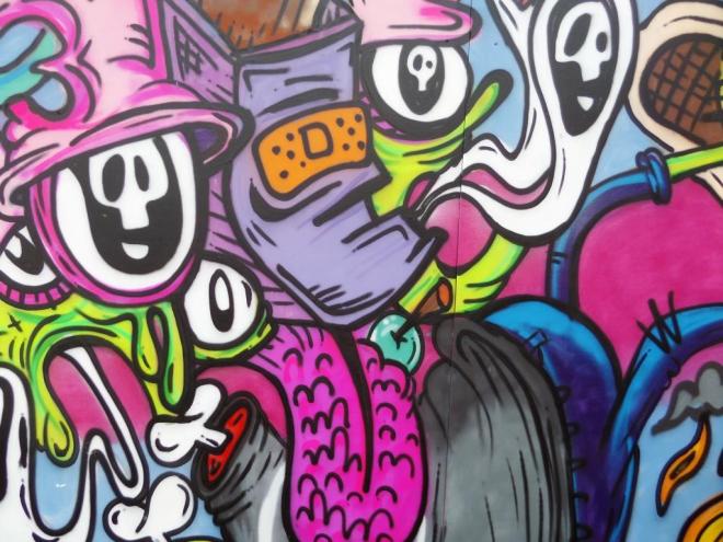
I have recently become well acquainted with the work of Guts, a Bristol artist, and am enjoying it more and more with each exposure. His style has something of a doodler’s look about it, with lots of little characters and shapes filled in with bright colours. There is a real skill here though, because this could just end up as a messy sprawl, but look carefully and there is a story in this piece.
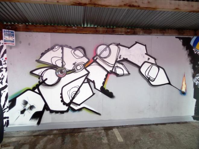
It is great to be able to post yet another incredible work by another Bristol Artist. This one is by Shab, and stands head and shoulders above many of then other abstract pieces at Upfest this year. His use of the brilliant white an black outlines on a slightly off-white background works a treat, and the match and flame are something to behold.
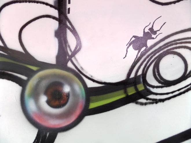
This is a thoughtful piece which had some scratching their heads. An acquired taste maybe, but actually technically really good. As always with his pieces an eye is incorporated too.
I do really like his work, but missed the opportunity to meet him. He had finished by the time I made it this far on the first day. This one makes it into my top 10 for the festival.
This is a wonderful compisite piece stitched together perfectly by Kid 30 on the hoardings in Raleigh Road. Kid 30 is an artist based in the midlands and member of the highly regarded Oxygen Thievez, of which Deamze is one too. His style is always clean and bold, and this piece is pretty awesome really.
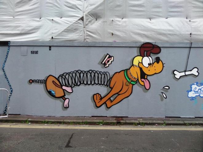
The dogs I can identify are Snoopy, Pluto, Scooby and Slinky…I think. This piece was favourite of many who attended the festival. You’ve got to love a dog, of four.
The artist who created this piece has an interesting and colourful background. I will quote the profile from the Upfest programme:
‘Lapiz started wheat pasting in the streets of New Zealand after moving there from South Africa where he had worked in HIV research. The immense cultural shock proved to be a source of inspiration but needed a vent which was and still is street art. While living in Buenos Aires the many murals inspired him to paint his thought provoking stencils on a large scale.’
 H
H
This piece for Upfest is challenging, but also beautiful. Split into three colour sections the whole piece presents as slightly menacing…balaclavas are always menacing…but also witty and very skilfully composed. I like this one a lot, and it really stood out.
UPDATE (7 September 2017) – following an instagram exchange, Lapiz shared a description of the piece as follows:
Female #nipples still have to be covered in public or the internet. But when it is a painting they usually aren’t. But what happens if you paint one of the best known statue of a woman, the #venus of milo as she was a real person including the nipples. And how would the spectator react. That is what i did for #upfest2017 a #streetartfestival with thousands of visitors. The only way to do it, is to use a ridiculous amount of highly detailed stencils. The body has 9 layers, the toga 7. The pink beanie was done so she looks like a member of #pussyriot just to push the viewer into the right direction. What do you think?
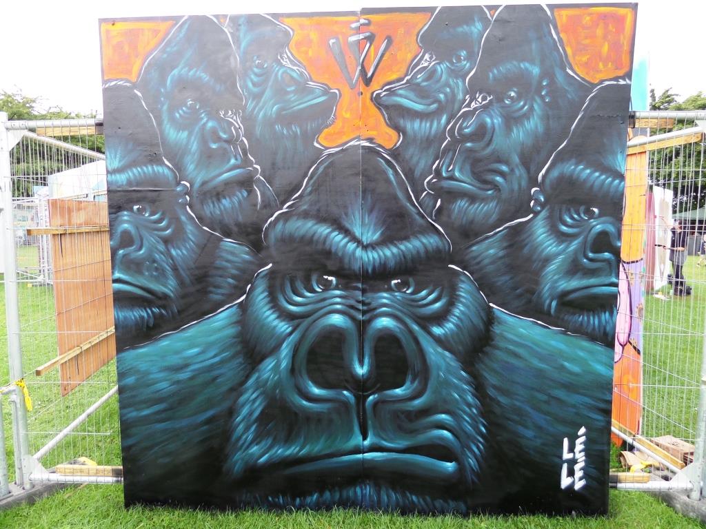
In the middle of South Street park, this hoarding really stood out from the crowd. The amazing gorillas by Lélé stopped people in their tracks, and the colours used looked much better than these pictures portray. I only know what I read about Lélé in the Upfest programme notes, and that is that he was born in Brittany in 1987.
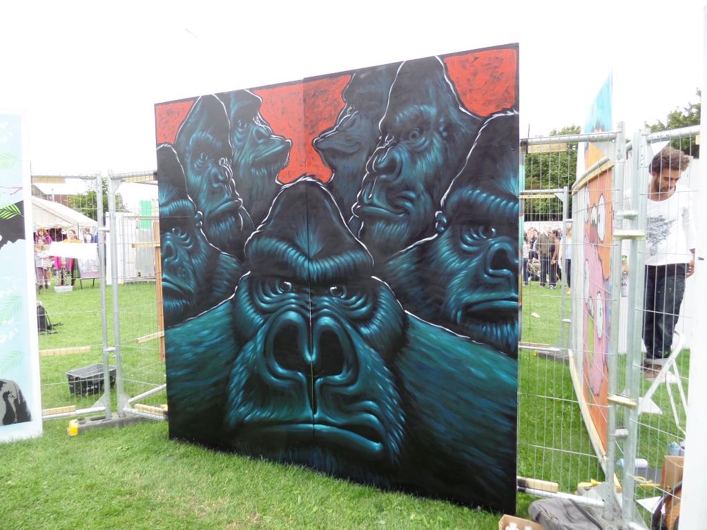
It would seem he was inspired to paint monkeys with his own graphic identity on his way back from a long trip to South America. Well, whatever his inspiration, I think this piece is really good, and I spent quite a lot of time looking at it during the spraying and afterwards. I’d like to see more of his work.
This is a wonderful and very large piece by Nol from this year’s Upfest, which was sprayed on the wall of a school next to South Street park. The thing about these walls in local schools is that they are only accessible during the festival. After that is only pupils, their parents and teachers that get to see them, which makes them rather exclusive.

Last year Nol worked with Edo Rath in the car park opposite the Tobacco Factory, but Edo couldn’t make it to Upfest this time so Nol had to work solo. Edo was there in spirit though, and just to make certain, Nol had attached a face mask of Edo to the lift platform…a nice touch.

This was a large undertaking, and it was something of an accomplishment by Nol to complete this wall over the three days, given the rain interruptions. I managed to catch up with him a couple of times and asked him how much pink paint this wall would take. He said that typically a can will cover about one square metre. He used seven cans of pink for this piece. That is a lot of paint.

The phrases ‘good things come to those who wait’ and ‘fortune favours the brave’ come to mind with this piece. During Upfest, I never got to see this piece completed, which actually happened with many of the pieces this year. However I returned during the week after, and thought I’d see whether this piece was on view still to the public. It was not. But I just happened to be there at the exact time the contract firm were collecting the lift, and blagged my way into the school yard to take some pictures of the final piece. Such luck, and there were two other pieces I got to photograph as well.

This is a bold, fun and larger-than-life work, and ideal for a school playground. Nol is a gentleman who seemed happy to talk while he was working, and this is some wall.

On an advertising hoarding in North Street, there is this wonderful Losthills wheatpaste of Jake the dog posing as Yoda. The placement and writing make this piece just about perfect. I have said it before, that the placement of paste ups plays a major part in the impact they can have, and this one drew the attention of passers by, where others did not.
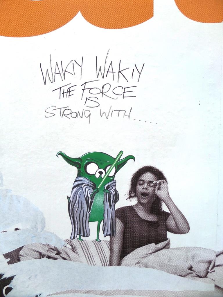
I am not sure who introduced the writing, whether it was Losthills or somebody else, but it sets the whole thing off really well, given the subject matter of the advertisement.

Losthills absolutely ‘nailed it’ at this Year’s Upfest, and I am looking forward to sharing a whole bunch more of his work in the coming months. Bravo.
This site on North Street has played host to some great street artists in recent years, including N4T4, Phil Blake, AgeAge, Caro Pepe and most recently a collaboration between Paul Monsters and Copyright. At Upfest this year, another wonderful piece was painted, this time by Brazilian artist Inke.
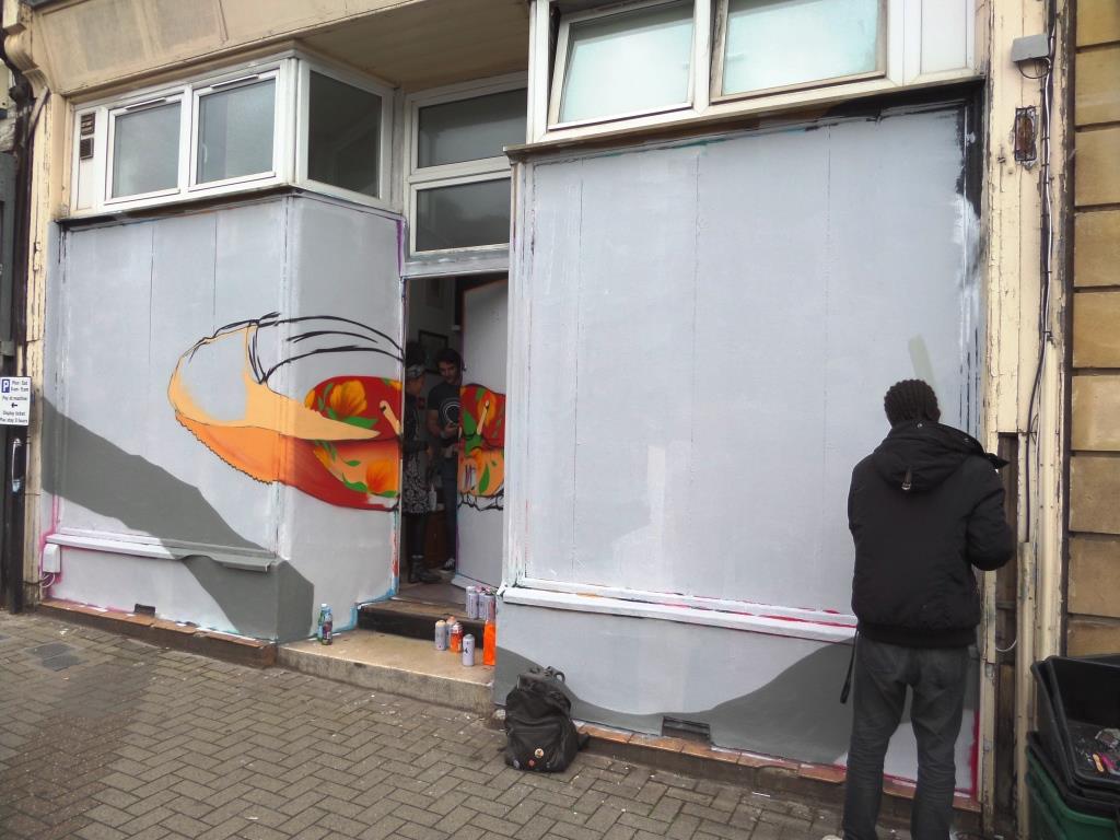
I had not heard of Inke before and chatted with him briefly on the Saturday of the festival. I think I must have utterly confused him, because I don’t think his English was too good, and my Portuguese is non-existent. I think I was blabbering on about the potential for a mix up with Inkie, the Bristol artist…an effort at trying to be humorous that fell a bit flat.
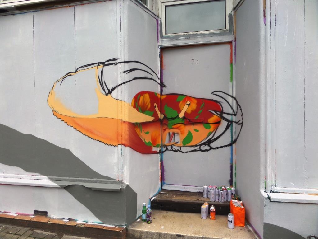
While he was spraying, the residents of the building emerged from their home, which all seemed a bit surreal. The piece itself took Inke quite a while to complete, and the rain certainly interrupted things. The final piece though I think is stunning, a really beautiful and exotic work.
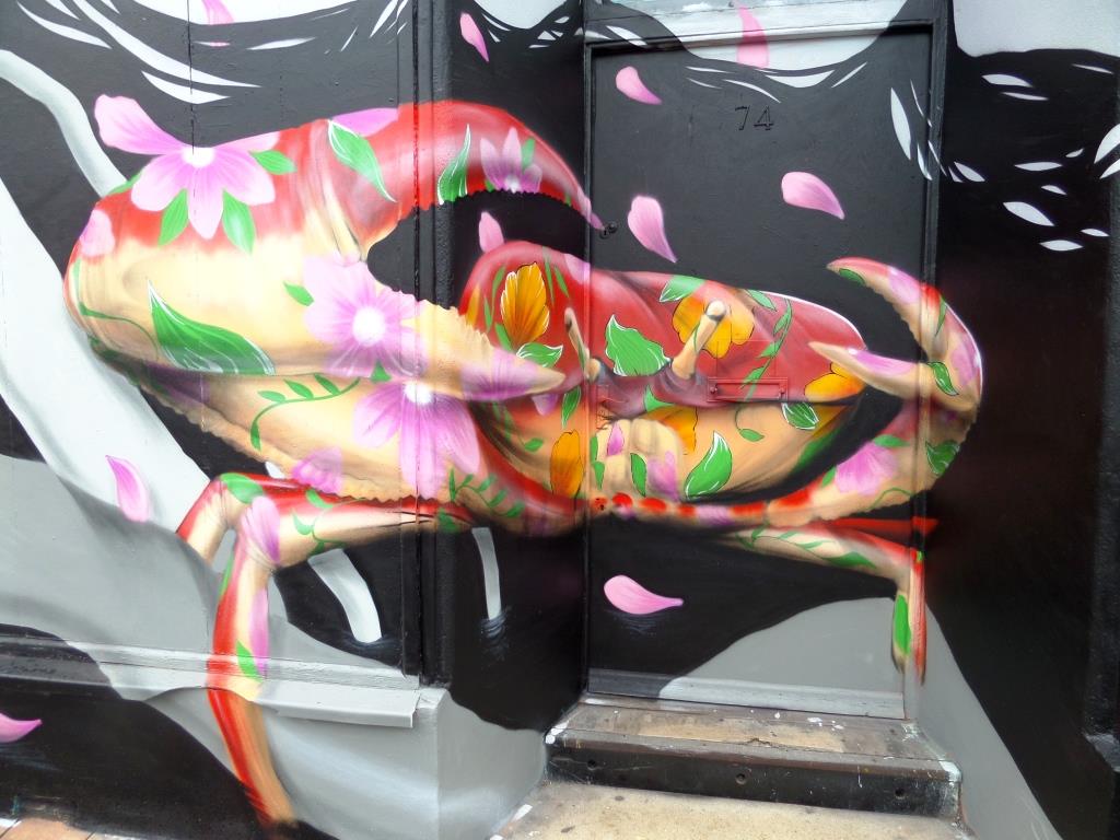
The crab in the centre of the piece is sprayed in a bold floral pattern, but the shadows of the crab and its form are incredibly well presented. It reminds me a little of the way Louis Masai creates his quilted animals. Superb technique and one of my top pieces at Upfest 2017.
Bristol really does love its foxes, so to see one appear as part of Upfest is always very welcome. This beautiful piece is by Bex Glover, a contemporary artist and illustrator who runs a freelance illustration and graphic design practice in Bristol.

From a viewers perspective, there are so many things to look at in this work. Glover’s illustration skills are clear to see and the abstract backdrop brings the fox into sharp focus. A nice touch in the haunches of the fox hints at a yin yang symbol. The fox looks wily, just as it should and ready to move off at the slightest disturbance.
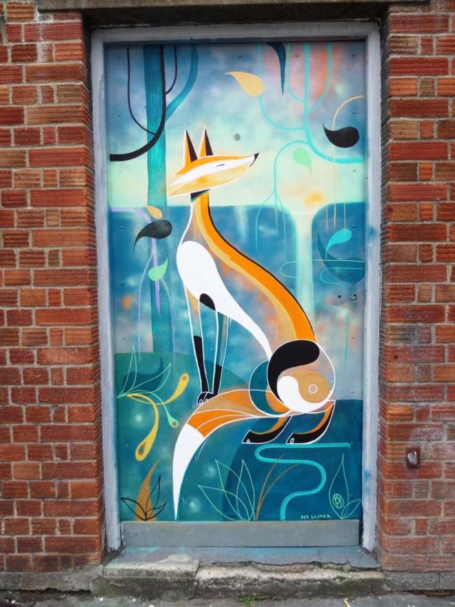
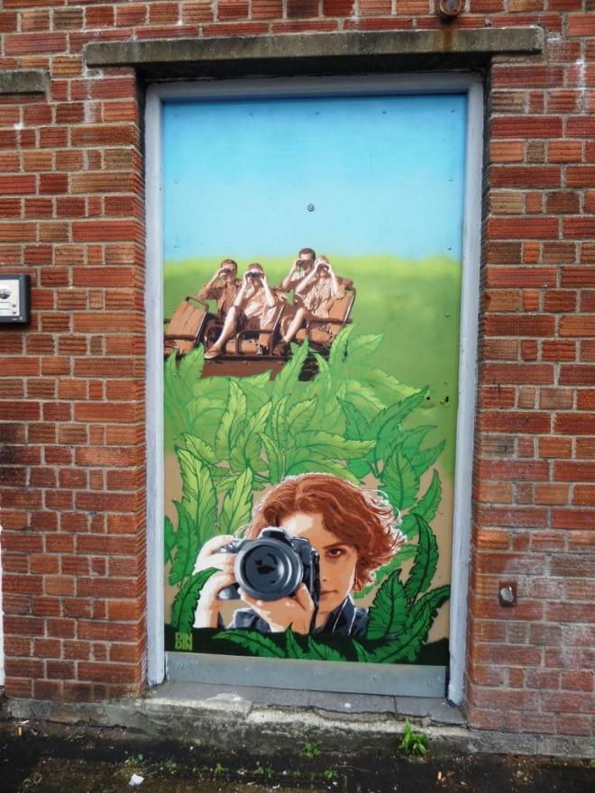
This is a calming piece with superb colour selection which may have gone unnoticed by many visitors as it is just off the main road and set back just a little. Last year this spot was occupied by a wonderful stencil by DinDin.