.
A golden beech tree
harvests the sun’s first warm rays
beyond, a jet flies
.
by Scooj
.
A golden beech tree
harvests the sun’s first warm rays
beyond, a jet flies
.
by Scooj
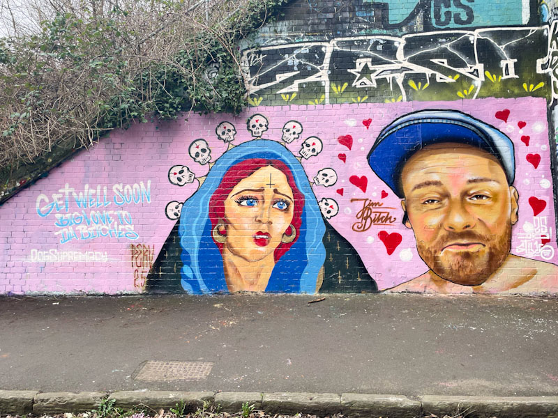
This slightly unusual collaboration from Badger Feral and Stivs has been turning a few heads, and not surprisingly, as it is rather striking. While I am very familiar with Stivs’ work, I believe this is the first piece I have come across by Badger Feral.
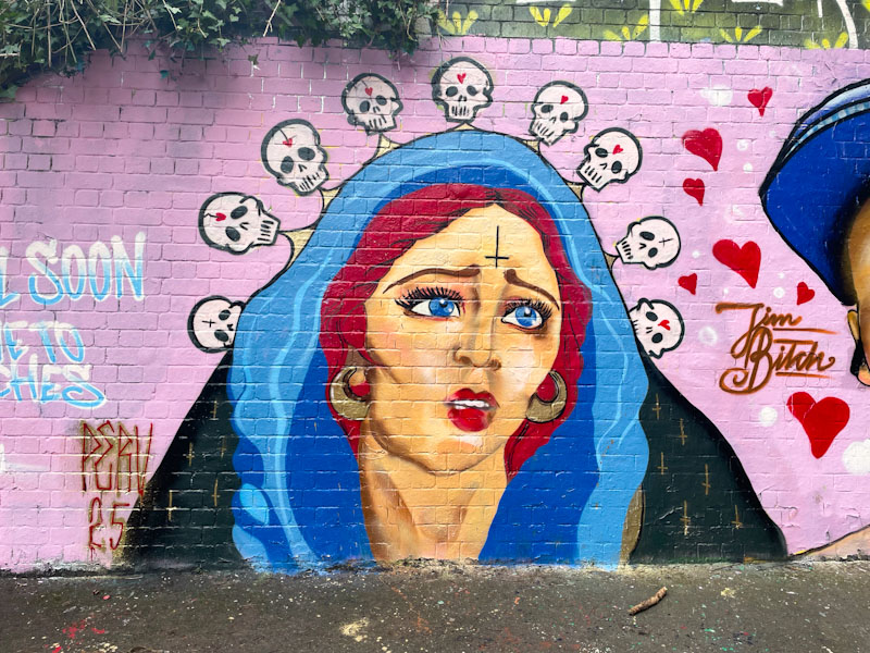
Starting with the Badger Feral piece, we are presented with a portrait of a hooded woman, with red hair and gold earrings. Her blue eyes are matched by the hood around her head. The portrait has a slightly darker side, with an inverted cross on the woman’s forehead, and her hood is suspended by a line of little skulls. Lots to take in here, and plenty of symbolism too.
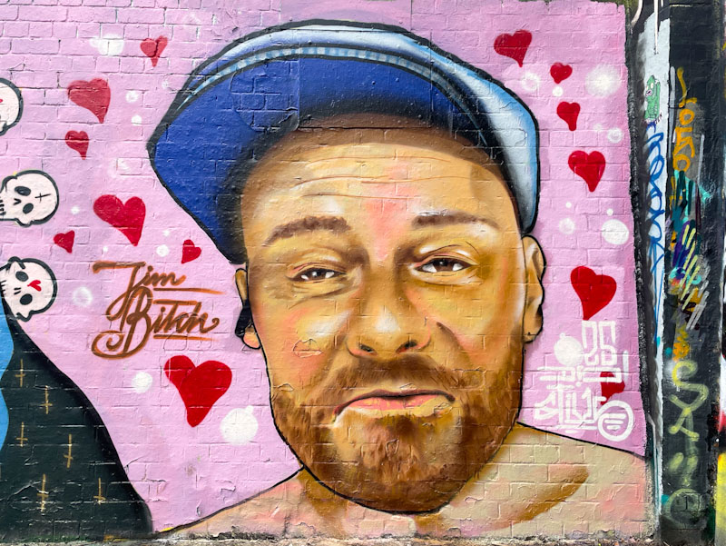
Stivs on the other hand has painted a portrait of a jolly fellow wearing a cap. I don’t know who the character is, but there might be a clue in the ‘Jim Bitch’ that accompanies the piece. Stivs has painted the portrait in a photorealistic style, and it looks like, from subsequent pieces, that he is rather enjoying portrait work at the moment. There is so much to take in from this ever so slightly weird collaboration.

This stunner by Hemper (who else?) has caused me a lot of grief. It was painted at the farm end of the tunnel, and had a black van parked in front of it every time I went to visit. I never did get a clean shot of the piece, so I have had to decide whether to share some rubbish pictures of it or not to share at all. I chose the former.

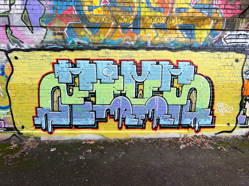
This is one of a series of outstanding pieces from one of the most imaginative graffiti writers in Bristol. He has been operating at full tilt this year, and has already clocked up countless pieces, no two looking even remotely similar. It is probably a good time to update his gallery (I have just done it), which is swelling, in a positive way. These bubble letters spell out HEMS and are set on a delicious red background. The pink and blue fills are expertly worked, as you would expect. So much more to come from Hemper’s renaissance.
.
Irrepressible
longer evenings, bright skies
excited contentment
.
by Scooj
.
Sulphur yellow wings
vibrant in the midday sun
I eat lemon cake
.
by Scooj
I think I am going to have to refer to Trafficity as something like ‘old faithful’, such is his consistency and form. This is one of at least three relatively recent pieces by the Polish artist on the swimming pool wall. I wonder if he paints here, because it is a little bit out of the way and less busy than other parts of the Deaner.

His letters ZIOS, which for years I mistakenly thought were ZIOM, are split horizontally into three colour stripes, which is customary for his work. The writing is set on a yellow background, which looks as if it has been attached to the wall with rivets or nails, a simple but clever detail. As ever, lovely work from Traffiticy.
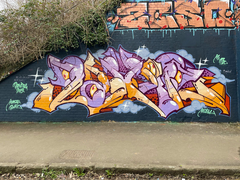
When I first saw this piece, I was puzzled. The style felt familiar, but I couldn’t match it to any of the artists I am familiar with. There was a reason for that, it is a wonderful piece by visiting artist Lezaxer, and one of at least two painted during a trip to Bristol earlier this month.
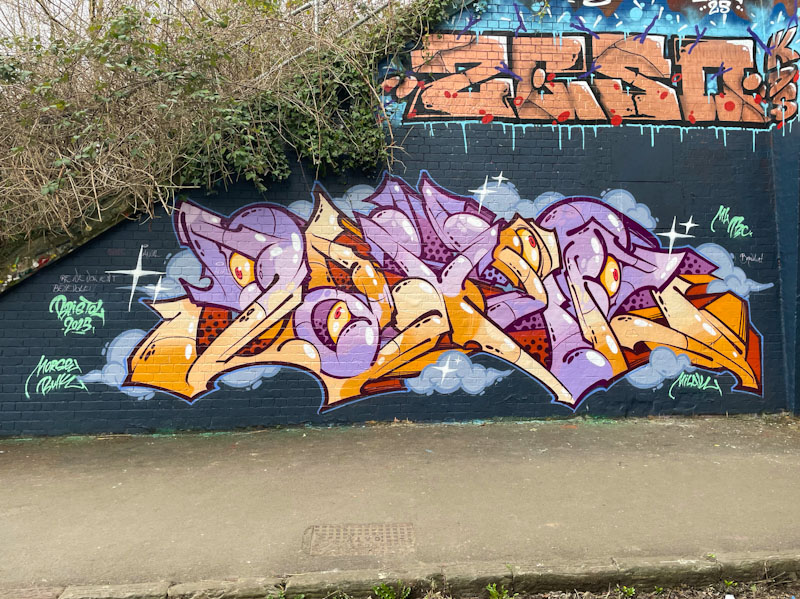
The beautifully crafted writing spells out ZAXER, I think, with a perfectly complementary colour scheme, set on a cloudy background. Clearly the work of an experienced graffiti writer, and one who certainly doesn’t look out of place in Bristol. From Lezaxer’s Instagram profile, it appears that home is Sheffield, and we are privileged that the artist made the long trip south.
.
Fairy Godmother
helps a poor girl meet a prince
true love wins the day
.
by Scooj
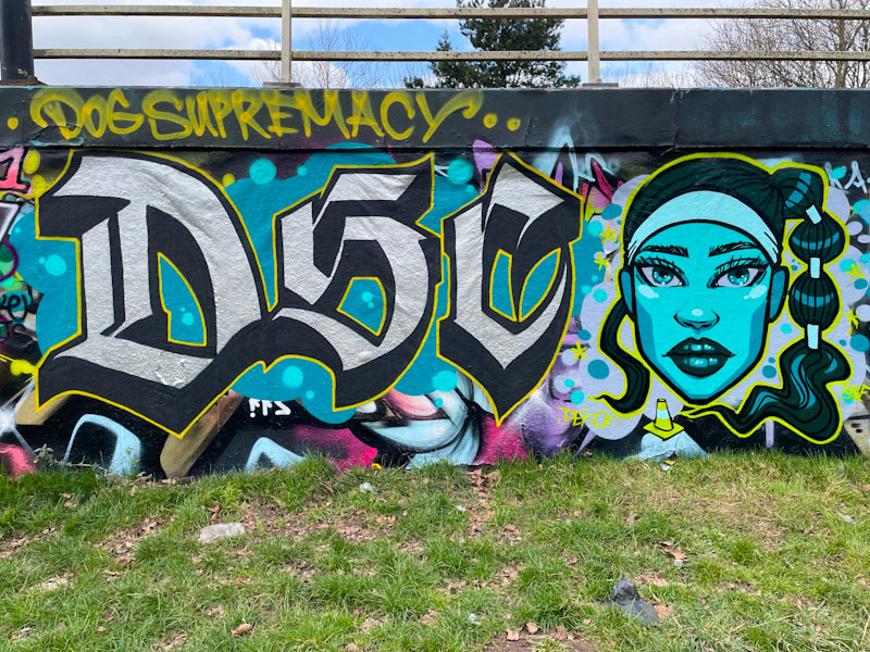
It was great to see this collaboration from Stivs and Pekoe recently, two artists who are knocking out some fabulous work at the moment. To the left, the calligraffiti letters are by Stivs and the character portrait on the right is by Pekoe.
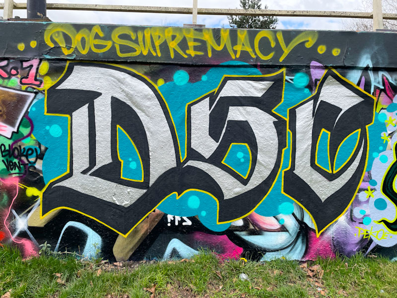
Stivs has written his familiar letters DSC, which stands for Dog Supremacy Crew (formerly Dog Shit Crew – I think). The beautiful letters are not quite as elaborate as some of his calligraffiti pieces, but are nonetheless impressive. From the size and intricacy of it, I would think that he painted this fairly quickly.

To the right, Pekoe, in keeping with the collaboration colour scheme, has painted this wonderful blue-faced portrait of a young woman with a fabulous hairdo. There is a symmetry in the face, and a slightly haunting stare. The piece is beautifully produced, and so very neat and tidy. I am not sure what the significance of the road cone is, but I’ll take it.

Conrico has a lightness of touch and an ability to tell stories through his pieces that is almost unique in Bristol. If I were to pick another artist who has similar qualities, it would be Daz Cat. This is a wonderful piece was painted as part of a paint jam I think to mark the birthday of Benry – I don’t know who Benry is, but there was some great art produced in celebration.
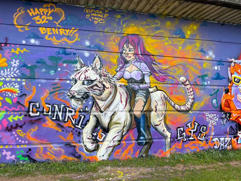
The piece features a girl riding a white tiger (or some mythical feline beast), and why not, and the orange atmosphere around the characters indicates something magical is going on. There is movement, excitement and fantasy in this piece which is beautifully painted by Conrico. Great stuff.


