.
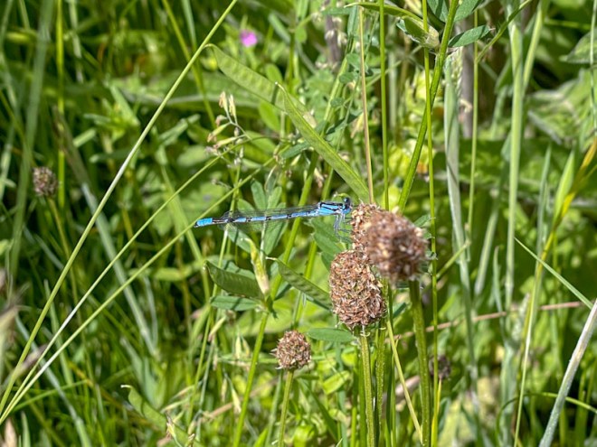
My poor failing eyes
so slow to settle on the
slender blue beauty
.
by Scooj
.
My poor failing eyes
so slow to settle on the
slender blue beauty
.
by Scooj

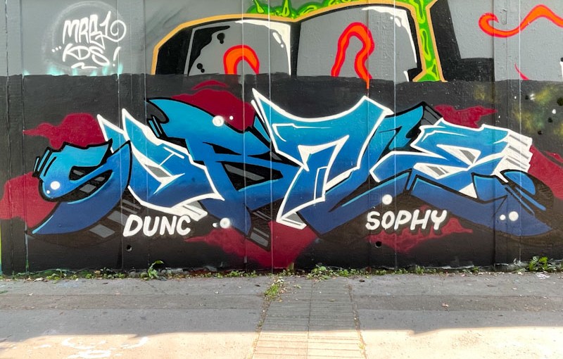
It is totally awesome to see Subtle again after quite a long break. His work, for me, epitomises the Bristol style of graffiti writing. I have mentioned that different towns and cities, regions or countries have distinct styles, and this piece by Subtle oozes Bristol.
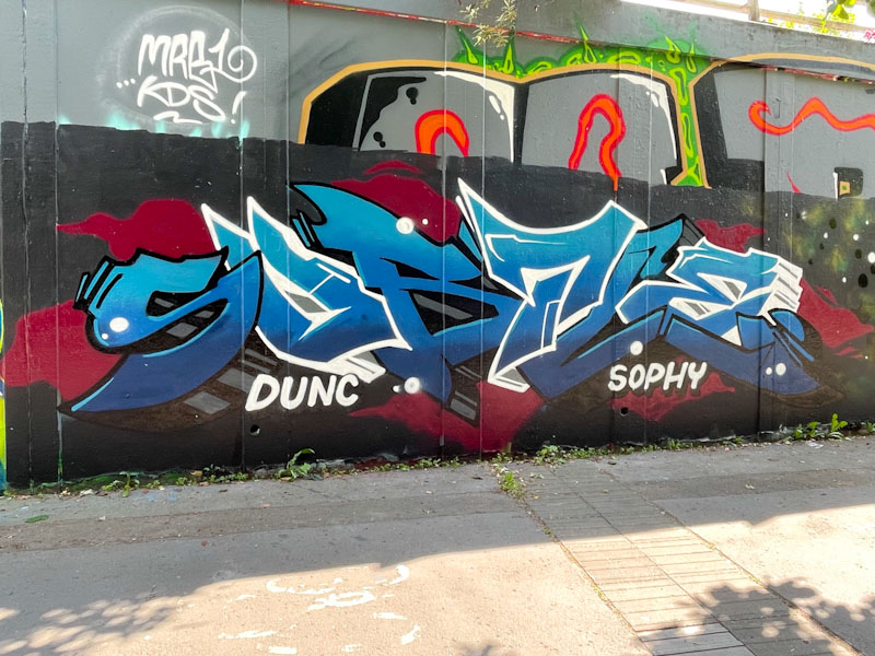
The piece itself is painted in rather dark colours and a little difficult to pick out with the light behind the wall. Great big fat letters on a buffed wall with a dollop of red decoration is just what the doctor ordered, and a great way to start the day. Classy and beautifully executed. Welcome back Subtle.
I wrote this last night, because I had a very early start this morning (1:30am) taking my daughter to Heathrow airport followed by a full day at work. The things we do! So a couple of quickies today.
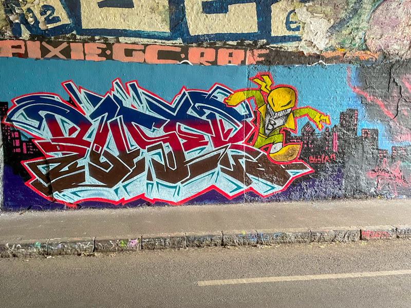
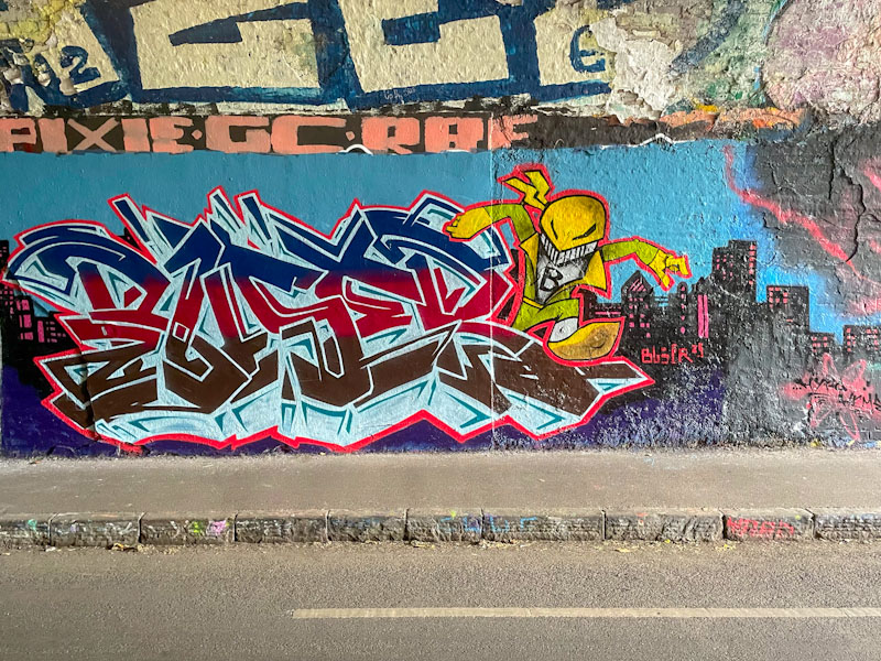
This is a fun combination piece by Buser in the tunnel. I don’t recognise the character and think it might be from the artist’s imagination. The writing is of the highest order with great fills and an exceptional ice-blue drop shadow. I’ll be looking out for more from Buser.
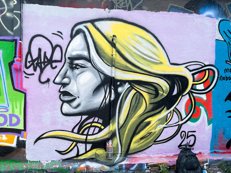
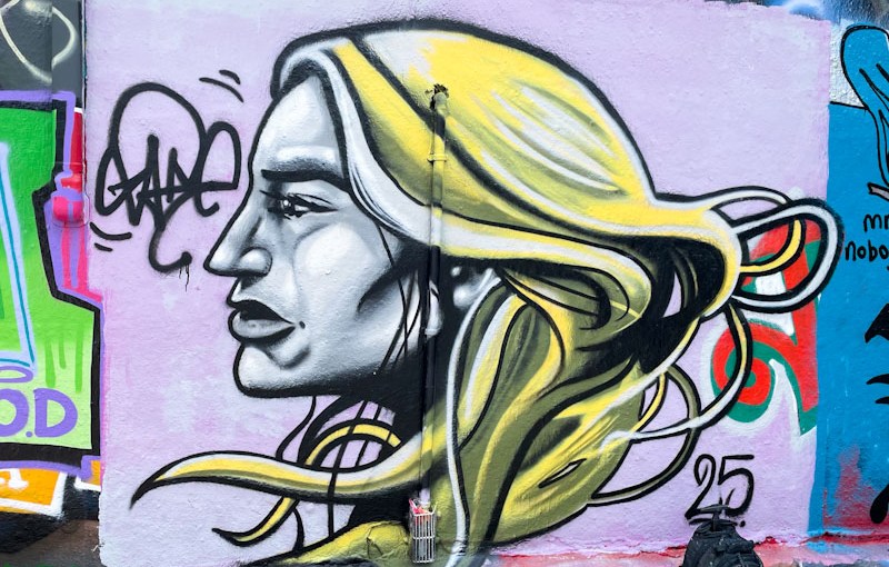
I am used to seeing Zake character pieces that tend to be head-on round faces in a cartoon style with lots of light and shade creating depth, so this is something a little different.
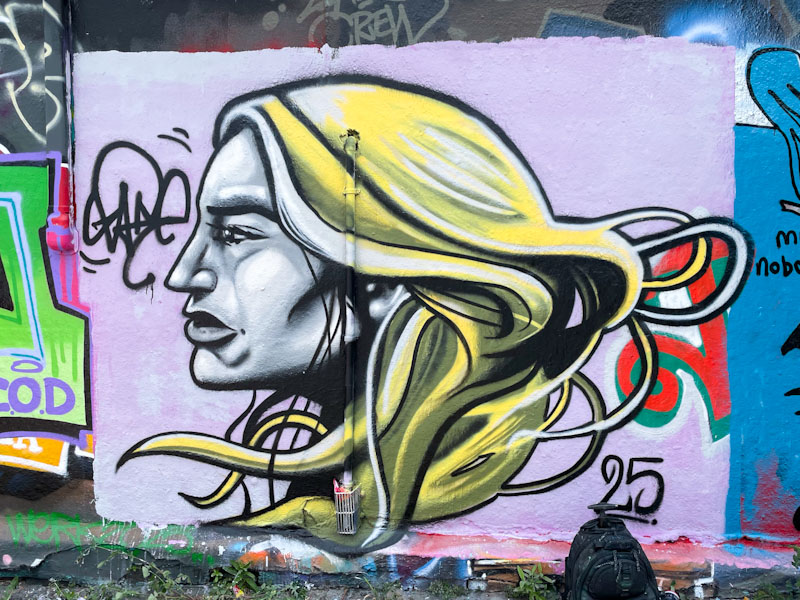
The profile portrait of an androgenous person draws more on a realistic version of a character than the cartoon style I am used to from Zake. The hair, in particular (most of his characters are bald), is great to see, demonstrating that Zake is far more than simply a one-trick pony. Definitely an unusual piece from one of the most prolific artists painting in Bristol at the moment. I have updated my gallery of Zake’s work so you can see what I mean.

Mr Underbite’s appearances are few and far between these days, so it was great to find this one in one of his favourite spots recently. I’ll not make reference to the brown background.

The Hapless character is painted in vibrant green, has his customary underslung jawline and is wearing a baseball cap for good measure. Signed MUB (Mr Underbite) and dated 2025, this is a piece without pretension or complication – what you see is what you get.

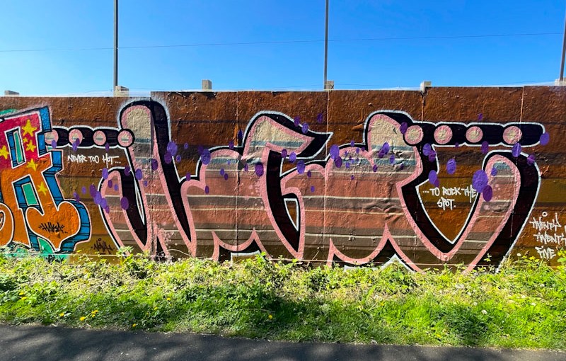
I hate to labour the point, but I am going to anyway. I don’t much care for brown paint, unless it is being used in context, for example to depict a chocolate bar or a tree trunk, but decorating graffiti writing using brown colours is, to my mind, such a waste of a good design.
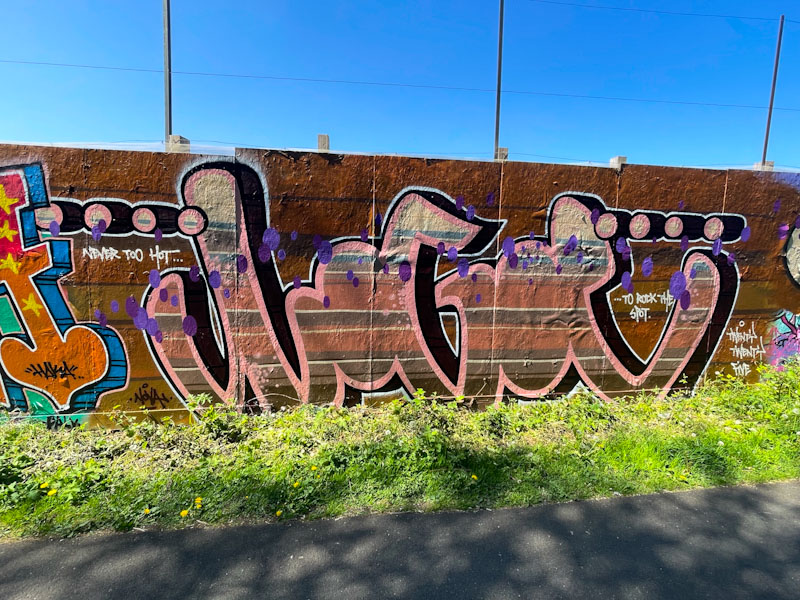
I am going to suspend my prejudice in this instance though, because Logoe has somehow made the brown colours of this piece rather attractive. His script graffiti writing is filled with layer upon layer of brown shades, set on a dark brown background. The piece is a symphony of brown, and probably because it is Logoe, I rather like it. Three Hail Marys for me.
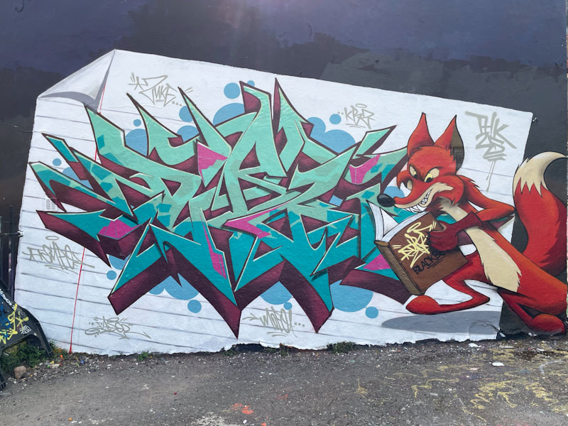
This combination piece from Fade and Dibz is outstanding, and really ticks all my boxes. I watched them as they started painting this and knew, even when it was in draft that it was going to be an absolute blinder.
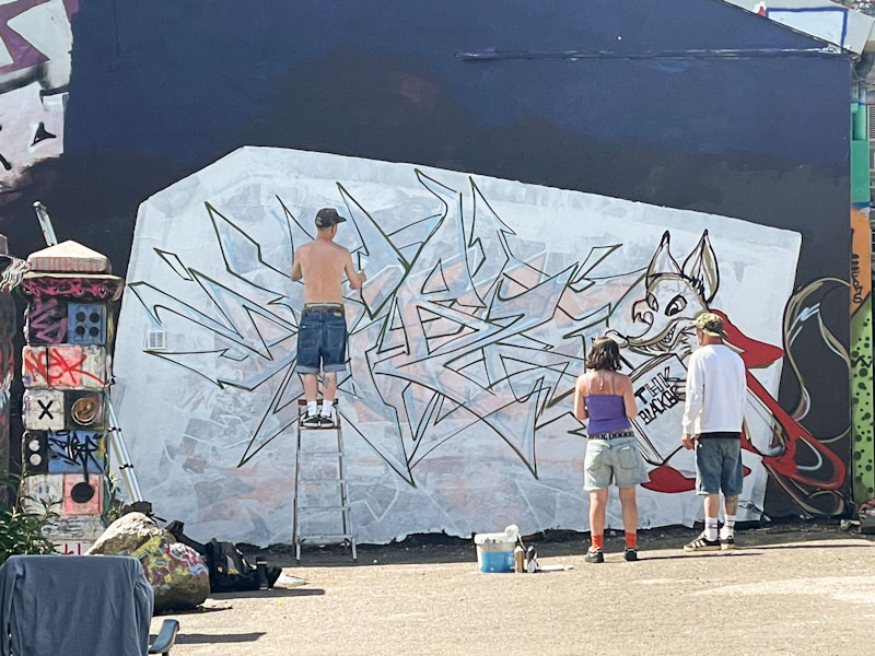
This is straight out of the black book, a sketch come to life with a clever twist and superb early Disney character. I love seeing works in progress as it shows just how unbelievably talented these artists are, and how they build the picture up into something quite magnificent.
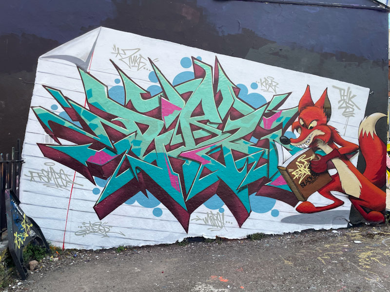
The writing is by Dibz, and has a beautiful, deep 3D drop shadow, with additional shading to create perfect depth and lift. The fox character, by Fade, looks like he is reading Dibz’ black book, maybe at this actual picture, which would be a clever twist. The whole thing is set on a piece of lined paper, which adds another whole dimension to the collaboration. Bravo! Gentlemen.

.
Hotel car park sounds
distant hum of motorway
car music booming
.
by Scooj
.
My ancestral home
a place where spelling my name
isn’t a problem
.
by Scooj
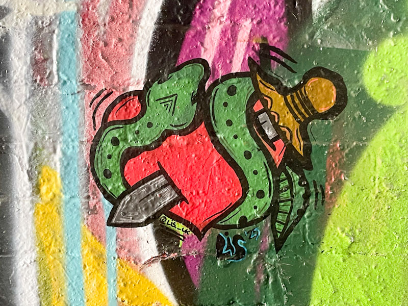
I must’ve walked past this little beauty by Lis several time before I noticed it. It is heavily disguised, sitting on a larger piece, and easy to miss (obviously). I felt rather clever when I spotted it, but later realised, when looking at her Instagram feed, that it had been there for weeks.

The heart with a sword running through it and a snake is a stunning motif, and looks like a tattoo sample. The fine work is a combination of spray paint and she used it as an opportunity to try out some small stencils. This is so typical of Lis, expanding her portfolio and improving her technique and skills.