.
Where did they come from?
these miniscule building blocks
it doesn’t make sense
.
by Scooj
.
Where did they come from?
these miniscule building blocks
it doesn’t make sense
.
by Scooj
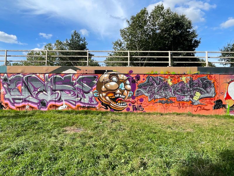
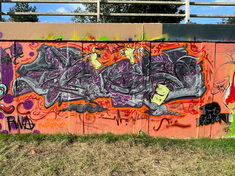
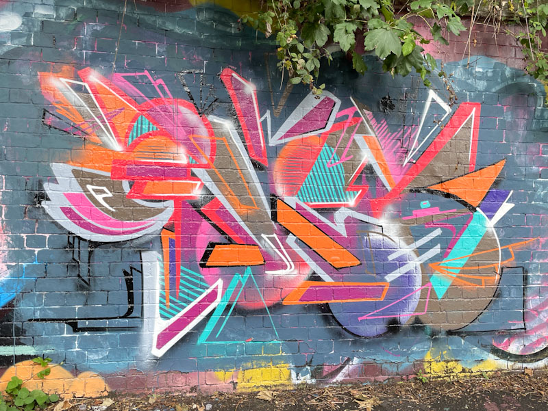
This recent collaboration on the M32 roundabout full of mischief and colour. I would call it a PWA collaboration, but technically I am not sure about that. I have lost track of who is and isn’t in PWA, although I don’t actually think it matters much. The collaboration is from Noise, Zake and Posh (whose work I think I might have seen before, but who has not, until now, appeared in these pages).
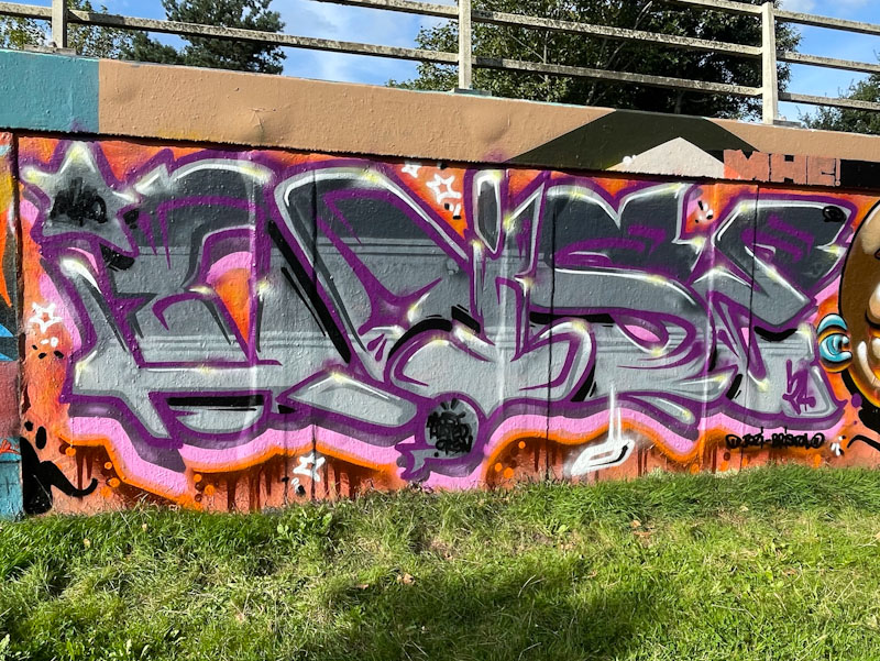
Noise burst onto the scene about 18 months ago, and I don’t think he has hit the ground since, being one of the most regular graffiti writers in Bristol, painting either solo, or more frequently these days in collaborations or paint jams. Here he presents his chunky letters in a lovely purple and orange assemblage.
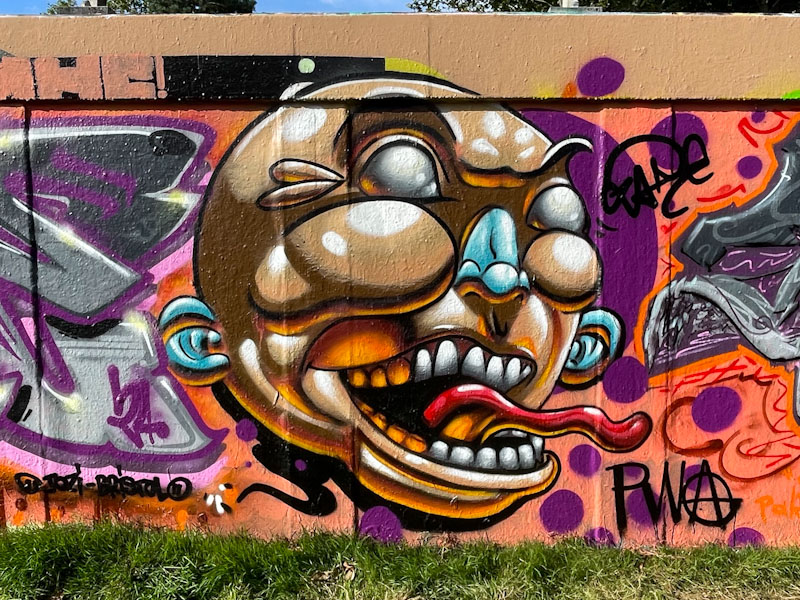
While Noise may be challenging for the crown of most prolific graffiti writer, Zake is the undisputed champion of cartoon character pieces – barely a week goes by without another of his distinctive contoured (light and shade) works making an appearance. Here, Zake has painted a slightly unhinged or alarming character for us… the lack of pupils in the eyes is always unsettling.
I believe that I have seen the little monocled character by Posh before, but can’t quite recall where or when. I don’t know, but I am making the assumption the the writing says POSH, although that might be over-speculating on my part. There is a very distinct style in this writing, with plenty of energy and fill detail – I would say the work of a busy mind. Great to welcome a new (to me) artist to the throng, and I will be looking out for more from Posh on my rounds.
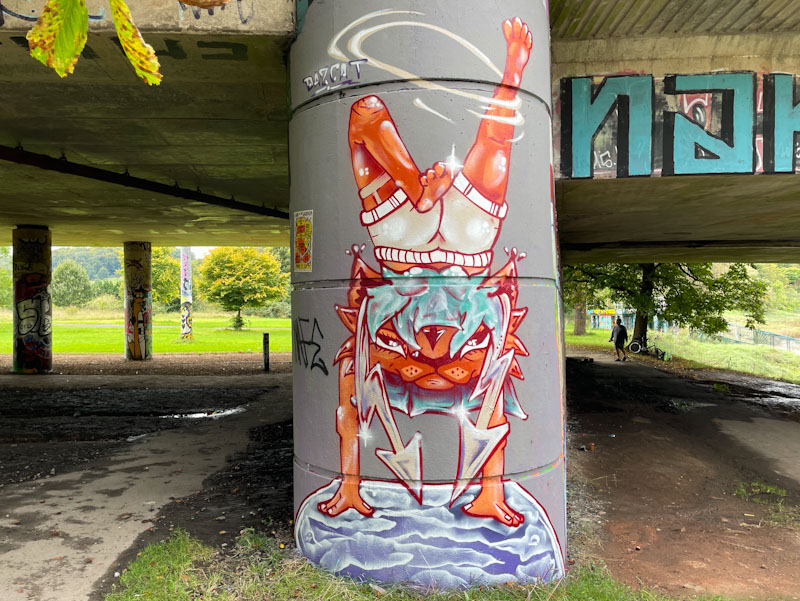
My heart sang when I saw this wonderful piece by Daz Cat on the end of the long wall under Brunel Way. It is not the first time he has decorated this spot with a cat, and somehow the space lends itself really well to his upright characters, which I guess is why he paints there.
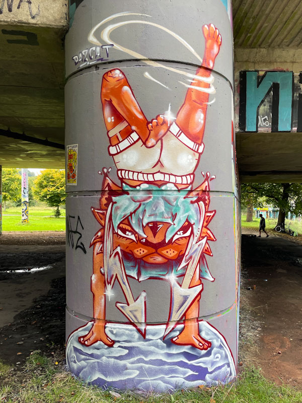
In this piece, the androgenous cat is doing a hand stand on top of a globe or water or a toilet seat, or something decorated with clouds. The pants the cat is wearing are hilarious, and the tottering movement of the legs, brilliantly portrayed. This Daz Cat at his fabulous story-telling best.
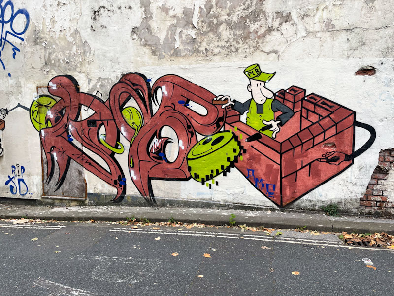
A couple of weeks ago, before we drove our daughter to her new university adventure, I had to drop the dog off with a dog-sitter which took me to a part of town I don’t go to all that often. While I wouldn’t describe the area of Redfield as a graffiti/street art hotspot, there are a few pieces knocking about the place and it is always worth having a little explore. I got lucky and found this Taboo piece, which might have been there for some time, but it was a discovery for me nonetheless.

This is a fabulous anti-style graffiti writing/character combination piece that Taboo is so good at, full of innovation and charm as well as being a little bit surreal. The letters spell out TABOO, with the last ‘O’ represented by a bricky busily building a wall. This is a wonderful piece that demonstrates the rare and extraordinary talents of Taboo.

Benjimagnetic has been dropping pieces at about the rate of one a month or so for the whole year, many of them in St Werburghs tunnel, which leads me to think that he must live pretty locally to the spot.
This is a classic piece of deconstructive graffiti writing that Benjimagnetic specialises in. The letters spell out BEN, but without knowing that, you wouldn’t really be able to guess. The colourful piece is made up of so many independent components that all come together in a coherent abstract writing piece that makes a whole lot of sense. Very nice work from Benjimagnetic.
.
European night
Paris visiting London
feeling confident
.
by Scooj
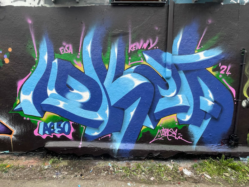
This wall in Dean Lane has taken a lot of paint recently, and anything painted here hasn’t lasted more than a few days, and so it was for this wonderful piece of anamorphic graffiti writing by Lokey. The piece was part of the celebratory paint jam marking Andy Council’s birthday (note the AC50), and encouraged by Paul H, we visited the spot the day after the works were finished, which was just as well given that several of them didn’t last long.
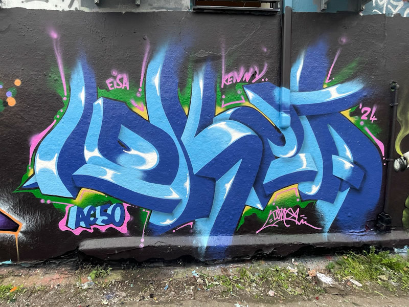
Recently, Lokey has been taking his daughter with him to paint (which, incidentally I think is brilliant), but on this occasion it was just him, so he was able to put maximum effort and concentration. I think that this is probably the best piece I have seen from Lokey for a while… so full of precision and a perfect teaser for the eyes. Those letters really pop. Wonderful stuff.
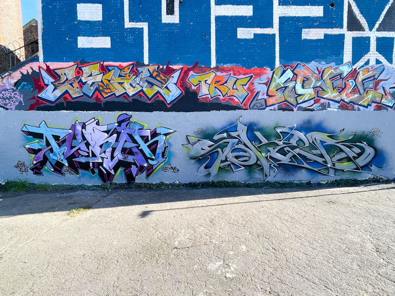
Two of the Bristol masters have been at work in this fabulous collaboration in Dean Lane. Turoe and Soker have been writing for way longer than I have been posting about street art and are without doubt part of the established scene in the city. Although they don’t paint as often as some other graffiti writers, their work is always immaculate.
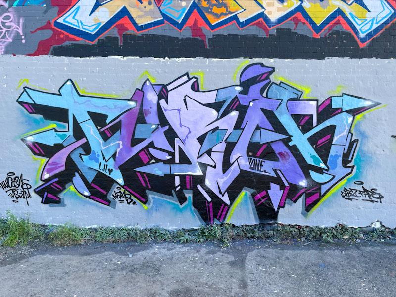
The colour selection of both pieces is superb, with cool steel blues dominating. There aren’t the words to describe how good Turoe’s writing is. There is some wildstyle work, but it is not fussy or over-complicated. The colour transitions in the fills are exquisite and the 3D drop shadow with a vanishing point just beneath the piece sets the piece up perfectly.

Soker’s piece is rather more elongated and has a slight metallic quality. The letters SOKER are clearly marked out, but it is the design of the letters that is so attractive. What a pity I photographed it when it was in the shade, as I expect that in the sunlight it would give off a quite different aura. Simply a wonderful collaboration.
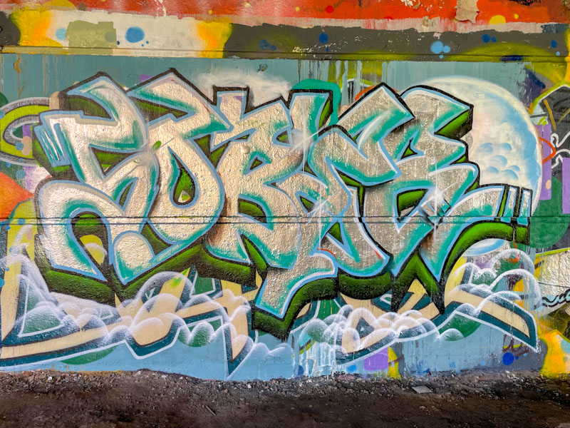
Klashwhensober is consistently one of the most prolific graffiti writers in Bristol, tracing out his SOBER letters wherever he finds a free wall. Some of his pieces are obviously rather hurried while others, like this one are a little bit more considered and tidy.
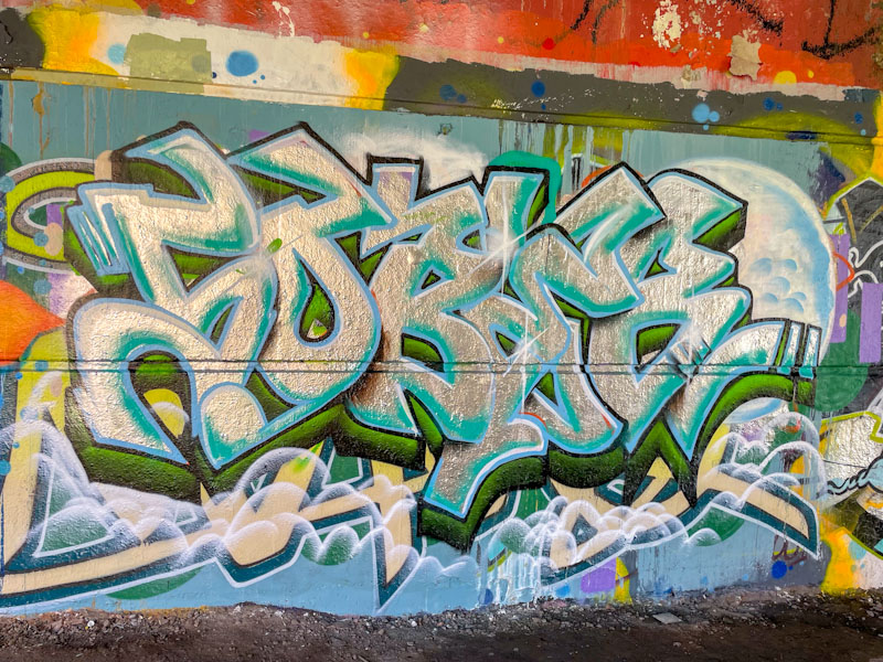
The way that Klashwhensober has overwritten the piece underneath is quite clever in that instead of buffing out the wall completely he has created a cloudy covering obscuring it enough to nullify it. The chrome letters are really nicely worked with a tidy two-tone drop shadow and clean black border. Definitely one of Klashwhensober’s better ones.

I have said it so many times before, but Mr Draws really is one of the most consistent graffiti artists in Bristol, and has been for as long as I have been writing this blog. This is a lovely piece of writing at the entrance to the tunnel and is bright, cheerful and welcoming.
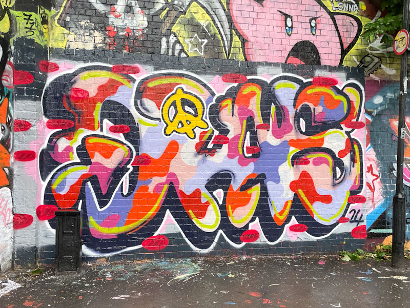
Mr Draws has several different fill styles, and this camouflage pattern is one that he uses a fair bit, although not always as colourful as this one. His curvy letters are propped up with a deep drop shadow, and he has added a peace symbol for good measure. I think we could all do with a bit of peace in the world at the moment. Nice work from Mr Draws.


