.
Six of our planets
visible in the night sky
heavenly bodies
.
by Scooj
.
Six of our planets
visible in the night sky
heavenly bodies
.
by Scooj
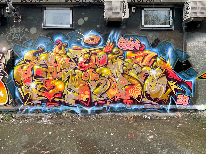
Another H-bomb of colour and energy from Grimes, this time in Dean Lane. He really is quite incredible, the way that he generates so much movement through his pieces, which dazzle and amaze.
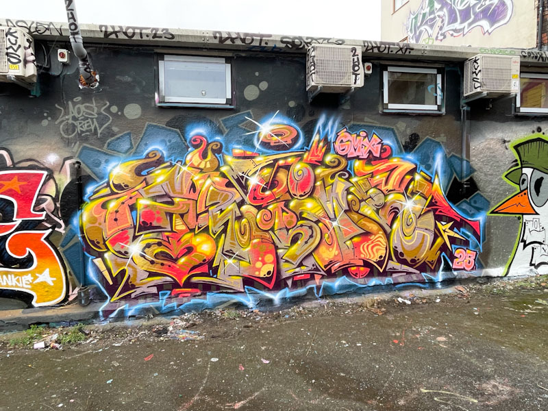
The colours in this piece are warm and fiery, with so many elements, each beautifully interlocking with its neighbours. If I were to liken this work to any other artist it would be Deamz, who left Bristol some years ago now, but who also created complex graffiti writing pieces. This is praise indeed for Grimes’ work. The finishing touch of a blue plasma border is nothing short of brilliant, offsetting the warm colours with a chilly edge.
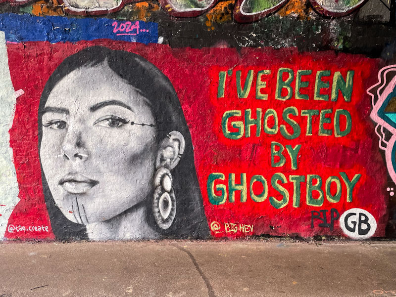
Of interest, but not really of much importance, is the gender split of street artists and graffiti writers in Bristol which I would say is around the 60:40 Men to women, but it is noticeable that a higher proportion of women are painting now than were ten years ago, when I first started this blog. This is a fabulous collaboration from Tao Create and Big Hev, who have painted together before, and I assume are friends.
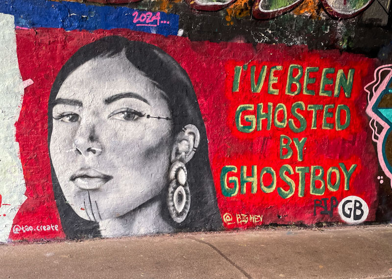
To the left is a portrait piece by Tao Create, who underwent something of a transformation in her style over the last year or so, taking her to a new and much higher level. I can’t find any information about whom this is a portrait of, but it is stunning nonetheless, with superb depth and texture in the greyscale shades. Big Hev’s words ‘I’ve been ghosted by a ghostboy’ are equally mysterious. The piece appears to be a tribute to GB perhaps? This is a striking collaboration, which sadly has been overpainted, but was a delight while it was there.

.
New inspiration
shop bought, a thing of the past(a)
life in the kitchen
.
by Scooj

Mr Crawls has had a good start to the year, but rather surprisingly, he hasn’t been painting with his friend Mote – I’m sure there are all sorts of good reasons why. I have loved watching the way Mr Crawls has been evolving his bird characters, and it feels like it is a journey that is still in its early stages.
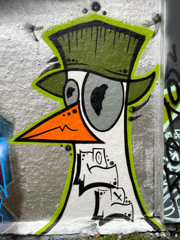
Here, Mr Crawls has painted one of his gulls (I am using the orange beak as an identifier, as there isn’t much more to go on), which is in a stylised cartoon form. Beautifully simple, but full of interest, with a fine bucket hat, asymmetric eyes and a couple of letters thrown into the bird’s neck. A wonderful character piece in the Deaner.
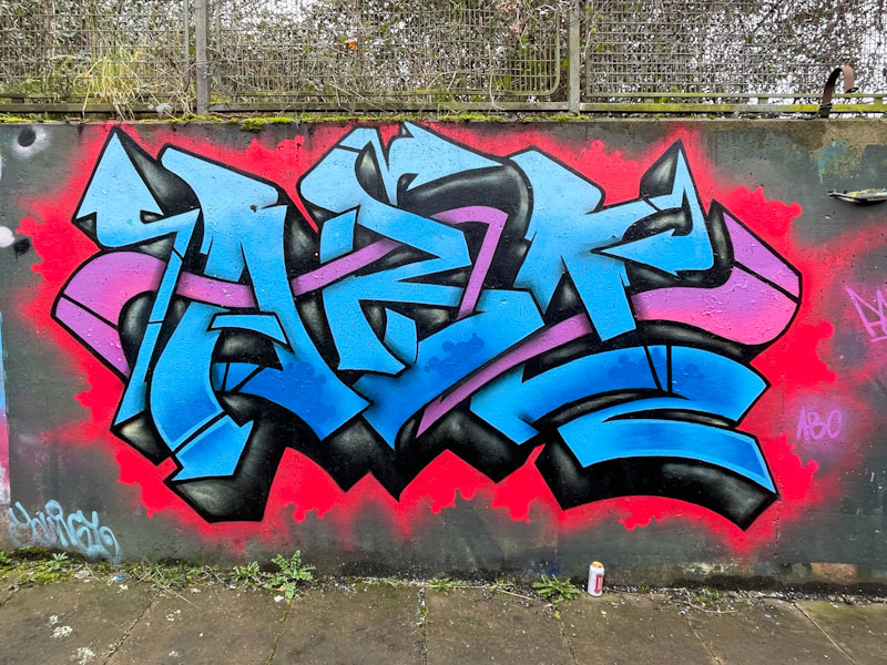
There are a few ‘sure things’ in the Bristol street art world, and one of them is that you will always find pieces by DJ Perks in the Lawrence Weston spot. This is partly due to some legacy pieces that just never seem to get painted over, but also because he paints there frequently enough for me to find new pieces each time I visit.

I would consider DJ Perks to be a natural, when it comes to graffiti writing. He is so incredibly modest, but his work is technically excellent, and always nicely presented. Here he has painted the letters ABC (Art Beat Crew) with blended blue fills, and a nice pink ‘ribbon’ running horizontally through the piece. The scarlet background dusted onto the wall offsets the piece perfectly.
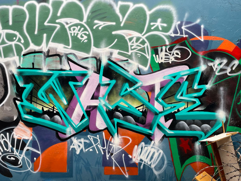
Very occasionally we are lucky enough to find pieces by Piewaste. His work tends to blend in with its surroundings, and it can be quite easy to pass on by without noticing it – unless you are like me, and wired to sniff out such pieces wherever they might be.

Piewaste has written three thin-edged letters (WSE) interspersed with two pink-filled letters (AT) to spell out WASTE, but all elements of this writing kind of disappear unless you are concentrating. The three green-bordered letters are filled with an incredible scene, as if you are looking through letter-shaped windows. This is a brilliant piece that is so modestly presented. This is why I like to keep my eyes open and really study what is around me.

Wherever you find a piece by Desi, you are likely to find a Mr Two Gram piece nearby. Like many partners (Ryder and T-Rex, Bloem and Sub), they paint alongside one another all over town, leaving their ‘household’ stamp.
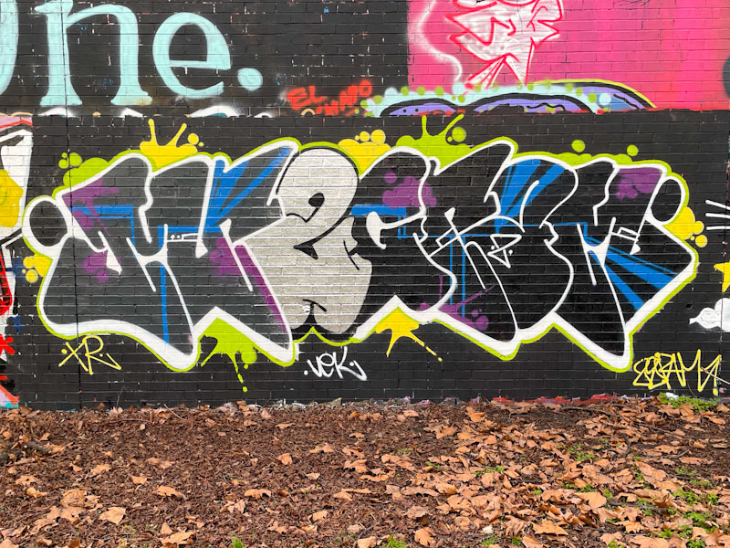
I haven’t posted many pieces by Mr Two Gram, but have dozens in my archives, so I need to do a little better at posting them. His writing is distinctive, and depending on the size of the wall carries variants of his name. I suggested to him once that he might like to try character pieces, and although receptive to the idea, I haven’t seen anything in that direction.
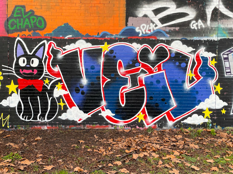
This pairing was of course one part of a larger collaboration celebrating Desi and Even’s birthday and carried a theme of Studio Ghibli – a Japanese animation studio, hence the cartoon cat. Desi, who often writes VEIL, has painted a combination piece, which is quite unusual and something that would be great to see more of. Reflecting back to when I first started seeing Desi’s work, there has been a constant improvement, and this piece is truly one of her best, with tidy, clean letters and fabulously presented fills.
.
The closure of the
North Sea sand eel fishery
err… I think that’s it
.
By Scooj
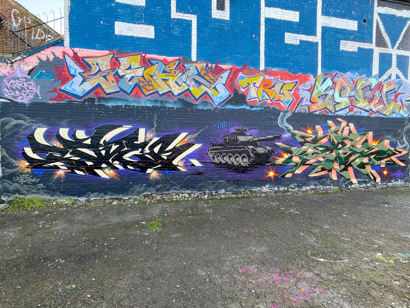
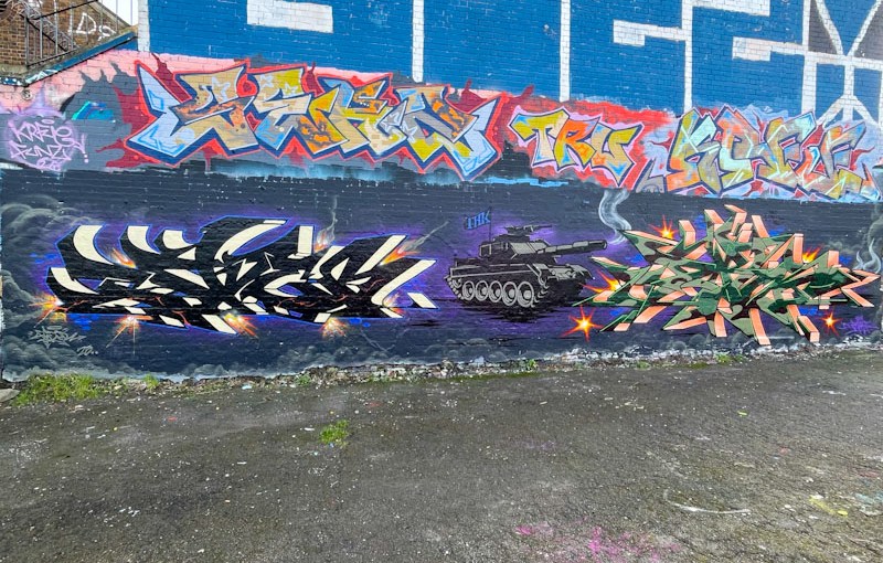
I caught up with Fade a couple of days ago, and he observed that I hadn’t posted much of his and Dibz’ work lately, He was right, but fortunately this collaboration was already in my pipeline, and is a timely reminder of their fantastic work. I would add that they have had a generally quiet start to the year, but are picking up the pace a bit now.
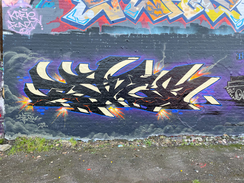
Unlike most of their collaborations, the three elements are a little bit fragmented. The writing from Dibz and Fade is distinct and there is no general colour theme, and the tank is a little bit out of context. Fade has gone for some beautifully finished letters, in the corners of which are a bunch of explosions. The writing is set on a nighttime cloudy sky.
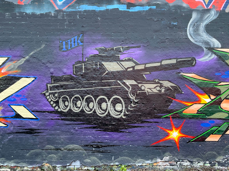
That brings me on to the tank, which I assume is a joint effort. I don’t quite know what the tank represents, but I guess you could take your pick – Gaza, Ukraine or even a metaphor for Trump’s wreckless and aggressive international policies. Maybe it is just a nice picture of a tank.

Dibz’ outstanding writing has a camouflage thing going on, but it is subtlely applied, and contrasts beautifully with the orange (but it looks like copper) 3D drop shadow. This wall has been a great place for Dibz and Fade to showcase their work, and recently, they have painted it again (keeping the tank intact) – to come soon.