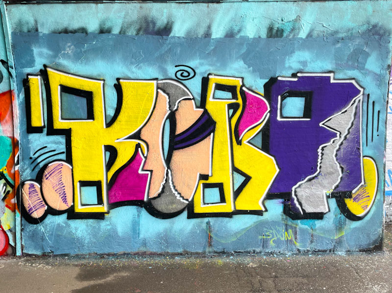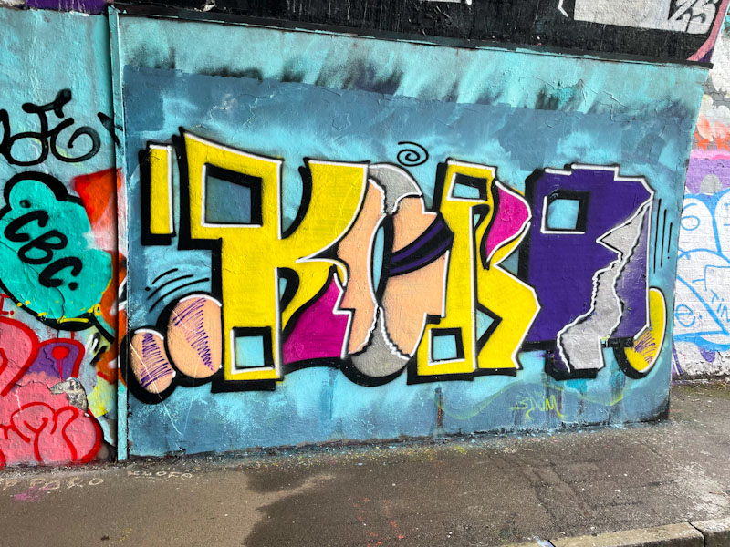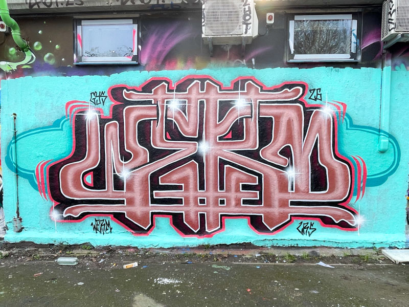
What a superb piece from Werm in the Deaner. The symmetry created from the letters WERM is excellent, and something Werm plays with a lot in his work. This might be the tightest one yet. The brownish fill is in two tones and is best described as a chocolate mousse look – regulars will know that I am not fond of brown, but I’ll let it go in this instance.
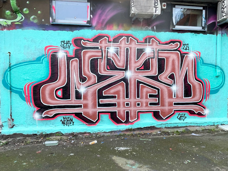
The deep drop shadow veering to the left provides depth and the light blue background plenty of contrast, bit devices lifting the letters nicely. The red border creates a nice boundary between the letters and background, and I like the ‘cloud’ detail in the blue background. This is an interesting piece that deserves a while to enjoy it.