.
Decorations boxed
military precision
swapped with the ski gear
.
by Scooj
.
Decorations boxed
military precision
swapped with the ski gear
.
by Scooj
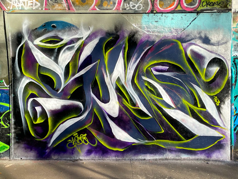
Normal service is resumed in the tunnel. After a spate of birthday paint jams, Mr Klue has reclaimed one of his favourite spots at the entrance of St Werburghs tunnel, with a trademark ephemeral piece of graffiti writing.
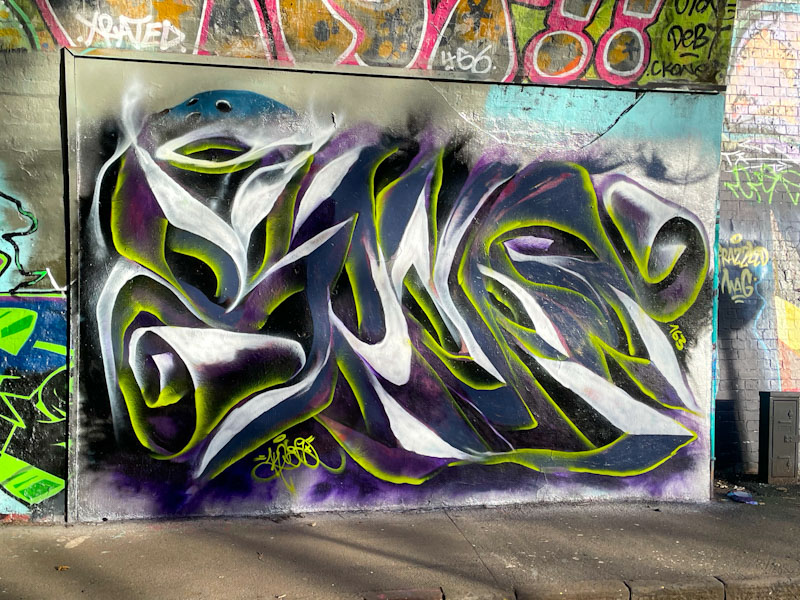
The letters spell KLUE, I think, although I can equally make out WONE, the other half of Mr Klue’s name – it is most likely the former. This piece is a little more solid than some of his work, and has an anamorphic appearance, created by the clever use of light and shade, and tops and bottoms of surfaces. An accomplished piece by a writer who just loves painting in the tunnel.
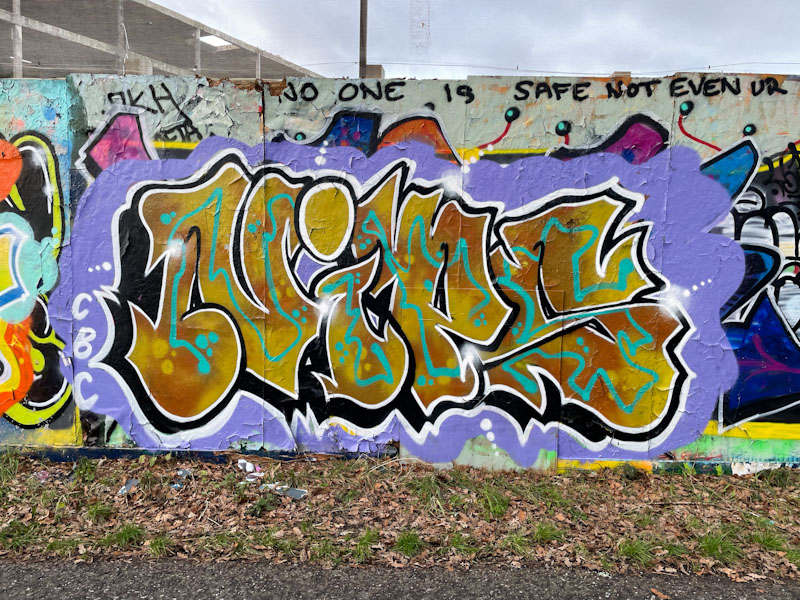
Nips has had a strong winter and managed to get out often, when others have preferred the warmth and comfort of their homes. This is one of a string of winter pieces and continues with her consistency and quality.
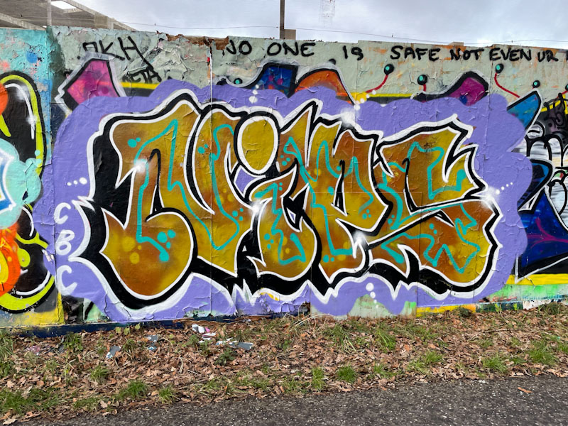
The bronze/brown letter fills are beautifully accompanied by a turquoise midline and dots that run through all of her letters. It is interesting that she left out any decoration in the tittle (dot of the i), making it a point of interest. Set on a purple background, the piece is finished with a black drop shadow some beaded dots and small starbursts. Great work from Nips.

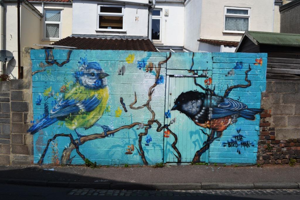
It is rare for me to post the same piece more than once. I have done it before a couple of times by mistake, but I think this might be a first where I have returned to a piece that has been somewhat augmented from its original form. This is a wonderful blue tit painted in Devon Road by Aspire, when he still lived in Bristol.

I love the fact that the householder has very carefully painted around the bird and its perch in tidying up the wall, keeping the stunning piece largely intact. Sadly the bullfinch had to go, probably because of the doorway. All too often you’ll see outstanding pieces of artwork painted over by philistines without any concept of great art. Below is a picture of how the wall used to look, and appreciate what a great job the householder has done. A great outcome.
Most artists in Bristol have good days and bad days and everything in between, when it comes to their artwork. One artist whose work is consistently near-perfect is Dibz. I can’t think of a time when he has turned out a piece of writing and thought to myself ‘that’s a bit shoddy’.
This is a beautifully finished piece painted for Shade One’s birthday, hence the letters SHADE. It would be easy to describe the piece as simple, but that isn’t necessarily the case. The white letters are decorated sparingly with green accents. The pink drop shadow is immaculate, and there is a tight thin blue border around the letters. To add some extra interest, Dibz has painted some glowing cubes around the piece, rounding it all off perfectly. Flawless.
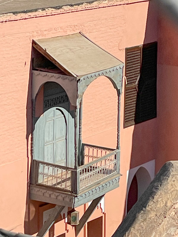
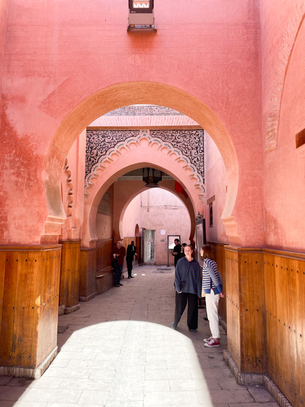
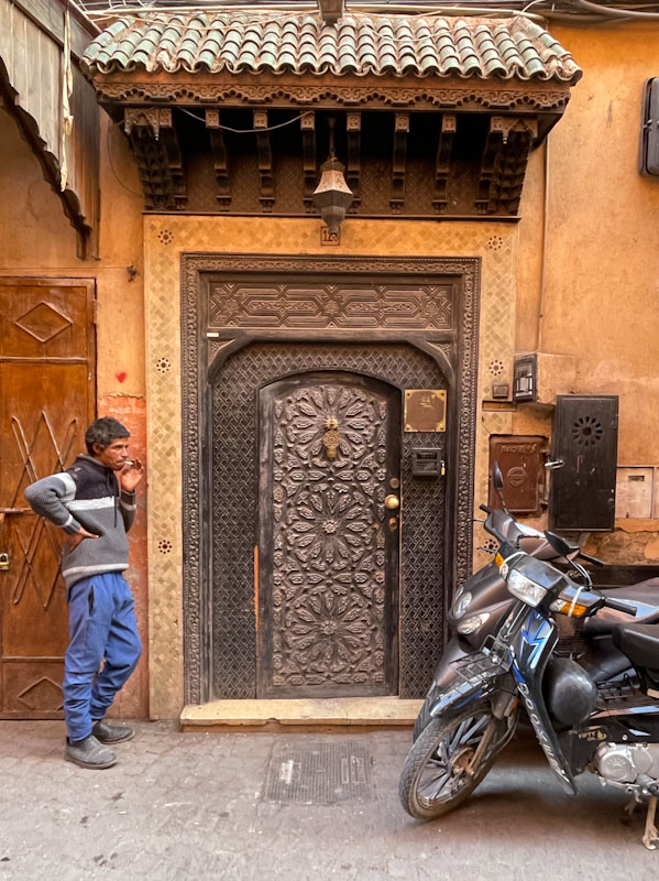
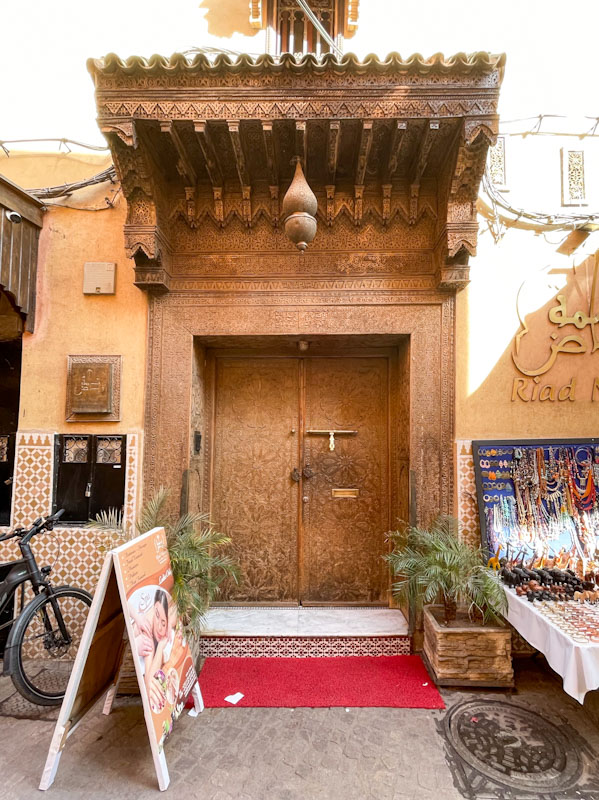
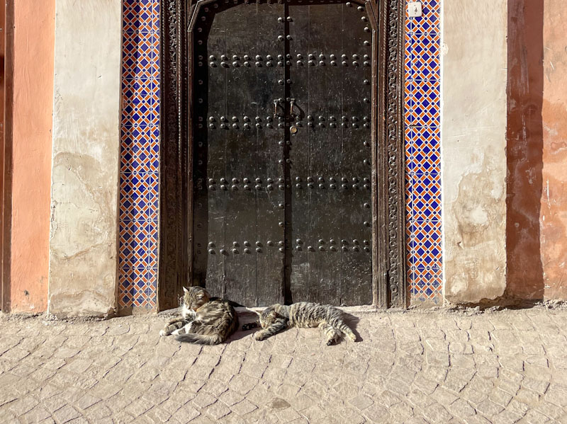
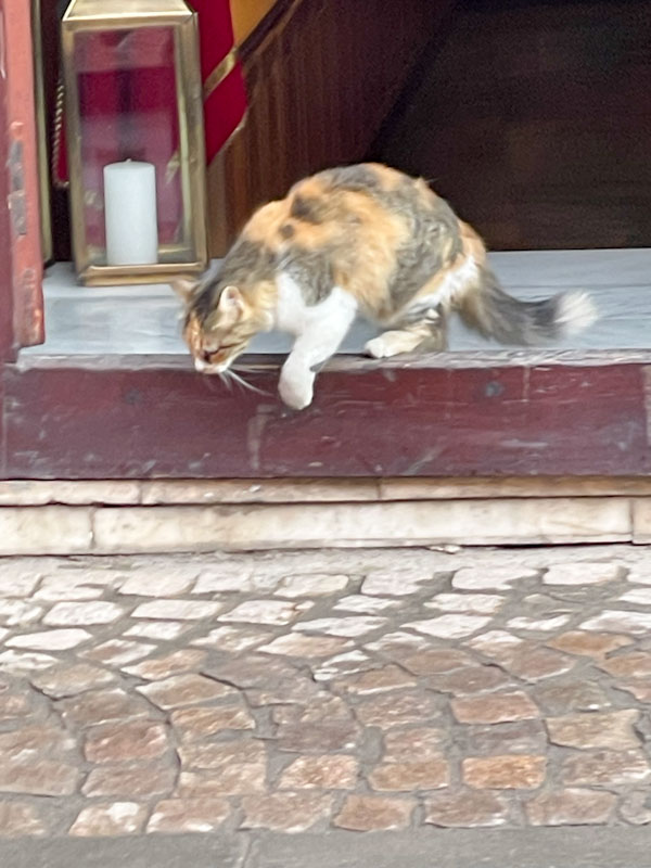
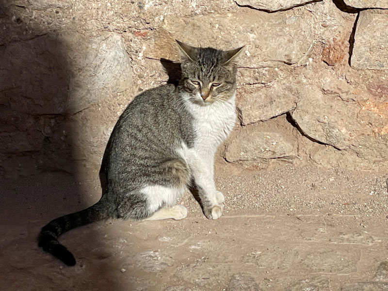
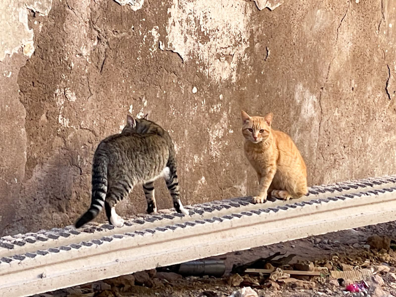
Doors 338 – Doors of Marrakesh and some bonus cats, January 2025 (Part XVIII)
When I went on holiday to Marrakesh with my wife and daughter last January for a little bit of winter sun, not in my wildest dreams did I think that one of the legacies would be 18 posts of Thursday Doors. I have really enjoyed sharing this series of doors, all the while reliving moments and experiences from our trip.
This final selection is a sweep-up of the last remaining doors and, as promised in an earlier post, some cool cats of Marrakesh.
There is a large population of feral cats in Marrakesh, that although they don’t appear to belong to anyone in particular, seem to benefit from a collective responsibility of citizens to offer them food and shelter. For cat lovers, it is a joy to see these streetwise characters around every corner, in shops, markets, derelict buildings and so on, and the people of the city demonstrate a tenderness and affection in the curation of them. I hope you enjoy this final selection from Marrakesh, and thank you for sticking with it:


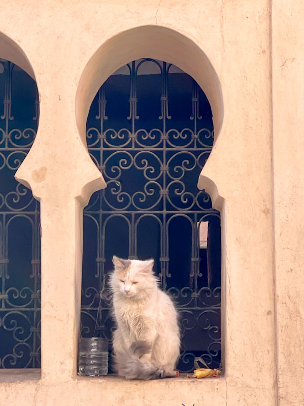


And that, my friends, really is it from Marrakesh… I promise. I now have the wonderful challenge of deciding which doors to share next time. Have a great Thursday and weekend.
If you have made it this far, you probably like doors, and you really ought to take a look at the No Facilities blog by Dan Anton who has taken over the hosting of Thursday Doors from Norm 2.0 blog. Links to more doorscursions can be found in the comments section of Dan Anton’s weekly Thursday Doors post and his Sunday recap.

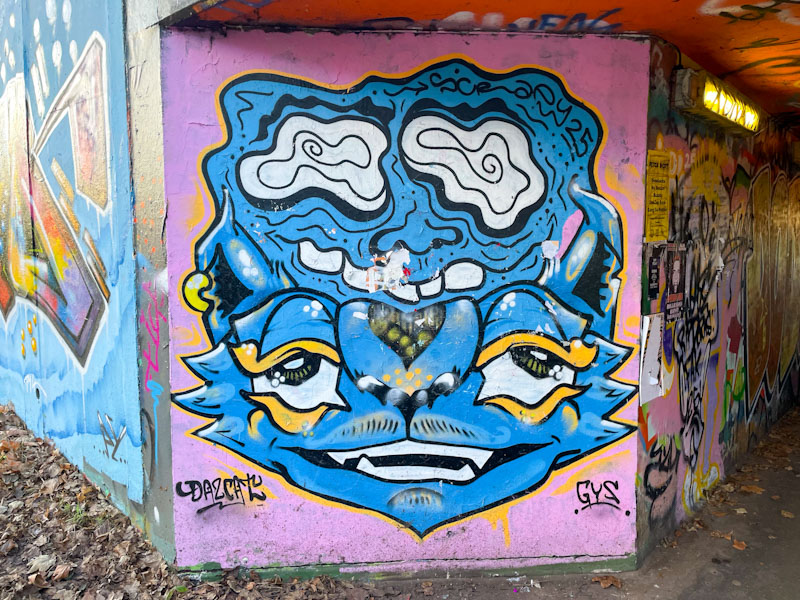
I have said before on Natural Adventures that there are several different kinds of collaborations, ranging from light-touch painting together to hardcore total assimilation of two or more artists into a single piece. This collaboration by Scrapyardspec (who prefers to be referred to as Scrapy) and Daz Cat sits somewhere in the middle of the spectrum. Their styles are distinct, but the colour scheme is common, and the outcome is a single piece.
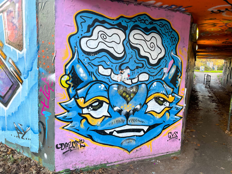
The fusion, has a Scrapy character with googly eyes nestled atop a Daz Cat cat. Although the styles are so different, the collaboration works well, and from a viewers perspective it is always great to see artists adapting and working together. By the time I got to the piece, some idiot had tried to slap a poster or two over it, but these had been ripped off, leaving a bit of a mess in the middle. Nice combination.
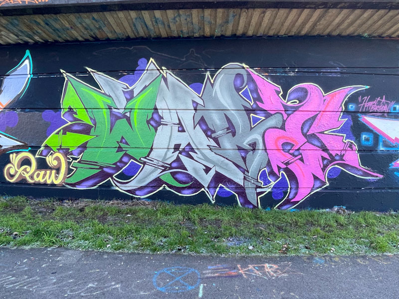
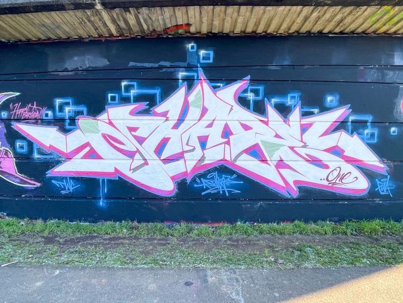
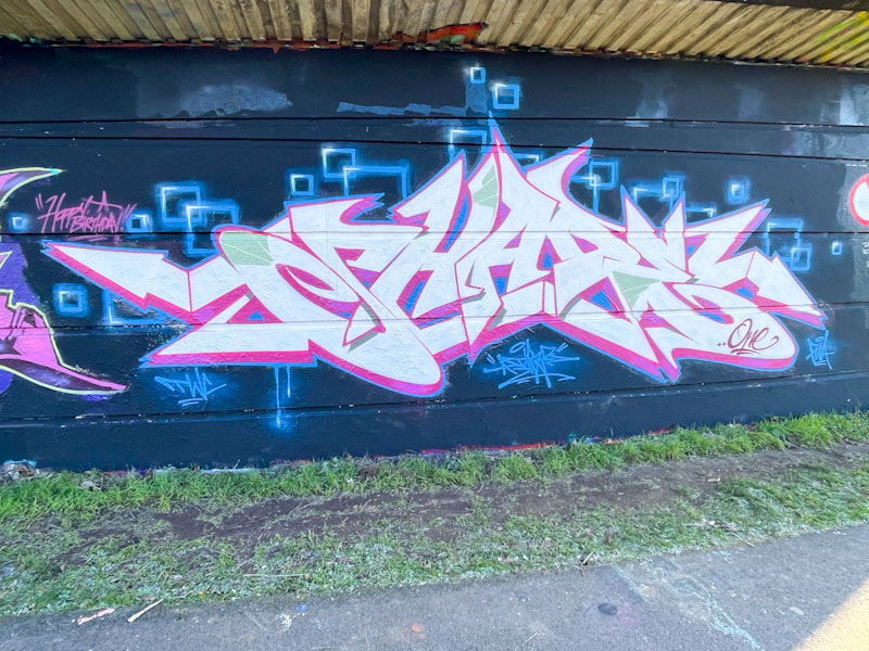
One of the nice things about birthday paint jams is that they tend to encourage artists who don’t paint all that often to come out of the woodwork. One of those artists is Ware from the RAW crew. I have only ever seen his work a few times in Bristol, and it is possible that he lives and paints elsewhere, which may be why I don’t see his stuff all that often.
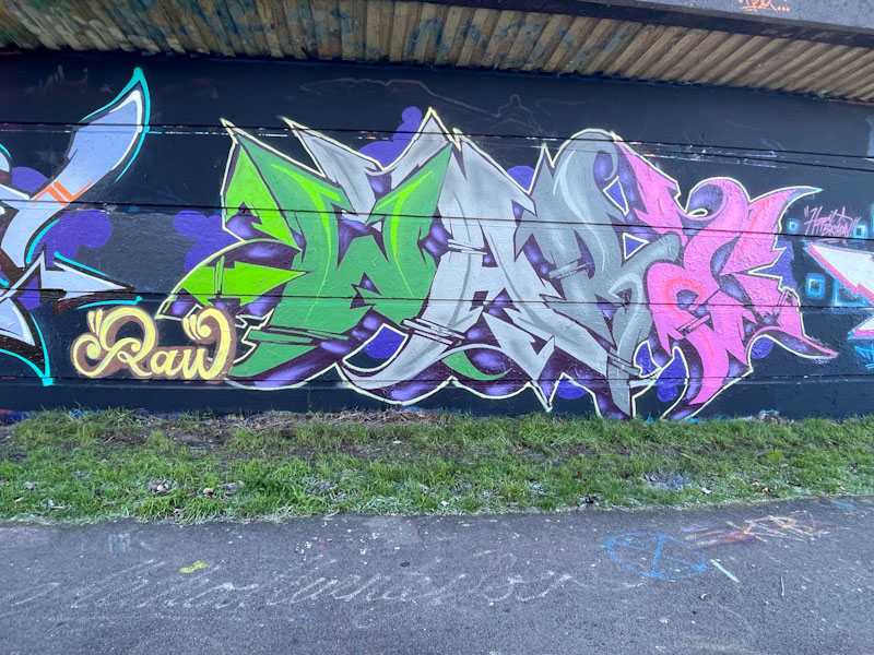
This is a wonderful and technical piece of wildstyle writing. Each of the letters is assigned a colour, from green to light grey to dark grey and pink. The design of the letters is verging on a kind of Gothic or calligraphy font, but not quite. This is very nice writing, beautifully presented, and a great way to celebrate Shade One’s birthday.
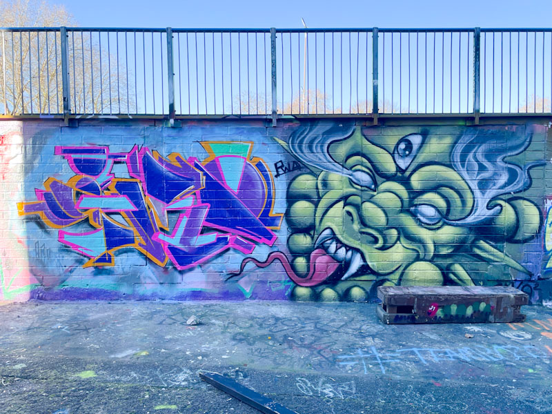
This is a rather unusual collaboration, and I can’t quite make up my mind whether it is a collaboration or two independent pieces that are sitting adjacent to each other I’ve not seen Benjimagnetic and Zake paint together before. My guess is that they both turned up at the same spot on the same day, and decided to paint alongside one another, which makes sense on this wall, because both artists tend to occupy squarish spaces, and this wall is a long rectangle.
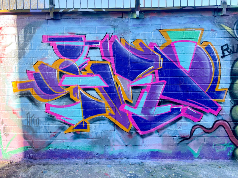
To the left, Benjomagnetic has painted one of his customary GRO pieces in his distinctive cryptic style. The colours are a bit compromised because the wall was in shade with a bright sky behind. The shapes and colours that make up the whole are once again perfect.
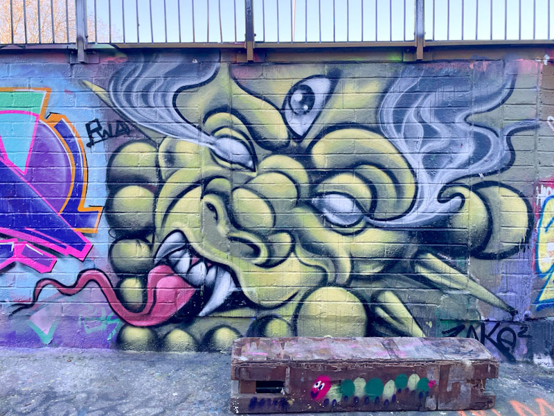
The character by Zake is rather more elaborate than many of his pieces, and with more than a hint of Chinese dragon about it. There is a rather unsettling third eye in the forehead, and wispy smoke ‘bleeding’ from the main pair of eyes. Definitely curious and slightly odd, but very nicely painted. The long forked tongue rounds off things nicely. An unusual collaborative wall.
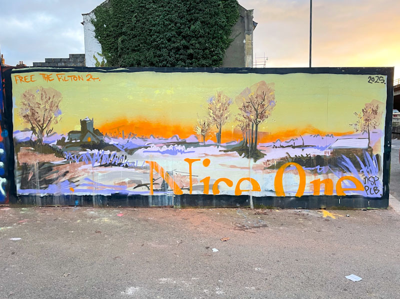
Nice One is one of the most dynamic artists in Bristol, switching up his font writing with his portraits and landscapes. This hoarding, which he has kind of made his own, is currently hosting this magnificent winter scene, the sort of composition so rarely painted in Bristol or anywhere else for that matter.
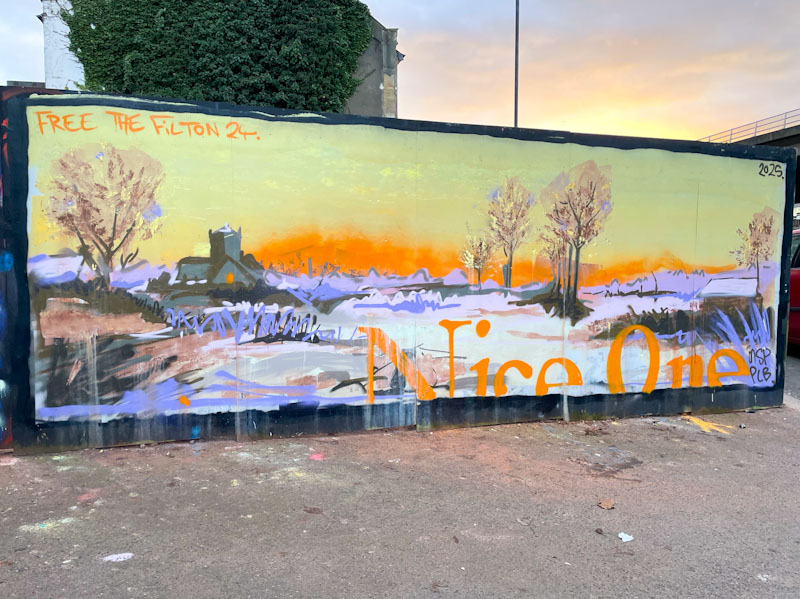
The snow, the church, the bare trees and the milky sky offer a taste of a classic English winter landscape. The trees are particularly evocative of a cold winter’s day. The artist has included his letters Nice One in orange and only partially present, a trademark mechanism he uses. I am rather pleased that the colours of the sky in his piece are mirrored by the sky in the photograph, demonstrating the relevance and accuracy of his artwork. A winter wonderland.


