

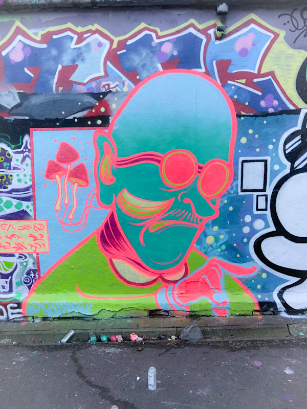
.
Standing motionless
worn down and battle-scarred bill
heron… gone fishing
.
by Scooj
.
Standing motionless
worn down and battle-scarred bill
heron… gone fishing
.
by Scooj
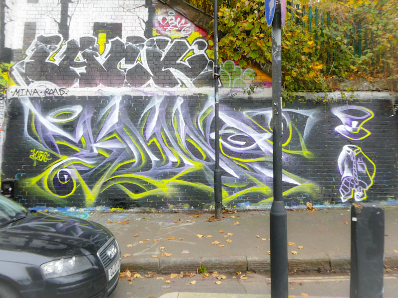
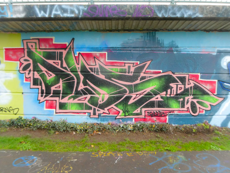
There has been a constant trickle of fabulous abstract graffiti writing from Mr Klue during the second half of this year, and it has been a genuine pleasure to see. Mr Klue is an artist who tends to ‘go to ground’ for periods of time, and it is good to know that he is in a productive phase at the moment.

The tunnel is a spot that Mr Klue favours, especially since the Stokes Croft area has seen a downturn in activity due to the gentrification going on in the area. This is a large KLUE from Mr Klue and has the added joy of a ‘mad Hatter’ character that he paints from time to time. Mr Klue’s work is so unique – I really don’t think I have seen anything like it anywhere else.
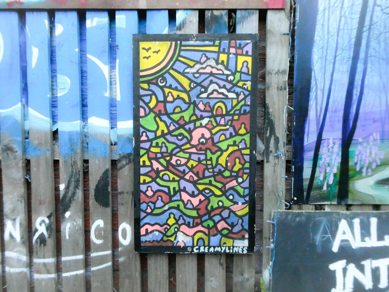
I can’t believe that this is only the fourth post from this charming spot on the Bristol to Bath cycle path. A place which showcases original art by people of all ages and abilities for the benefit of the local community… an urban treasure trove for those who like to explore and discover.
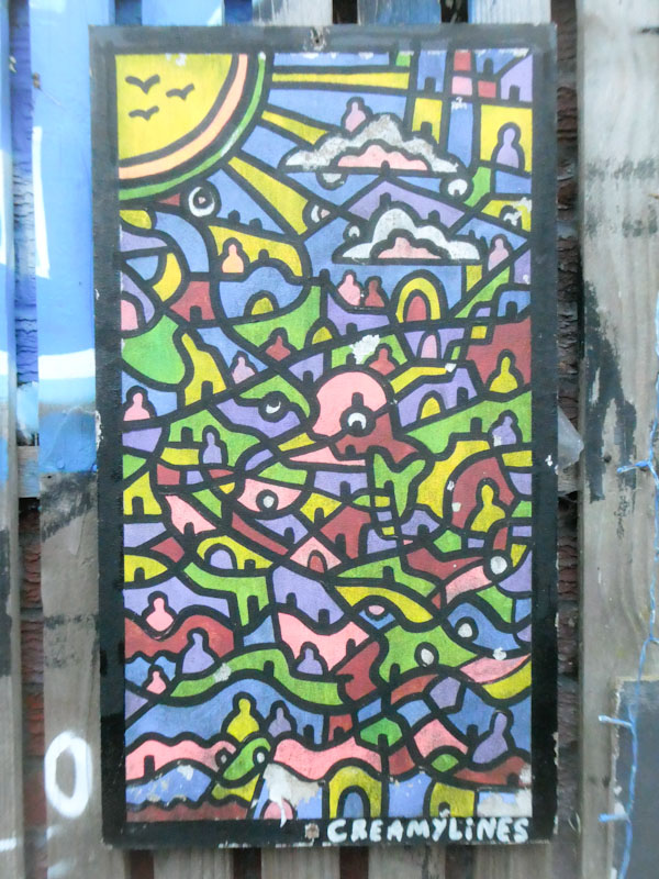
I have featured several pieces by Creamylines this year, but this is a mini version of his imaginative creations, probably created with Posca pens or something similar, rather than spray cans. There is an element of hope and optimism in Creamylines’ work that offers something of an antidote to the constant onslaught of bad news, and I applaud him for it. There is also an ecclesiastical feel to his work, probably associations with the sun and its rays and the stained-glass appearance. Nice to see this one in this open-air free gallery.
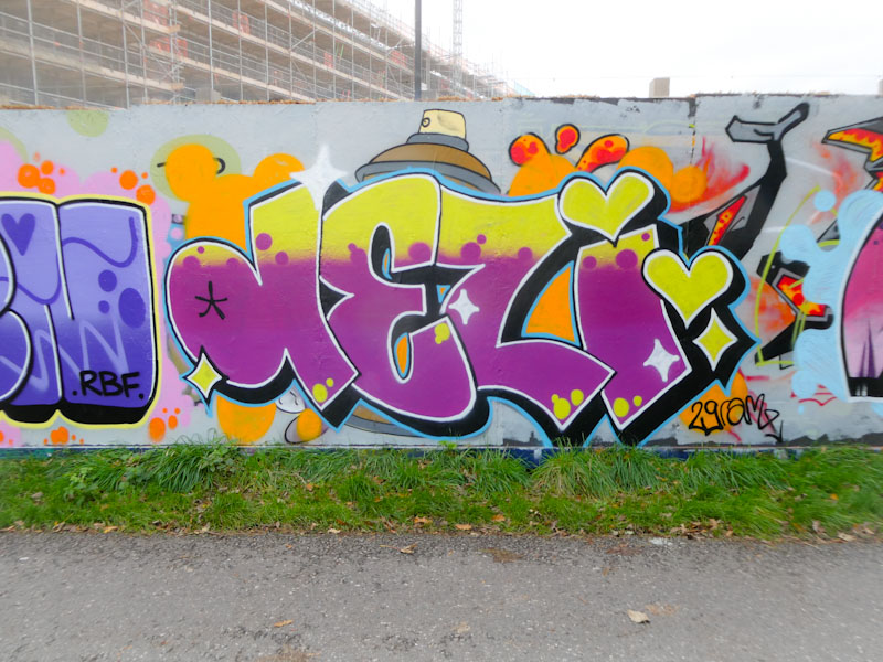
An artist who has come on in leaps and bounds in 2022 is the irrepressible Desi, and here she is at Greenbank with one of her DEZI variants. It seems such a shame that these boards won’t be here for much longer and that all we will have to reflect on it the images captured, but that is the ephemeral nature of street art of course.

Painted over a 3F fino piece (you can see the top of his spray can), Desi has confidently sprayed these large letters which have lovely 3D drop shadows and a very nice transition in the fill from yellow to purple, and great use of reversed dots to add some interest in the fills. A really nice piece beautifully finished, and a major improvement on her early works a couple of years ago.
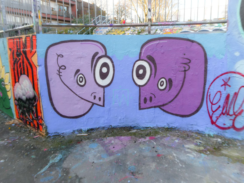
Mote always pleases with his clean and simple designs of monsters that can be found pretty much everywhere in Bristol. This beautiful (ugly) pair are on the small part of the curved wall in Dean Lane skate park.
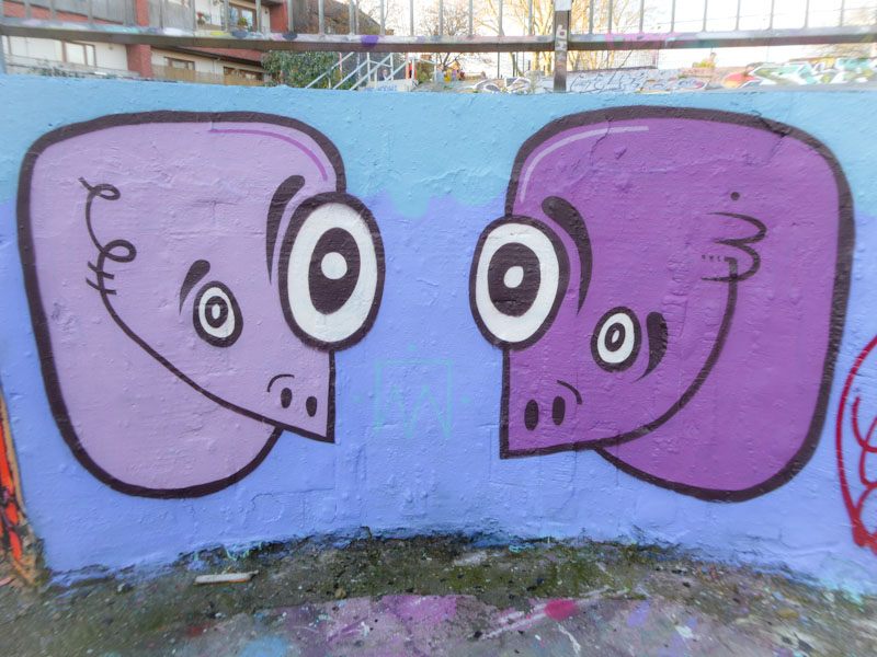
I think that Mote’s work is a great example of why it is important to buff a wall for best results. Imagine if these two characters were painted directly onto a messy wall without the clean background, the balance and status of the characters would be completely lost. I love these giant doodles, and have enjoyed the ride this year with Mote’s appearance on the Bristol scene. I am really looking forward to seeing how he can develop his style next year as he gains experience and new skills. Thanks for all the monsters.
A gallery of weird and wonderful alien creations from Bristol artist Unnamed
Instagram: removed at request of the artist
All pictures by Scooj


I haven’t posted a piece by Alos for an absolute age, and I happen to know that he has been writing different letters, which makes it a bit difficult to ID his work, but thankfully he has made it easier with this one in Cumberland Basin.

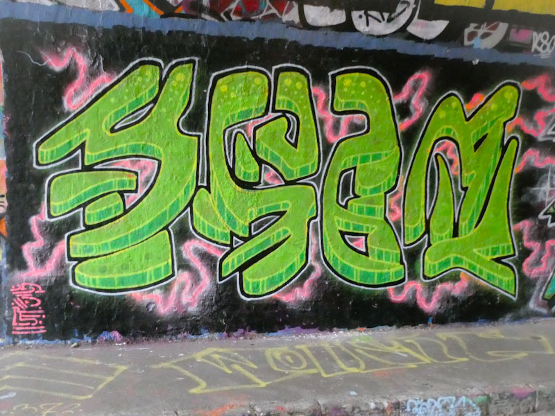
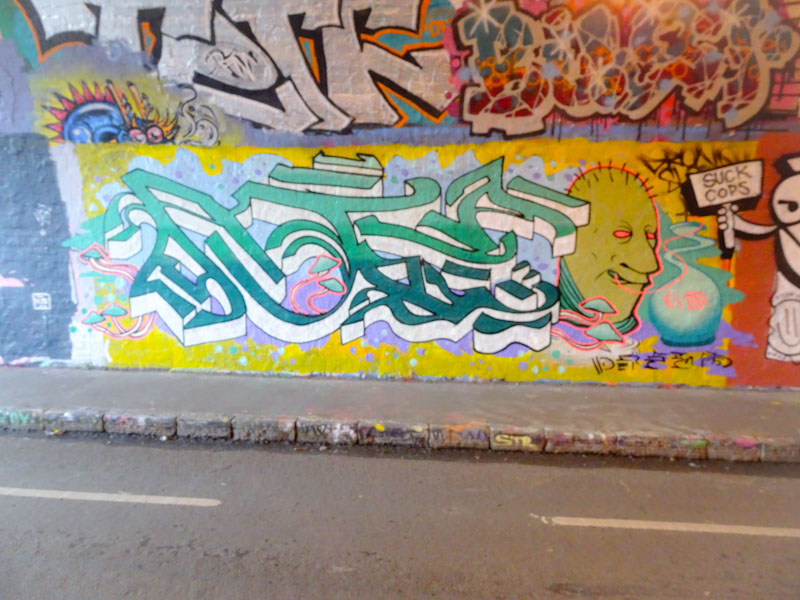
I believe this was painted as part of a celebration paint jam for Solar’s birthday – I don’t know this for sure, but circumstantial evidence suggests it. This piece of writing is unusually structured and tidy with some nice green letters set on a blocky red background. The green letters are also fringed with a blocky edge. There is a little shout out to Solar. Something interesting and different from an artist who is regrettably under-represented on the pages of Natural Adventures.
This collaboration by Hemper and Hypo was painted at least a month ago, and I photographed it is November, I also photographed it this month as a way of reminding me to post it. It would appear that these two have been encouraging each other to get out more often lately, as they have painted together a few times in the latter part of the year.

Hemper’s writing is never, ever duplicated. Every piece is a spanking brand new and creative design, way too complex to ever be repeated. This piece is a joy to behold, crazily explosive, with so much happening on each of his HEMS letters, and the graduated fills are simply perfect. Incredible writing from one of Bristol’s masters.

To the right, we have a rather calmer piece by Hypo, whose neat letters contain an interesting fill colour selection, not exactly what I would call natural bedfellows. It almost feels like two independent colour selections have been squished together and I’m not too sure it works as well as it might have done with other selections. But then again, what do I know? The letters are nicely crafted and this modest piece by Hypo is the perfect counterbalance to Hemper’s energetic piece.
.
Shoulder to shoulder
I stand with low-paid workers
who make the rich rich.
.
by Scooj
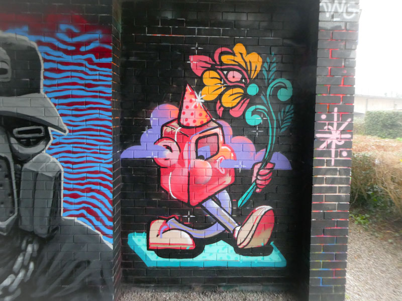
This wonderful collaboration reminds me of an early moving picture of an early Disney Mickey Mouse cartoon – some of you may know what I am imagining, some of you might think I have lost the plot. No matter. The colourful collaboration is by Mudra and Peggy and an absolute joy.
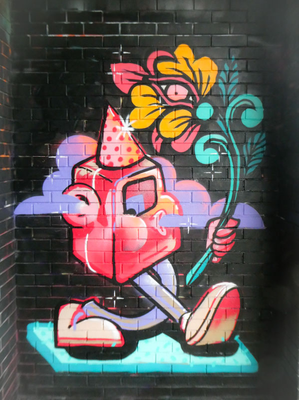
The character is by Mudra and looks like it is a letter (B?) walking and whistling and so gull of animation, it looks like it could walk right off the wall. The character is holding a beautiful flower stem and flower, painted by the up-and-coming Peggy. The whole thing is set on a black background which helps with giving the character definition and purpose. This is a very welcome and joyous pairing; long may they continue to collaborate.


