.
Acerbic at times
more often a loving heart
my favourite aunt
.
don’t tell the other ones though
I’ll miss you so very much
.
by Scooj
.
Acerbic at times
more often a loving heart
my favourite aunt
.
don’t tell the other ones though
I’ll miss you so very much
.
by Scooj
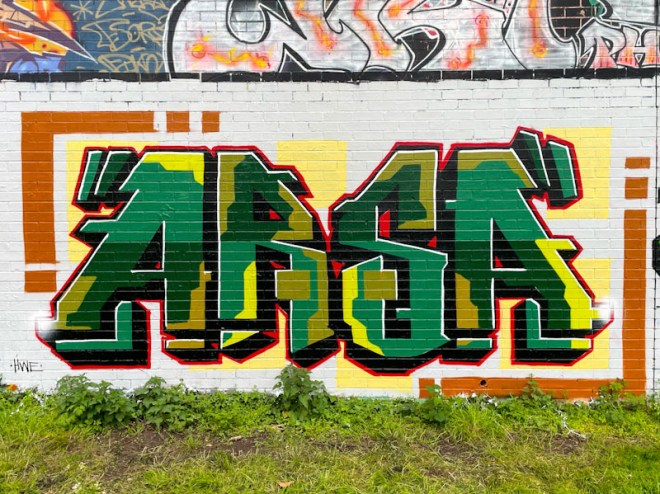
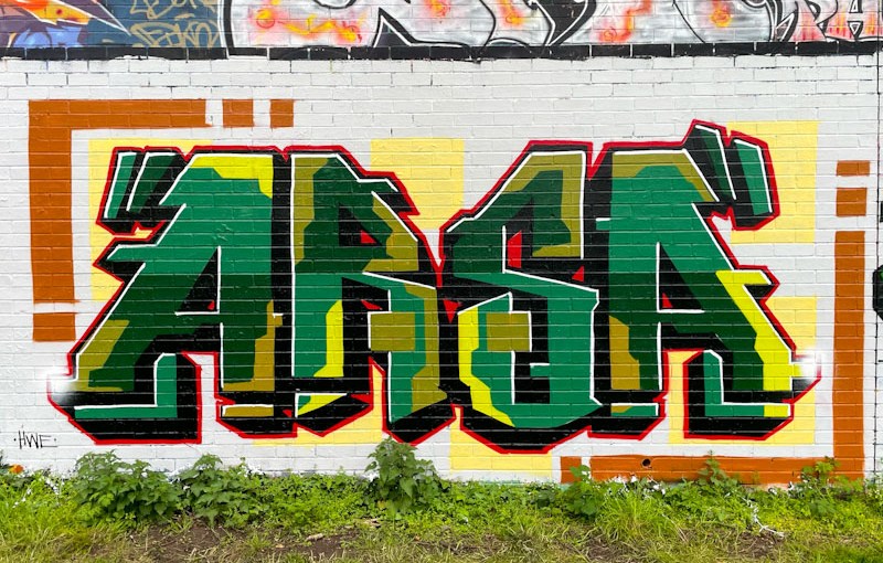
The style, which is instantly recognisable, and the letters ARSA combine to tell us who this attractive piece is by. There is a lot of precision in the piece, aided by the mortar lines on the surface of the brick wall.
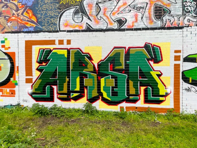
The letters are filled with a camouflage colour palette and patterned in an unblended fashion. There is a nice drop shadow and red border, but the signature element in Arsa’s work is the symmetrical presentation, which works really well. Distinctive and pretty cool.
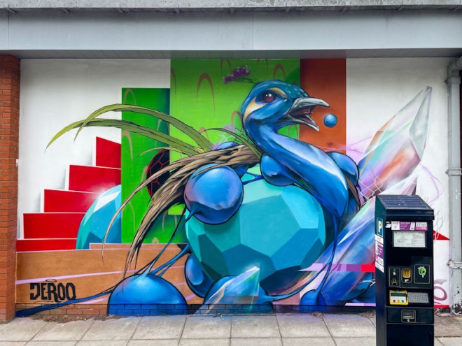
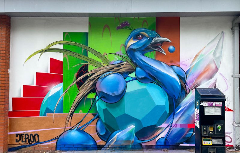
When it comes to stylised pieces, this one from Jeroo is right up there with the very best. There are lots of things going on here, with a peacock being at the centre of it all.
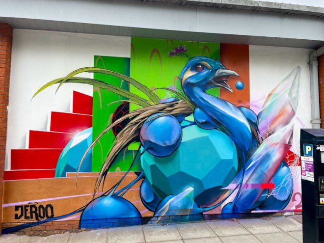
Stairs and crystals and some other shapes make up the body parts of the peacock in this high-definition adventure. While the content of the piece is a little surreal, the execution and photorealism are on point. A superb piece from Jeroo.
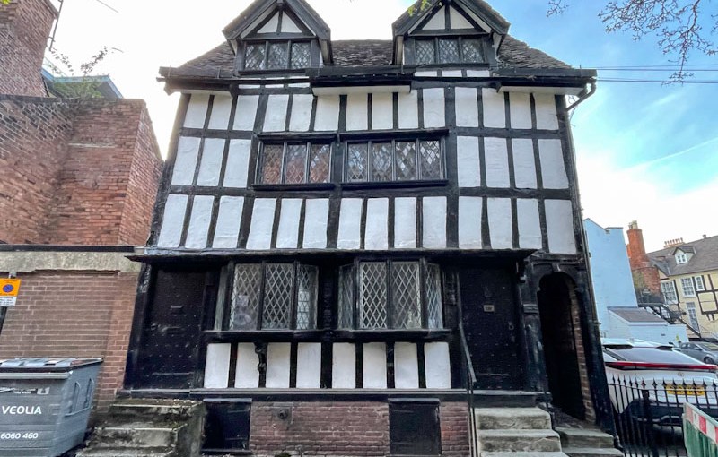
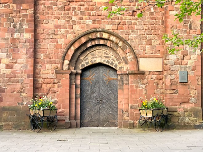
Doors 356 – Doors of Shrewsbury (part VI) – April 2025
I am in Cornwall with work, and seeing family, but have to jump in the car shortly to get home before travelling up to Leeds this afternoon. This will be a very short post as a result. Some ecclesiastical doors from Shrewsbury this week.
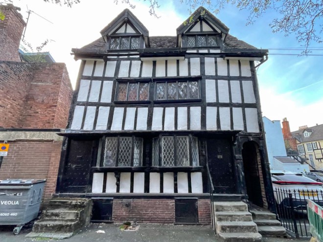
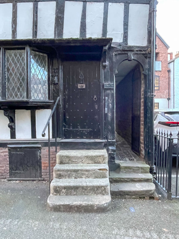
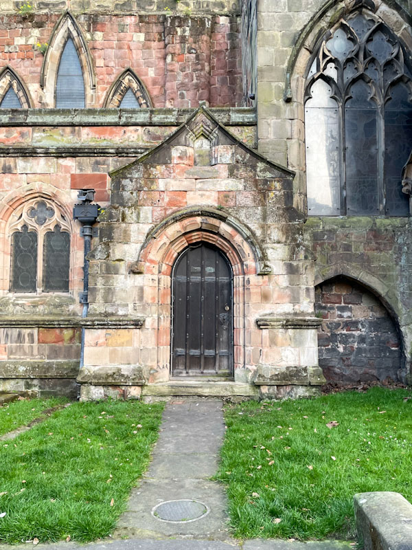
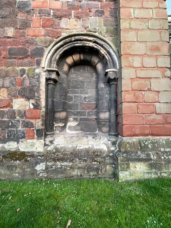
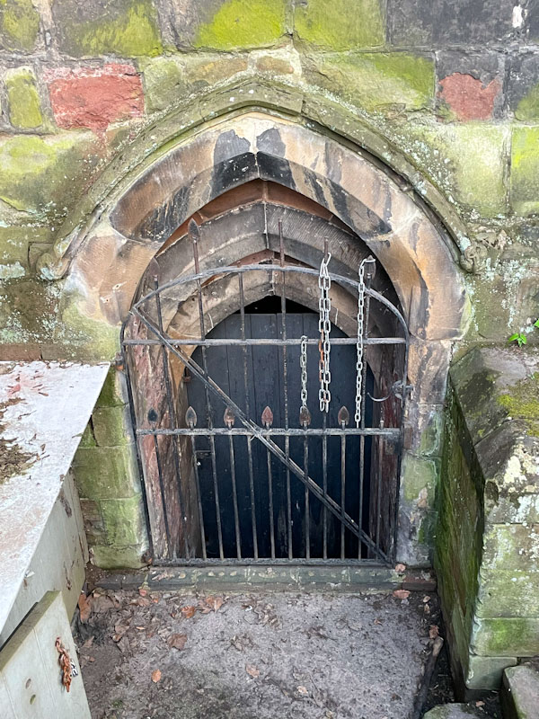
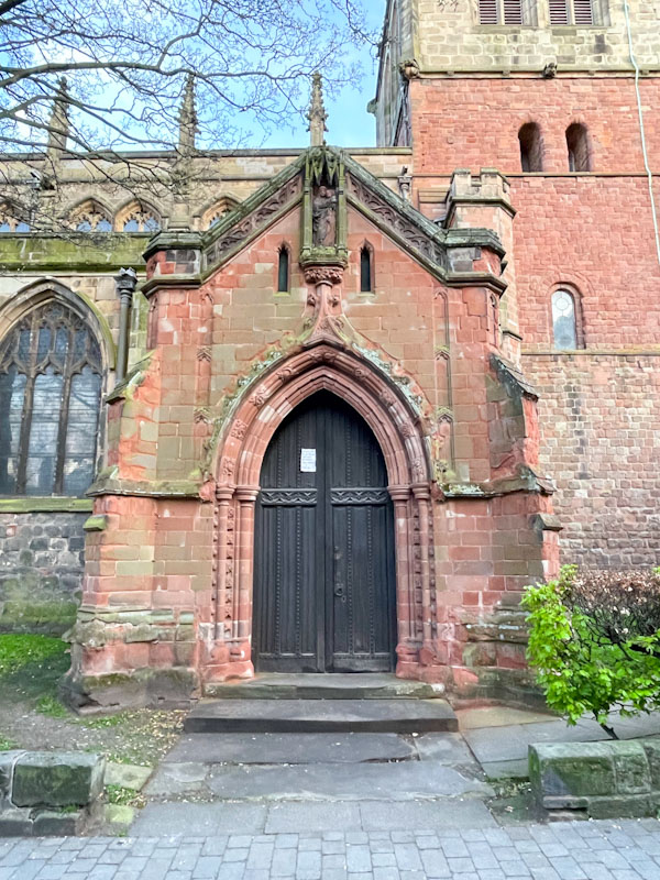
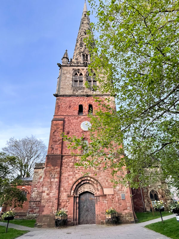
If you have made it this far, you probably like doors, and you really ought to take a look at the No Facilities blog by Dan Anton who has taken over the hosting of Thursday Doors from Norm 2.0 blog. Links to more doorscursions can be found in the comments section of Dan Anton’s weekly Thursday Doors post and his Sunday recap.

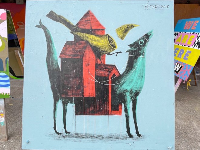
Three more small boards painted during the first weekend of Upfest. Unfortunately I missed the second week of boards, because they disappear after the Saturday, and I visited on Sunday. The first is an eye catching piece by Alex Dimond. Unusual, contemporary and most compelling.
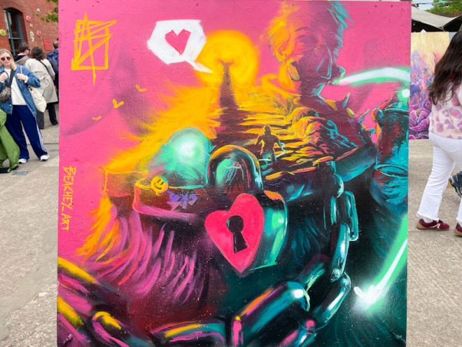
Next up is a fine piece by Adam Beachy. Some rich colours in this piece that appears to have a lot of symbolism – locks, chains and an ancient stairway. Not too sure what it all means, but it is a visual feast.
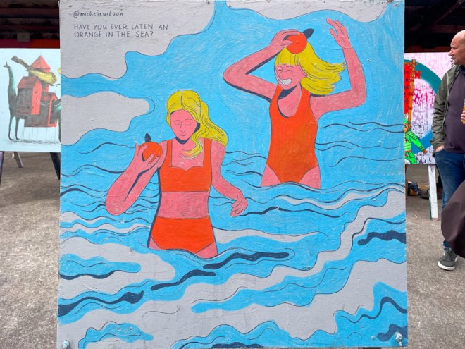
Finally, a most attractive stylised piece of art by Michelle Urban has two women in red bathing costumes, paddling in the sea. The caption reads “Have you ever eaten an orange in the sea”. Your guess is as good as mine.
Three great examples of beautiful art in three very different styles.
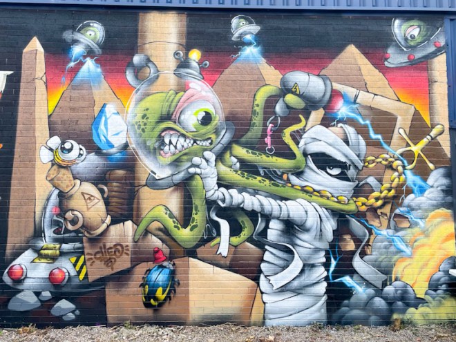
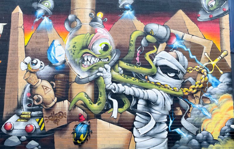
A quick one today. I am in Cornwall with work, and have an early start. I wrote this one last night. Cheo is a firm favourite at Upfest, where he gets to showcase his extraordinary talent in front of a much wider audience than usual.
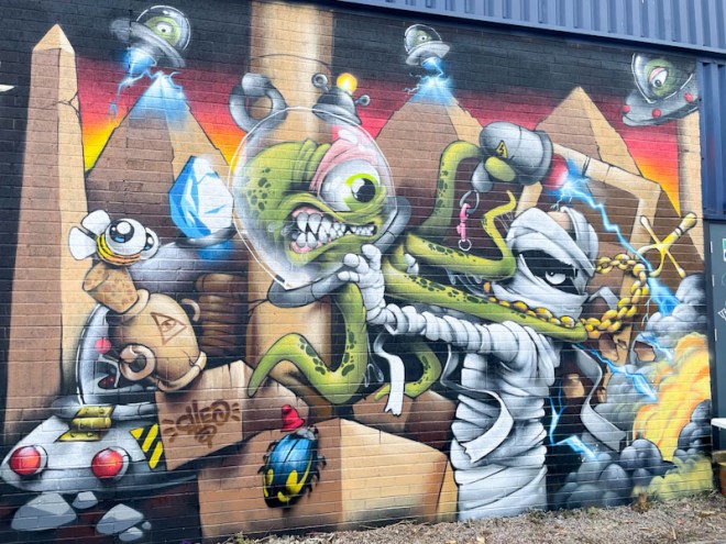
This is a marvellous and imaginative creation set in an ancient Egyptian scene with mummies and aliens having a bit of a brawl. This is a wonderfully detailed piece, and there is so much going on, but it is the scarab beetle that wins the day for me.
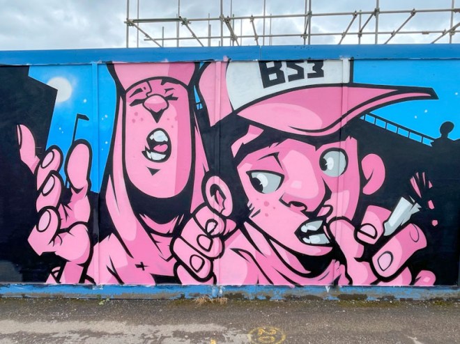
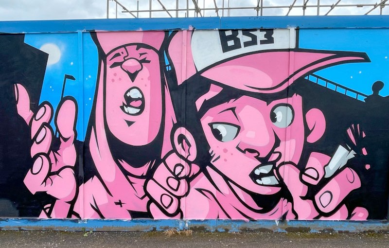
What a wonderful bonus for Upfest 202 to have The Art of Sok come over from Wales to paint this absolute gem on Greenway Bush Lane. His comic-book cartoon style is utterly captivating and feels very contemporary in a kind of retro way.
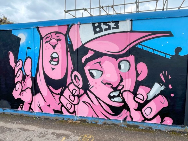
The BS3 referred to on the cap is the postal district where Upfest is held, encompassing Bedminster, Southville, Bower Ashton and Windmill Hill. The two characters, captured in shades of pink are pictured standing in front of silhouetted buildings and a nighttime sky. It feels like there is a story here, leaving the viewer wanting to know more. A wonderful Upfest piece.
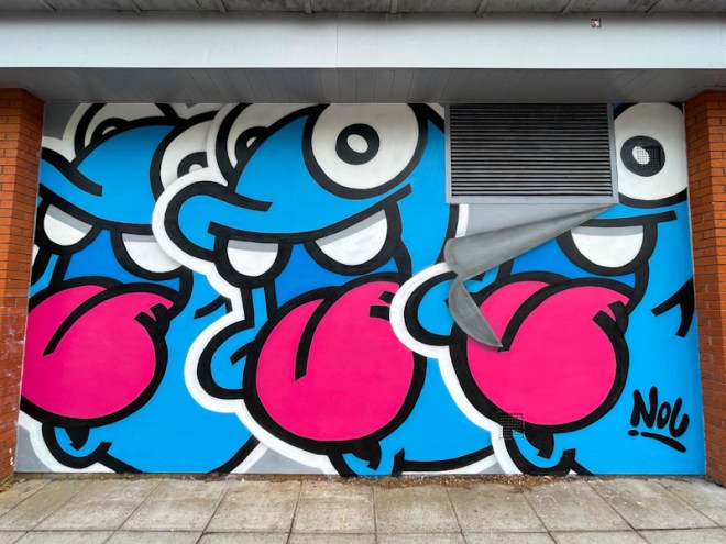
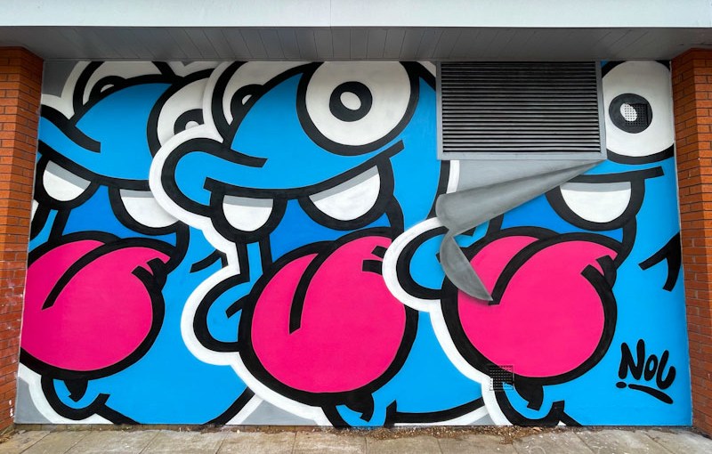
Nol is a favourite artist at Upfest and is well known for his friendly characters that have been gracing the streets of South Bristol for several years. The Dutch artist usually leaves behind a few ‘extras’ as well when he visits for the festival, and he has not disappointed on this occasion.
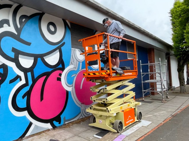
This piece is on a new wall, painted for the first time at Upfest 2026, which is on the rear side of the Aldi supermarket. It is brilliant when the local businesses embrace the festival and make walls available.
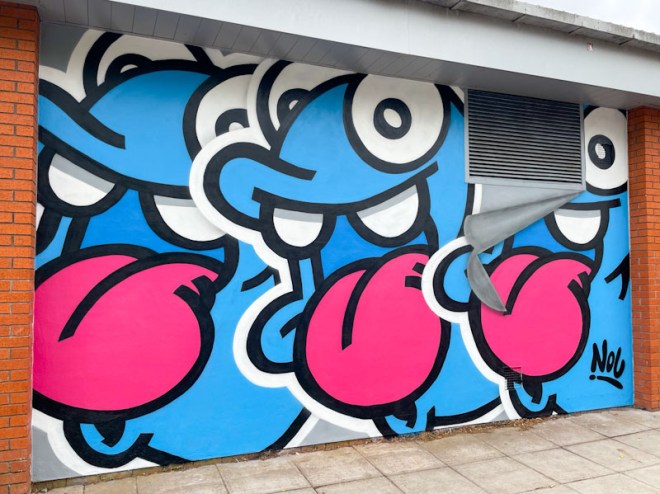
Nol’s cheeky characters are always superbly presented, crisp and clean, with great solid fills and bold black outlines. These three appear as if they are giant stickers slapped one on top of the other. I love the way he has incorporated the air vent and made it look like the metal ‘cover’ is peeling off the wall. Wonderful stuff from Nol.
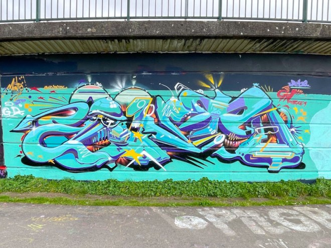
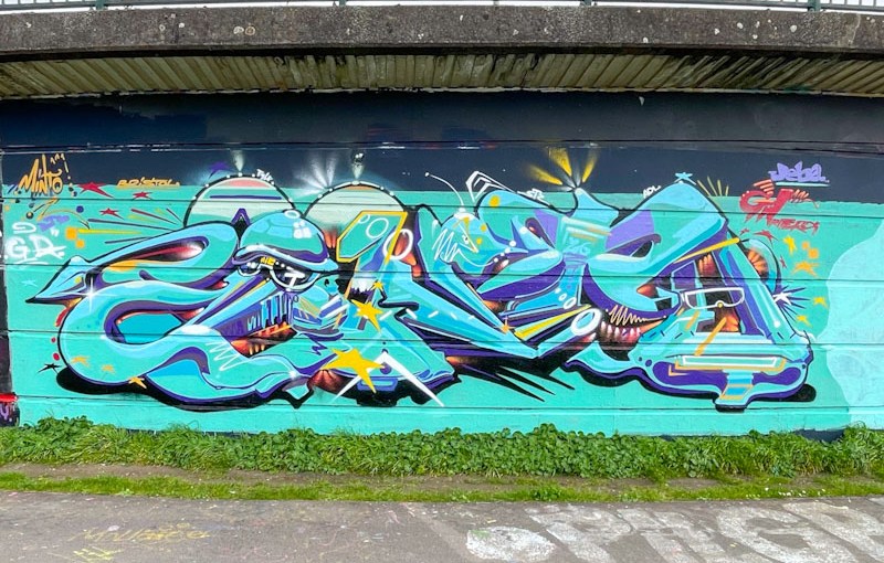
Minto has been turning out a series of outstanding pieces lately, and it feels like he has a new energy in his work. This one has a base of turquoise shades which make a strong visual impact.
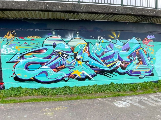
His piece is organised around the well disguised letters MINTO, but what brings his work to life is the detailing and the plethora of shapes, shadows, patterns, lines and if you look carefully, characters. His pieces are always a feast for the eyes and worth studying for a little while.
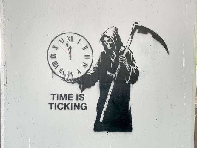
More from the irrepressible John D’oh and his gallery of column stencils underneath the M32 motorway. I have reason to believe that he has recently painted a whole load more in this spot, so I will be planning a jaunt over there soon, maybe even today.
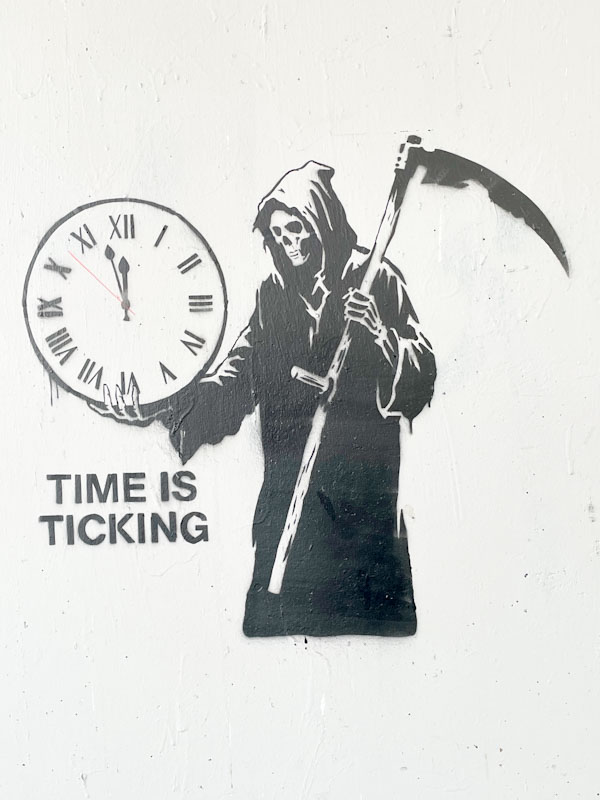
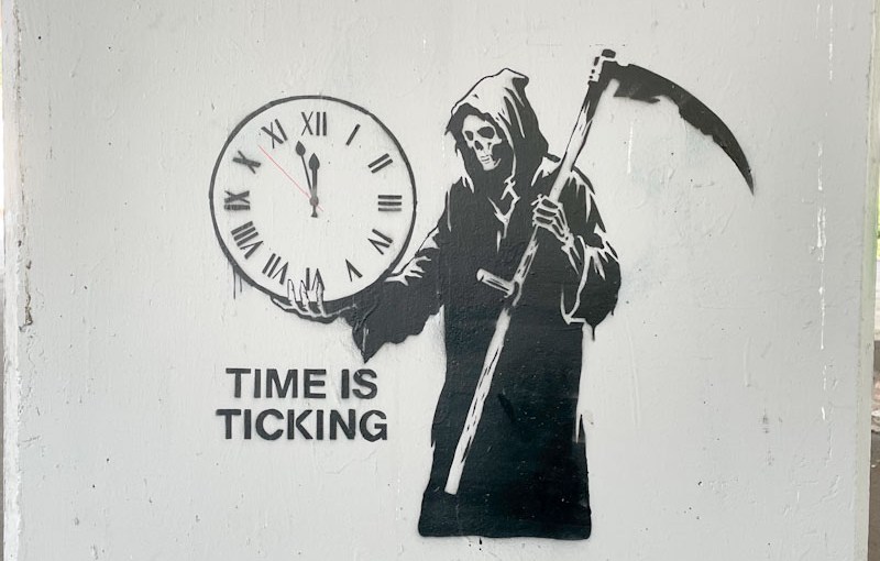
The subject of this stencil is rather gloomy, with the Grim Reaper standing over a clock at two minutes to twelve and the ominous words ‘Time is ticking’. I guess for humanity. But then I hear the birds sing, and I am filled with hope.