.
Bernard or Bernie
a long, productive life lived
may you rest in peace
.
by Scooj
.
Bernard or Bernie
a long, productive life lived
may you rest in peace
.
by Scooj

Yet another fine piece of script writing from Logoe, painted during something of a marathon by the artist on his most recent trip to the city. There is little more that I can say about his pieces that hasn’t already been said.

One thing that has been missing from this feast of work is the incorporation of song lyrics slapped over a corner… maybe he just didn’t allow himself enough time to do them. In a way, his pieces look cleaner without the lyrics, but in another way, they do add interest. I think that I have one more from this session to share, and there was another that was painted over before I had a chance to photograph it. I’m sure there will be more the next time Logoe hits town.

I believe that maybe Minto lived in Bristol, although I might have that wrong. One thing for sure though is that he has friends here and regularly visits the city, usually dropping a fin piece of graffiti writing.
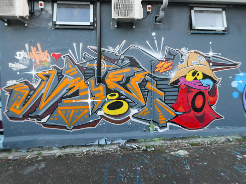
This is one such piece, and Minto has combined his writing with a character. It is driving me mad, but I recognise the character but can’t identify him, and even Google has let me down on this occasion. Minto’s work is as meticulous as ever, and he is always welcome to paint in Bristol.
.
You shuffle the pack
but it’s the game that’s at fault
Tory’s time is done
.
by Scooj

Character pieces don’t come much better than this remarkable dog, wrapped up in its lead. Sepr is the greatest. What makes this truly outstanding, figuratively and literally is the application of the shadow of the character. It is so sharp and crisp, and completely accurate, mirroring all aspects and details of the dog.
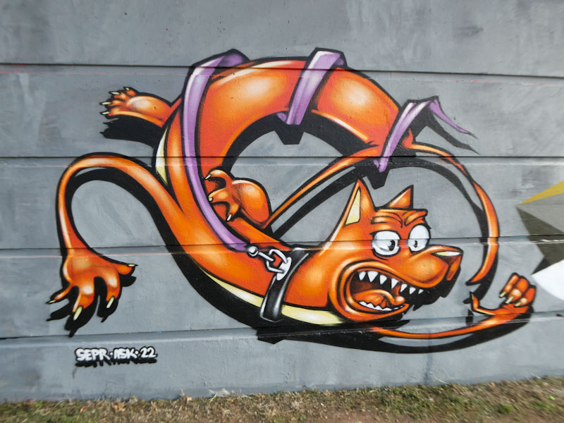
This would have to go down as one of my favourite pieces of the year, and that is saying something as it has been something of a special year. It may be small and ‘simple’ but it is technically and visually a masterpiece. Bravo Sepr!

I checked through previous posts before writing this piece about Solar, and it appears that I have only written about his work twice before on Natural Adventures. This is in spite of having taken plenty of pictures of Solar writing about the place. I will need to rummage around in my archives to post more Solar pieces, as they offer an antidote to more conventional graffiti writing.

In this ethereal piece under the M32, Solar has written out his letters, which have a transparent look to them, over a background pattern of red, purple and black ‘marbelling’ of the wall. A lovely piece in a place where it won’t get as much exposure as it deserves.

This piece from Enn Kay (NAK) demonstrates just how far the artist has come in a relatively short space of time. There are qualities in this piece that are not present in some of his earlier works, which provide texture and depth, rather than a flat solid monster with an outline.

This sophistication advance can be seen in the shading on the ‘dragon’ character, with different tones of green creating more of a 3D effect. The whole piece has more of a pastel feel to it and is less harsh on the eye than a solid fill monster. I love the way the character is spraying a little monster on the edge of the piece. A great work from Enn Kay.

On one of my favourite walls, in one of my favourite streets, by one of my favourite artists. This is a lovely piece by Face 1st, and something of a new idea, with a bit of fragmentation going on in the girl’s smiling face. As is usually the case, the hair spells out FACE.
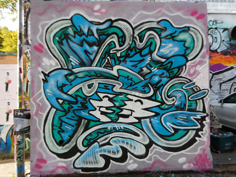
This is a piece that is not only well painted, but also is full of energy and movement. It is pieces like this one that remind me how much I love photographing and following street art in Bristol, seeing and capturing talent and beauty. Time to update my Face 1st gallery, as he has been on a very productive streak lately.

Bristol has an international reputation for being a graffiti and street art hub. Because of this, we get an awful lot of visitors, who come to paint one time, never to be seen again. I got lucky and managed to catch Cuomo, just as he was finishing off and photographing this piece. Cuomo is an Italian graffiti artist, and whether he was being evasive or whether there was a language barrier, he was reluctant to let on too much about himself. Perhaps he didn’t realise that there was little or no risk painting this board.

Cuomo has an interesting style, often combining characters with his writing. His writing is often black, as in this example, with angular shapes. What is clear is that there is a significant difference in design to the kinds of things we are used to seeing in Bristol. Vive diversity.

I first came across Whysayit (YSAE) a few years ago when he regularly collaborated with Kleiner Shames. Although I have never met him, I have enjoyed his irregular anti-graffiti style over the years, and this one under the M32 is a banger.

The organic writing is simple, spelling out ‘YSAE’ in two tones of pink. Light pink for the letters and dark pink for the drop shadow. Combine these with a black border and white highlights, and you have straightforward, quality writing which lifts nicely off the wall. Sometimes less is more.


