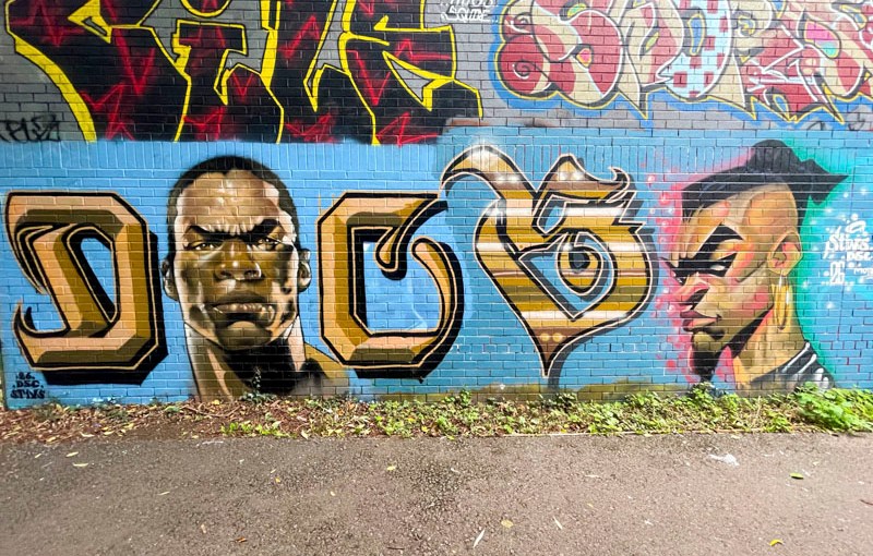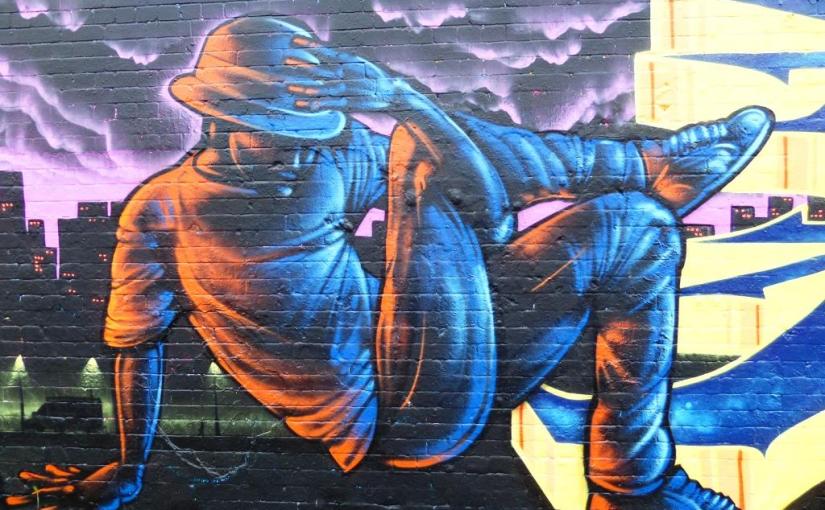
A gallery of outstanding character pieces by Bristol artist Ulow.
All photographs by Scooj.
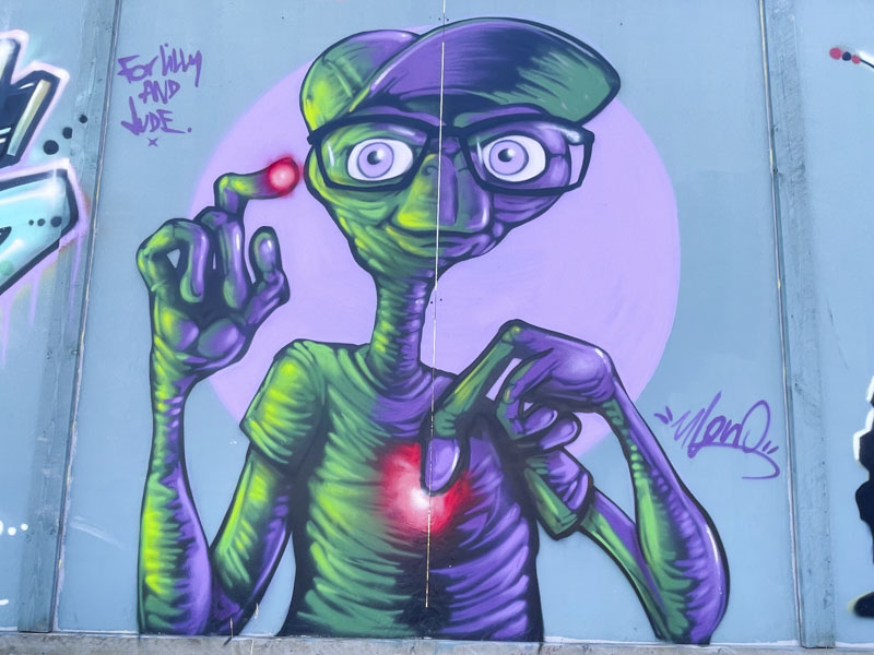
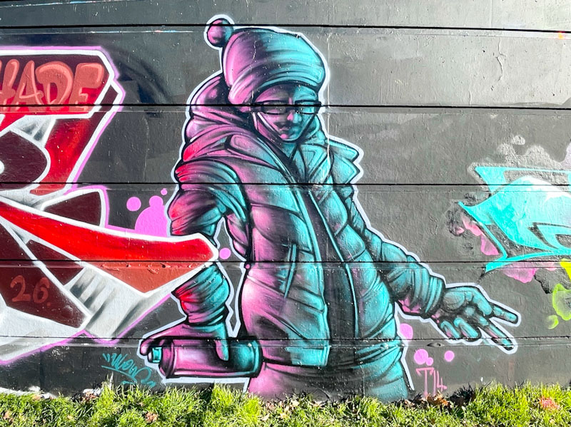
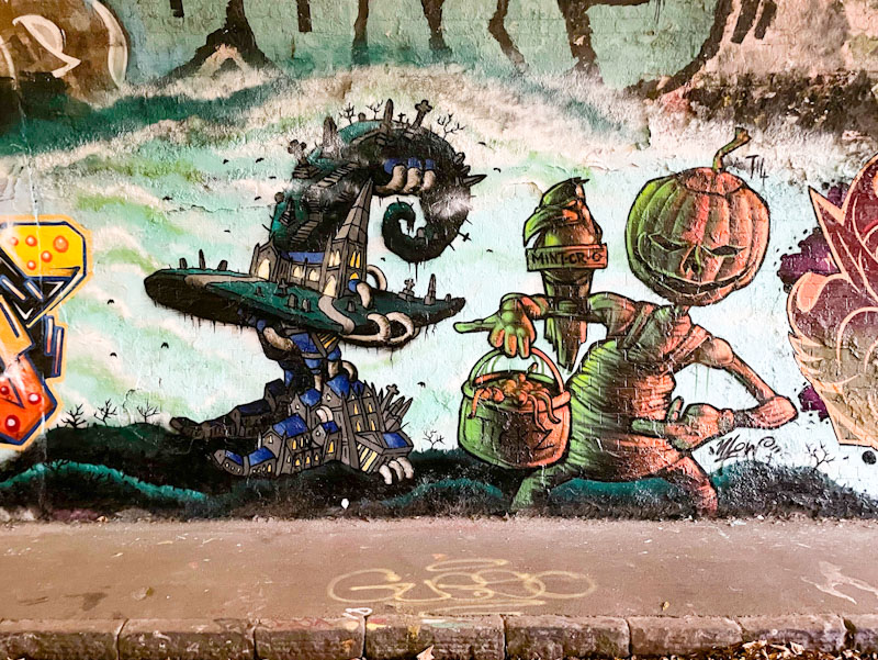
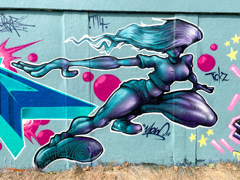
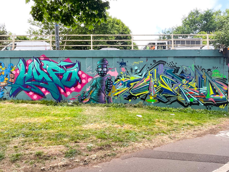

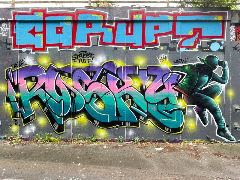
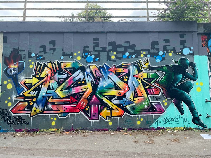
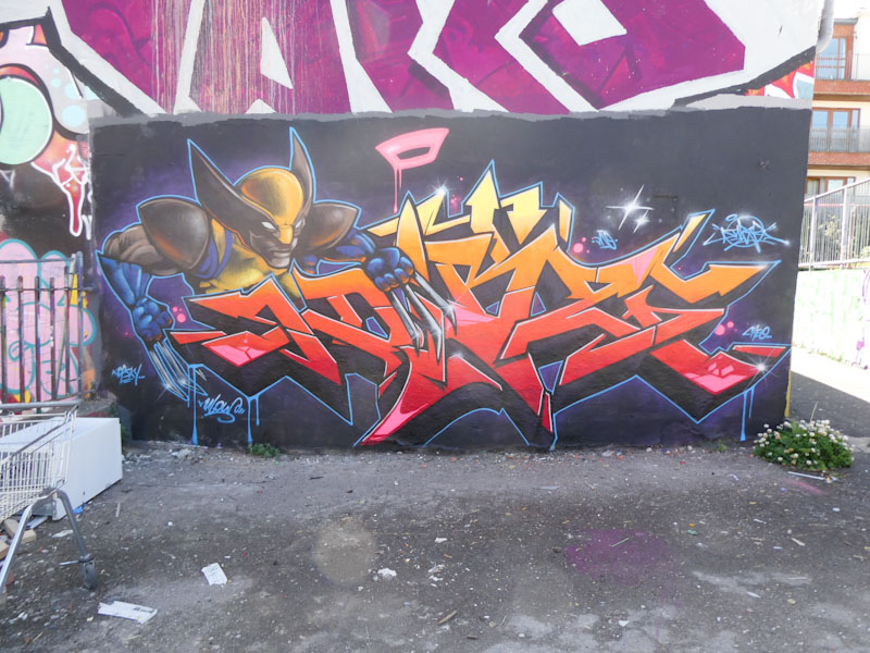
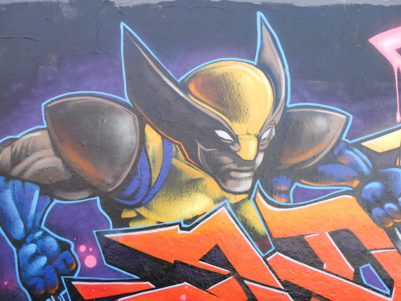
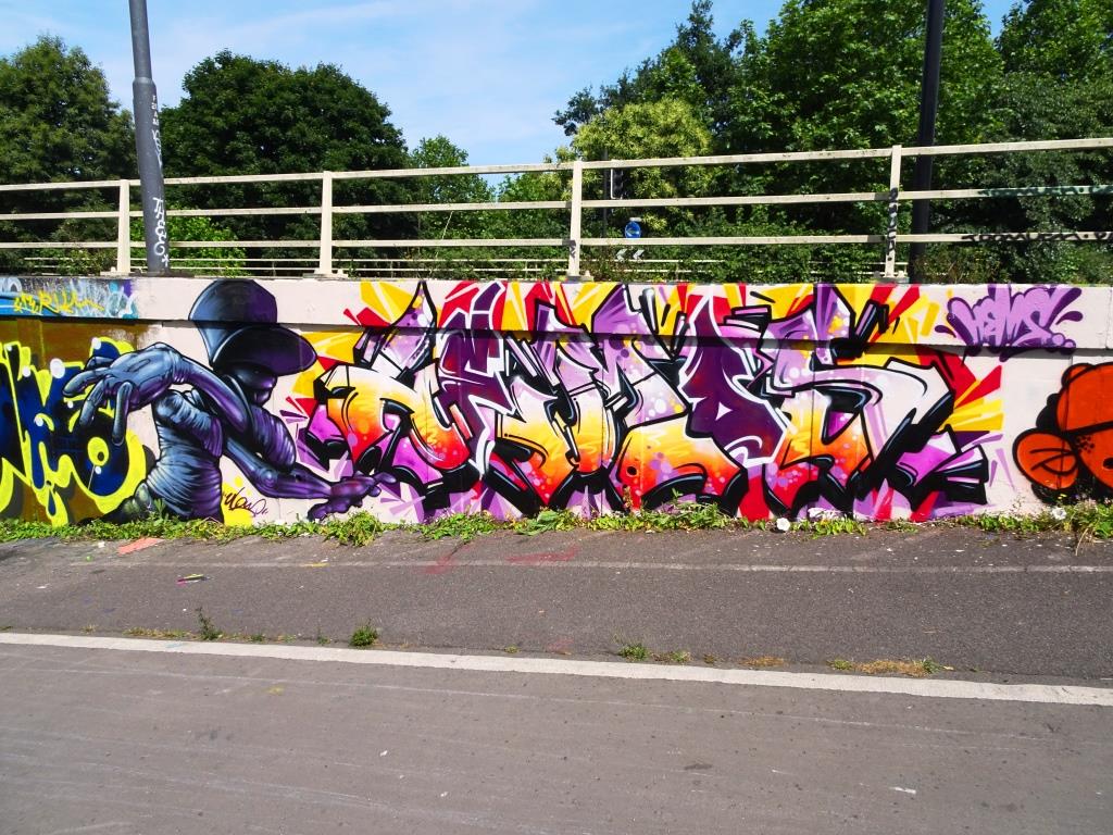
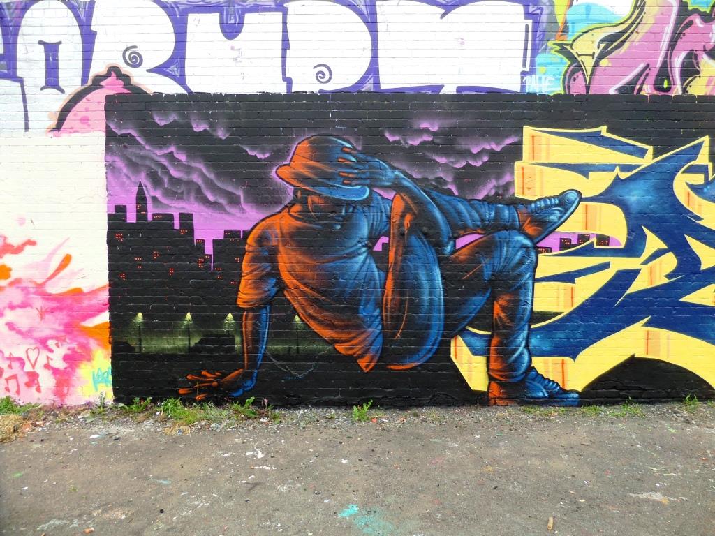
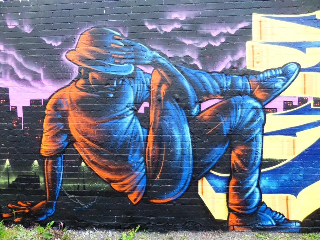
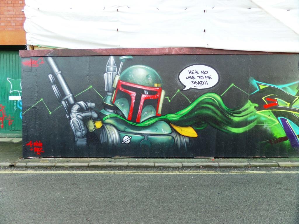
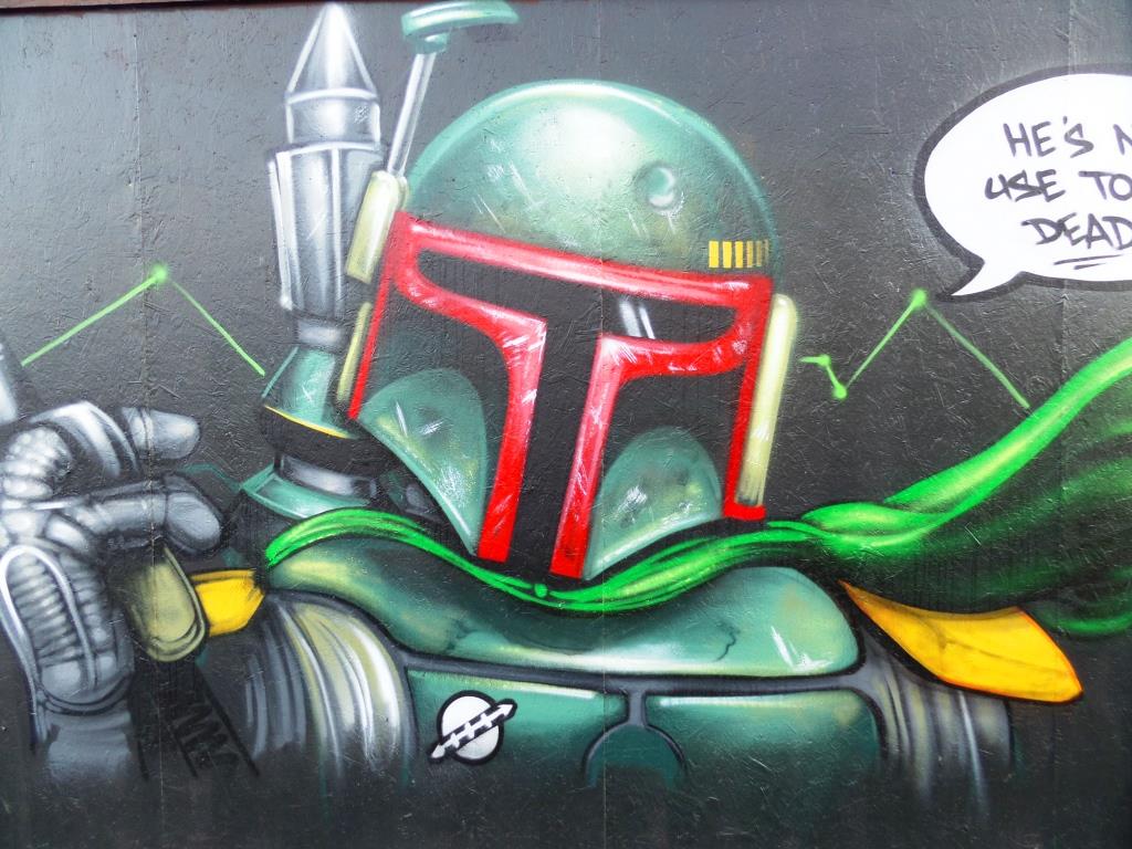
A gallery of outstanding character pieces by Bristol artist Ulow.
All photographs by Scooj.
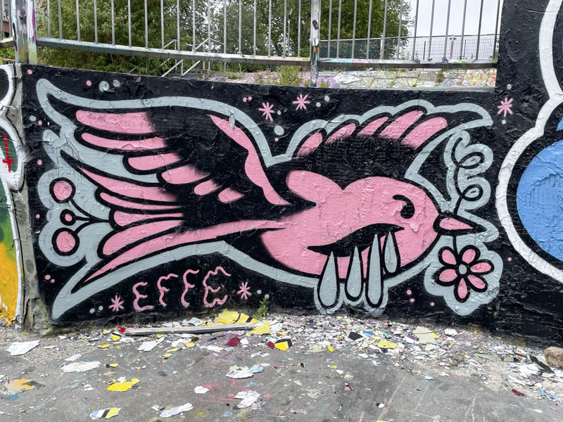
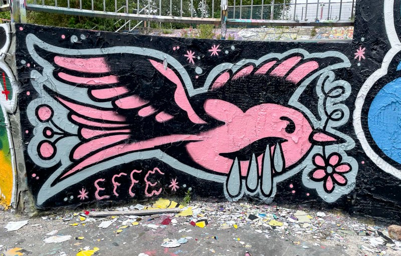
This is another piece that I have pulled out of my archive, which I photographed back in June this year. It is a rather charming piece by Effe, an artict I know little about other than that they are primarily a tattooo artist.
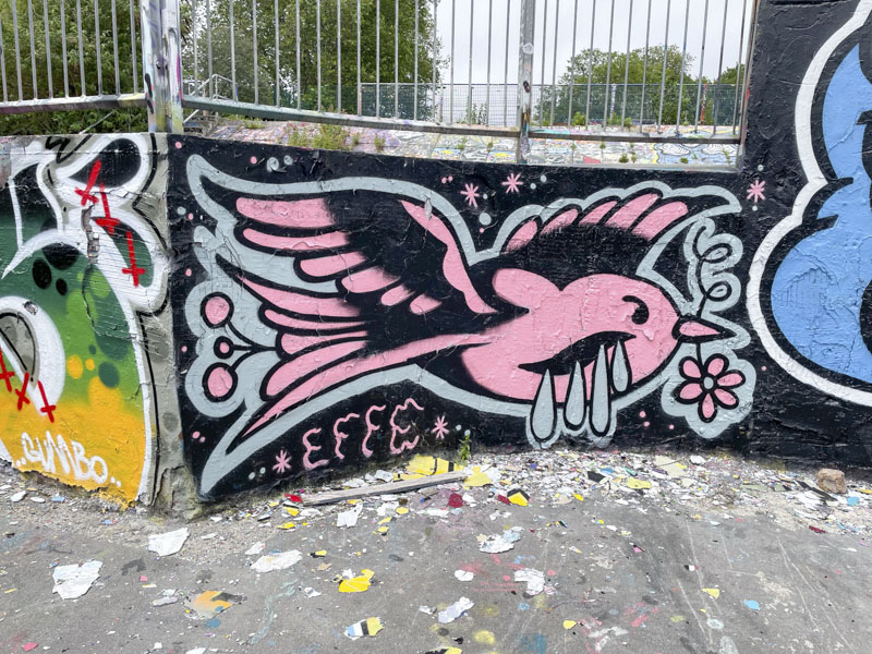
This piece definitely reflects a tattoo art style, a clear emblem, in this case a bird with a flower in its beak, and a piece that feels like it is an outline that has been coloured in. There is a tremendous cross-over between street art and tattoo art, with many practicing tattooists painting the sreets of Bristol. I look forward to finding more pieces by Effe.
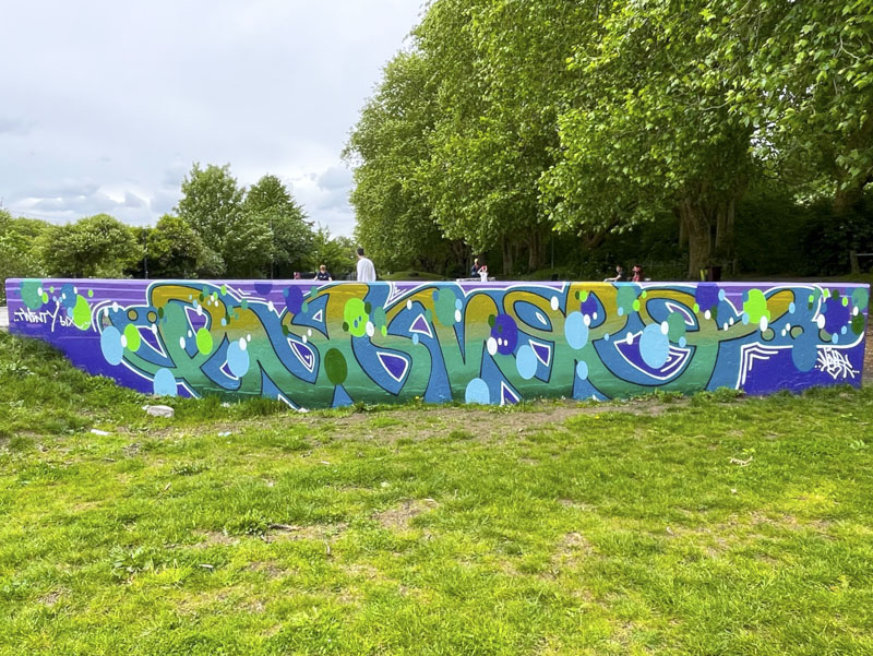
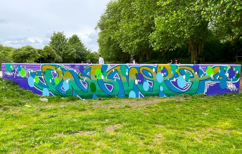
I’m back to work with a bump today, after a fantastic holiday in Greece with my wife and daughter – truly a perfect holiday. The only upside that I can think of is that I can get back into a rhythm for writing my blog posts before work, a pattern that goes completely out of the window when on holiday. This is a piece from Logoe which I photographed back in May.
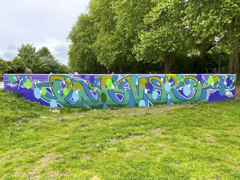
This is a long wall, and Logoe has filled the space perfectly, withoug distorting his letters too much. The colour palette is beautifully worked out and sympathetic with the immediate environment. Of course, the piece incorporates Logoe’s script writing style and is liberally sprinkled with oval decorative spots. Nice piece in a nice place.
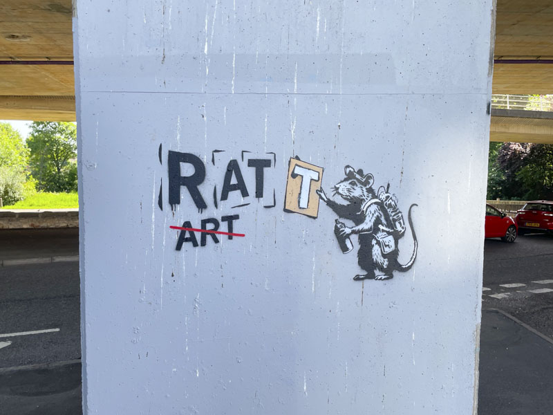
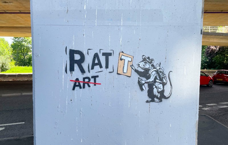
This is another stencil piece from John D’oh, painted earlier this year in May. I still have plenty of his pieces still to publish, and I guess there are probably some more to photograph too.
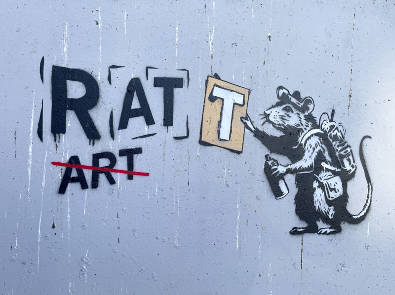
Rats feature a fair bit in street art, probably popularised in part by Banksy. In this piece, a stencilling rat, has switched the letters of ART around to read RAT. Humour and subversion all captured in this small stencil from John D’oh.
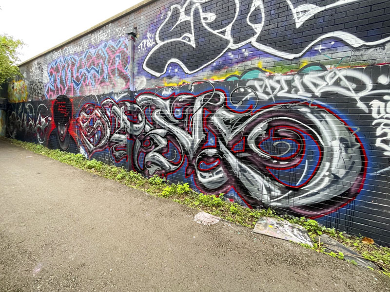
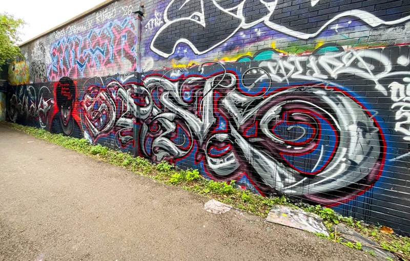
This is an interesting and well worked combination collaboration alongside the river from Hire and Stivs. Hire’s graffiti writing is to the left and a combination of writing and a portrait by Stivs on the right.
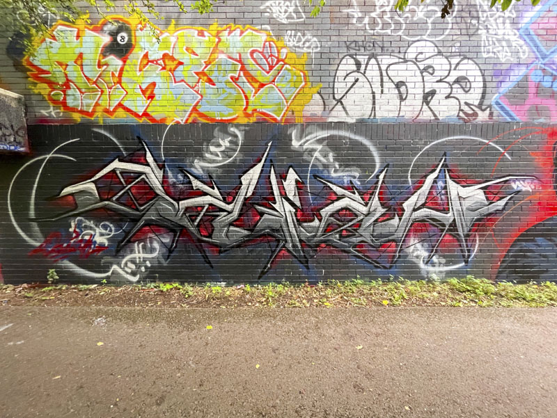
Hire writes ODIAH most of the time these days, having moved on from the previous HIRE letters used in the past. The piece does hark back a little to when Hire used to produce very spiky pieces, and the combination of greys, black and red work very nicely.
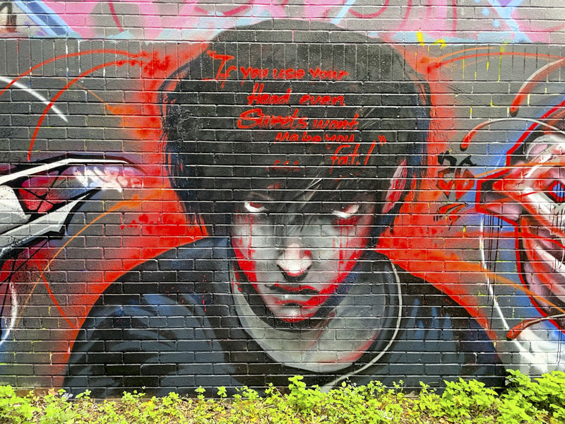
Stivs has painted the portrait centrepiece, which has anime cartoon overtones and is accompanied with the words “If you use your head, even sweets won’t make you fat”.
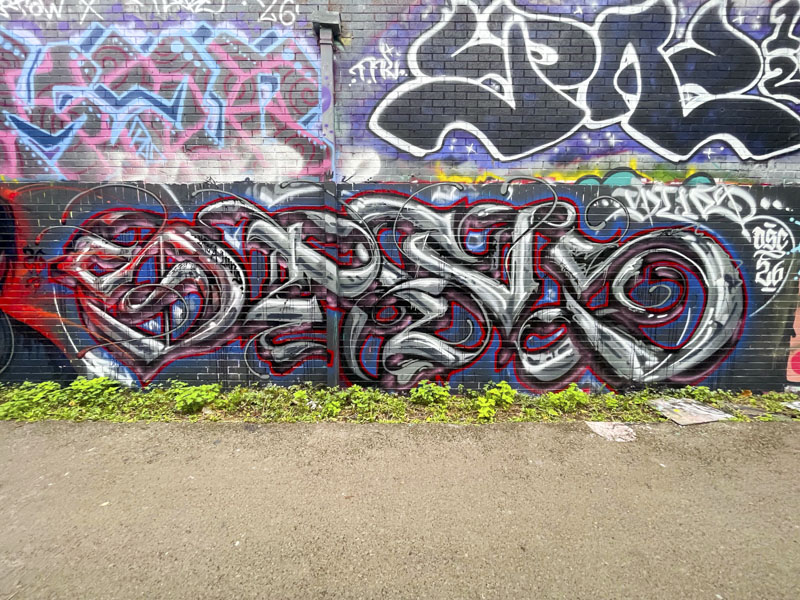
The final bit of writing, spelling STIVS, is written in a soft calligraffiti style adopting the same colour scheme as used by Hire with the inclusion of some blue. A fine collaboration.
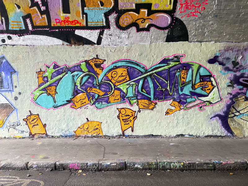
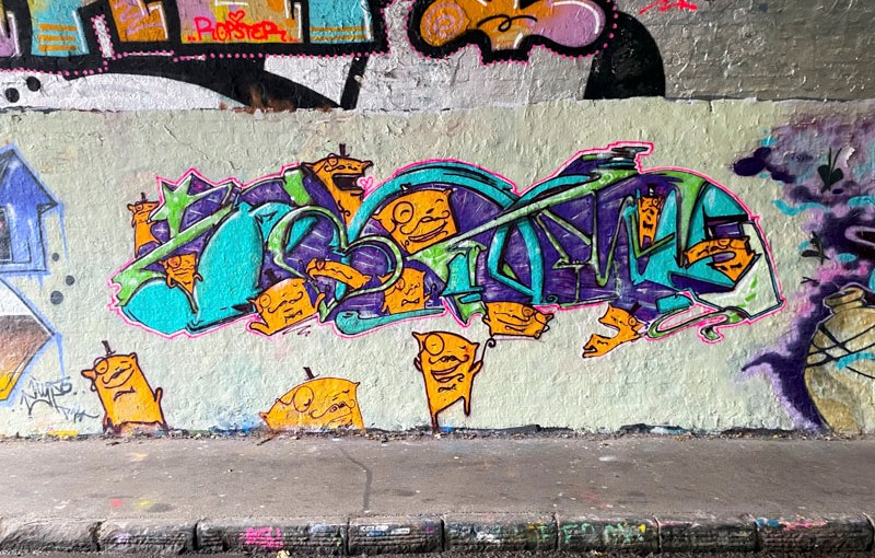
In my book, this is an absolutely fantastic piece of writing from Posh. The letters, which I think might read POSH, but it is impossible to know because they are so disguised, are accompanied by several of his imp-like posh characters.
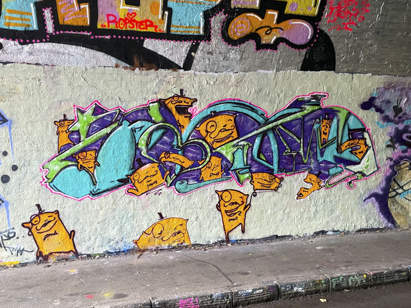
There is a wonderful balance to the writing and characters, and the colour selections for the letters contrast nicely with the little yellow folk. There haven’t been too many pieces by Posh that I have seen this year, so this was a bit of a treat.
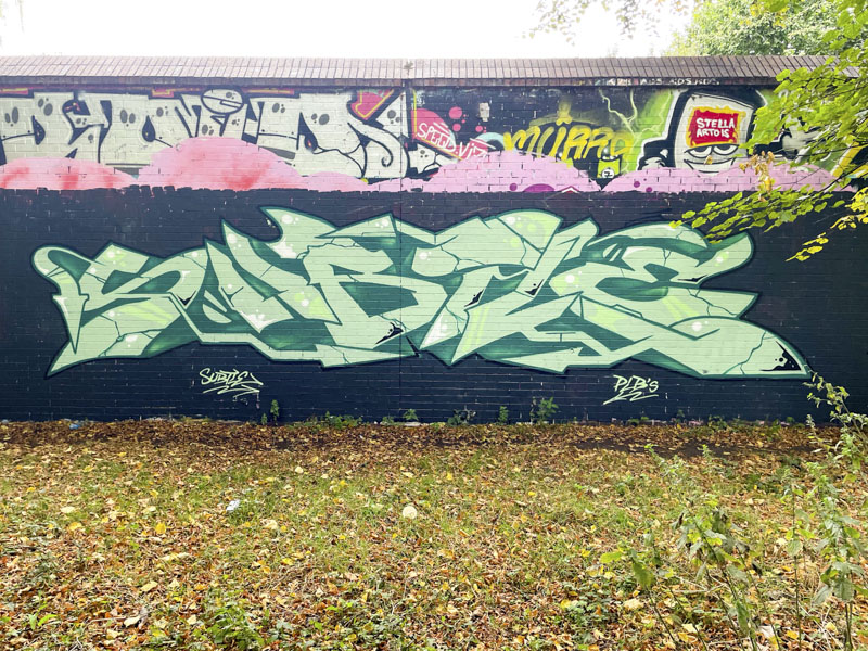
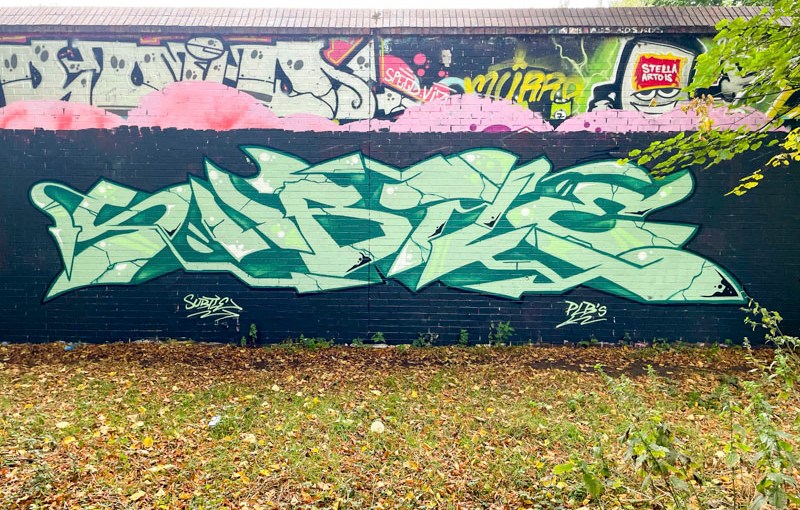
Another recent piece by Subtle, but this time looking much more like the Subtle writing we are used to seeing. I have to say that is is hugely welcome to see him painting back in come of the regular spots again after a bit of a quiet spell.
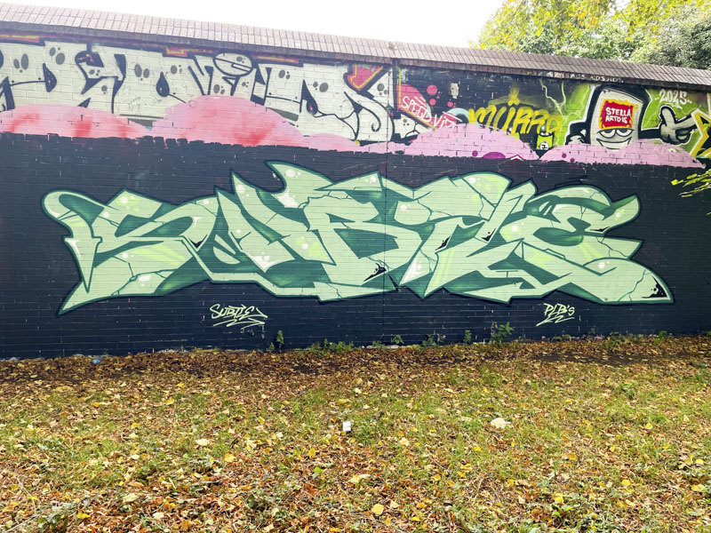
This piece has all the hallmarks of a Subtle piece. A nicely buffed wall, a long spread of his letters, taking up a lot of wall space and all beautifully presented with a deep drop shadow. Classic Subtle.
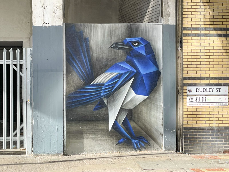
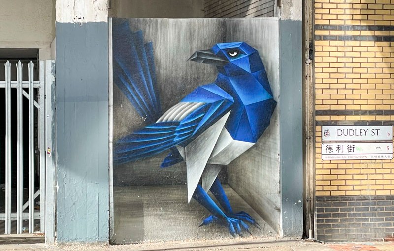
Another piece I managed to snap on a recent work trip in Birmingham on my way to the station, this time by the brilliant Annatomix, whose ‘origami’ style animal pieces are so distinctive.
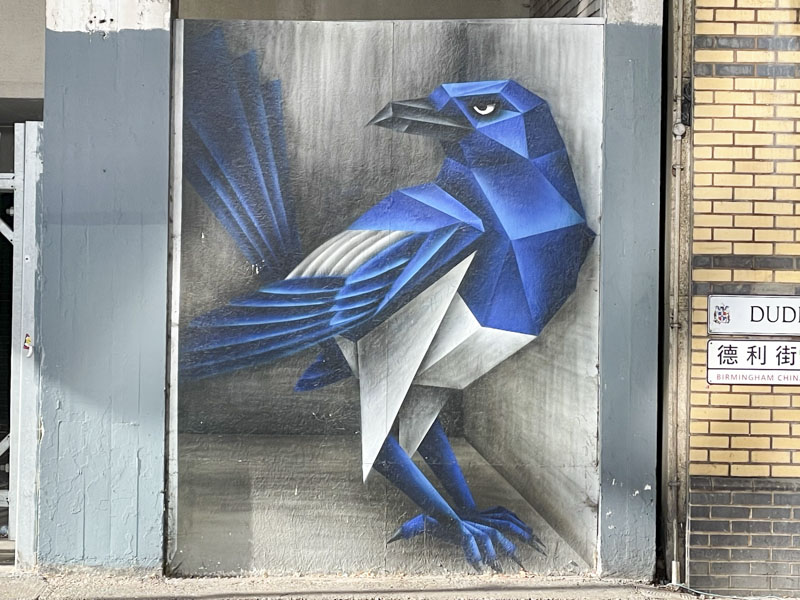
This gorgeous magpie or maybe blue jay certainly brightens up an incredibly bland street in Birmingham. Annatomix is running a campaign against exploitation of her and other artist’s art, and is limiting her street work to commissions, so I am guessing this might be quite an old piece. Stunning though.
An early start today to fly back home from them perfect days in Skopelos and Skiathos, Greece, so I wrote this post last night. A quick one…
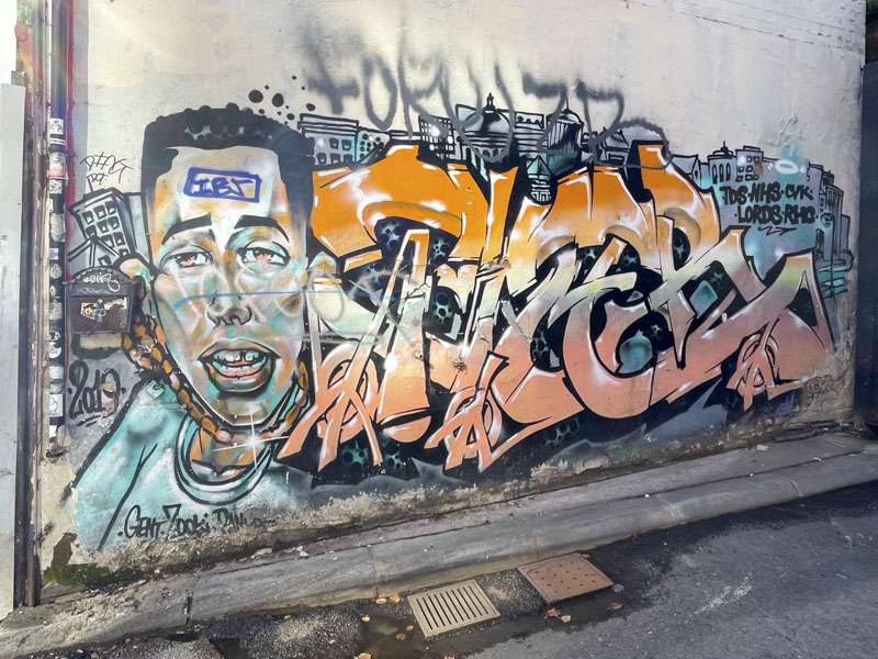
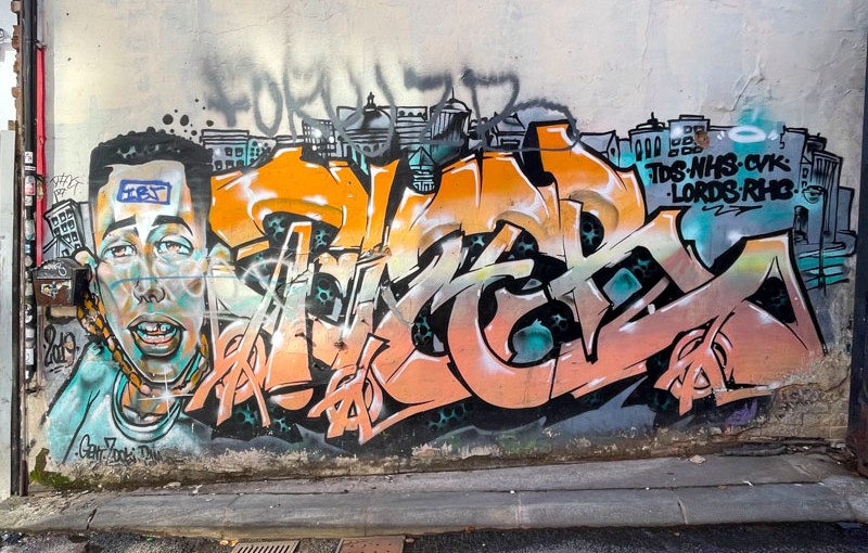
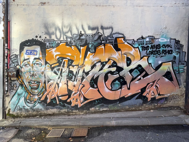
I ran a workshop in Birmingham a few weeks ago, and walking back to the station I spotted this old piece by Tizer, dated 2019. It appears to have fared reasonably well. It is a classic combination piece by the London-based artist. Great character and letters.
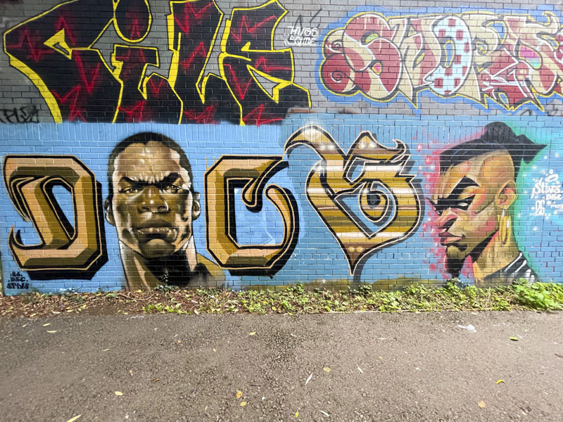
Such has been the consistency of sunny days this summer, the shadows cast on this piece have forced me to photograph it on at least three occasions, but my patience paid off at last with these ‘clean’ pictures of the combination of letters and characters by Stivs.
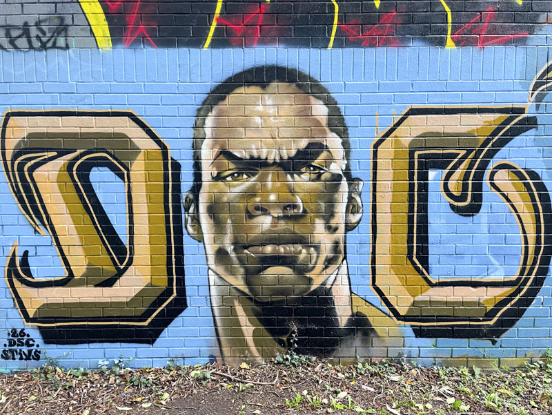
Judging from the buffed background in two slightly different shades of blue, it looks as if these two cartoon portraits might have been painted on different days. The first portrait is accompanied with a D and C in calligraffiti style, part of his DSC tag. The portrait in gold and brown tones and with slightly exaggerated cartoon features is fantastic.
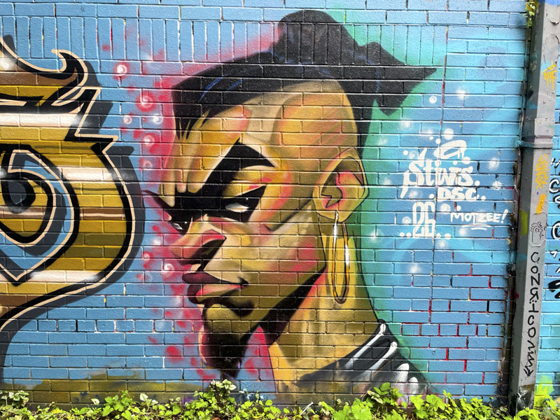
To the right, is a floating S written in a slightly different style, and a three-quarter portrait view, much more angular than the first, of a man with a tight haircut and goatee beard and large hoop earring. Once again the features are somewhat exaggerated. All beautifully finished as you might expect from Stivs. I’ll need to find out more about the characters next time I see him.