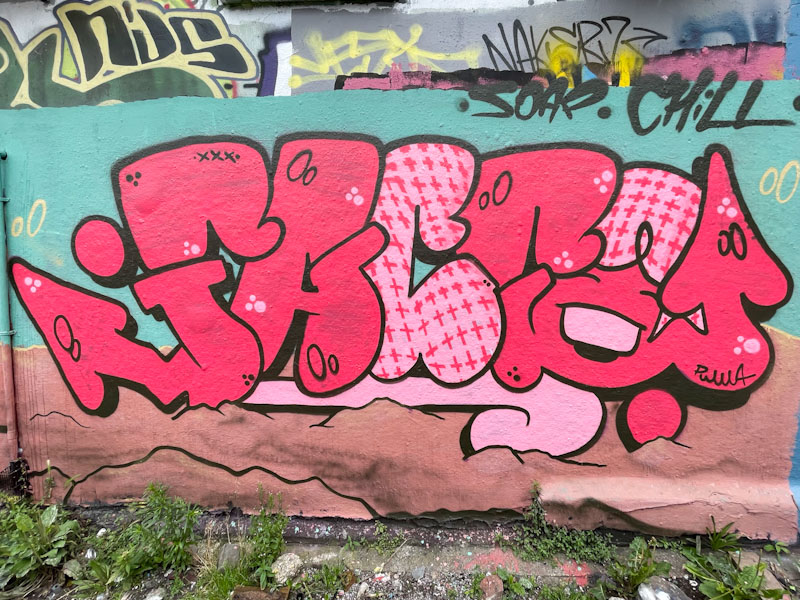
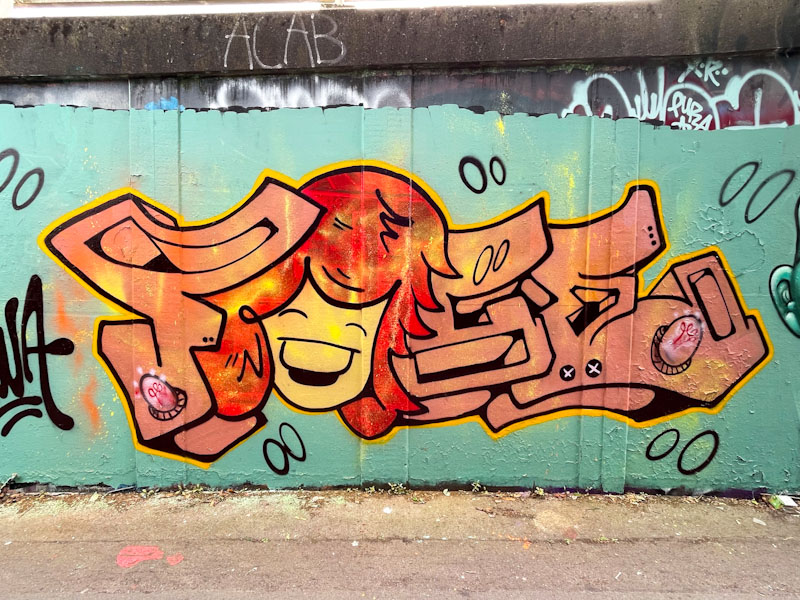
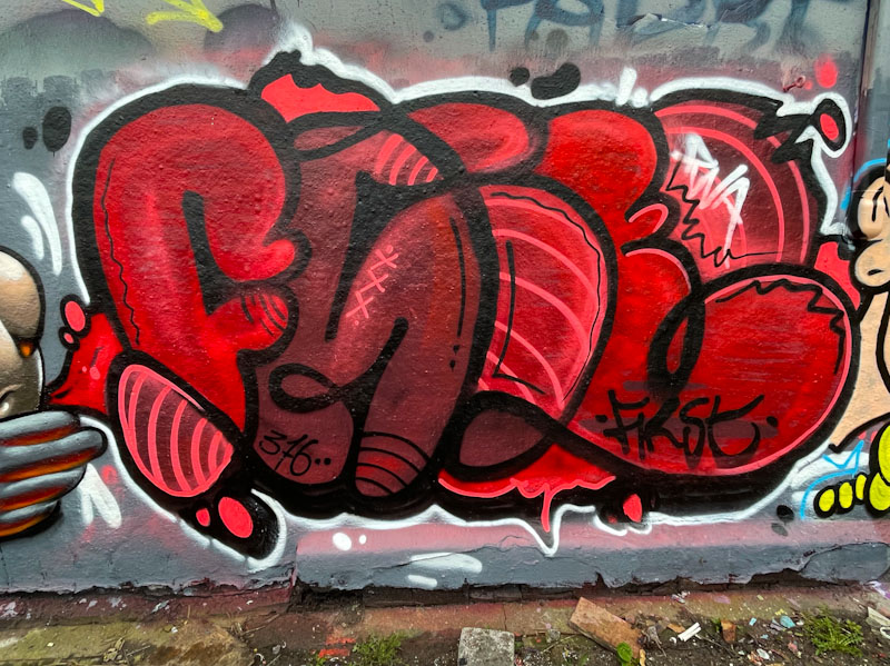
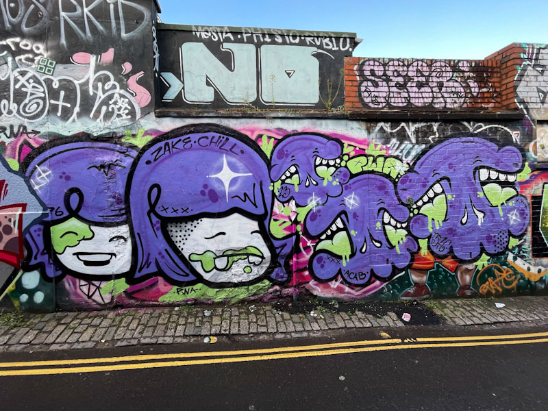
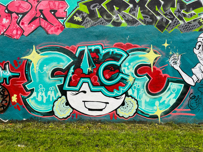
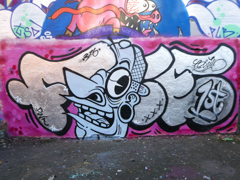
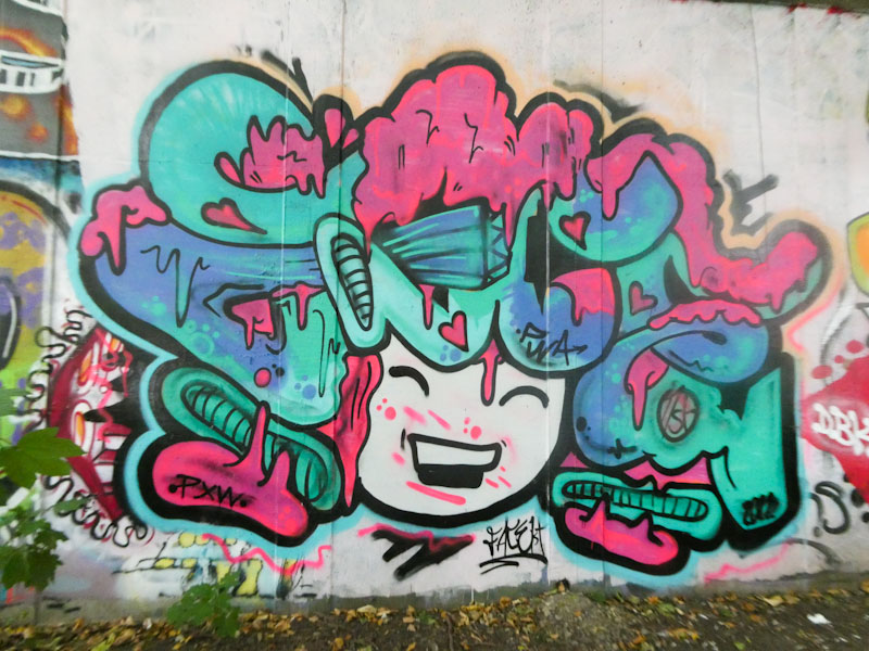
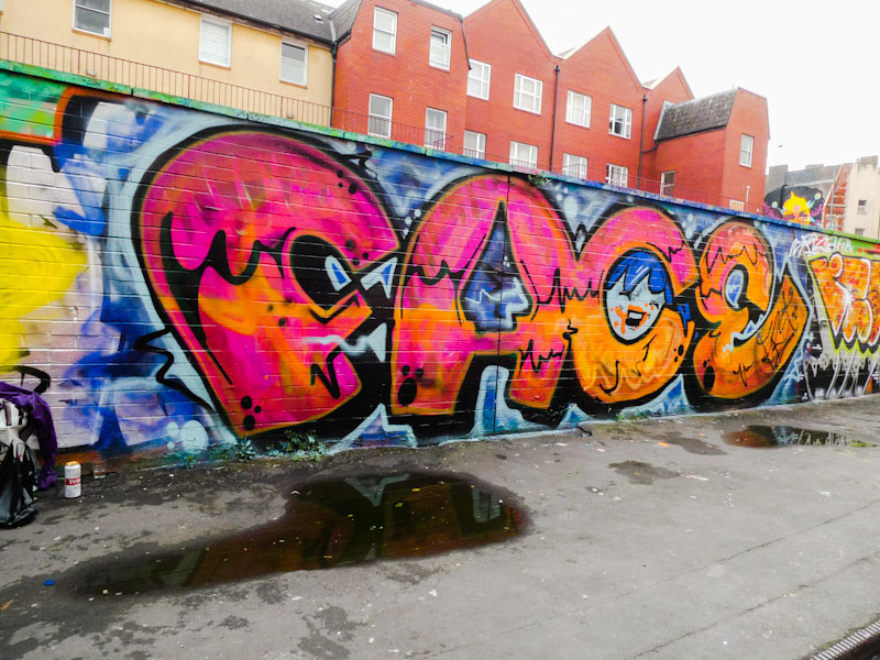
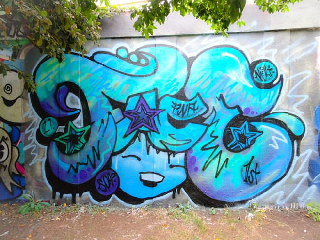
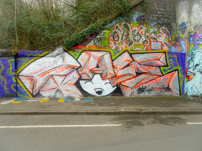
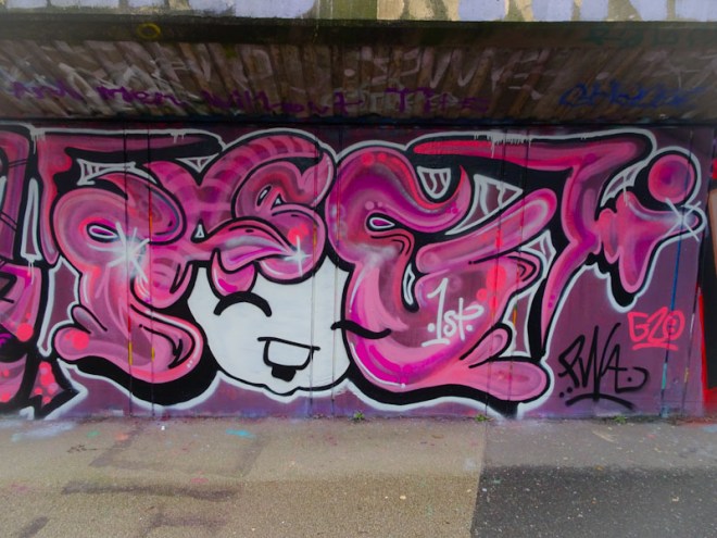
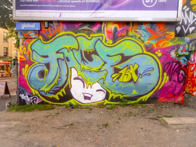
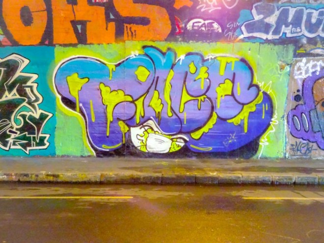
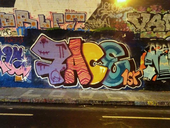
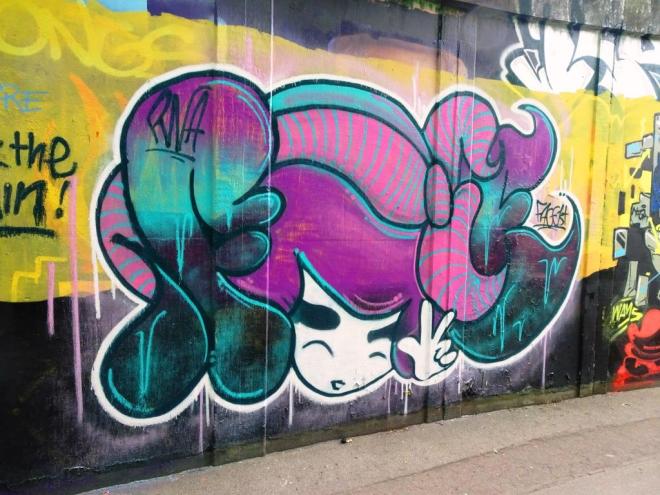
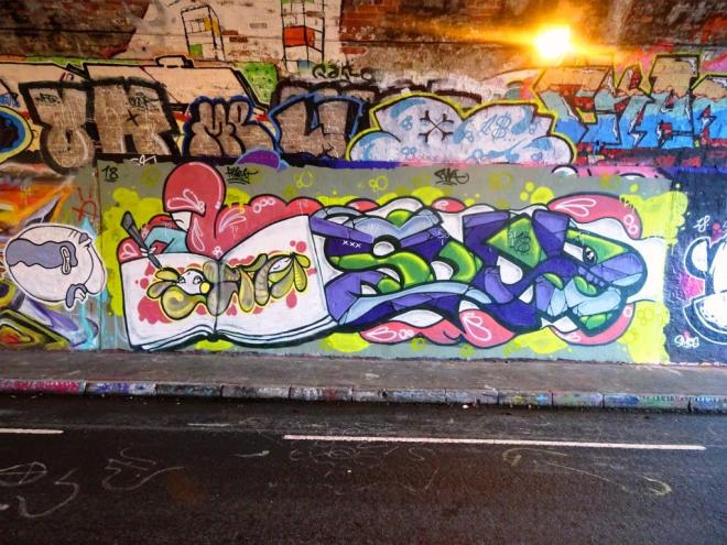
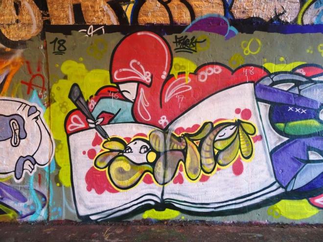
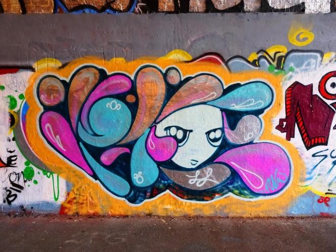
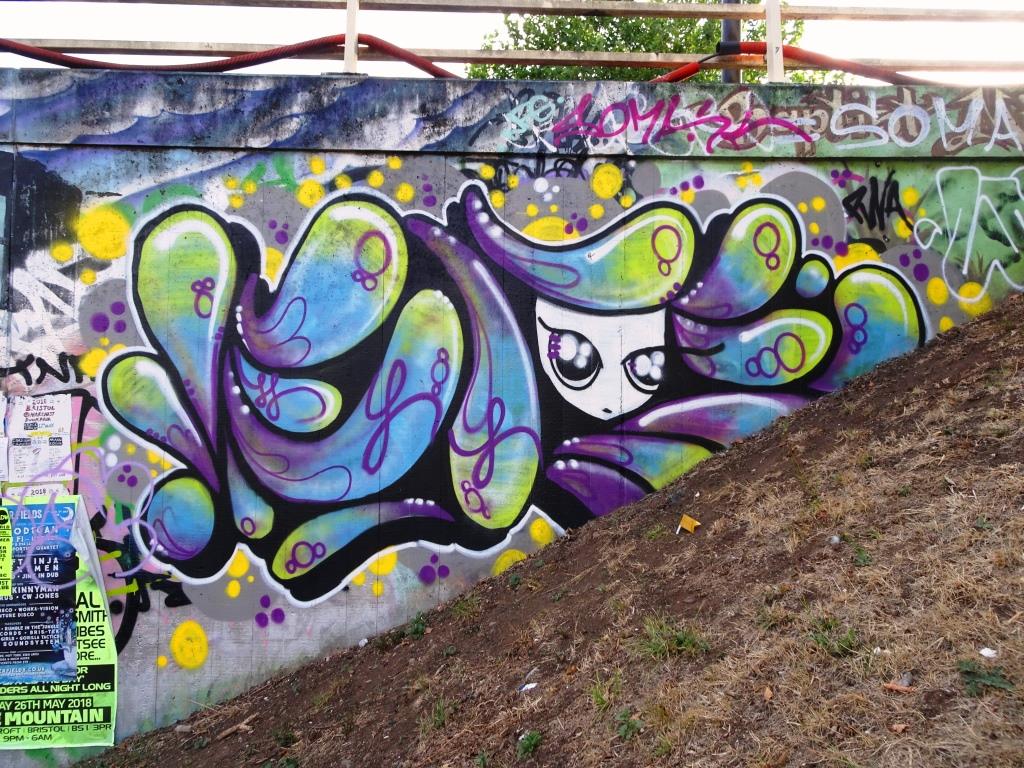
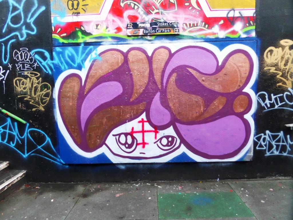
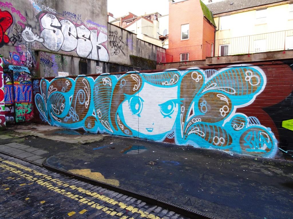
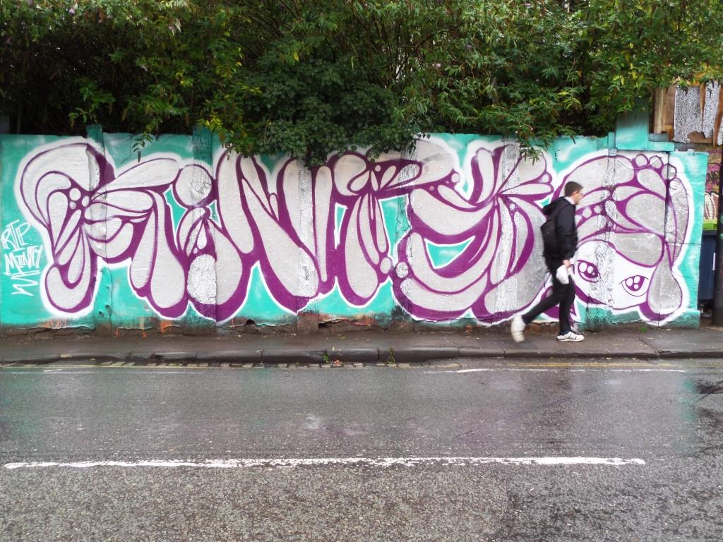
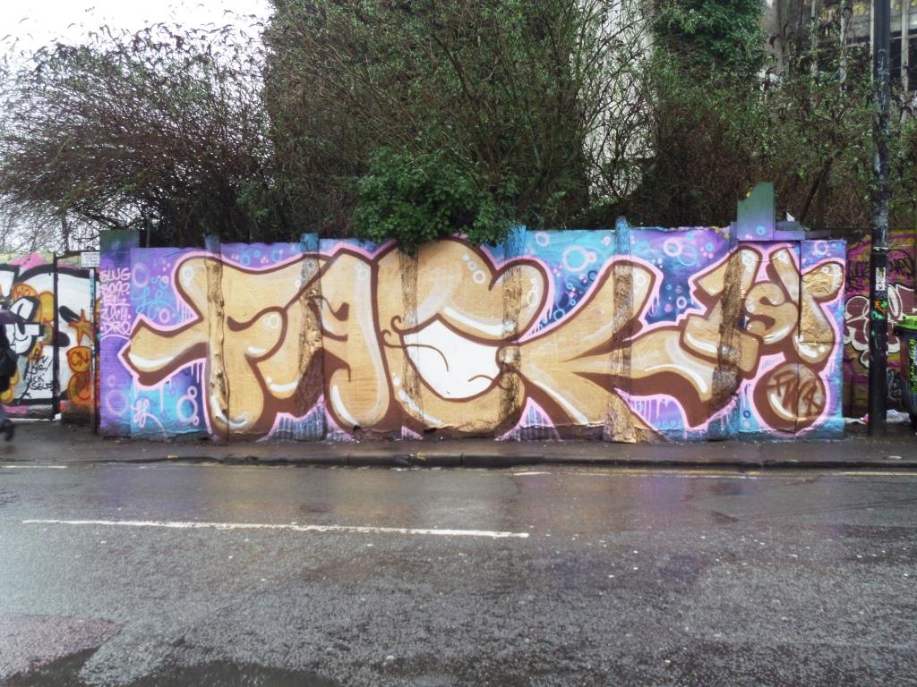
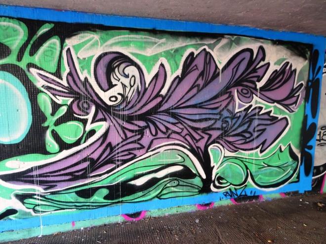
In the past when I have posted work by Ments, I usually describe it as being ‘organic’ in nature, with lots of swirls and unusual shapes making up the letters of his name. In this piece however, we see something quite different. What is interesting about this is that If he had used different letters for this piece, I would not have been able to identify the artist. Conversely, if he changed the letters on his regular style, I would still be able to identify the work from the shapes, tones and colours used.

This particular piece is easy on the eye and shows us a different side to the talents of the artist. I will be interested to see if he does more of this kind of work in future.