
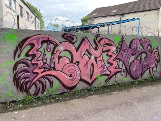
A gallery of anti-style graffiti writing from Bristol’s fabulous Whysayit (YSAE).
Crew: PLB
All photographs by Scooj


A gallery of anti-style graffiti writing from Bristol’s fabulous Whysayit (YSAE).
Crew: PLB
All photographs by Scooj

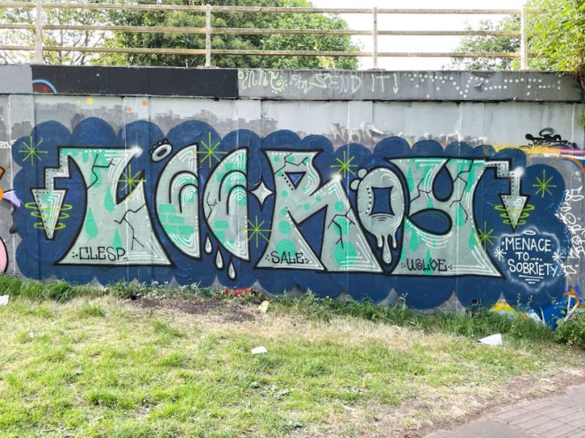
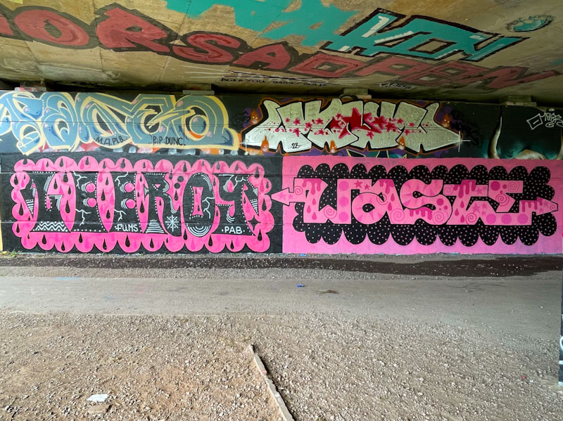
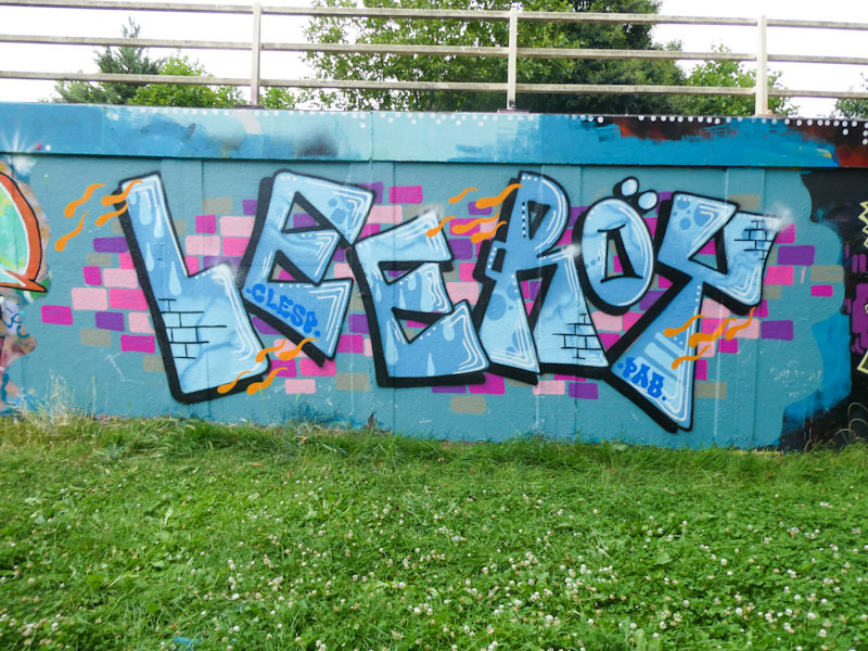
I happened to meet Lee Roy yesterday, while he was chilling with his dog beside the river, and we got chatting. I spoke to him about this wonderful new piece on the cycle path that runs alongside the M32, and commented on how different it felt to his other recent work. He said that he was trying something a little bit different, and although he couldn’t put the changes into words, he used hand gestures to describe how this new approach is a little more curvy and free of blocky letters.
The piece spells out Leeroy, although the letters are far more cryptic than we are used to. The modest colours, similar to the kind of muted colour palette that Dog Bless the Band tends to use, sit nicely on the grey buffed wall, and the green flashes keep the eyes busy. I am looking forward to seeing where this new direction takes us. A lovely piece from Lee Roy.
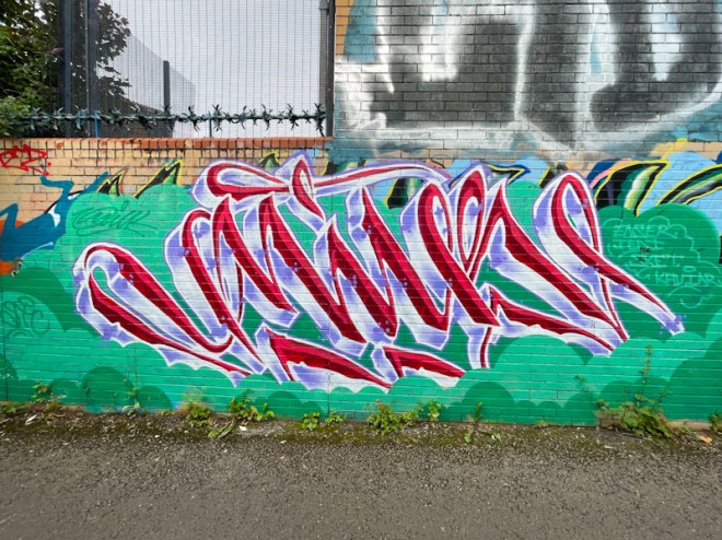
With the turnover of art in Bristol being such as it is, I get an awful lot of pieces left behind in my archives, and then I forget whether I have posted them or not. I guess that this is a bit of a first-world problem, but it troubles me a little. I was certain that I had posted this piece by Wxttsart, but it would seem as though I hadn’t. It is still in great condition, so perhaps it is relatively recent, and I am mistaking it for another similar piece. Anyhoo, it is a bit of a blinder.

I describe Wxttsart’s work as a bit of a blend of calligraffiti with a touch of anti-style. I’m not too sure how the artist would describe it, but it is unique and always recognisable. The red script letters spelling MILK are nicely proportioned (a feature of calligraffiti) and have been bestowed with a deep 3D drop shadow in lilac shades. The whole thing is set on a fine green cloudy backdrop which contrasts well with the letters. This is another great piece from Wxttsart.

Solar is definitely an artist I would like to know more about, as he is something of an enigma to me, and I have never had the fortune to meet him, or indeed most of his elusive PLB friends. His work is quite unique and touches on the anti-style, but not in a way that is similar to others who paint that way. Although he changes his fonts from piece to piece, there is a consistency about his letters within a piece.
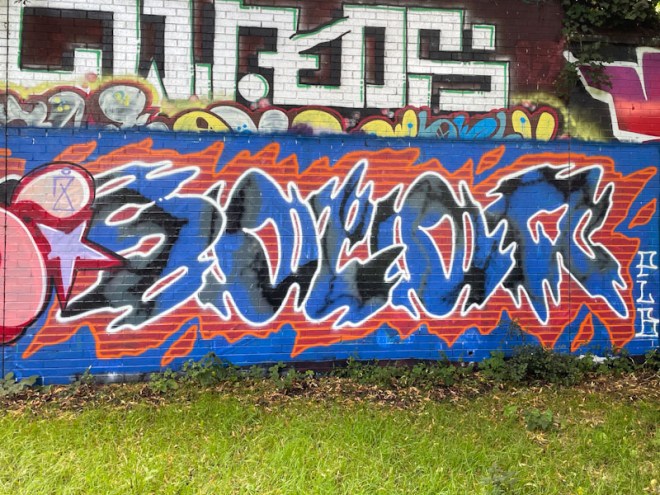
The most striking thing about this work is the colour combination and contrast between the blue and black letters and the red and orange surround, set on a blue buffed background. I can’t really describe the letter forms, but can say that somehow they are typically Solar, and the gentle way he has of almost disguising his name. I will soon be able to pull together a gallery of his work which will be a great showcase of his individual style.
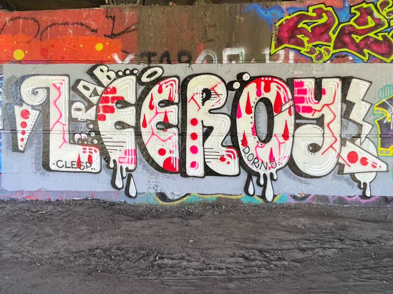
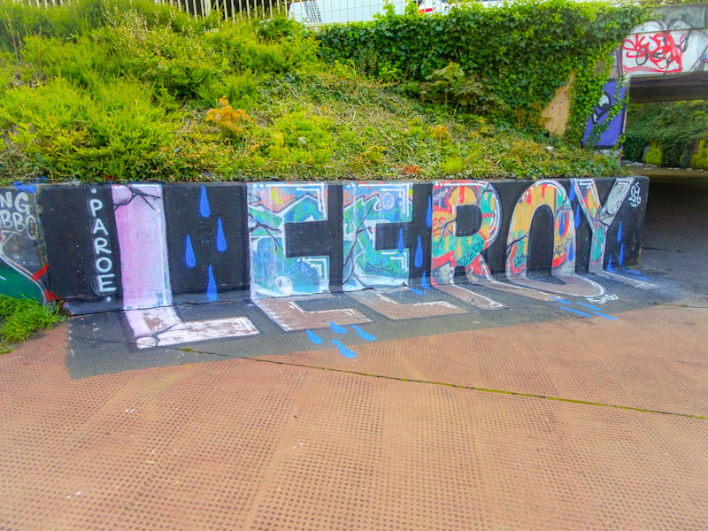
I was fortunate enough to meet Lee Roy for the second time this week, when he was just finishing off a piece in this exact spot, and it reaffirmed my first impression that he is a really decent and likeable fellow, who is happy to talk about his work, and shows an interest in what I do to record and report on the pieces that I see.

This piece of graffiti writing has a modest colour palette, but contains all the fun elements you might from Lee Roy. The letters are painted in a semi anti-style way, following the freedom he enjoys. The fills vary from letter to letter but the white accent lines are consistent, and I particularly like the yellow stars and hoops on the arrows at each end. Some nice ‘shout out’s to other artists round the piece off nicely. Lee Roy remains on a hot streak.
A gallery of fabulous graffiti writing from Bristol’s Lee Roy
Instagram: @leroyale191
All photographs by Scooj


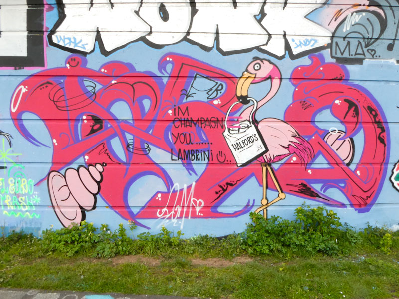
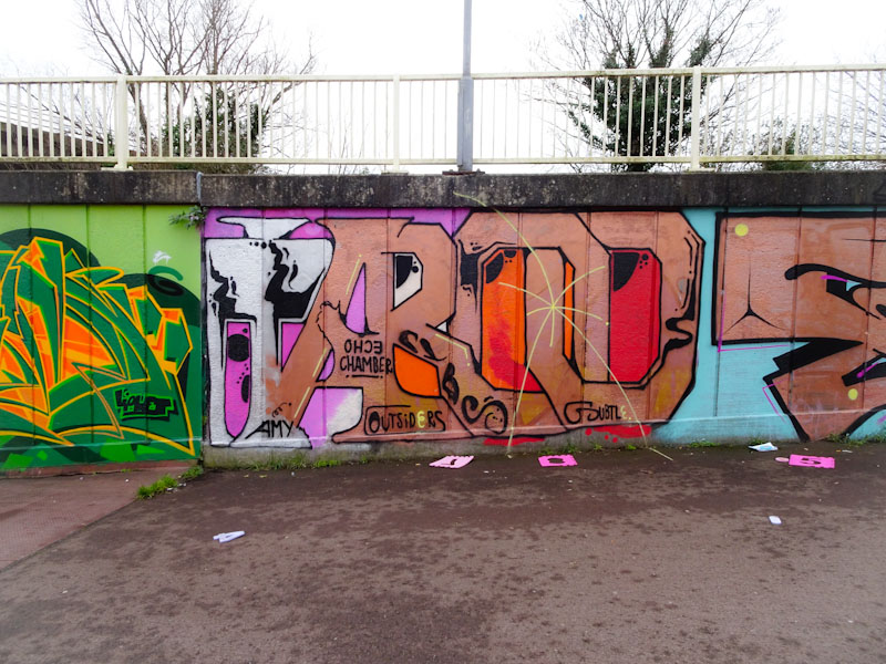
If anyone can tell me what is going on here, then I doff my cap to you. Some fabulous anti-style graffiti writing from Taboo with a pink flamingo holding a Halfords bag in its bill, and the words “I’m Champa(i)gn, you… Lambrini”.
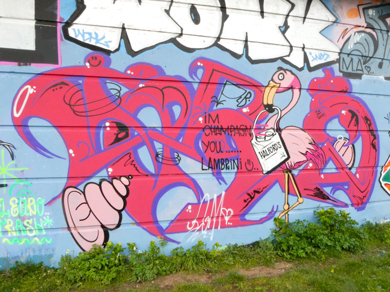
The colours here are striking without being gaudy, and I have to say I love that red colour, and I think it works very nicely on the light blue background. The whole thing feels slightly anarchic or eccentric – it would be nice if there was a word that meant both of those things – ‘anarcentric’ perhaps. More great stuff from Taboo.
Another root around in my archive unearthed this old one from February 2018, by Taboo, and if you look carefully to the left you can see the edge of a piece by Deamz. I still miss seeing Deamz’ work on our streets, even though he left for Tasmania several years ago – maybe one day he will return for a visit and decorate a wall or two.
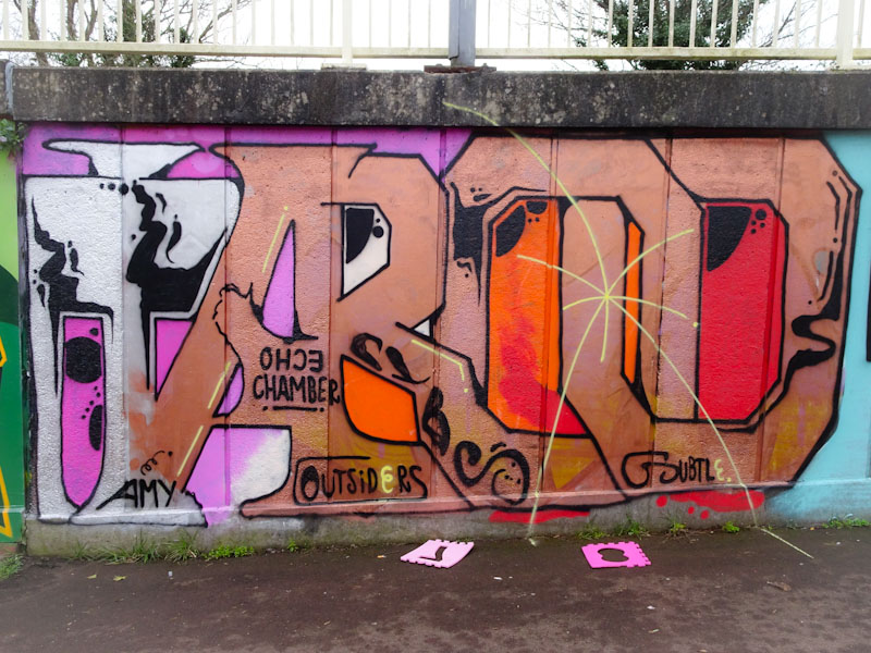
I suspect that I have several more unpublished Taboo pieces lurking in my files, but this one stood out, most probably, because of the colour selections, with a transition from white to copper, with some interesting oranges and reds filling in the holes. This is a really nice piece of anti-style graffiti writing.

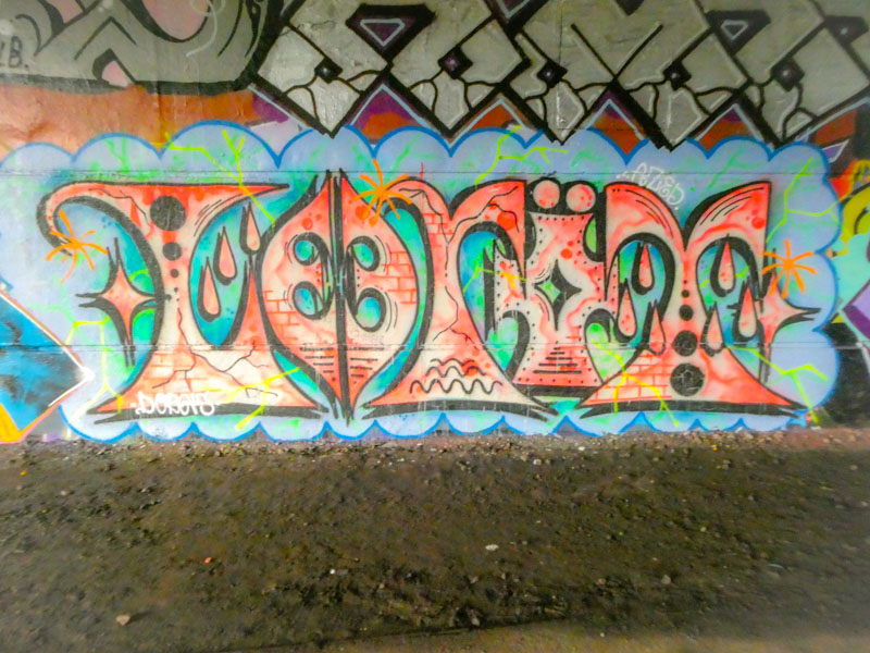
This is another piece in a series in which we see Lee Roy spell out his name with his unconventional font that teeters on anti-style graffiti. There is a lovely symmetry about this piece, and something about the style, colours and composition that has hints of the Indian subcontinent (although I don’t think that is necessarily the intent).
There are many similarities with a recent piece he painted in Cumberland Basin recently, and it would seem that he is playing with themes and ideas. It is great to see this pulse of activity from Lee Roy, and I look forward to finding more as the weather improves and artists get busy (as if I don’t have enough to keep up with as it is).

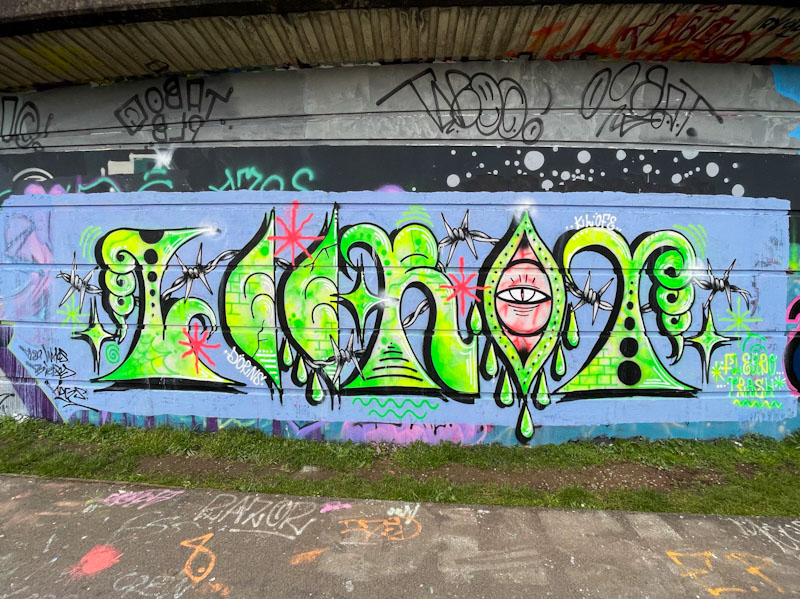
An artist who had completely fallen off my radar over the last couple of years is Whos. His anti-style of graffiti writing could be seen from time to time about the place, but this curious piece is the first I have seen for a long while.
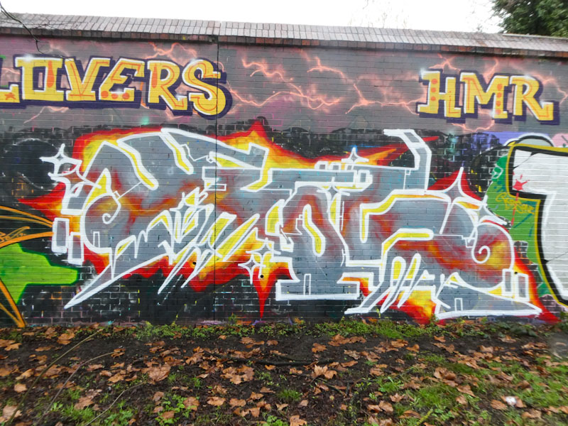
This fiery piece doesn’t follow any particular convention and is free from constraints. Spelling WHOS, one of my favourite elements of this piece is the flame plasma line running through the grey letters, looking like it is behind them. This is a nicely crafted piece, and a welcome return to the pages of Natural Adventures.


