.
A good night for the
aurora borealis
so I understand
.
by Scooj
.
A good night for the
aurora borealis
so I understand
.
by Scooj
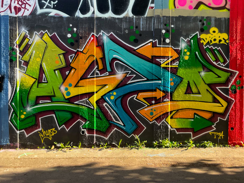
I have enjoyed immensely the vigour with which Hypo has upped his game over the last year or two, both in terms of the quality and quantity of his painting. Sticking with his HYPO letters, he has come up with a sequence of colourful and strong designs of which this is one of his more recent.
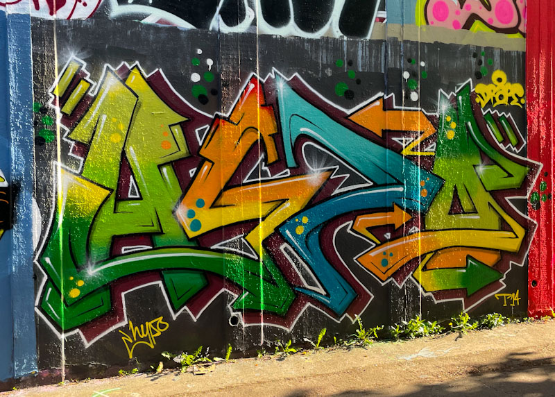
Unfortunately I captured this piece on a late sunny afternoon, and there is a bit of glare, but it doesn’t hide the excellence of the artwork. The colour palette is really good and the transitions through greens to yellows and oranges and blue are really well done. some spots are added for decoration, but it is the overall design of the letters and the clean finishing that I am particularly attracted to in this piece. Great work from Hypo.
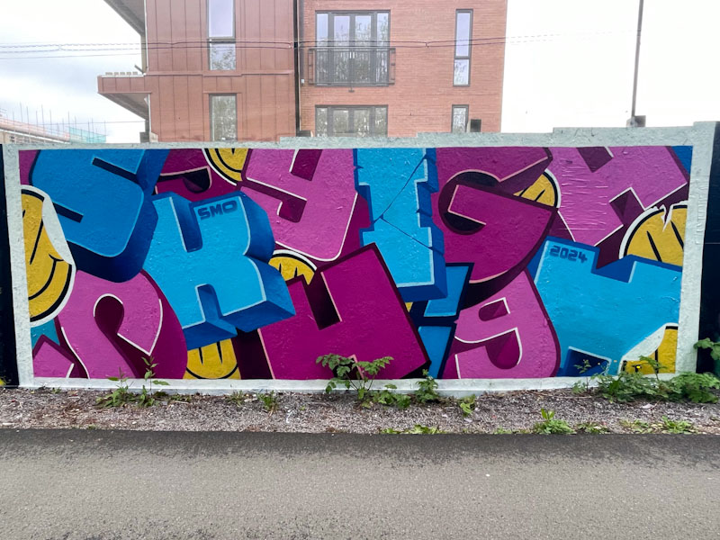
We are lucky that SkyHigh and Roo appear to have a strong association with Bristol – I believe that they have family here. This is good, because every time they come to visit, they drop a couple of pieces, which mixes things up nicely.
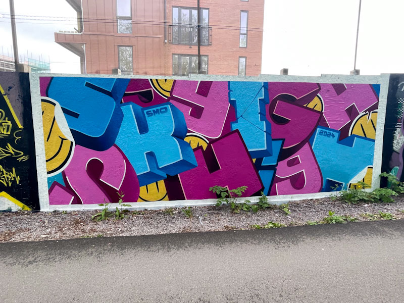
This is a beauty from SkyHigh in which he has spelled out his name with several optional variations in how you choose to read it. The block letters, each in a different font/style, have loads of depth to them and are displayed in different orientations creating a kind of 3D collage effect. The tried and trusted pink and blue combination is a winner, and is augmented with some splashes of yellow in the form of smiley ‘stickers’. Tidy.
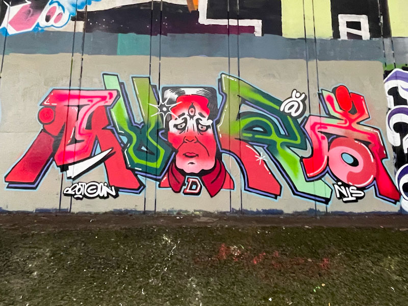
It feels like only a matter of months but is actually more than three and a half years since I first encountered Mudra’s work, and over that time it has improved immeasurably from the small character-based pieces to complex pieces of writing/character combinations.
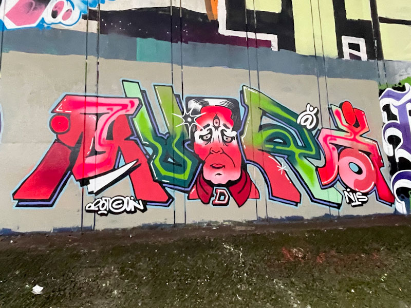
This piece underneath the M32 reminds me a little of Minto’s work, with its combinations. The colours red and green work well together and rather contradict the fashion industry maxim that ‘red and green should never be seen’. The letters are quite fancy and the face in the centre of the piece a little odd. Overall though, this is a nice piece that shows how the artist is constantly stretching himself.

Mote is an artist who emerged as a Bristol-based artist in the spring of 2022 and has been developing his craft steadily since then. His early pieces were relatively simple constructions with solid primary colours and thick solid lines, but he has quickly developed his style which is altogether more sophisticated while sticking to his monster characters.

This monster at the back of the Temple Meads development site is carrying a theme that Mote recently appears to be playing with which is to have the eyes appearing quite differently, one wide open, the other heavily lidded. this asymmetry certainly lends itself to the monster-like appearance of the character. There are just so many good pieces by Mote out there.

These pictures are my second attempt at capturing this fine bird piece by Mr Crawls, the first effort resulted in photographs that had the piece in brighter light but scattered with shadows. Sometimes overcast days are much better for certain spots, such as Greenbank and Sparke Evans Park, as well as anywhere with overhanging trees or herbage.

Mr Crawls has been having a great few months, especially since joining up with Mote, a partnership that appears to have stretched both artists with some terrific outcomes. In this bird piece, Mr Crawls has used his favoured chrome background as a backdrop for his raptor(?) character sporting a rather nice hat. Although Mr Crawls has been experimenting with all sorts of creative monsters, it is comforting when he returns to one of his classic birds.

When Logoe comes to Bristol from Wales where he lives, he tends to paint in the Eastville spots, so I imagine that he has friends who he can stay with in the area. This piece from a recent visit was painted underneath the M32 motorway, a spot that I don’t visit all that often because it is quite tricky to do with the dog.

This piece, which has not photographed very well because of the light conditions, follows the classic Logoe formula. Some decent script writing, nicely filled and bordered, set on a contrasting background and sprinkled with oval spots. I think that brighter colours might have suited the spot better, but remains a fine piece of graffiti writing.

It feels quite satisfying to reach another landmark on Natural Adventures. This is the 6,000th post featuring graffiti/street art, and that is a lot of art and a lot of words too. The first piece I wrote about was on 16 July 2015 on Park Street by an unknown artist, and was a temporary installation rather than a painted wall, little did I know then that I would still be posting street art nine years later. Today’s landmark piece comes courtesy of Zake.

The face piece is unmistakably by Zake, and although I don’t think it is one of his best pieces in terms of artwork, it is nonetheless striking and demands more than a cursory glance. A face appears to be emerging from a mask which is split down the middle, but the proportions of the mask don’t quite work for me. As ever, the skill with using light and shadow to create depth and texture is Zake’s forte, and the central brown face in particular is wonderfully crafted. Onward to the next 6,000!
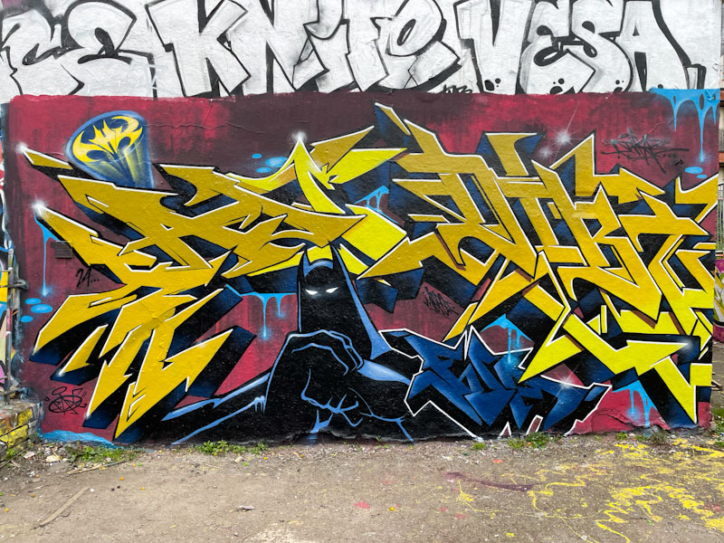
The machine that is Dibz and Fade continues to produce outstanding collaborations, and this one in Dean Lane is a cracker. The Dark Knight is a popular icon for street artists, and Dibz and Fade have gone with the darker variant of the caped crusader, unlike the comedic, lighter cartoonish options they might have gone with
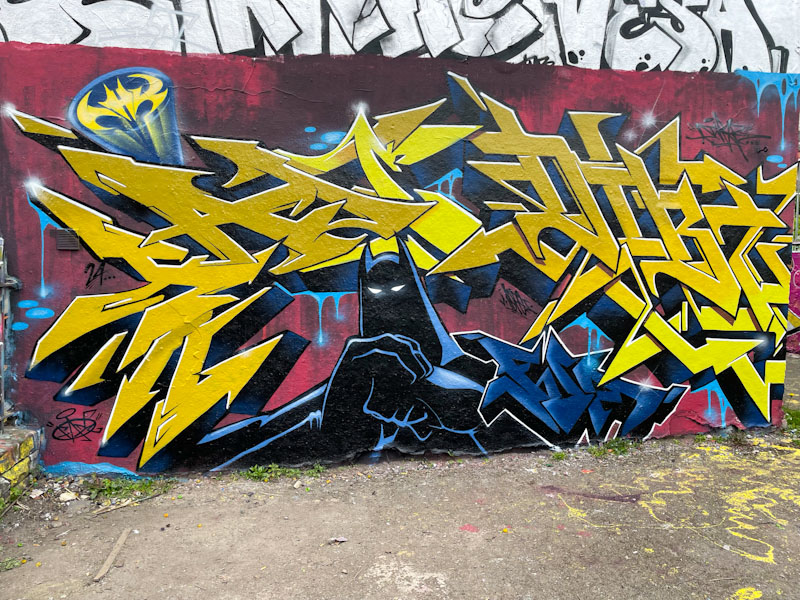
When I asked Fade how I should attribute the artwork in their pieces, he suggested that where the lines become blurred, just label them Dibz and Fade. The writing is attributable, with Fade on the left and Dibz on the right, but the rest of the work is collaborative. A well-thought-out piece, tidily presented – what else would you expect?

In recent years, Haka has shifted his focus a little away from political statements, to the softer world of children’s picture books. The act of graffiti is no less subversive, but perhaps reflects different priorities in the artist’s life right now.

This piece is a faithful reproduction of the iconic children’s classic ‘Not Now, Bernard’ by David McKee, with the obvious replacement of the name Bernard with Haka. The piece, painted on the reverse side of a skate ramp, is in one of Haka’s favoured spots, and is wholly appropriate given that the park is so popular with young families. More, please.


