.
White chocolate-topped
salted caramel cake slice
my elevenses
.
by Scooj
.
White chocolate-topped
salted caramel cake slice
my elevenses
.
by Scooj
.
Aristocratic
surveyor of his domain
goldfish pond in view
.
by Scooj
I think I said this last time I posted a piece by Nevergiveup but I will say it again because it is still pertinent… gone but not forgotten. I discovered a new (to me) graffiti spot in the Cumberland Basin recently, and one which I think Nevergiveup also discovered a little while before he left Bristol.

This rabbit looks like it has had a little dose of nuclear radiation, but apart from the extra eyes ears and tooth it seems to be in the rudest of health. I love the location of this rabbit and for me it really adds to the quality of the piece. Still plenty to come from #followmyrabbits.
More great graffiti writing from Smak on the south side of the M32 roundabout on a stretch of wall he has painted many times. As one would expect his letters are beautifully designed and presented and the colour patterning really cleverly used in each one.

Smak really sets the bar for this style of writing in Bristol and rarely drops below this exceptionally high standard. It is the care and attention to detail that raises the quality of the piece, for example the darker colours on the background are carefully worked and in synchrony with the letters where he could have just presented the whole thing on a dark plain background. Lovely piece.
.
Standing room only
the swollen carriage hurtles
Bristol in its sights
.
by Scooj
It took me three visits to this wall to be able to get some decent photographs of the fine collaboration from Laic217, Ugar and Cory. The solution to my photography problems was to visit the spot on an overcast day. On Autumn sunny days, there is a high risk of shadows from the trees and shrubs being cast across the wall.

Laic217 has once again excelled with this fabulous skeleton with a boogie box over his shoulder, a common motif for his pieces. He has once again shown his mastery of painting materials and fabrics with the skeleton’s jacket. Lovely work.

Ugar, who pretty much always paints his name, even though I have seen a couple of character pieces some time ago, has given us characteristically brilliantly filled letters, something that he excels at.

The third piece in this collaboration is by Cort and rather like Ugar’s piece is creatively and imaginatively filled and decorated. His letters though are a bit of a moveable feast and in this instance he has spelled out CORTOS.

From my perspective the Laic217 piece wins the day, it is simply so good and the artist just gets stronger and stronger.
When I saw this little collaboration from Tasha Bee and Stupid Stupid Meathole, my first thought was that it looked a bit old and weathered, and I wondered if I might have overlooked it on previous visits to Dean Lane… in other words I have absolutely no idea when it was painted.
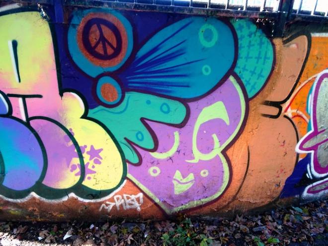
The collaboration is bookended with two beautiful faces from Tasha Bee and filled with what looks like the word ‘meat’. These two have collaborated before in the past, but not for some time. In fact I don’t recall seeing much from Stupid Stupid Meathole for quite a long while.

I’ll always have time for Tasha Bees stylised faces and am equally fond of SSM’s rather grotesque figures. This piece of writing though is quite uncharacteristic because there is lots of colour, not just the single pink SSM usually uses. A nice low-key collaboration.
Two conference days
each inspiring and awesome
refreshed and equipped
by Scooj
Communicate is a national annual conference for environmental communicators, policy makers, scientists, students, film makers and the like from all sectors. It is organised by the Natural History Consortium and is based in Bristol.
Each year I get to meet with my peers and listen to and get involved with cutting edge ideas, with contemporary practice and with exploring solutions. Time to recharge my batteries.
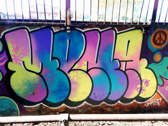
Ah, this is Mr Draws at his happy creative best. His wonderfully recognisable lettering filled with bright and imaginative colours and spme rather nice spotty patterning. Along the bottom of the writing we have some melty drips. All very neat and tidy.

This is unquestionably a feel good piece and with the blue skies behind it reminds us that not every day is dreary and wet, even if it feels like it sometimes. The shadow effect to the bottom and left of the letters is particularly notable. Do you know what, I think Mr Draws is moving up a gear.
This should be fairly quick and simple. Here we have a rather fun column piece by an artist called Zinso. Although I have a few pictures of his work from recent walks, he is a new artist to me and I have not been aware of him before the last couple of months or so.

Zinso seems to have a clear idea of his artwork and executes it cleanly to a rehearsed design (I am guessing), almost like a very fancy tag. Practising the same broad design builds up skills and technique. Zinso already seems well on the way to creating an identity. Look out for more from this artist.


