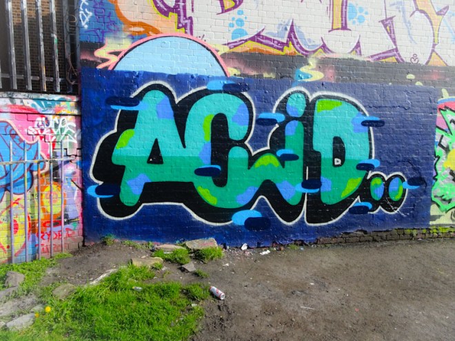
Large windows offer
fleeting moments of escape,
then it’s back to work.
by Scooj
Large windows offer
fleeting moments of escape,
then it’s back to work.
by Scooj
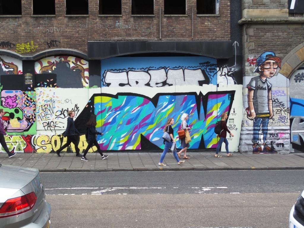
It has been a while since I last took a trip to Raleigh Road, and similarly I haven’t posted anything by Rusk for a while, so here is a piece by Rusk in Raleigh Road. The building work behind these hoardings is moving on at pace, so this spot is on borrowed time, but for the time being it still serves as a great gallery for Bristol artists.
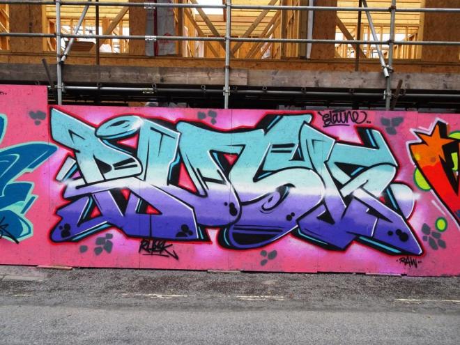
I have always taken a liking to Rusk’s writing, largely because of his perfectionist approach and desire to turn out high quality work. This particular piece incorporates a horizontal colour gradation that he favours in much of his work, with a strong, bright white accent line running through the middle of the piece. The interlocking letters, decorations and colour palette work well together. Another fine piece from this gentle artist.
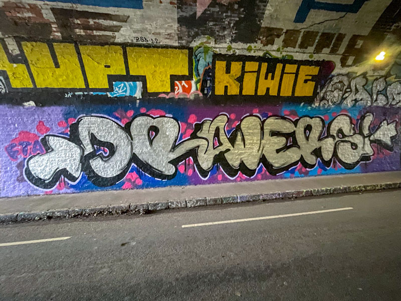
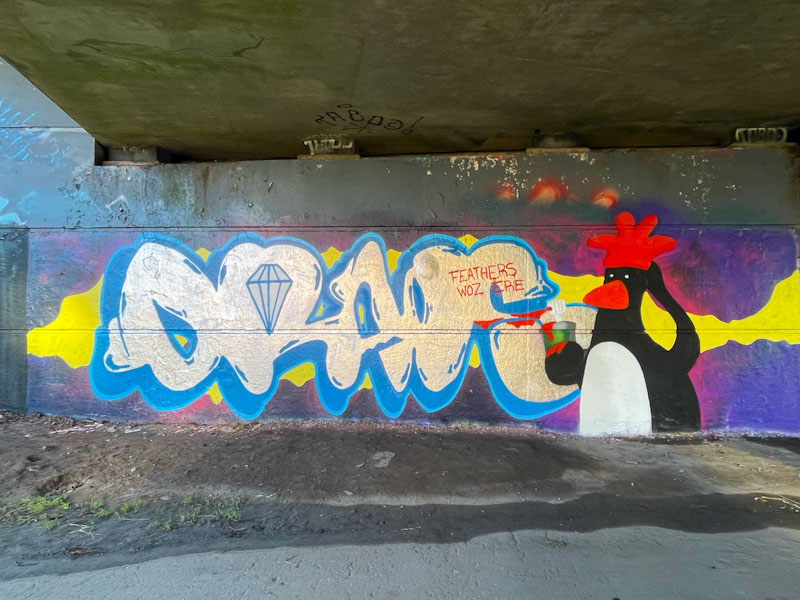
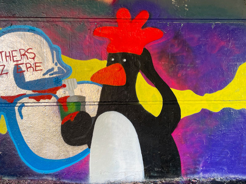
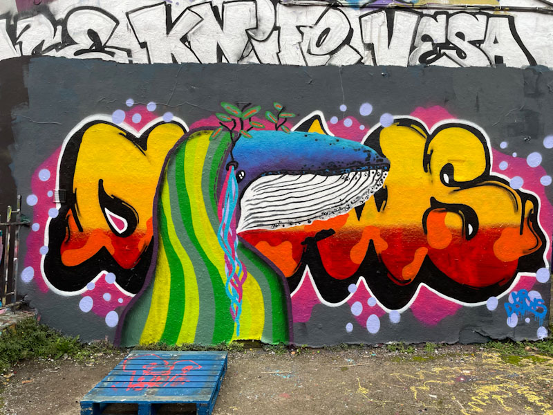
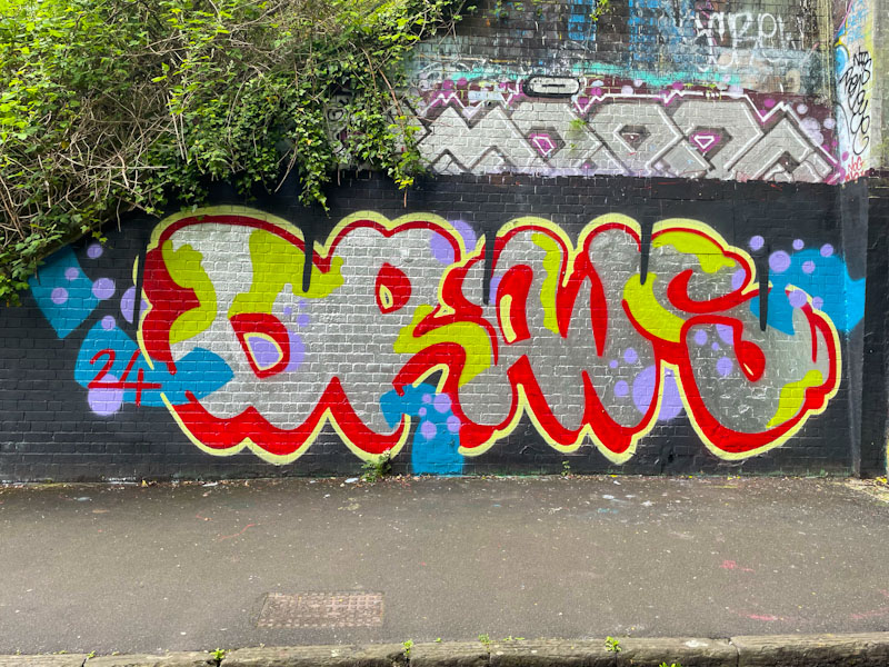
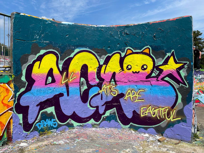
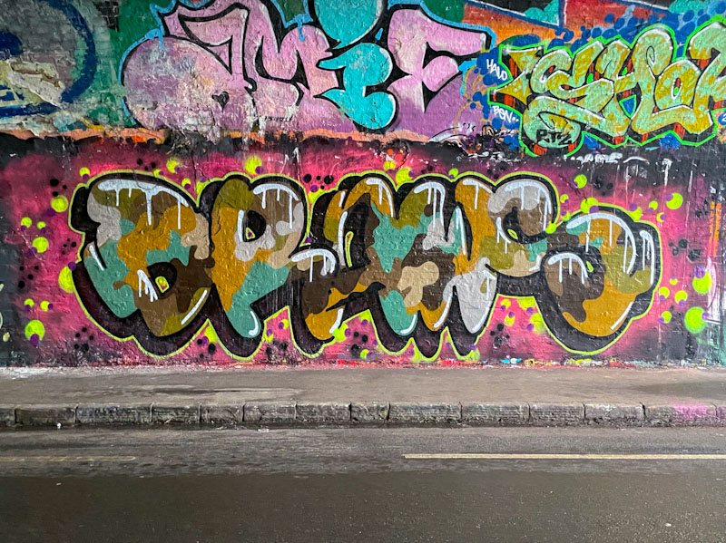
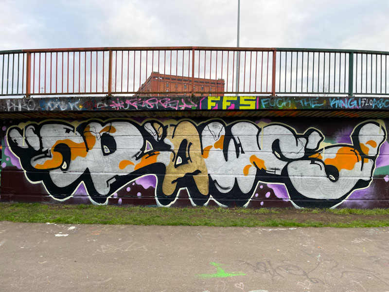
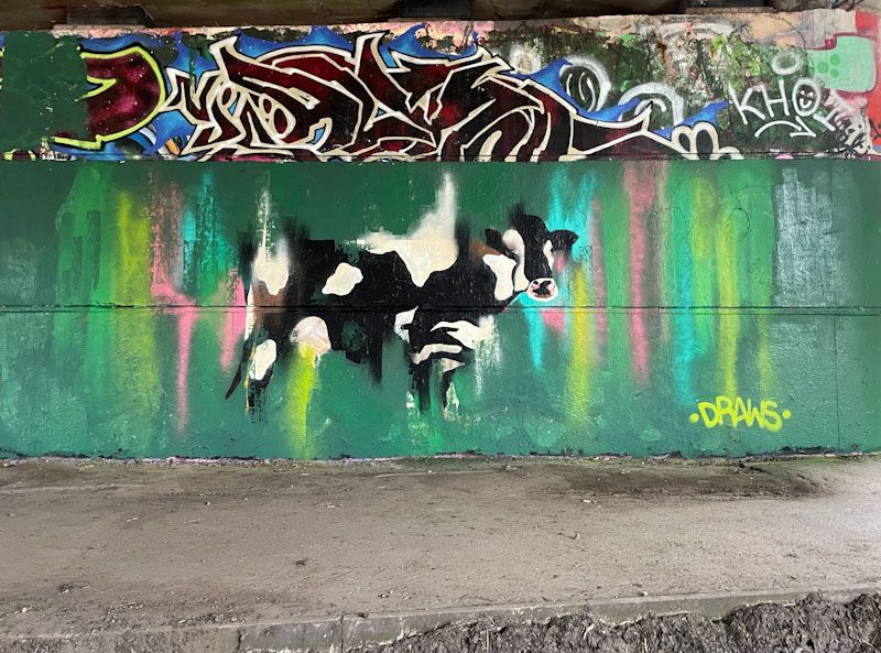
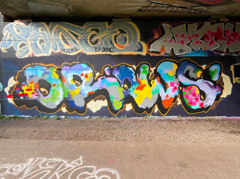
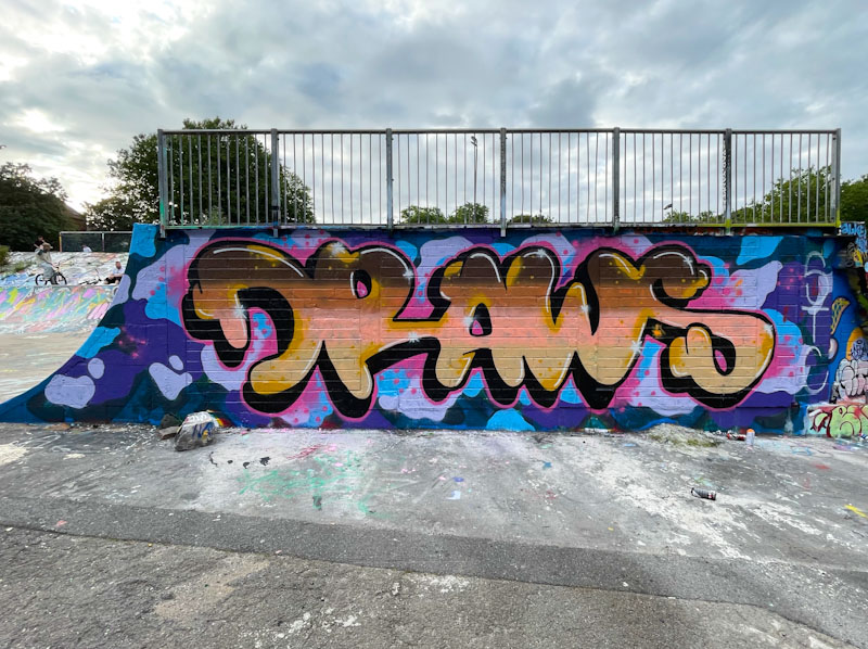
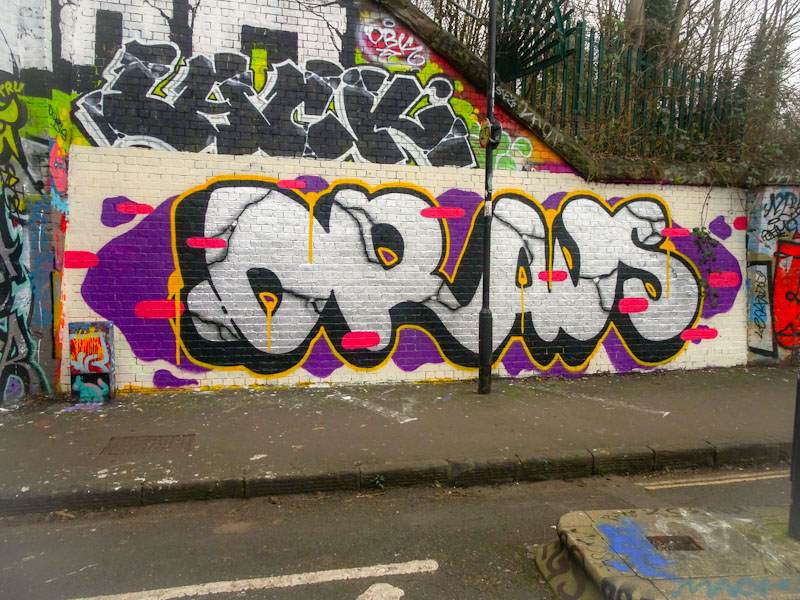
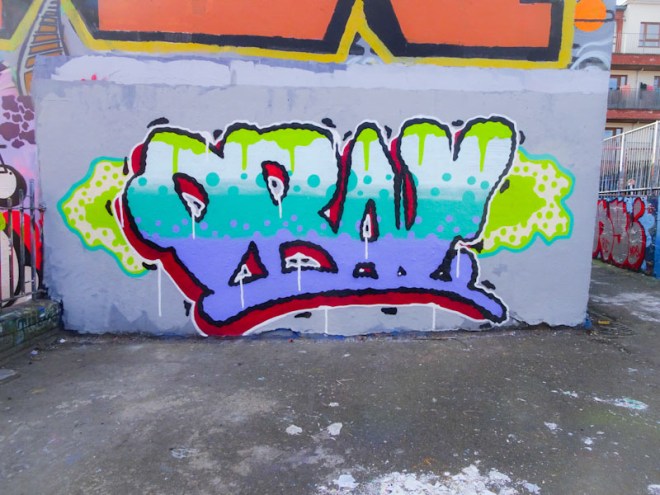
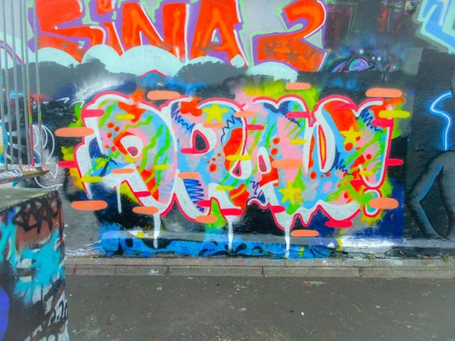
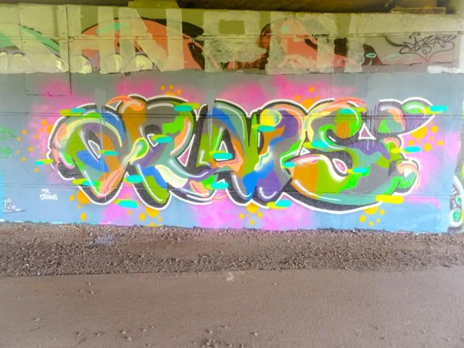
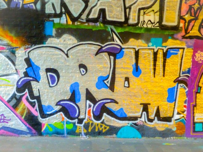
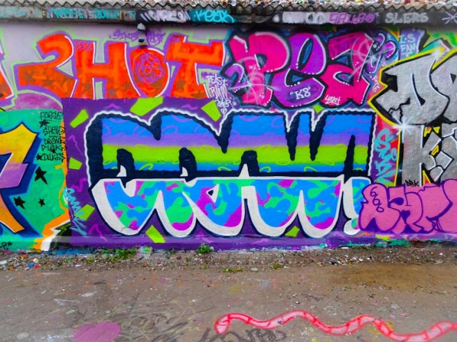
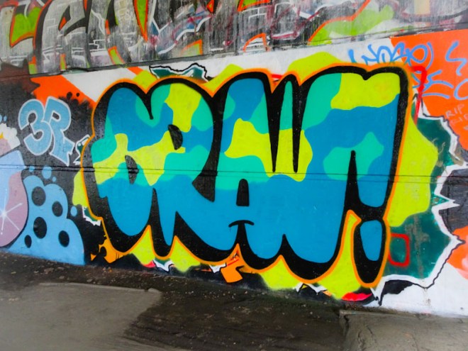
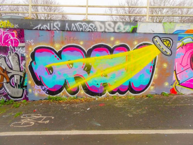
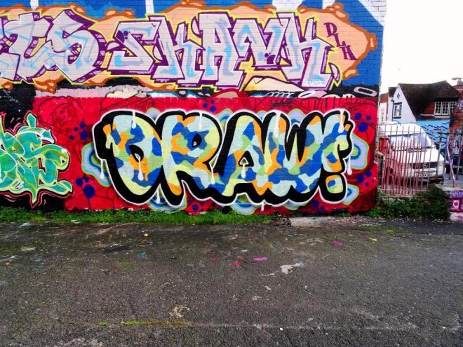
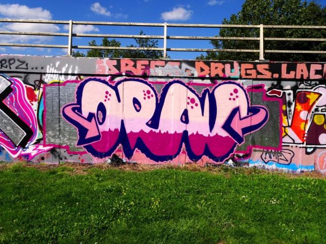
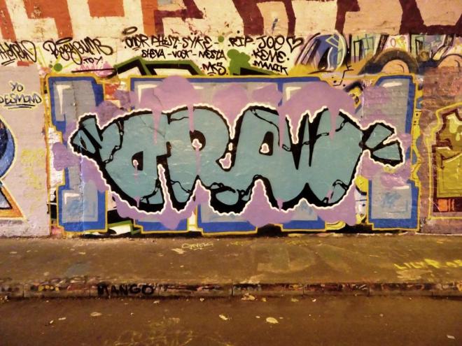
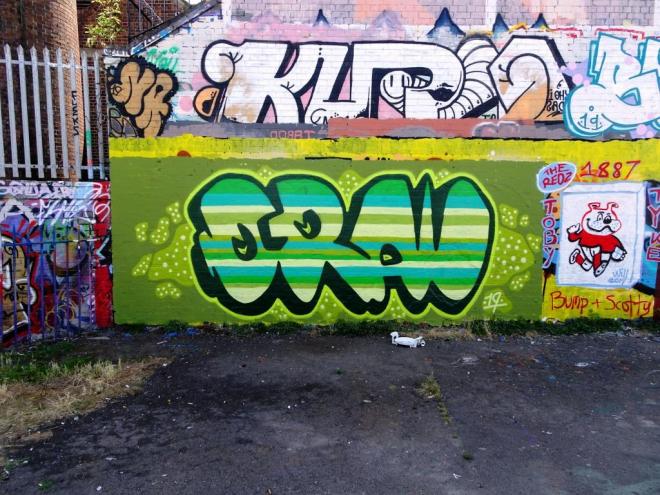
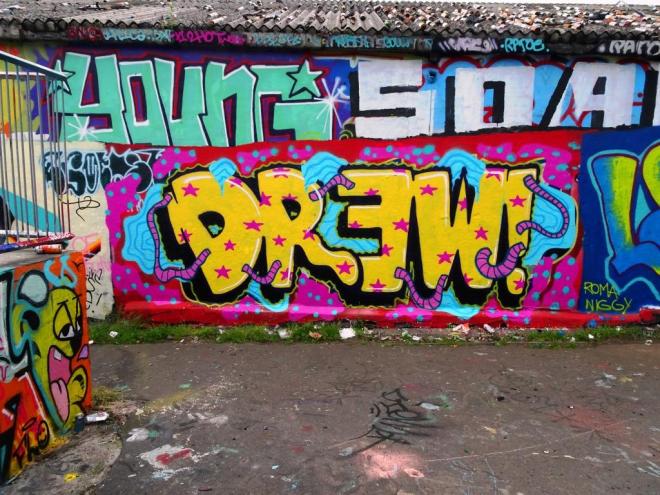
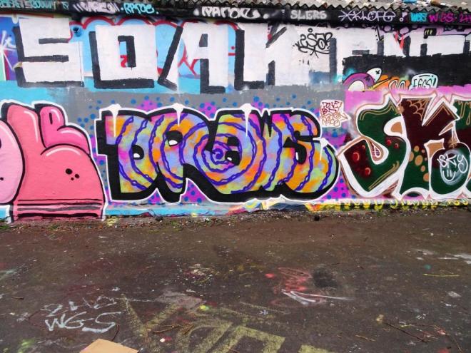
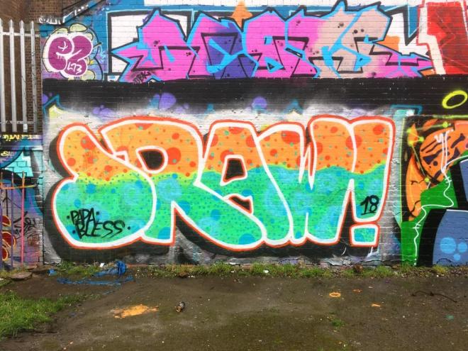
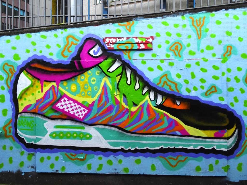
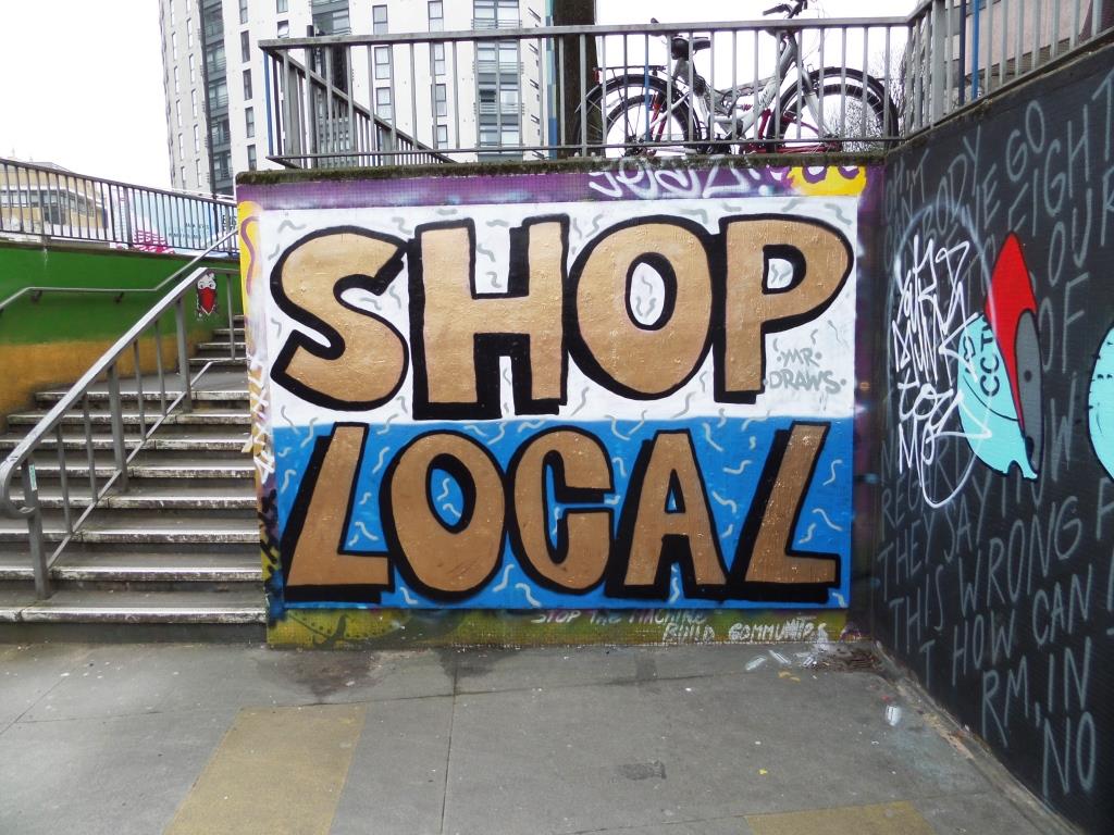
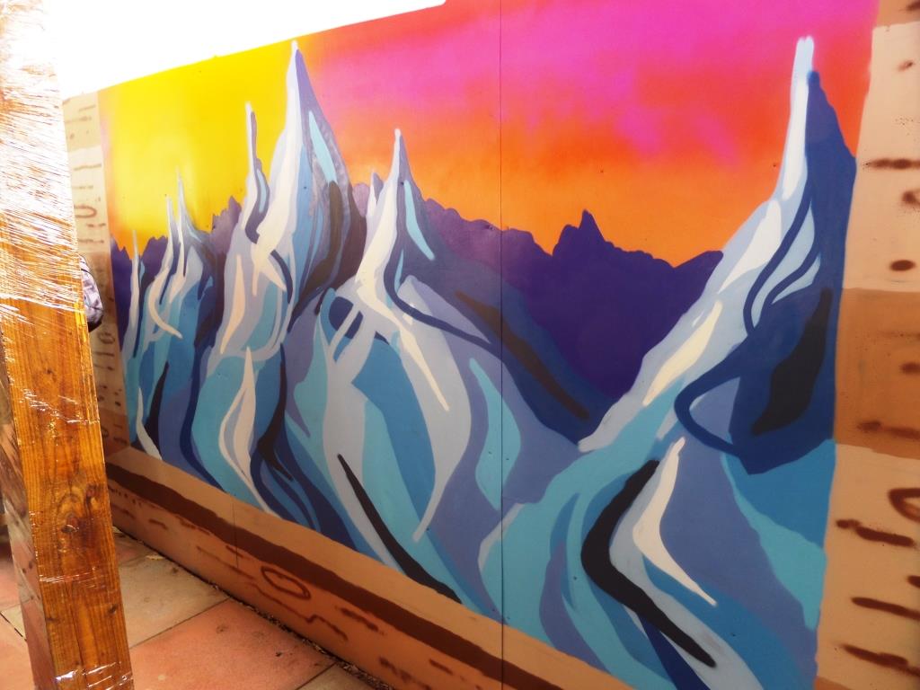
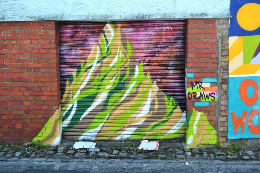
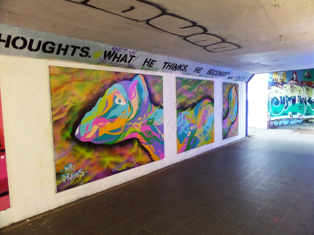
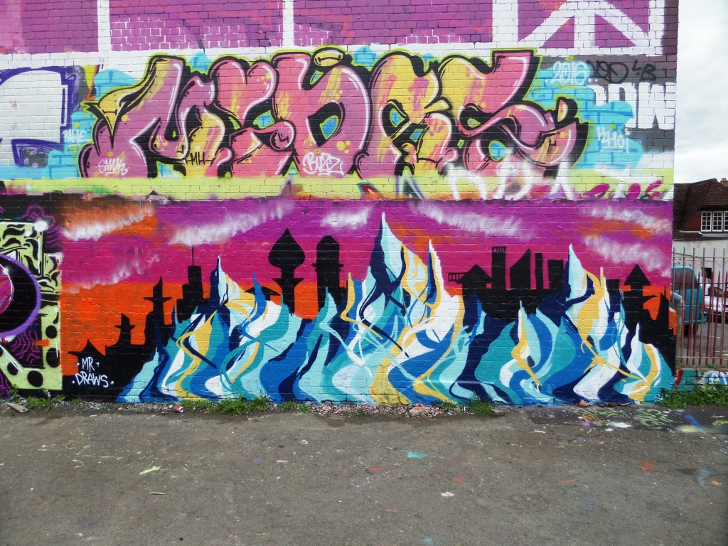
A collection of street art by Mr Draws
All photographs taken by Scooj


What a fine addition to the main drag of North Street from Andy Council. A fresh piece, which I hope will remain for Upfest 2018 from one of the most identifiable Bristol street artists. I understand the artist whose work previously occupied this spot was not overjoyed, but I think I know whose work I’d rather see.
This piece is similar in shape and size to one of his that I posted a few weeks ago on West Street. The subject is of a dinosaur although I’m not exactly sure which one – it looks like one of the ones with a bird-like tail. Typical of his work, we see the whole creation is composed of architectural building blocks and common with Andy Council’s pieces, there is the inclusion of the Clifton suspension bridge. The red billowing smoke adds movement to the whole piece. More fine work from Andy.
Castration, a word
filled with potent undertones;
puppy gets the knife.
by Scooj
It has only been a few weeks since I first was able to put a name to this tag, and since then I have seen it several times. The graffiti artist is Slim Pickings, who is part of the No Frills collective.
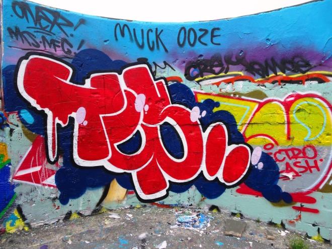
I rather like this curved wall at Dean Lane, and this clean piece stands out really well over the messy burners underneath. I still don’t know enough about Slim Pickings to read what his tag says, but it looks like TEUP or TOP or something like that. More from SP to come.
Door 37
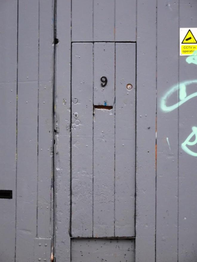
I like these kind of composite doors, doors within doors that are rather shabbily finished. This one has a slot cut out of it for a letterbox and locks on both sides, so where are the hinges?
The most observant among you might have noticed a little blue plaque on the right of the door which is one of Will Coles’ bees that he installed during Upfest 2017 last July. In fact I realise that is it one that I haven’t photographed before, so of course I have to go back to snap it up.

The building is what we used to call a junk shop when I was a kid, but I’m not sure it is terribly polite to call it that. A trader of second hand goods, house clearance and antiques might be more appropriate.
There is also something rather appealing about the angry face graffiti too. A nice grey door – something quite ordinary transformed into the extraordinary by simply stopping to take a look at it.
by Scooj
More doors at: Thursday Doors – Norm 2.0
Sounds like a fine wine
Volucella pellucens;
great pied hoverfly.
by Scooj
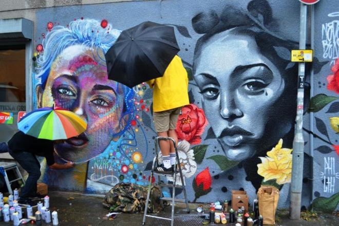
This utterly magnificent piece is by Philth who is the Upfest featured artist for June and who has made this Upfest curated wall his own for the month. Some of you may remember his Upfest 2017 piece which he painted with N4T4 in the rain, both artists sporting umbrellas while at work.

Since Upfest, Philth has gone on a binge of producing the most beautiful floral prints, which transport me back to my home in the 1970s and my mother’s love for floral wallpaper. She had good taste and would surely love this wall by Philth.

This work really needs to be seen to be fully appreciated, it is so different, and it is great to see floral print on this kind of scale. I can’t wait to see what he treats us to for Upfest 2018 (only a month away…can it be true?
Ooh, look at this magnificent wheatpaste by qWeRT on a side road just off North Street. In my eyes this is beautiful, not only for its cuteness, charm and sentiment but also because of the perfect placement.

I have said before on this blog that half the art of paste ups is the location, and qWeRT has absolutely nailed it with this one. There is a framing with the red line on the wall and the little bit of vegetation sets it of brilliantly. I love the artwork, I love my picture and this makes me happy.


