Unwell and in bed
and hanging in my darkened
room, that unwell smell.
by Scooj
Unwell and in bed
and hanging in my darkened
room, that unwell smell.
by Scooj
I have spent a little while trying to find out more about Feoflip. I don’t tend to spend too much time doing this kind of thing, because before you know it, an hour or two can pass. All I want to know is where he is from, but I have a big fail on that one. Feoflip is an artist whose work I love, and fortunately he left his mark in Bristol in a big way after Upfest this year. His Facebook page provides a little bit of information on this, but you might need to use the translate button.

This subtle piece blends in so well with the frame, it almost feels like it was always there. It appears that I am not the only Bristol street art blogger who has a thing for Feoflip, Cosmo recently posted this excellent review of some of his works…in fact she has beaten me to it with most of them.

I have a whole load more of his pieces to share and will try to post them as soon as I can, but I’m afraid the backlog doesn’t get any smaller…aaaaargh.
In far away fields
I left the boy behind but
now I want him back.
by Scooj
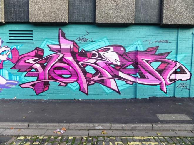
A week or two back I was lucky enough to meet Dibz for the first time. Dibz is a well respected local wildstyle writer whose black book contains works that have been sprayed by crews in London and New York, so he tells me.

This piece was one that I photographed back in May, and really shows off his style. The letters are disguised, but once you know it says Dibz, you can begin to work it out. This is all part of the game for wildstyle writers. I will soon post the piece he was working on when I met him in September. How many more Bristol artists are there out there to uncover? It seems there is no end to the talent here.
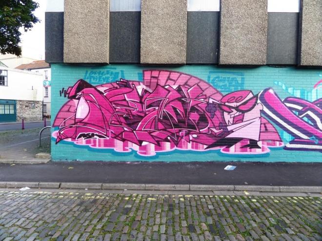
Hot on the heels of the previous post is another grand piece by Sky High. This one rather pre-dates the one in Dean Lane, and is in another part of Bristol entirely. When I took the photograph (back in June), I thought this was a collaboration because of the names of Deam and RPM on the periphery, but I guess this was just a respect thing going on – maybe they sprayed with him on the day.

Sky High’s pieces are so vibrant and the block lettering is in such a distinctive style. So far these are the only two of his works that I have seen, but both of them are winners. I’ll be looking out for more of his work on my trips to London.

A short while after Upfest, this wonderful piece appeared at Dean Park. Sky High is a writer whose work spells out ‘Sky High’ using different styles and colours for each of the letters set on a contrasting and interesting backdrop. This work is typical and really wonderful.

His colour selections and lettering are exceptional. The piece didn’t last very long at all. This particular wall sometimes only lasts a day before being painted over. During Upfest it was painted twice in one day. More of Sky High’s work to come in my next post.
Only the crying
gulls break the monotony
of overcast skies.
by Scooj
This wonderful piece appeared a few days after Upfest had ended, and I guess Feoflip decided to stick around and improve some bare walls. I really love this piece, the soft pastel colours give the piece the look of an illustration. The character looks like it has just walked off the pages of a children’s picture book. I would love to read that story.
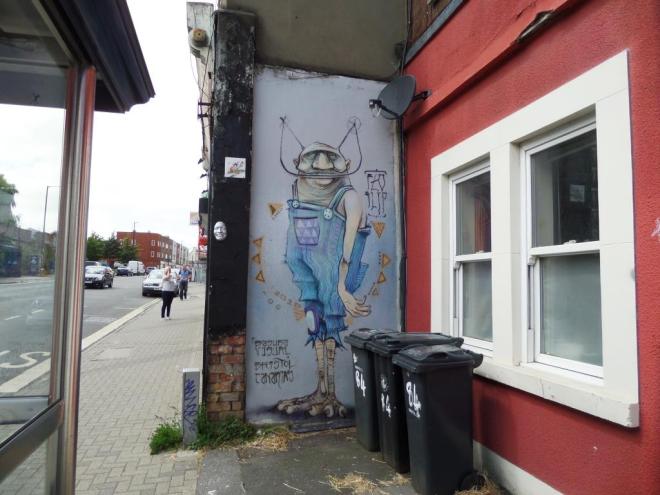
Feoflip was unknown to me before Upfest, but I have now seen several of his pieces all over Bristol, and will be sharing them over the coming weeks. He is fast becoming one of my favourite artists. I love the combination of organic and mechanical, it works very well, as with his piece at Ashton Gate School.
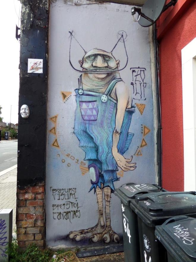
The more observant reader may also notice the Gregos mask just to the left of this piece which I wrote about last year.
Tears of a grieving
mother, stained in red tribute
where he used to skate.
by Scooj
http://www.walesonline.co.uk/news/wales-news/university-basketball-captain-died-after-11976867
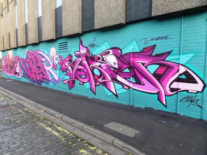
Just once in a while you see a wall and just go ‘wow’. This was one of those walls. Deamze, Voyder and Soker have collaborated before and seem to really go to town when they do. My only regret posting this is that these pictures really don’t do the wall justice, the pinks are absolutely amazing.
Deamze has a brilliant theme going on with a cartoon character rounding off his moniker. A quick Google search informs me it is from Dexter’s Laboratory – not a cartoon I am familiar with…it’s my age.


Voyder is in the middle, as usual, and sprays his signature with those beautiful curving letters. I wonder if their positioning is like the ‘Ant and Dec’ thing where one always has to stand on one side, and the other on the other.
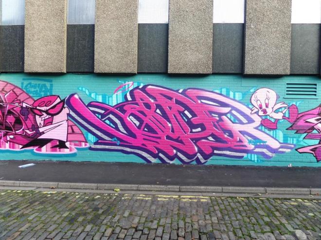
Joining the work of Voyder and Soker is a ‘tweetie pie’, I’m not sure which of them sprayed it, but it spans the two pieces well.
Soker rounds off the triptych with great wildstyle writing that we are used to seeing from such a master. These three pieces together are genuinely breathtaking. Let’s hope these three get together again soon.