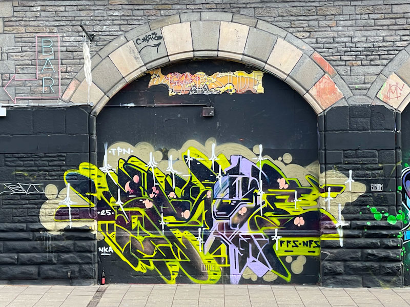
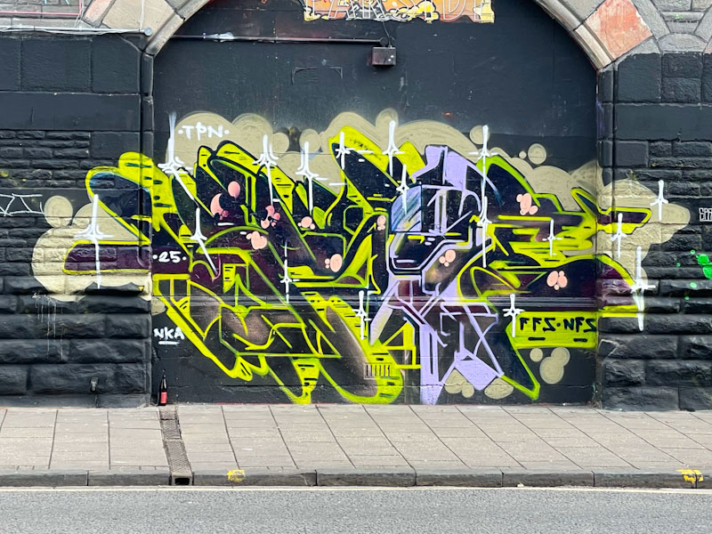
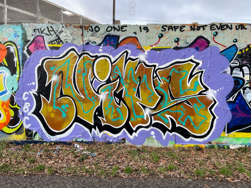
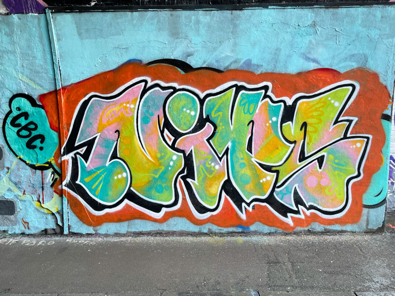
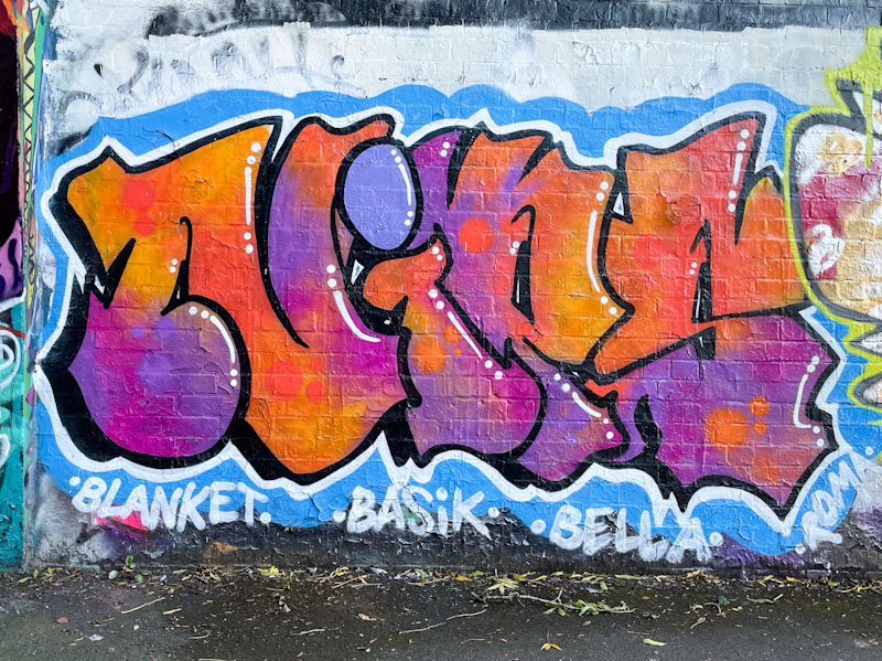
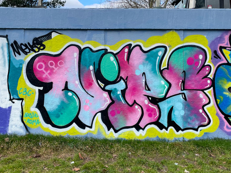
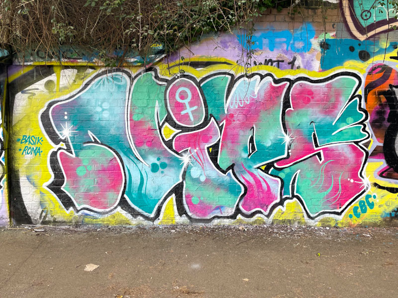
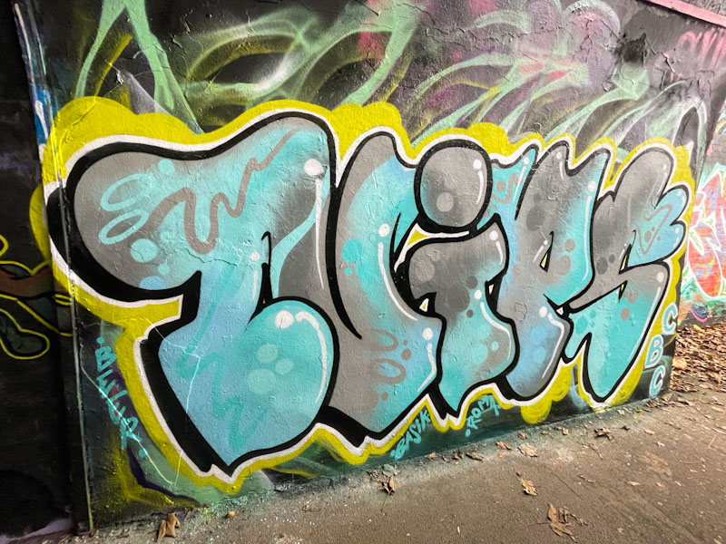
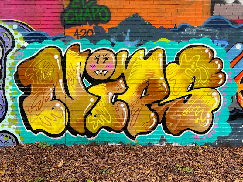
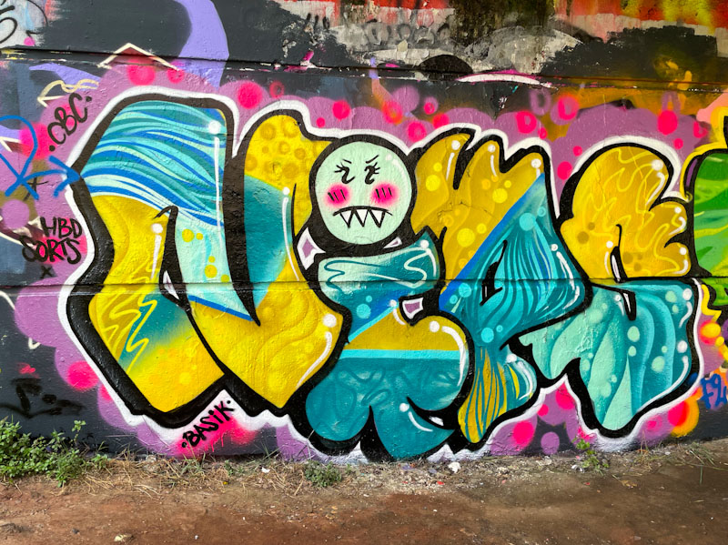
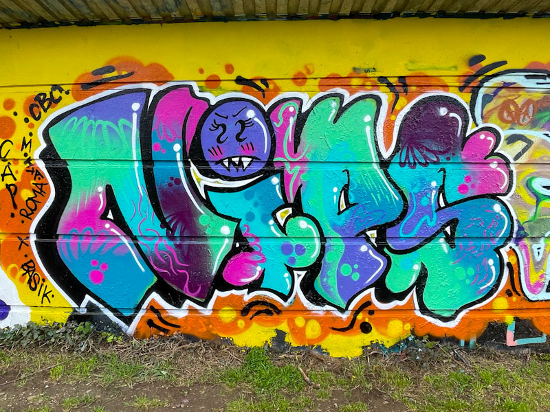
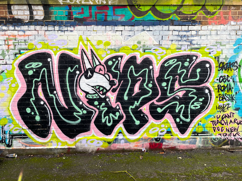
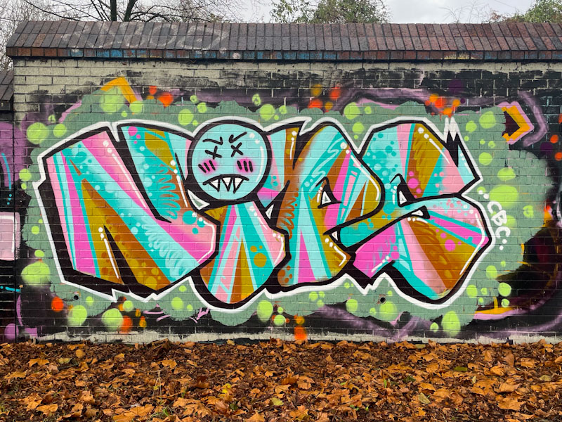
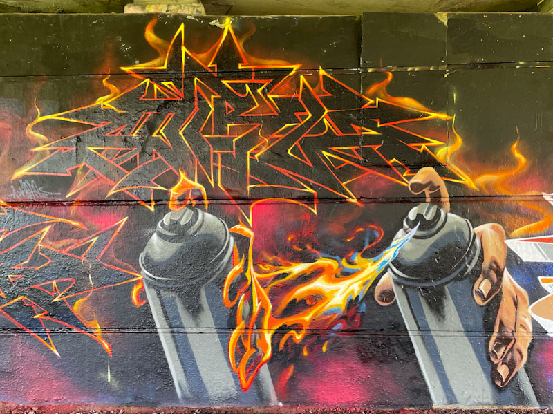
I would say that Mr Klue is the (undisputed) king of St Werburghs tunnel, on a measure of number of pieces painted there. It seems to be the place he enjoys painting most, and it is rare to not be able to find something of his at any one time.
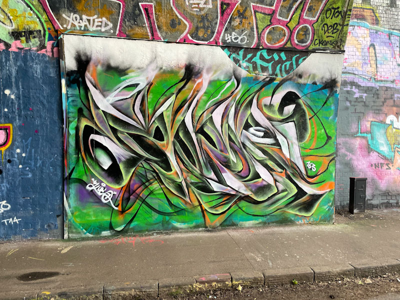
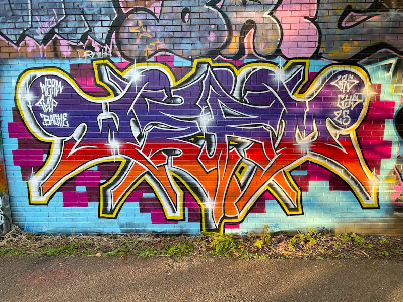
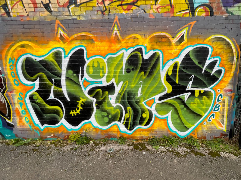
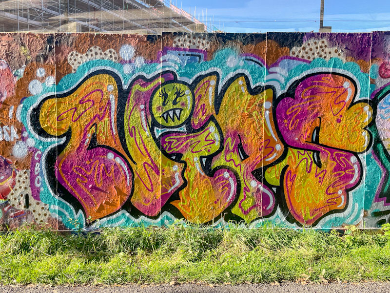
This is a colourful one, as ever spelling out KLUE, which is notable perhaps for the way the wispy tops of the letters bleed into a cloudy mass, which might have been there from a previous piece. The central colours are green and orange, which often work well together, but there are also injections of purple and white. The use of these colours combines to create depth to the piece which is on the cusp of being anamorphic. We can be certain that there will be more to come.