
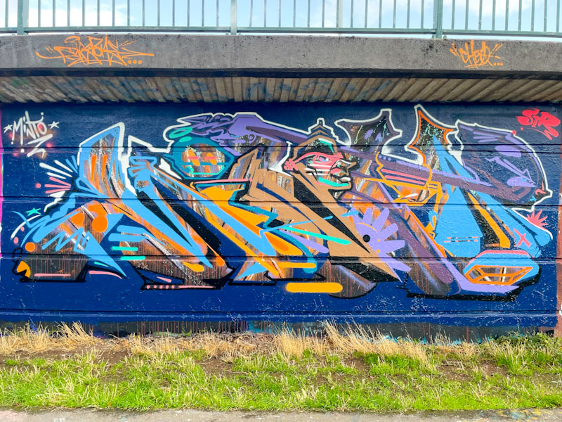
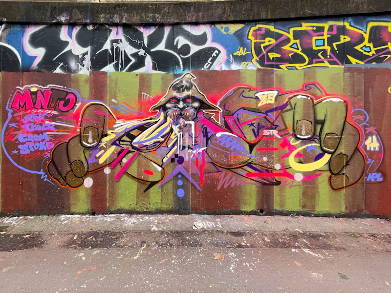
A gallery of illustrated graffiti writing from the brilliant Bristol-based artist Minto
Instagram: @instaminto
All photographs by Scooj
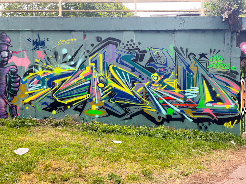


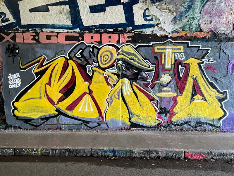


A gallery of illustrated graffiti writing from the brilliant Bristol-based artist Minto
Instagram: @instaminto
All photographs by Scooj

The day after the wedding party before… Actually I was a designated driver last night and am feeling good, apart from suffering with a sore throat from competing with some rather loud music. I feel my age on these occasions. I am pressed for time this morning, so a couple of quick posts for you.

DFC1848 paid one of his occasional visits to Bristol in May, and left a few of his hallmark character pieces behind, including this cutie under the M32. As ever it is always great to see his characters, which he has been developing over the last few years. I fully expect to see him painting at the Cheltenham Paint Festival next month.
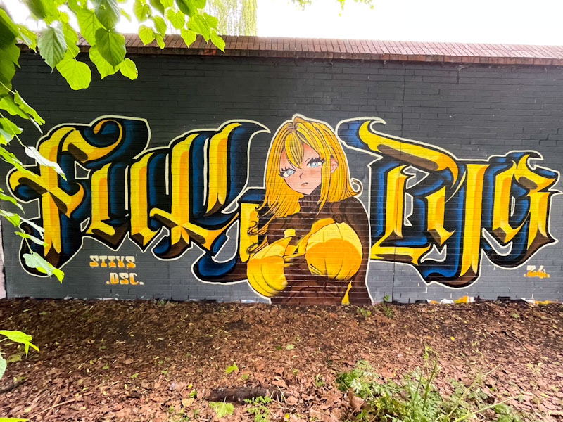
Stivs has utterly smashed it with this outstanding writing/character combination piece, which was painted alongside a Kosc piece (featured a few days ago) on the long wall at Sparke Evans Park. Stivs is an artist of many talents, and although he in well known predominantly for his calligraffiti, he isn’t half bad at painting characters, as this piece demonstrates.
Although he is a bit of a ‘potty-mouth’, this piece reads ‘FUK PIG’, he dresses the letters up so beautifully, that it kind of creates a profanity filter of sorts. The cartoon-style character, probably lifted from a film or cartoon series, is beautifully presented and makes you wonder why he doesn’t paint characters more often. Together with the Kosc piece, this is one half of a very fine collaboration.


I am taking a little break from Upfest now to concentrate on the street and graffiti art that happens every single day in Bristol, the lifeblood of the urban art culture in the City. One of the stalwarts of this culture is Biers (a name I use because this is what he used to write when I first encountered him – he goes by several other names these days, including Jimothy Slip).

This is a very neat and tidy WD40/character combination piece, although I have had trouble identifying the character peering out of the ‘0’. The fills in the letters are nicely worked and the thick white drop shadow lifts the letters nicely above the lime green background. A nice piece from Biers.
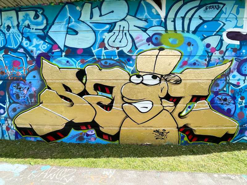
Rather annoyingly, I keep missing pieces by Sait Bare, either finding them prior to completion or that they have been overpainted, so it was a relief to find this one finished and intact. This letter/character combination piece is painted in a metallic gold colour, that is strong, and the background decor reflects the general messiness of the wall.

The letters spell SAIT with the character taking the pace of the letter ‘i’, and there is a deep red and black striped drop shadow. The character is painted in a carton style, with the eyes and mouth standing out in white against the gold. There is a lot to like about this piece and I look forward to finding more from Sait Bare.
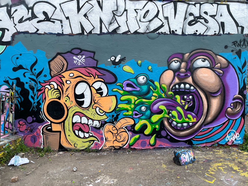
You don’t often see the PWA crew paint this particular wall in Dean Lane, I guess because there are usually three or more of them painting together, but this time it is only Chill and Zake, so there is room here for both of them. The two portraits, in very different styles, are interacting really well together and integrated using a common background.
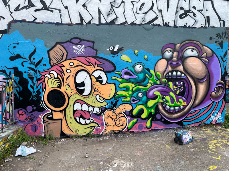
Chill’s portrait is both colourful and full of fine detail, and has that accuracy that is common in artists who are also tattooists. He is also responsible for the wonderful silhouette plants and signature song bird. Zake’s portrait, is a little softer and full of depth, with a slightly odd scene of fish and water flying out of the character’s mouth. While I am not too sure what is going on, it makes for entertaining viewing. The pairing is great to see, and this is certainly a memorable collaboration from them. I’m not too sure it lasted very long though, which is a pity.

There is something rather unique and weirdly charming about Awkward’s character pieces. There really is nothing like it out there in Bristol or anywhere else I have been. Not only are the characters unique in style, but his use of strong primary colours grabs the attention and draws the eye.
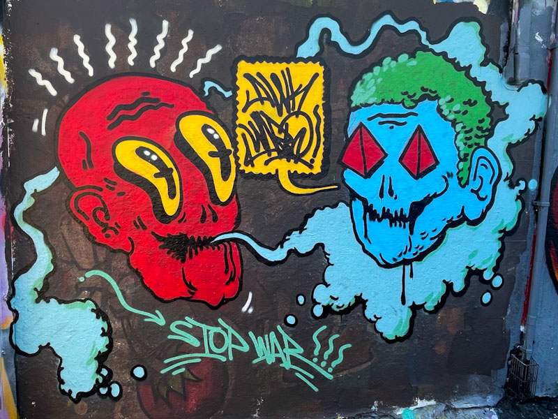
In this piece two characters are exchanging thoughts, one with a speech bubble saying ‘Awkward’. underneath the conversing heads is the simple message ‘stop war’, which places the piece very much in the context of the present, with the terrible wars in Gaza and Ukraine ongoing. Although his interventions are infrequent, Awkward’s characters are always welcome.
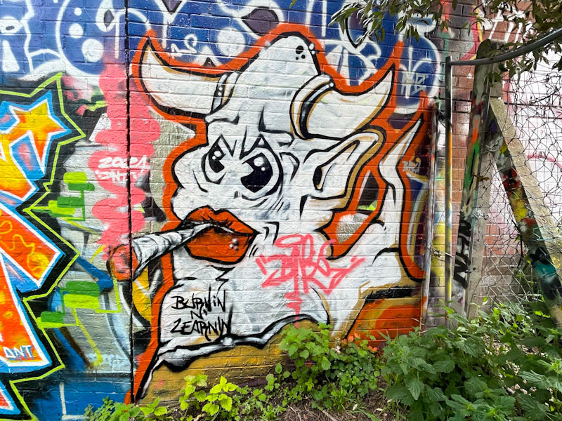
Now this is a rare thing indeed, a piece by DNT, an artist who hasn’t painted too much in Bristol over the last few years, but who at one time was one of the central artists painting in the Stokes Croft area of the city. His unusual and creative pieces have always been on the margins of the mainstream art we see so much of here.

This piece was painted alongside Klashwhensober recently, and is most welcome. The character is a bull, smoking a rather large joint, reminding me a little of the ‘Camberwell carrot’ from the outstanding film ‘Withnail and I’. There is detail and accuracy in the piece that gives away his skills and experience as an established artist. I sincerely hope that this might be a renaissance from one of my favourite artists. You can see more of his work in this gallery.

The productive partnership between Mr Crawls and Mote continues without interruption. What is comforting bout their work is that both artists are continually evolving, and their influences on one another converge and then diverge, so in this collaboration, we see that slight divergence of styles.
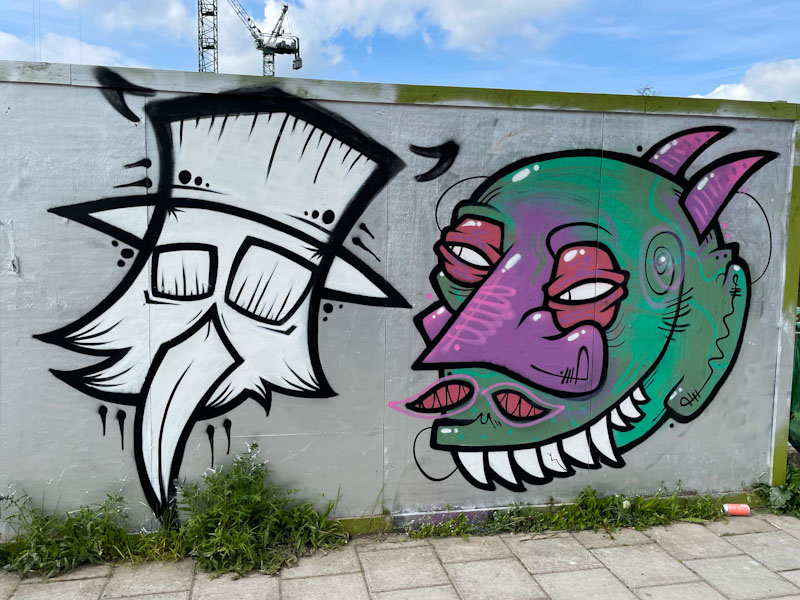
Mr Crawls has recently been experimenting with monochrome pieces and developed more of an angular approach to his stylised bird characters, quite a shift from his early pieces. Mote, meanwhile, is creating ever more sophisticated monsters, and working hard on particular features such as the eyelids. I continue to derive so much pleasure from these two character artists.
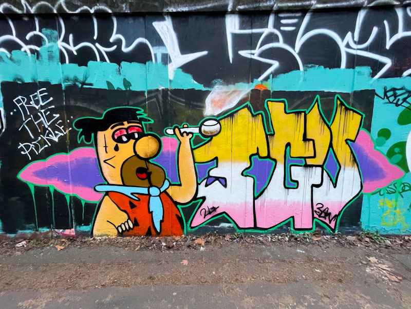
I have been aware of 3GV’s work for a little while now, but this is the first piece I have posted on Natural Adventures, which I photographed back in January this year. It has taken me a little while to post because I wasn’t too sure who the artist was, and whether this was a one-off or not. I have since seen several more pieces which I will try to feature in future posts.

3GV has an interesting combination style, which incorporates characters and his letters 3GV. While his work is quite undeveloped and raw, he has something about him, and with plenty of practice, I fully expect to see his work in some of the more prominent spots before long. The Fred Flintstone character is recognisable, and the rest of his artwork comes together to create something quite eye-catching. Practice on his technique and finishing #will lift his work from ‘good effort’ to outstanding – let’s see where this goes.


