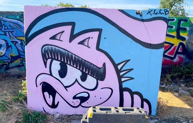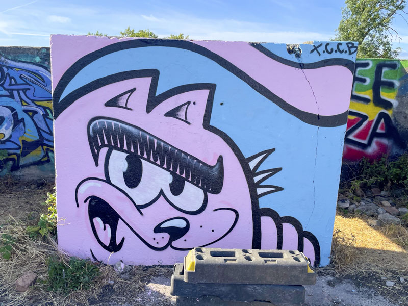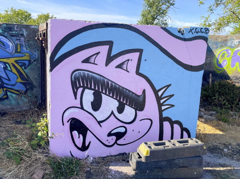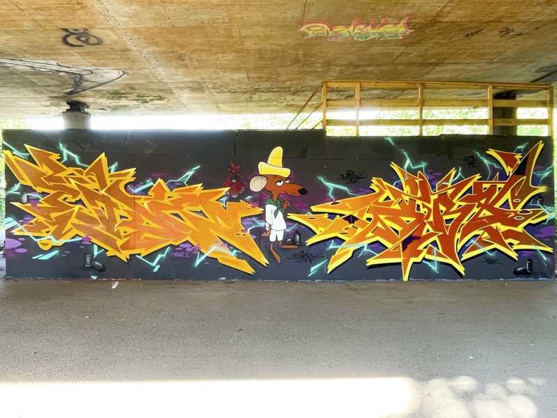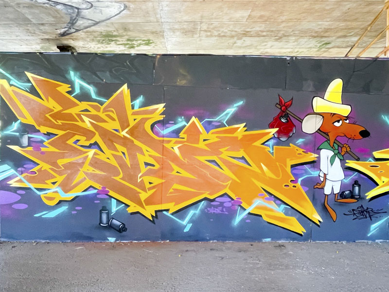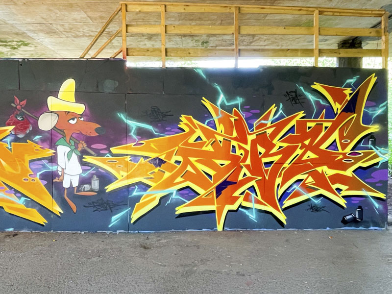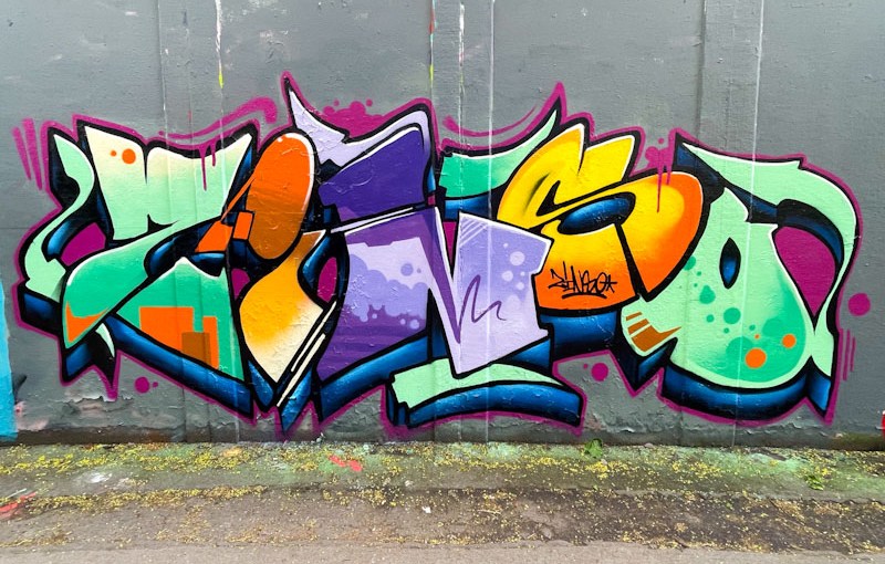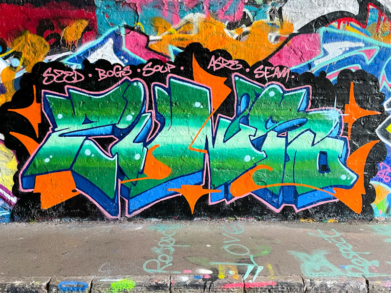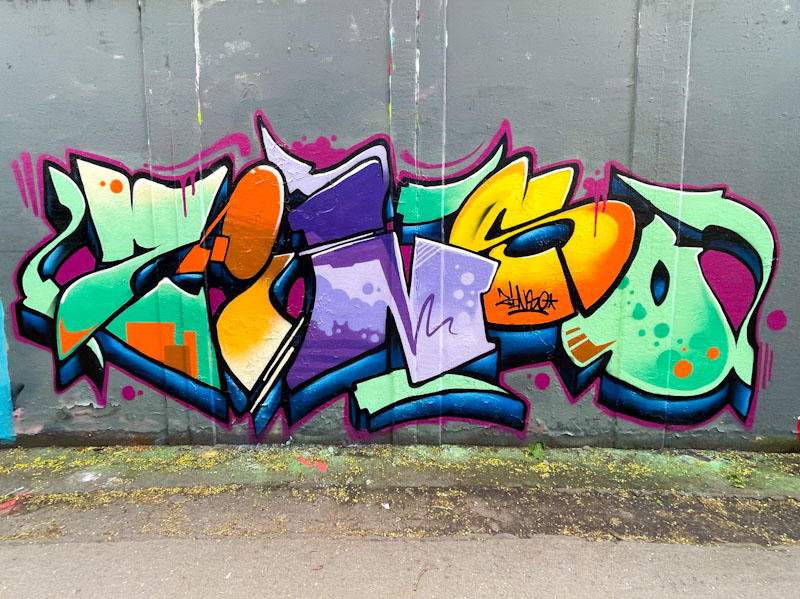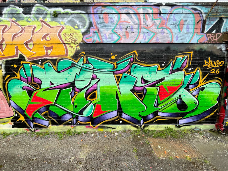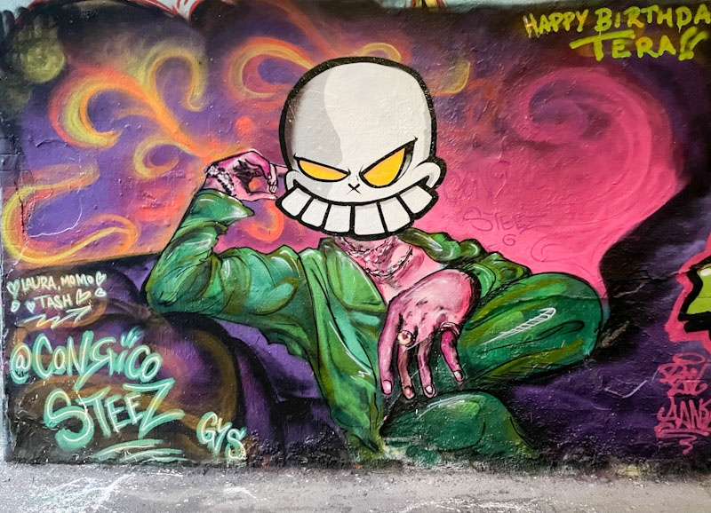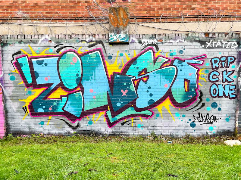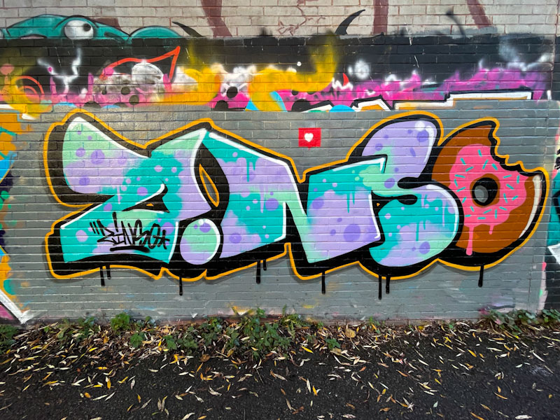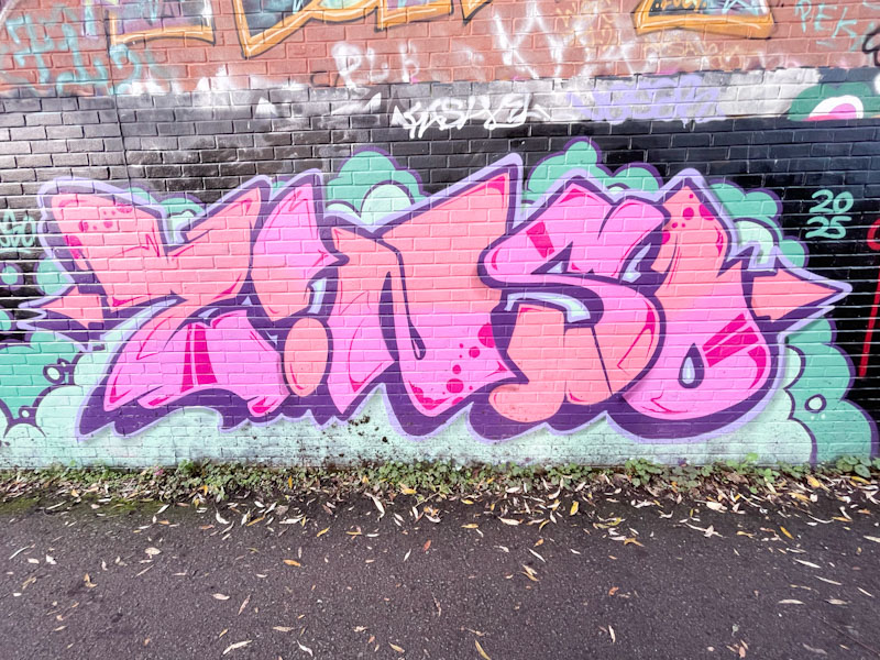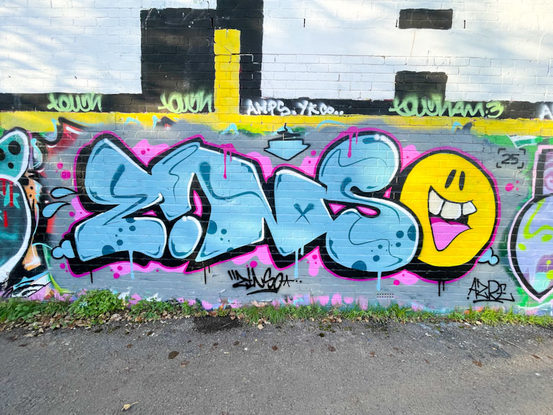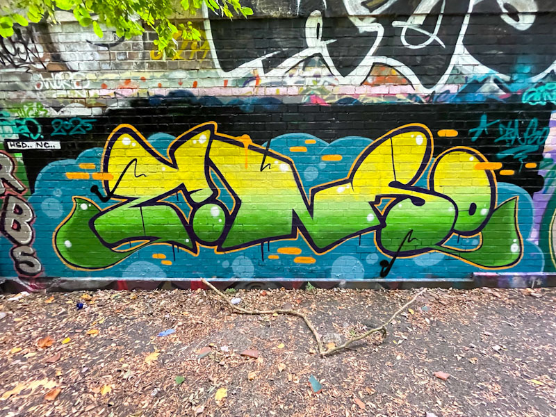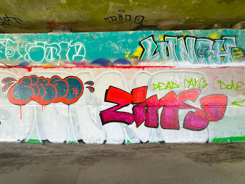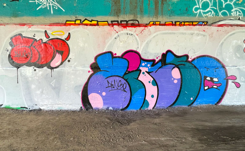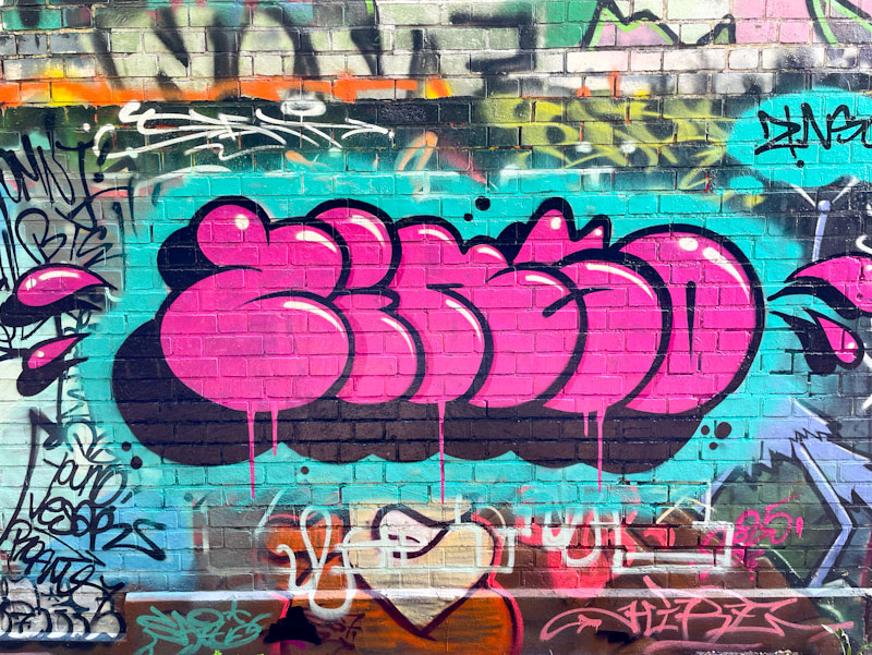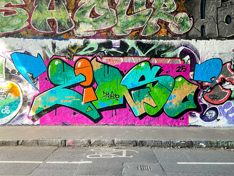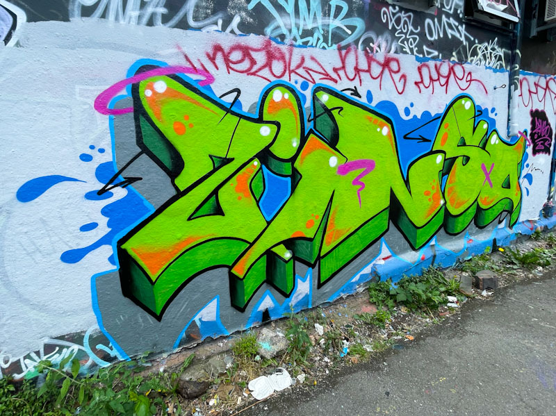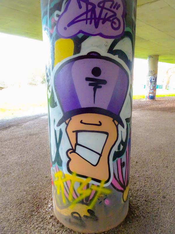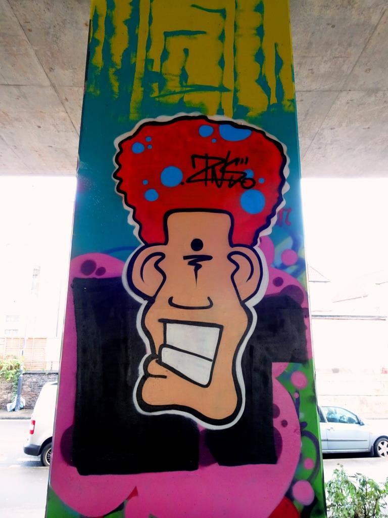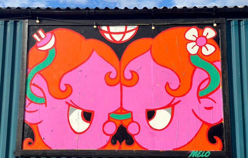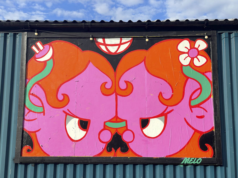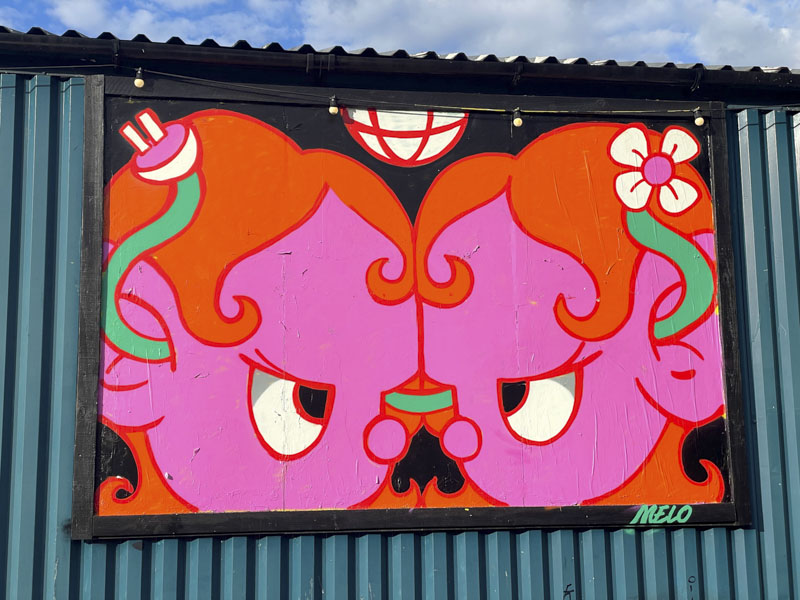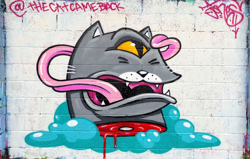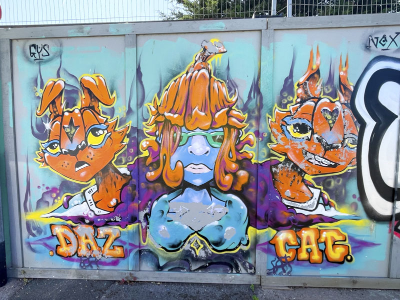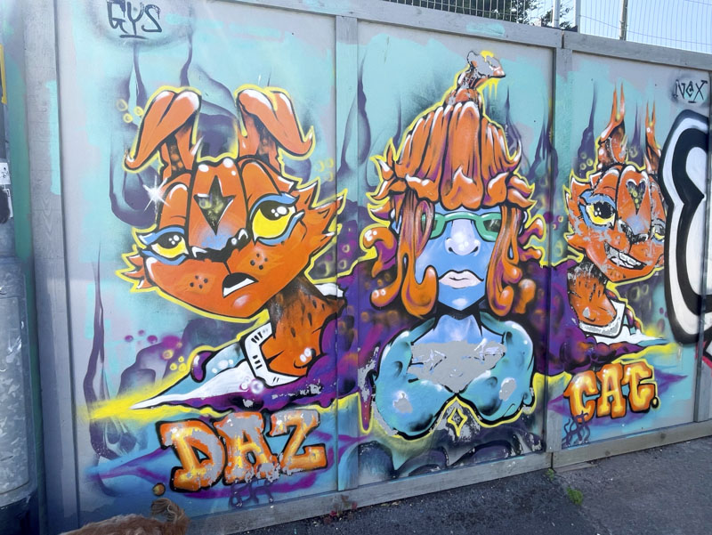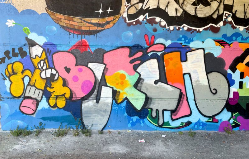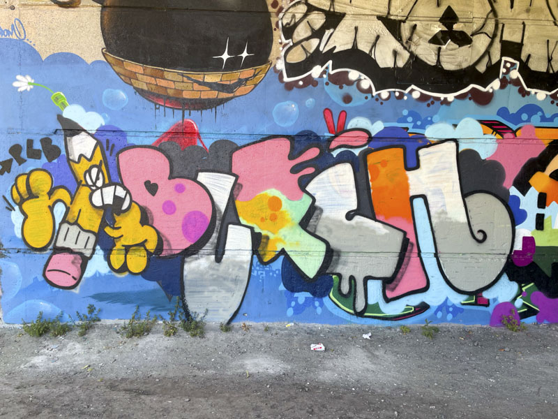
A gallery of superb character street art by Bristol artist I am Ian.
Instagram: @iam.ian.m
All photographs by Scooj


A gallery of superb character street art by Bristol artist I am Ian.
Instagram: @iam.ian.m
All photographs by Scooj


Conrico has had an exceptional few months, and even managed to secure a wall at Upfest 2026, something that I know he had been eager to achieve. His style of painting with ‘brush strokes’ using spray cans gives a unique look to his work and in particular his portraits.

Sandwiched between Werm and Kool Hand, this portrait piece features a woman taking a photograph of Kool Hand’s piece. I do like it when street art interacts in this way. The woman is beautifully presented and like many in his portraits has dyed hair. She casts a curious shadow which lifts her away from the wall. Lovely stuff from Conrico.

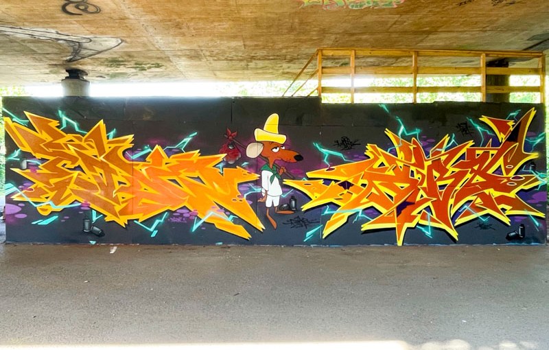
A recent paint jam alongside the M32 had a rather unusual Central American theme the likes of which we don’t often see in Bristol, perhaps for obvious reasons. This colourful character piece by I am Ian features a gun-toting ‘Mexican’ bandit.

The character, complete with sombrero and poncho, is a little bit stereotyped, which is not surprising as much of our understanding of such things is via the consumption of spaghetti westerns of the late 20th century. There is some great perspective in this piece, and I rather like the desert background including several cacti. More from this adventurous paint jam to come.

An unusual and rather grotesque piece by My Dog Sighs at this year’s Upfest, one of two very different offerings by the artist. I don’t think I have ever seen something similar to this by My Dog Sighs, and it is a departure from some of his staples, although the eye is very much a part of his repertoire.
My Dog Sighs has managed to use the space perfectly to present his ugly and distorted monster face. The mouth is perfectly placed over the door, consuming all that enter here, and there are dropped eyes either side of it. The eye on the right is a window of the building, but looks like an integral and deliberate part of the character piece.
Stretched green skin with stitches and warts add to the overall creepiness of this character piece. The signature eye is what gives this away as an MDS piece, in which you can see a reflection of the viewer and a wall and tree behind. Such incredible detail everywhere you look. Utterly outstanding in every aspect.

I’m not sure I have seen Benjimagnetic and Awkward collaborate since last year, but here they are in fine fettle, on the side wall of the swimming pool, tucked behind a bushy fence, well out of sight of most passers by.

The letters in this collaborative piece are by Benjimagnetic, and I can’t for the life of me read them. He normally writes 3 letters, so this is quite different. The cheeky, creepy red and yellow characters are by Awkward and augment the letters really well. A nicely integrated collaboration from the pair.

I have had a very challenging day. Super-busy at work. Laptop overheating and running extremely slowly, I’m overheating and running extremely slowly, and I have had to squeeze this post into a compressed lunch break. At least this post features a top combination collaboration by Veks and Bandito.

Veks has painted a classic b-boy character wearing the uniform of hoodie and baseball cap, and clutching a spray can. Beautifully presented is a timeless retro style. Perfect.

I haven’t seen anything by Bandito for years, so it was a very pleasant surprise indeed to see this piece in a tickz memorial wall paint jam. His slim letters are so characteristic of his work. The letters spell TICKZ and filled with horizontal colour bands that are beautifully blended. The slim yellow border finishes it of nicely.

The range of pieces at this year’s Upfest was notable from extreme high-end murals to regular Bristol graffiti writing and pretty much everything in between. This is a vibrant doodle-style piece by London-based Zebra Pozer.

The artist claims that he isn’t seeking perfection but bringing spontaneity and fun to his work, and I can completely buy in to that philosophy. Set on a pink background, the characters in this piece are crammed together and splashed with pinks, blues and yellows that breathe life into the black outline folk. Something a little different.

I haven’t seen a piece by London graffiti writer Tizer for a very long time, so it was great to come across this one on the long wall recently. The piece was painted as part of a paint jam that included ARSA, Minto and RBN One amongst others.

The combination piece features his TIZER letters bookended by a pair of characters, one liking rather sweet and the other ghoulish and sinister. Tizer’s style isn’t crisp and clean, but rather more detailed and brush-strokey if you know what I mean. A very nice surprise from the occasional visitor.

This is a very tidy piece by Kid Crayon on the long wall at Cumberland Basin. The combination of letters and characters works really well, and the whole thing feels like an integrated cartoon-style burner.

The large blocky letters are not uniform in distribution and size, but do stick to a font style. The character in the centre of the piece is holding a balloon fish – don’t ask me why, he just is. Another example of Kid Crayon’s creative and humorous work. Brilliant.

This is an infrequently painted fence which was in need of a bit of a tidy up, and Serm has duly obliged. The combination piece features some lovely intricate lettering spelling SERM with a very deep drop shadow offering a strong three-dimensional aspect. Very much two-dimensional is the well-known cartoon character – the Pink Panther.

I incorrectly identified this as an Avem808 piece originally, but he got in touch to say it wasn’t him, and so I had a closer look and the piece was indeed by Serm. It can be easy to get these things wrong from time to time. Great to see a new piece by Serm, as he doesn’t get out to paint all that often.