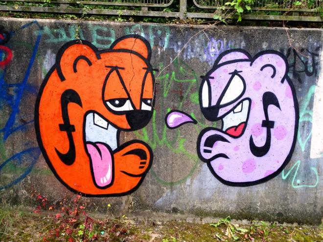
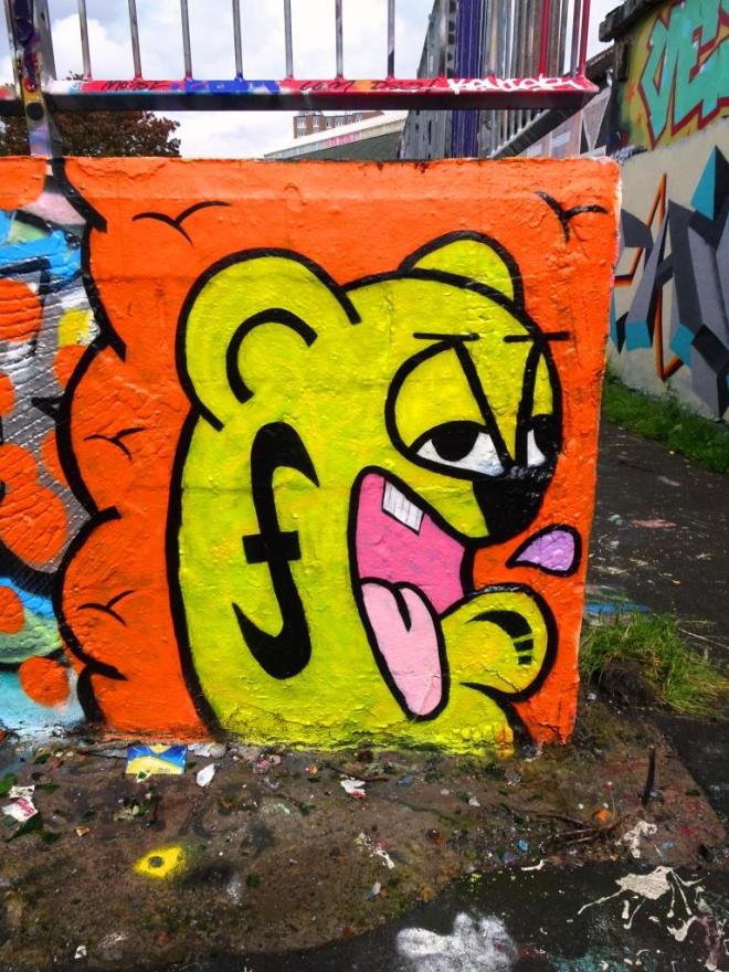
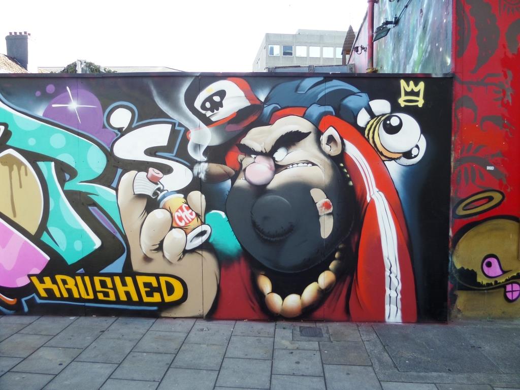
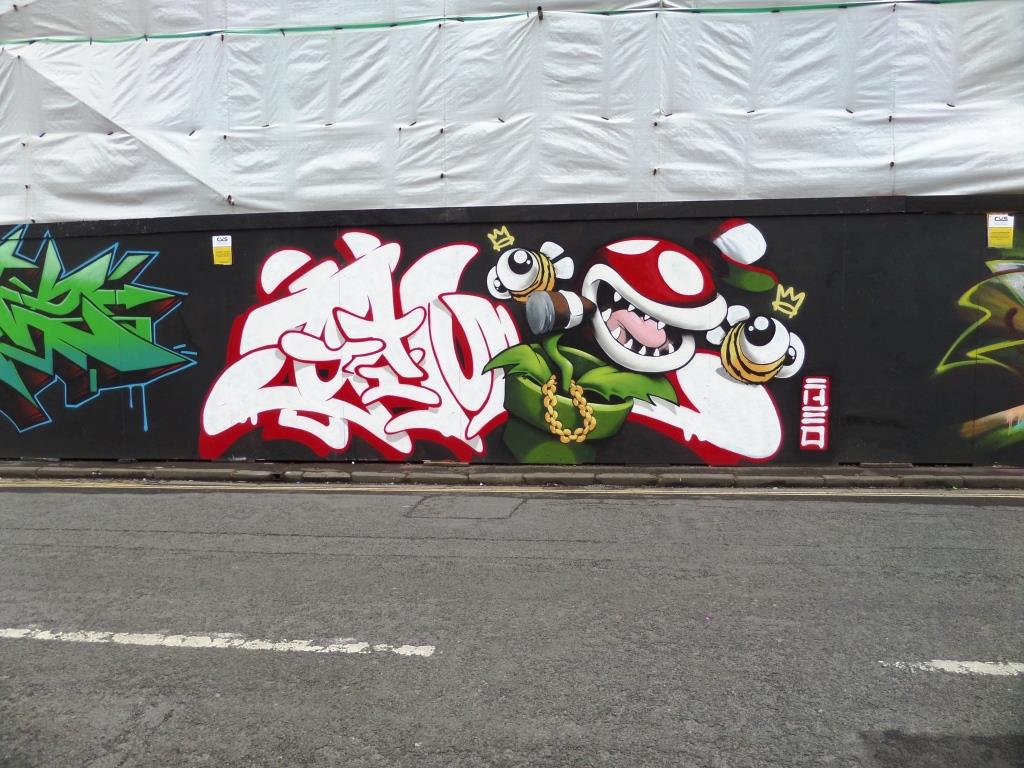
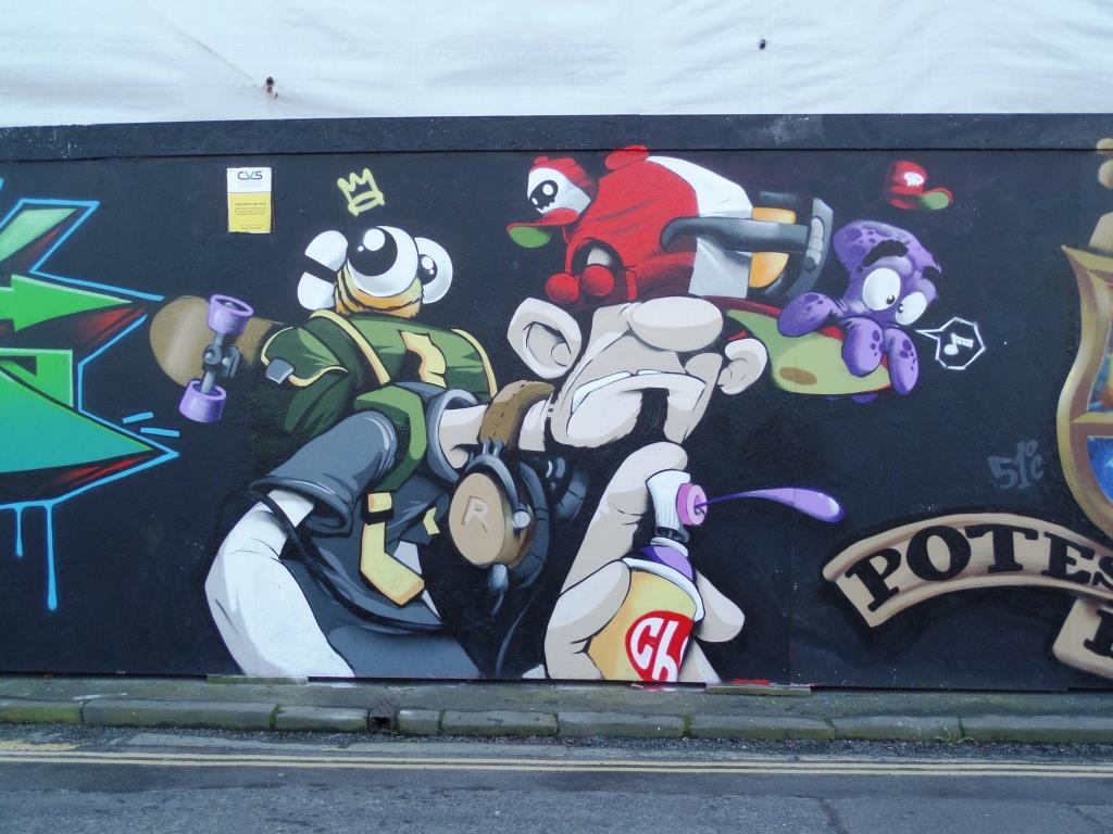
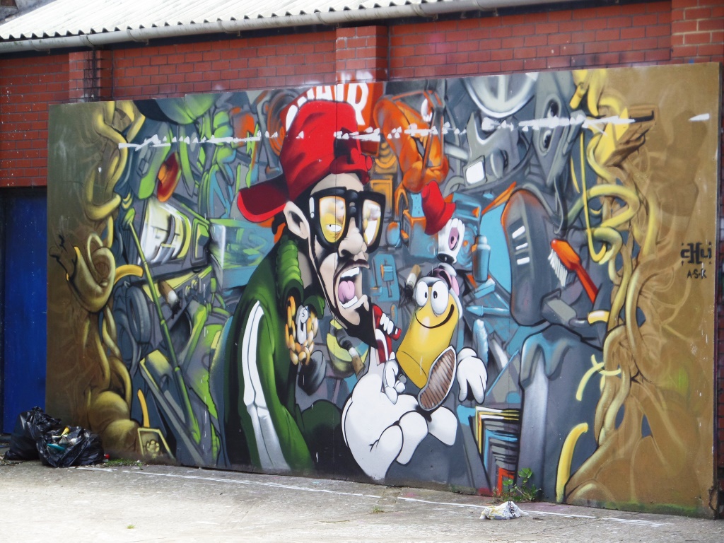
I have been meaning to get down to St George skate park for some time and finally a week or so back I made it and was rewarded with a whole ton of art that I had been aware of but thus far not seen. It was beautiful weather on the day I went to the skate park and it was incredibly busy, so I had to dodge pre-teens on their scooters, skateboards and bikes to get these pictures.
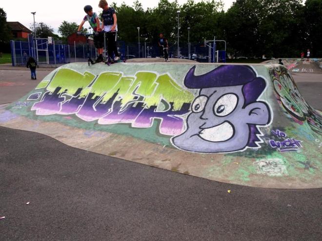
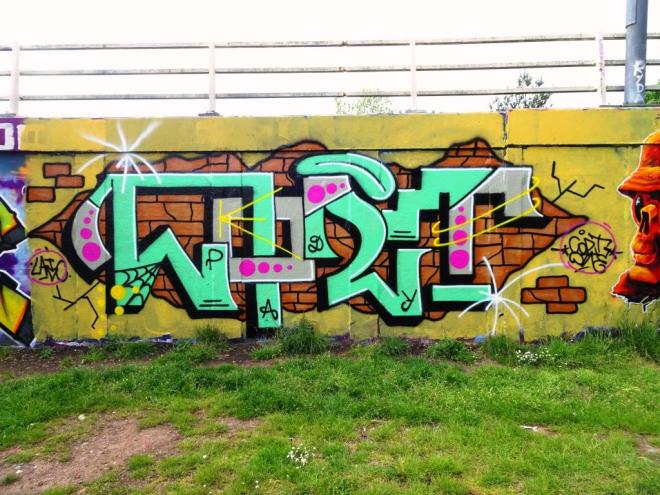
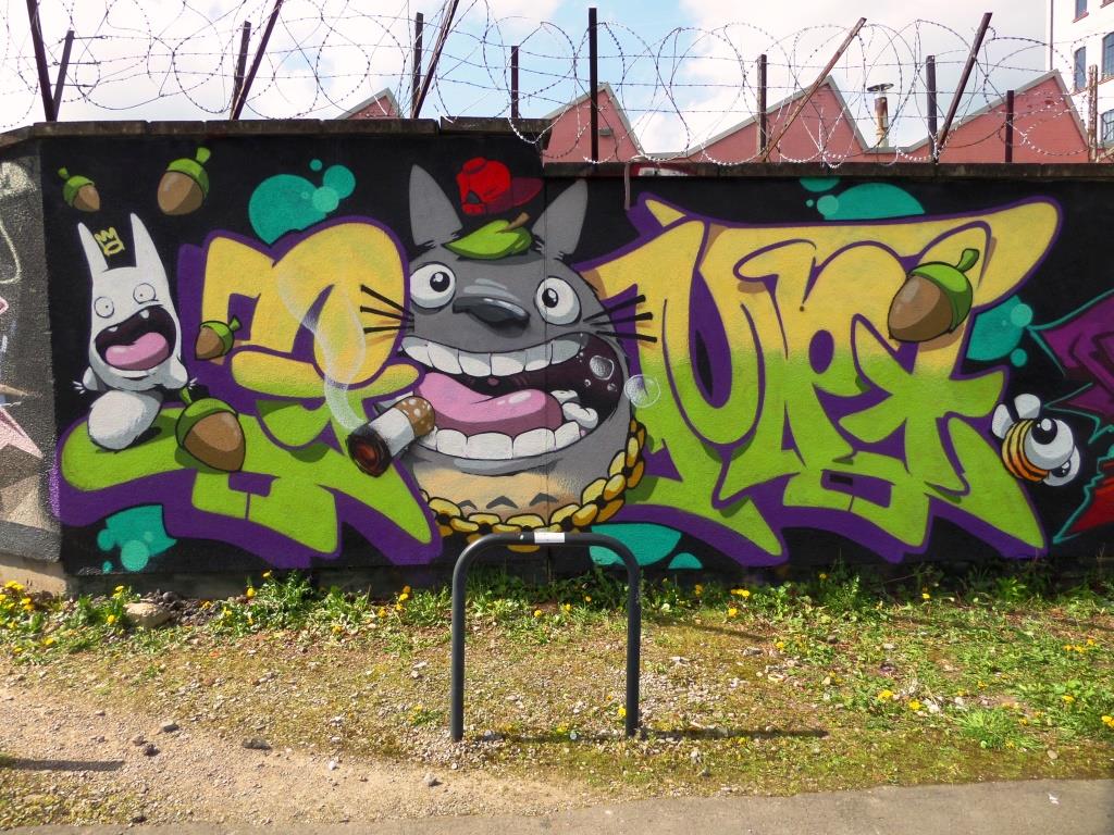
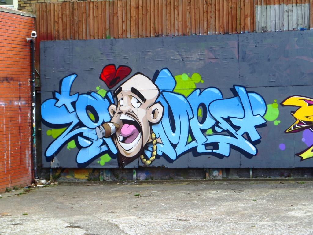
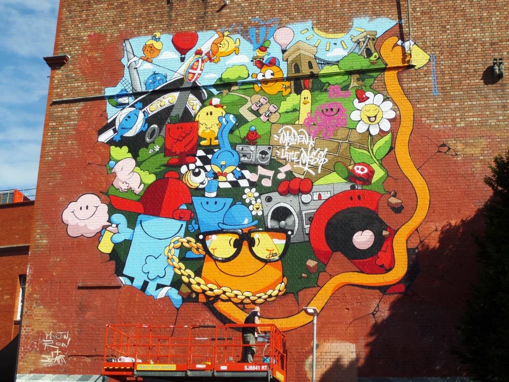
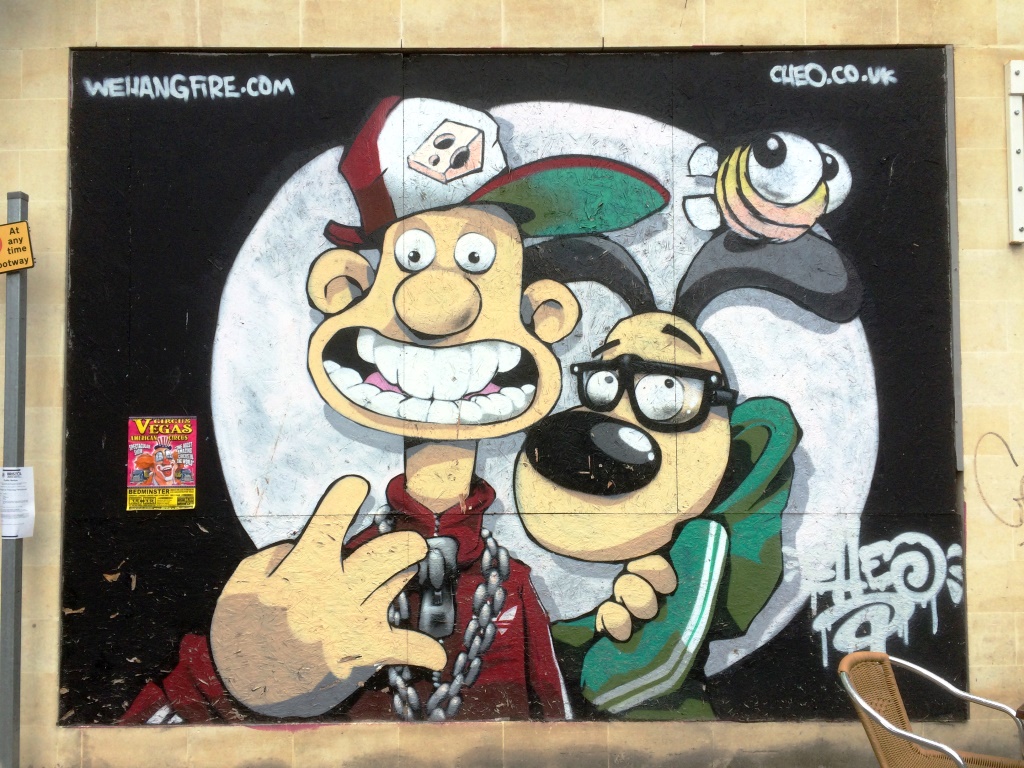
Regulars will know that I love the work of Fiva (Fiver), and although this one is a bit worn, it has all the hallmarks of a great piece from the artist. The cartoon character on the right sets the whole piece off nicely and the writing in seven colour tones ranging from green through to lilac and wonderfully worked, with an urban skyline depicted with the darkest shade of purple. A really lovely piece. I love his little shout out to Nightwayss (who has peppered this spot with pieces) at the bottom right too.