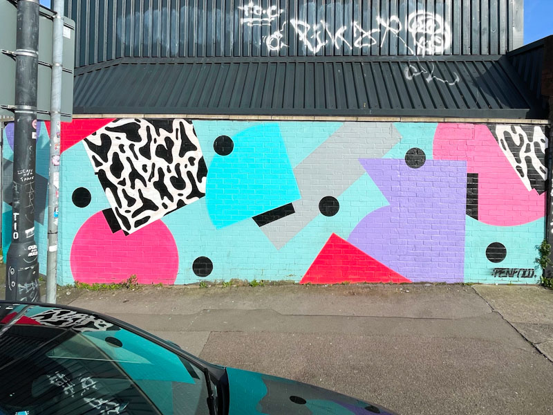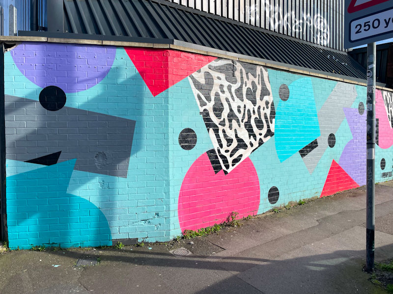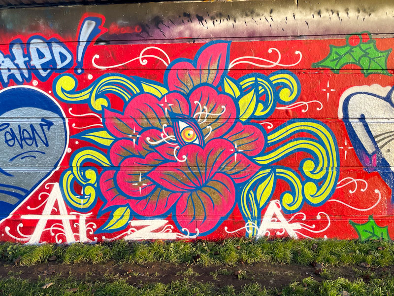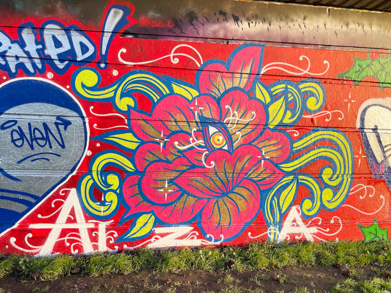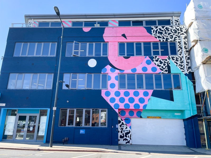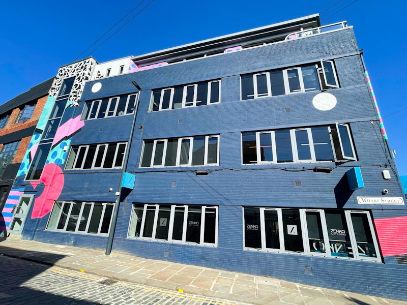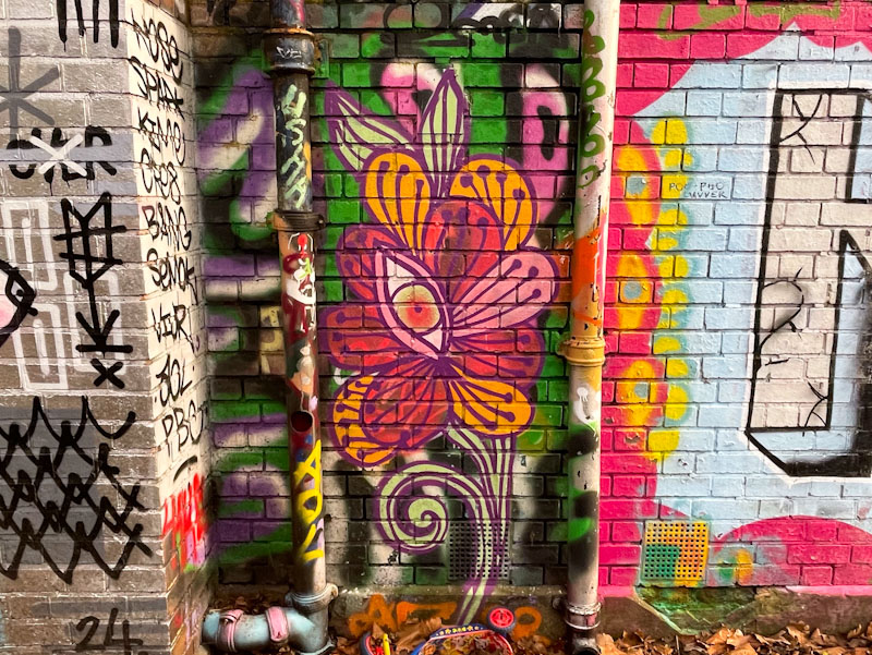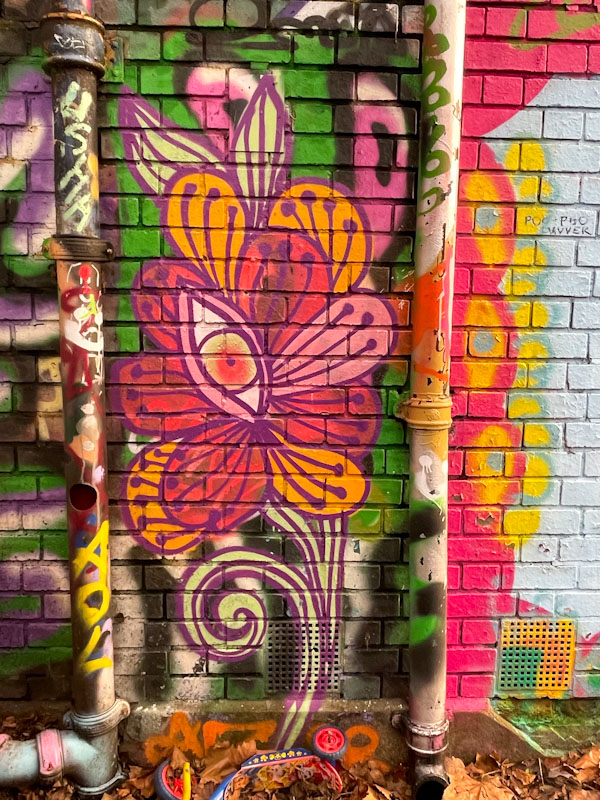
I have been aware of this lovely column piece by Peggy for some time, but simply haven’t been able to stop in the right place to be able to photograph it. I managed to do so on an extended walk a week or two back when I had a day off from work.
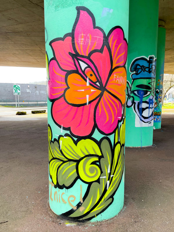
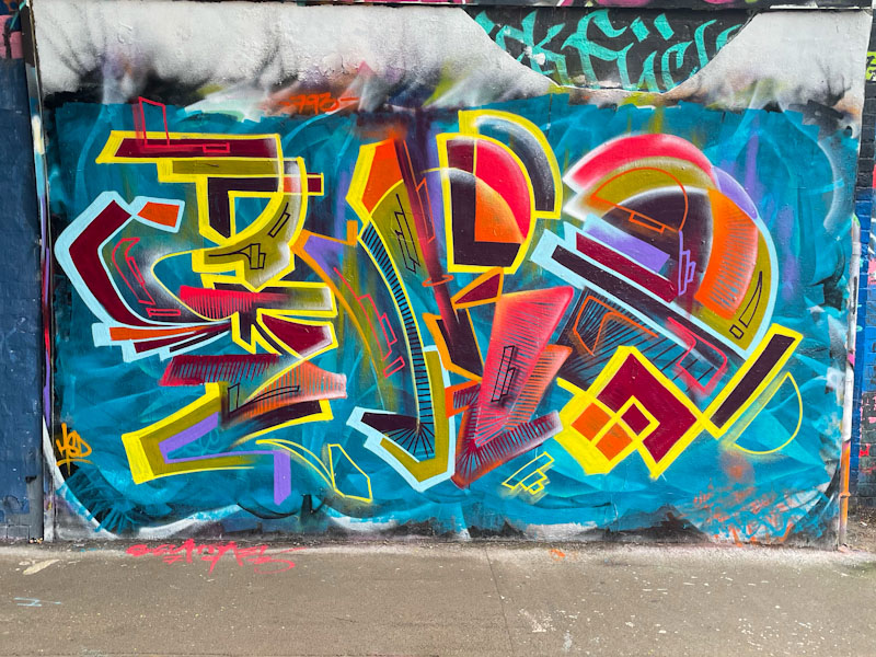
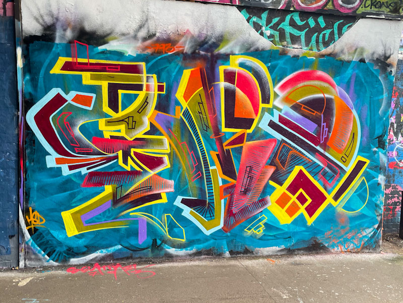
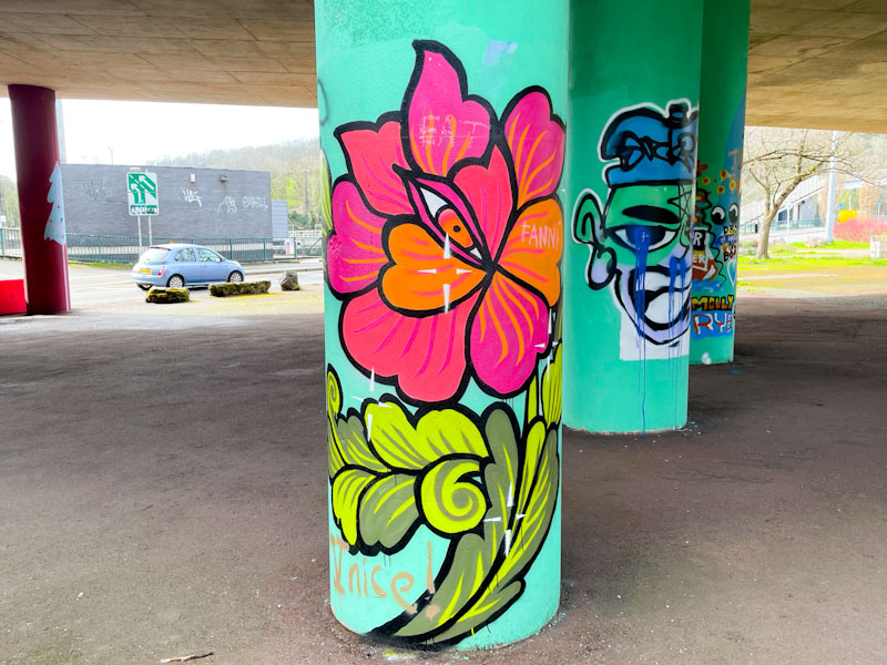
This superb floral design stands out brilliantly on the turquoise column, and is most striking. Peggy, who is a tattooist by profession, creates these pieces that are really quite unlike any other artwork we see in Bristol. Each one is quite different from the last, but stylistically consistent. It is good to see her work, especially as she doesn’t paint all that often.