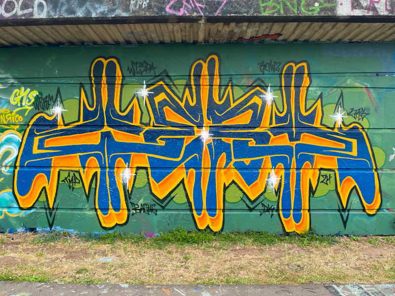
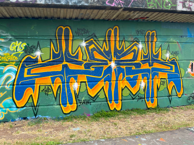
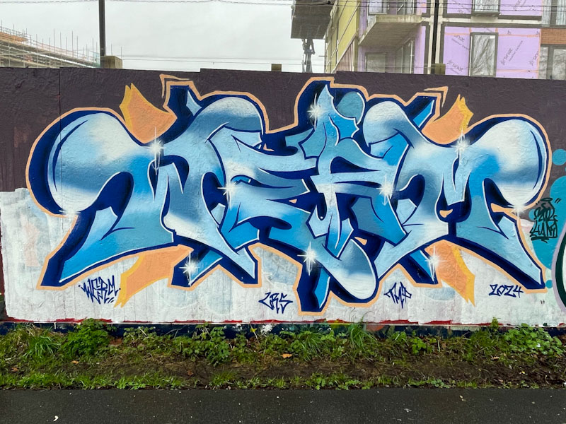
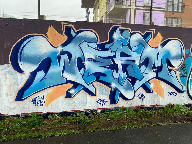
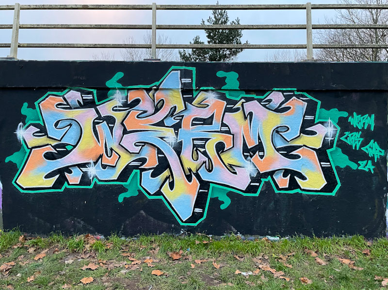
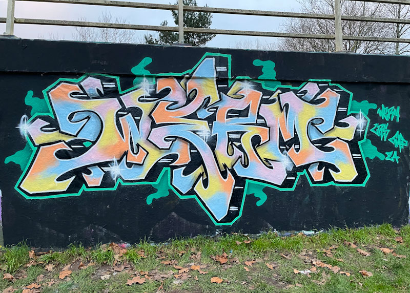
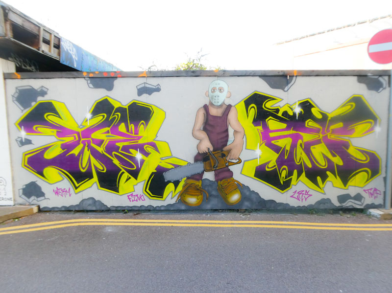
Werm is a graffiti artist who can divide opinion with his carefully thought out and intricate pieces. I am rather enjoying his recent designs though and I consider this to be a first-class piece of graffiti writing.
The curves Werm has designed in to the letters take away the stark edges that the letters WERM naturally have. He has also endeavoured to create some clever bilateral symmetry to the piece, which is a device he has been working on for a little while. The fills are coherent throughout the letters, and the colour scheme works well. This is an admirable piece from the versatile artist.