
A gallery of graffiti writing from Oner, an artist who decorated the streets of Bristol for a short while in 2018 and 2019.
All photographs by Scooj


A gallery of graffiti writing from Oner, an artist who decorated the streets of Bristol for a short while in 2018 and 2019.
All photographs by Scooj
Although I haven’t posted much from Oner for a while, it doesn’t in any mean he hasn’t been productive. On the contrary his work seems to be ubiquitous, and a day barely passes by without seeing something by him.
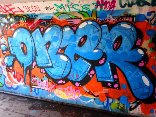
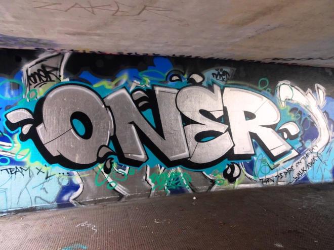
This is a rather good piece in one of the tunnels of Lawrence Hill roundabout. Real care has been taken with this to create nice clean lines, excellent shadows and clever accents that give the letters a rounded 3D appearance. Oner is an interesting artist who seems to enjoy bombing and quick throw-ups, but when he takes his time he can create works of high class, like this one. Very nice.
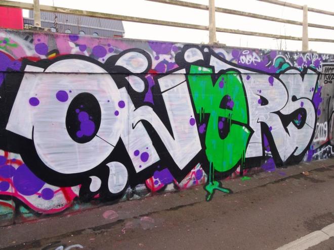
Oner has been very, very busy lately and this was a quick one he sprayed a week or so ago on the M32 roundabout. I actually caught up with him just as he was finishing off and he made time for a good chat, although I know that many graffiti writers like to just get on with their work uninterrupted.

We talked a little about how he likes to work alone, which I can see is a real benefit if you want to have flexibility and spontineity. This is a nice piece with good colour selection and great letters. I love the drips on the ‘e’ and the bleed onto the pavement. Many more to come from this prolific writer.
Oner has been a very busy bee over the last couple of months, and his writing has appeared on pretty much every well-known wall in Bristol. This one is a fine example of chrome writing in the tunnel in New Stadium Road.
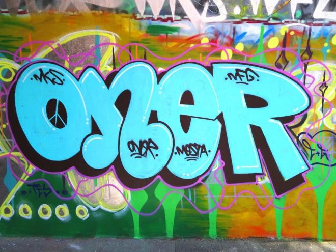
I really enjoy the range of work from Oner, which holds the single basic lettering ‘ONER’ or ‘ONEZ’ or ‘ONERS’, but comes in an elaborate range of colours and if I am honest quality. He is capable of producing great artwork like this piece with sharp clean lines but also seems to like nothing more than a quick throw up when he feels the urge. In terms of quality, I think this is one of the best that I have seen.
I arrived at this piece a little too late to see it in its original condition. It had been a collaboration between Mr Draws (in the middle) bookended by Tasha Bee. However, before I managed to get to see it, Oner had made a little contribution of his own.

I have to admit that I rather like Oner’s burners. There is a certain honesty about them, unpretentious but nicely turned out and often just a little bit edgy. Tasha Bee has rapidly made it into my group of favourite Bristol artists with her stylised characters and pretty flower motifs.
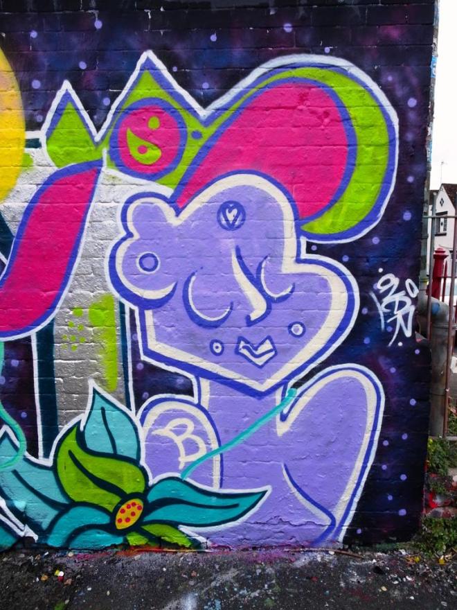
She is very prolific, and even today on a long walk with the dog I found a couple more of her pieces. There is something rather spiritual about her characters, it might be something to do with the simplicity of the lines or the closed eyes or the little peace and love signs, I’m not sure, but they ooze serenity. It is a pity I didn’t see the Mr Draws bit in the middle, but I can imagine it.
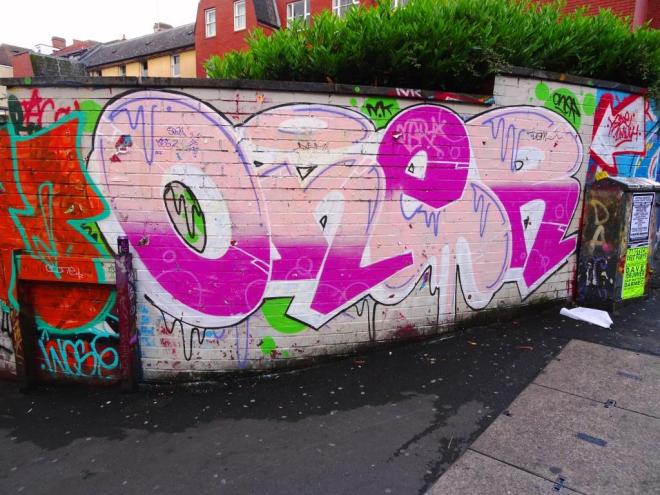
Oner has made his mark is Bristol lately with his rather attarctive burners popping up all over the city. This particular one was in St Werburghs tunnel, which is fast becoming a “go to” regular spot for me because the work there seems to be on an improving trajectory.
This burner is nice and clean and brings a bit of light into the tunnel. The black shading is nicely done, but I’m not too sure about the pink decorative squiggles.
I realise that some of you might think that I am overdoing it a bit with the Oner thing – this is my fifth post from this writer since mid-May – but I think that both his artistry and productivity deserve it.
At first glance the piece may look a bit messy, but there is lots that is good about it. His lines are clean and he has cut in the edges of his letters really skillfully so that each is distinct from the next. His shading regime has been reversed on the ‘e’ with the dark pink at the top and the light pink underneath. He has added in some nice drip decoration and if you look closely you can see some subtle bubbles on his dark pink. I think I could learn a lot from this writer.
I am really enjoying the work of Oner at the moment. He is certainly prolific and is capable of slapping up quick throw ups as well as taking a little more time to create some rather nice writing like this piece in Dean Lane.
There is something very easy on the eye about this writing, maybe it is the cartoon style or the colours or the fill styles and patterns, but whatever it is I really like it. At his best, which in my opinion this piece is, Oner is capable of turning out some really great work.
In Dean Lane, there is a fence which separates off the skate park from the council swimming pool. The wall here is a bit of a free-for-all and there really are no rules, apart from the fact that it is less legitimate than the main walls of the spot. To access the wall you first of all need to scale the fence…not for the feint-hearted.

I have not seen any Oner work in Dean Lane before, and this might be one of his first adventures to the site. I like the cartoonish style of this burner and the colours are uplifting. It is neat and tidy and has clean lines. I do like it when he spends a little bit of time on his work – sometimes his burners can be a little rough-and-ready.
I think that this is my favourite Oner piece to date. He has taken a little more time, which is possible in the backwater of this spot, which receives so little traffic since the cycle path along here was closed about six months ago.
His letters are a little more elaborate and he has included a rather dashing octopus character on the right hand side. I think that a piece like this showcases the capabilities of an artist. It is all fine to spray quick burners, because it is fun, but take a little more time and special work emerges. I love the colours and optimism of this burner.


