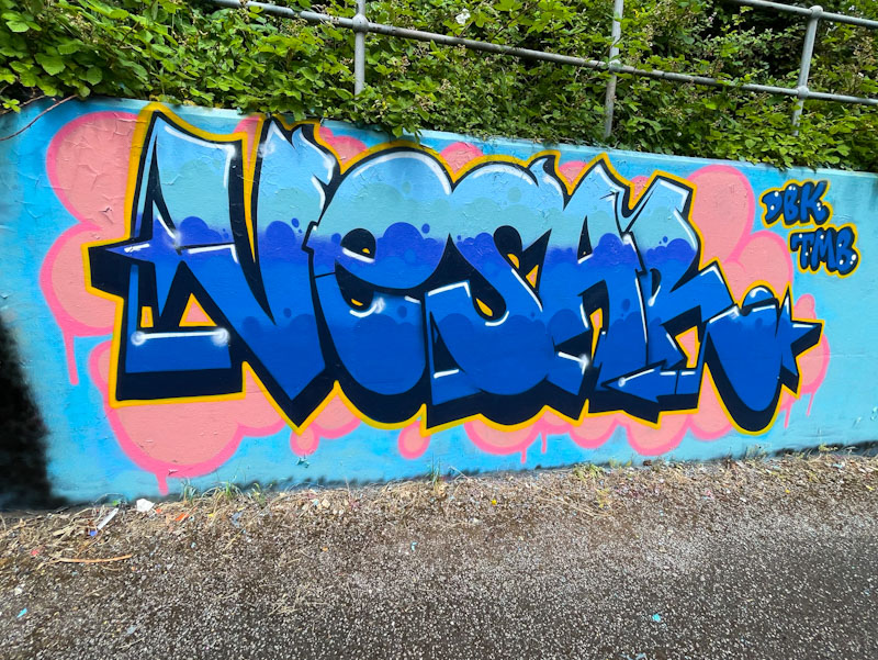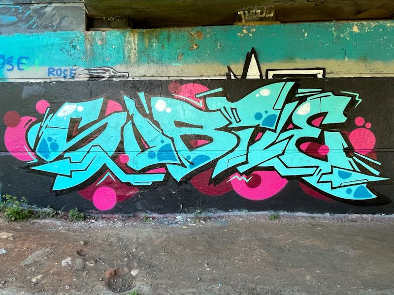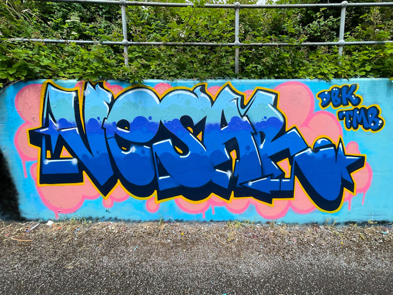
I think it is safe to say that Subtle is back, as this is the second of three recent pieces, although I have yet to locate the third. Seeing his large letters, which are anything but subtle, is like greeting an old friend, resuming the conversation where it was last cut off.
Subtle, Brunel Way, Bristol, May 2025
It is a welcome thing indeed, after so many brown shades dominating so many pieces recently, to see the good old bedfellows pink and light blue featured here. Subtle’s large blue letters, with modest decorations, are augmented perfectly with pink circles and spots surrounding. Set on a black-buffed wall, this is a splendid announcement of ‘I’m back’.
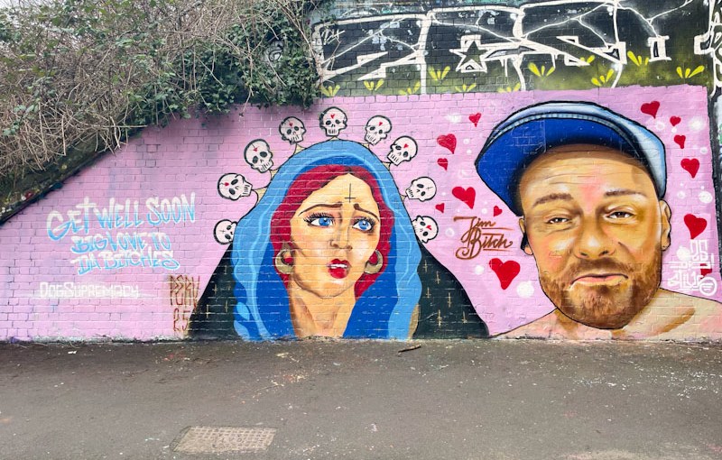
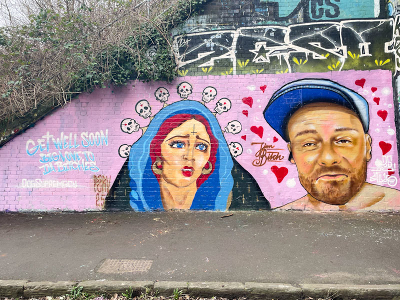
Badger Feral and Stivs, St Werburghs, Bristol, February 2025
This slightly unusual collaboration from Badger Feral and Stivs has been turning a few heads, and not surprisingly, as it is rather striking. While I am very familiar with Stivs’ work, I believe this is the first piece I have come across by Badger Feral.
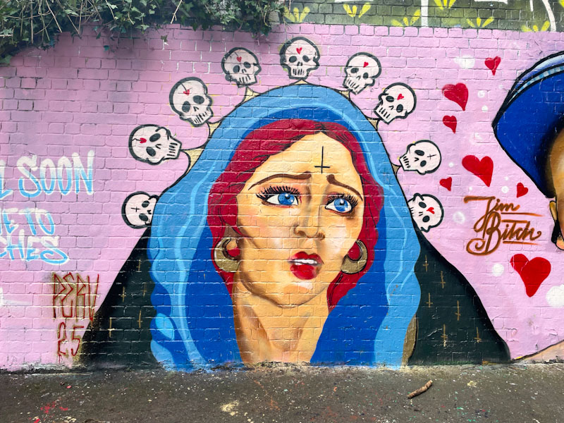
Badger Feral, St Werburghs, Bristol, February 2025
Starting with the Badger Feral piece, we are presented with a portrait of a hooded woman, with red hair and gold earrings. Her blue eyes are matched by the hood around her head. The portrait has a slightly darker side, with an inverted cross on the woman’s forehead, and her hood is suspended by a line of little skulls. Lots to take in here, and plenty of symbolism too.
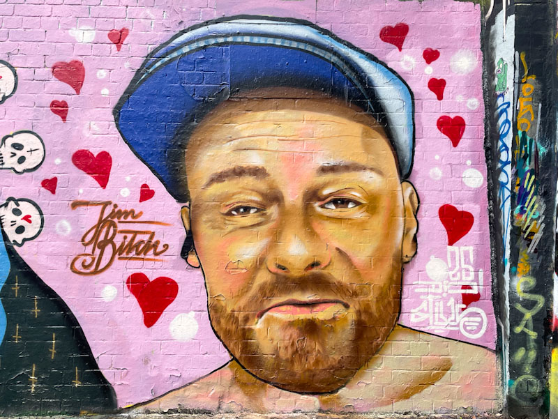
Stivs, St Werburghs, Bristol, February 2025
Stivs on the other hand has painted a portrait of a jolly fellow wearing a cap. I don’t know who the character is, but there might be a clue in the ‘Jim Bitch’ that accompanies the piece. Stivs has painted the portrait in a photorealistic style, and it looks like, from subsequent pieces, that he is rather enjoying portrait work at the moment. There is so much to take in from this ever so slightly weird collaboration.
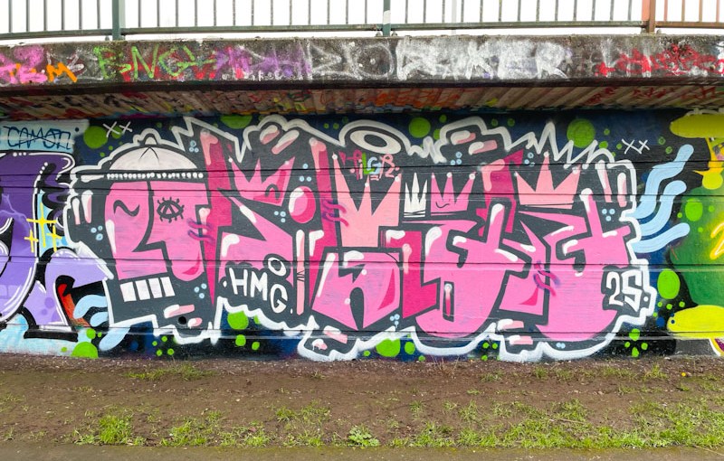
Pura Decadencia, Greenbank, Bristol, February 2025
Painted alongside a piece I featured recently by Desi, this super writing by Pura Decadencia took me several attempts to photograph on account of the wrong light conditions each time I visited. This third attempt was, as you can see, was on an unusually welcome overcast day.
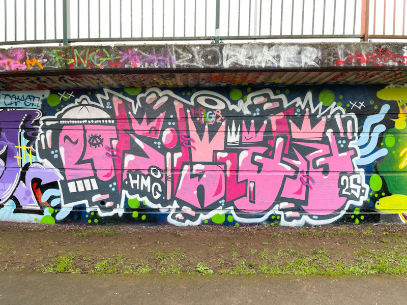
Pura Decadencia, Greenbank, Bristol, February 2025
Pura has been teaming up with Desi on a couple of occasions now, and they seem to be bringing out the best in each other. Pura’s letters are clear, regular and quite large, providing plenty of scope for playing about with fills. She has nicely blended three pink tones and added in some reversed spots to jazz things up a little. The atmospheric background is in a style I am seeing more frequently on the streets at the moment, a particular favourite technique used by Sub, for example. No vampire teeth this time, but a fine example of Pura Decadencia’s work.
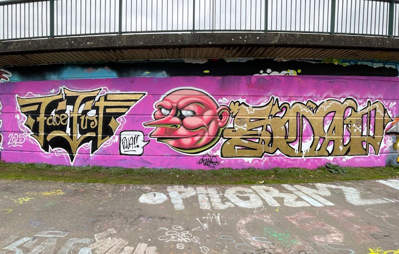
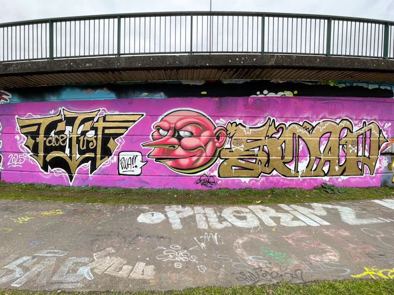
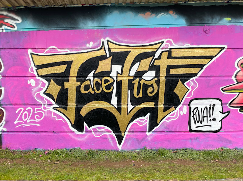
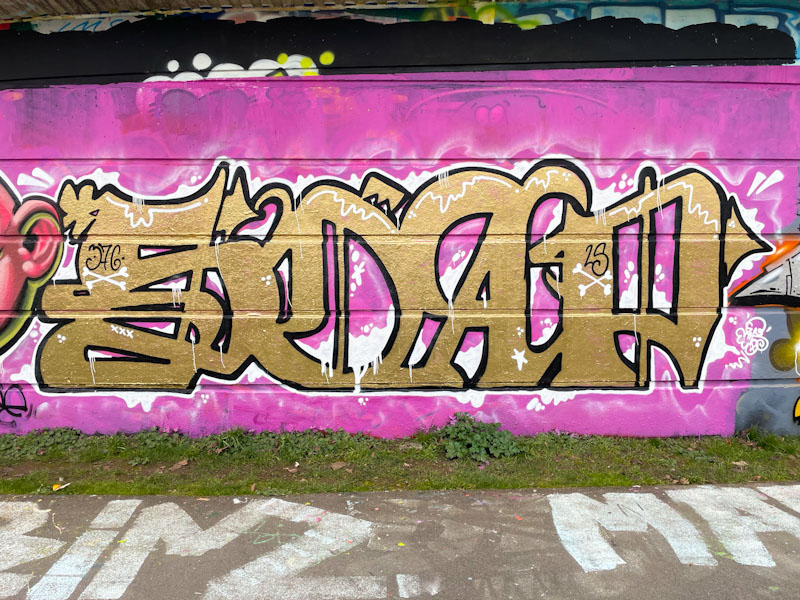
Face 1st, Zake and Soap, Cumberland Basin, Bristol, February 2025
It was great to see this PWA collaboration recently, something that is a little less frequent these days now that Face 1st has moved away from Bristol, but true to his word, he does still come back now and again to decorate our streets. Here he is joined by Zake and Soap.
Face 1st, Cumberland Basin, Bristol, February 2025
Face 1st has been experimenting with his letters recently, and perhaps it is a way of refining his technique and growing himself as an artist. There is a symmetry to the letters which spell out Face First, painted in a deep gold colour which contrasts with the pink background and sets the colour theme for the whole collaboration.
Zake, Cumberland Basin, Bristol, February 2025
The centrepiece is a character face painted by Zake, with all the depth we are used to seeing in his work created by the use of light and shade. Zake has cleverly picked up on the gold colour and used it as the bottom-lit element, highlighting his character’s features.
Soap, Cumberland Basin, Bristol, February 2025
Rounding off the triptych is a piece of writing from Soap, who also appears to be trying something a little different. His letters look like a halfway house towards calligraffiti, with some order and form to the letters in terms of shape and size, and some interesting details creeping in. A truly wonderful PWA collaboration from three beating hearts of the Bristol street/graffiti art scene.
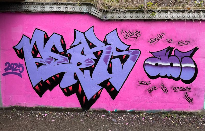
I mentioned in my last post (Mr Draws chromie in the tunnel) that the colours blue and pink make perfect bed fellows. It is a bit of a cliché, but it is also true. DJ Perks has used the two colours to great effect in this recent piece in Lawrence Weston. I guess to be more accurate, this piece is pink and mauve, but the same applies.
DJ Perks, L Dub, Bristol, February 2025
DJ Perks has produced some very flat letters and by that I mean he hasn’t tried to give the letters depth with accent lines, instead preferring a straight forward drop shadow to project the letters out from the wall. The graffiti writing is accompanied by the letters ABC (Art Beat Crew). As ever top drawer stuff.
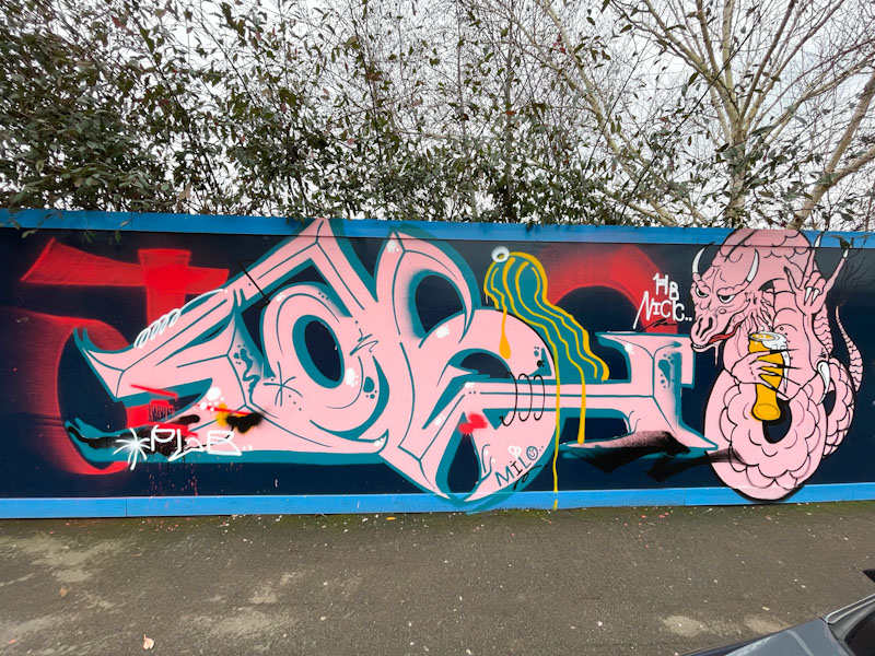
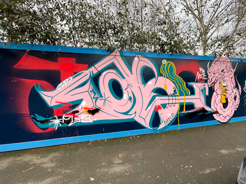
It feels like an age since I last photographed anything by Taboo, but the fresh wall on Greenway Bush Lane, seems to be an inviting prospect for street/graffiti artists in the area. In this piece he has teamed up with another artist (I don’t know who) to create this very pink collaboration.
Taboo, Greenway Bush Lane, Bristol, February 2025
Taboo’s anti-style letters spell TABOO, with the irregular letters partially disguised, especially the ‘OO’, also the T and last O are painted in red paint and seem disjointed from the rest of the piece. His letters are characterised by a distinctive midline running through them, a technique used by a lot of anti-style writers.
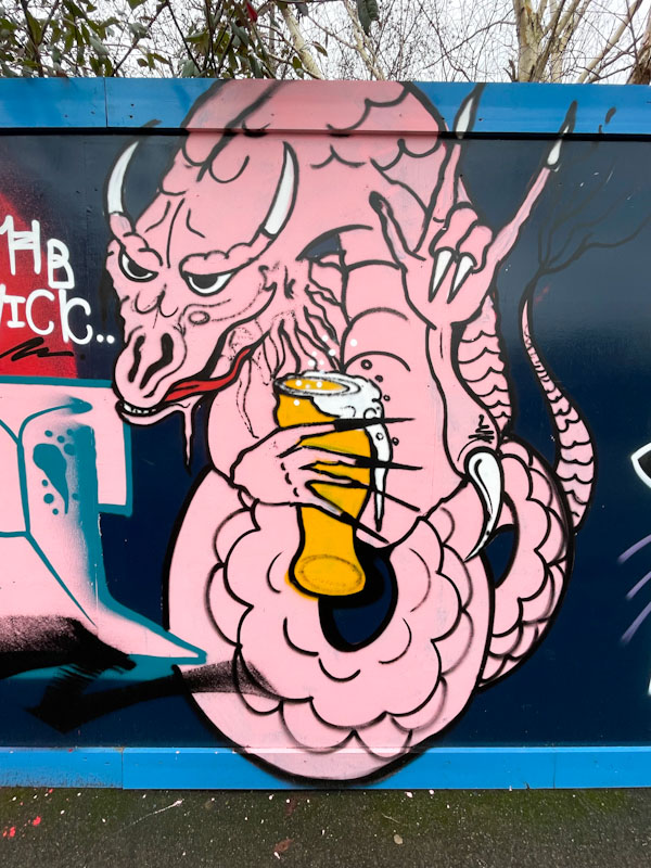
Unknown artist, Greenway Bush Lane, Bristol, February 2025
At first, I thought the dragon (having a pint – and why not?) was part of a combination piece by Taboo, but on closer inspection realised it is in a very different style, and is using black rather than blue to pick out the detail. I can see the letters HB Nick, but unfortunately that doesn’t get me very far. A nice collaboration on this rather exciting wall.
Dirtygypo, Cumberland Basin, Bristol, January 2025
It almost felt as though Dirtygypo had been forgotten. His pieces just weren’t appearing from last autumn onwards, and I was wondering whether he might have left town. It was great, therefore, to come across this recent piece in Cumberland Basin, and all is well.
Dirtygypo, Cumberland Basin, Bristol, January 2025
It doesn’t matter how hard I try, I simply can’t make out Dirtygypo’s letters – I am beginning to think that the word ends with GG, but even then I am uncertain. There is plenty of movement in his letters and I like the incorporation of the character on the left-hand side. I’m sure that his work will all make a great deal more sense once I can decipher the writing.
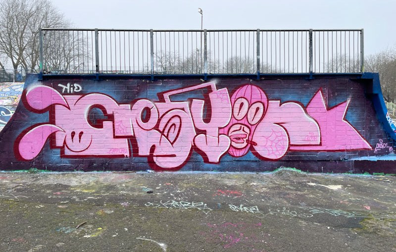
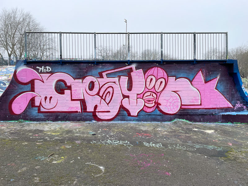
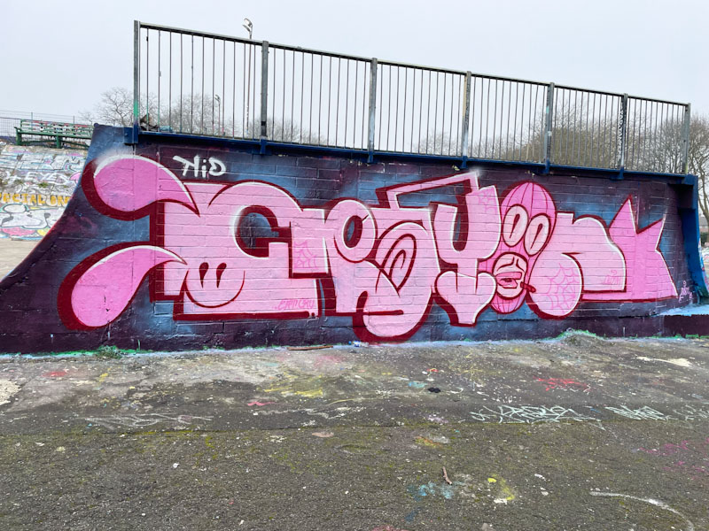
It brings me great joy when I come across new Kid Crayon pieces. He has been reasonably quiet over the last couple of years, which in a way is a good thing, because it signals that his work is going well, and being an artist/designer having plenty of work is always a positive.
Kid Crayon, Dean Lane, Bristol, January 2025
This wall used to have three alcoves in it, and in fairness, was quite difficult to paint. For whatever reason, the council decided to fill the alcoves with breeze blocks, and I have to say that the unintended consequence was this new long wall, which artists have been enjoying ever since. Kid Crayon has used the full length of the wall to paint his letters in hi favoured pink. Each letter is in a distinct style, where the ‘O’ is a masked character incorporating a floating crayon. A nice tidy piece and great way to start the year.
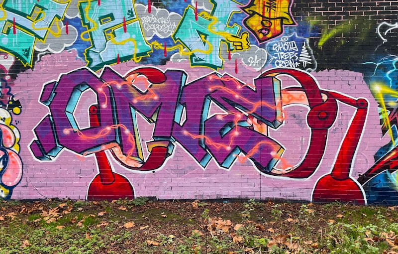
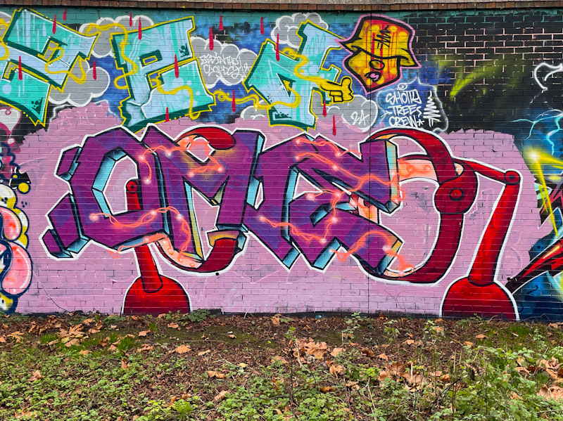
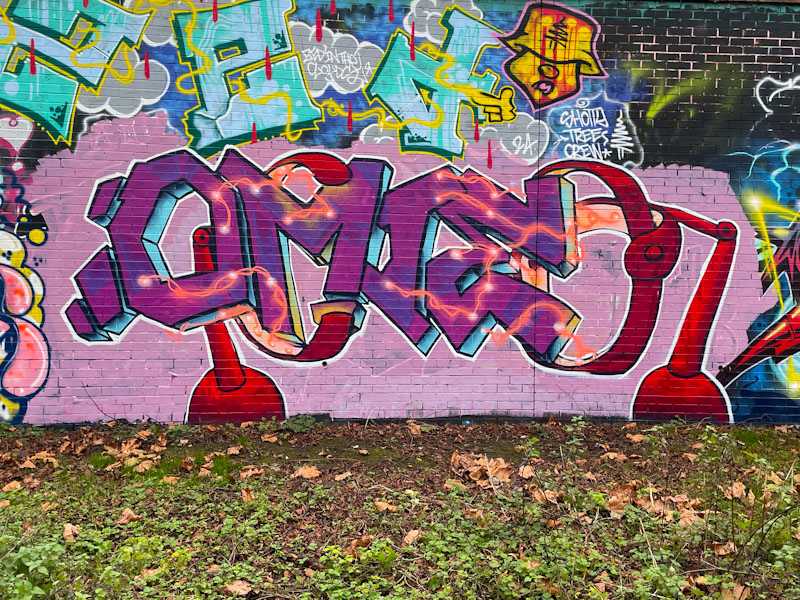
For the second day in a row, it gives me great pleasure to post a piece by Omie. I first came across Omie in January this year, and his regular interventions through the year has established him as a key player in contemporary Bristol graffiti writing.
Omie, Sparke Evans Park, Bristol, December 2024
No two pieces by Omie are alike, and his creativity is running on full throttle, which is a refreshing approach to graffiti writing. Sometimes it can even be difficult to assign a particular style to Omie, and if he didn’t paint the same letters, his work could be quite difficult to identify. In this pinky/purple piece it looks like the letters OMIE are being created in some kind of machine, with tons of plasma bolts running through the letters. Something a little Dr Frankenstein about it all. A lovely piece to share on Boxing Day.
I met Awkward for the first time at the Ikea Wall of Fame Metalheadz paint jam organised by Goldie. As is usually the case, Awkward was nothing like the image I had of him in my mind, based on his artwork. It was so good to have a chat with him and understand a little about his motivations around art and music, where his music is his main thing.
Awkward, Dean Lane, Bristol, November 2024
This cheeky piece (why is it that most of his character pieces seem to be on the cheeky side?) features a pink faced character with enormous eyes and a speech bubble with the words ‘Universal magnetic’. This may be a reference to his friend Benjimagnetic. To the left of the face, Awkward has left his customary signature split into two halves, AWK…WARD.