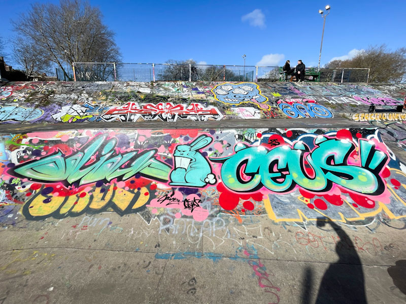
I’m off to a football match this morning and will shortly be catching a train to London, so today’s posts are likely to be fairly swift. The next few posts are ones from earlier this year that somehow got left behind in my archives. This was a nice collaboration from Hire and Ceus back in February.
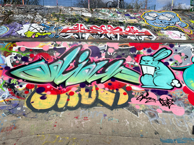
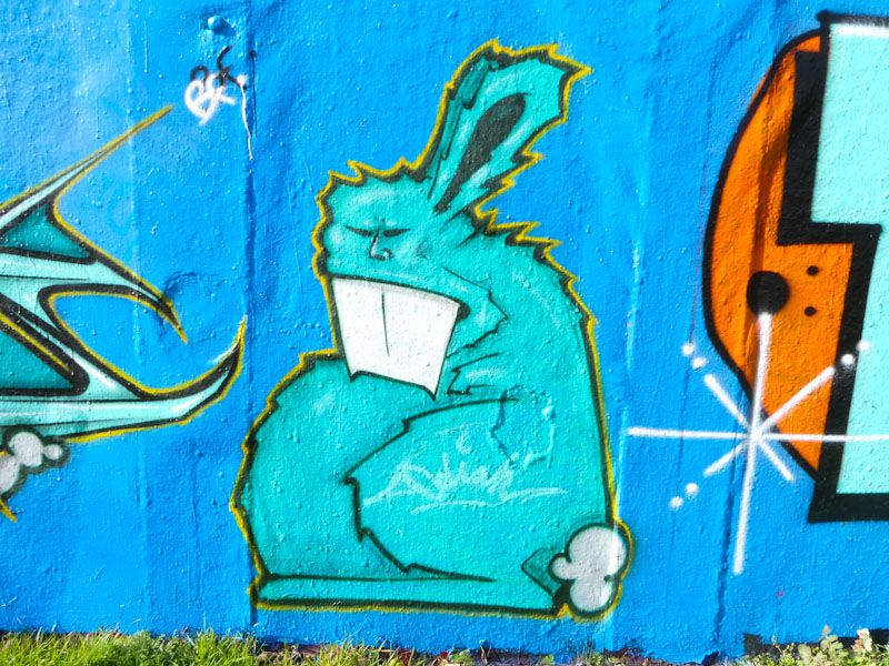
Hire, Dean Lane, Bristol, February 2025
Some unusual writing, spelling out Odiah, one of the words Hire likes to use, and his trademark rabbit. All looking rather smooth in the winter sunshine.
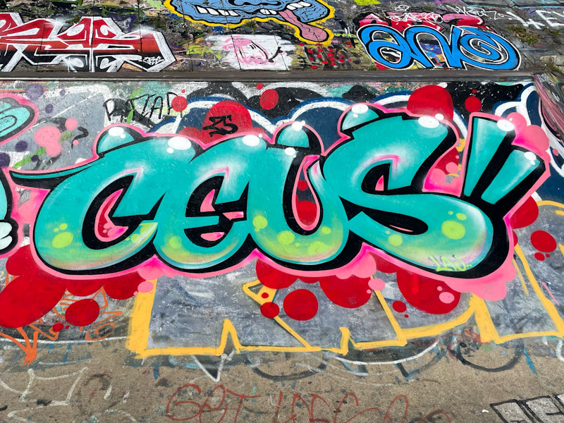
Ceus, Dean Lane, Bristol, February 2025
Ceus appears to have left these shores now, and I think that this might have been amongst the last ones he painted in Bristol. A fine collaboration.
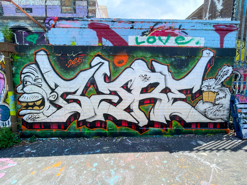
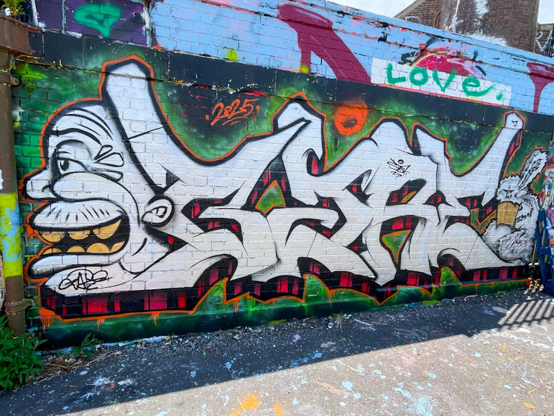
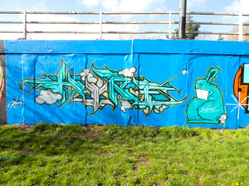
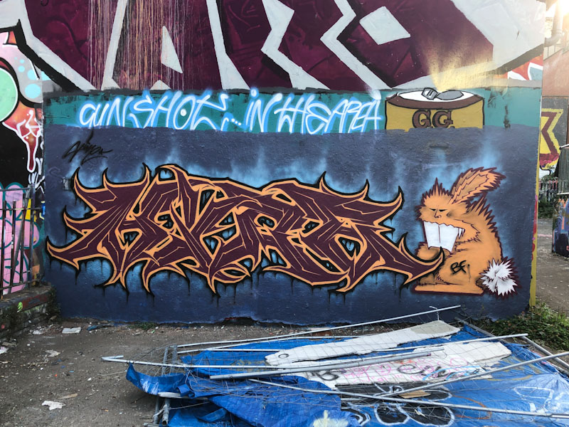
This piece from Hire had me raising my eyebrows, in a good way, because it is quite unlike anything I have seen from him before. I would normally associate his work with quite intricate, spiky, angular letters, but here he has gone for something altogether softer and more fluid – to be honest I hind it a little disorientating. (Update – I am being particularly dense, the writing is, of course, by Sait Bare, which is why it is so different in style. I couldn’t see the wood for the trees.
Hire, Dean Lane, Bristol, July 2025
The combination of letters and two characters works well, with a face on the left and one of his trademark rabbits (see, it is spiky) to the right. The letters have a traditional 3D drop shadow with black and red stripes. This whole thing looks like Hire is experimenting a bit, departing from his customary style, and that has to be applauded.
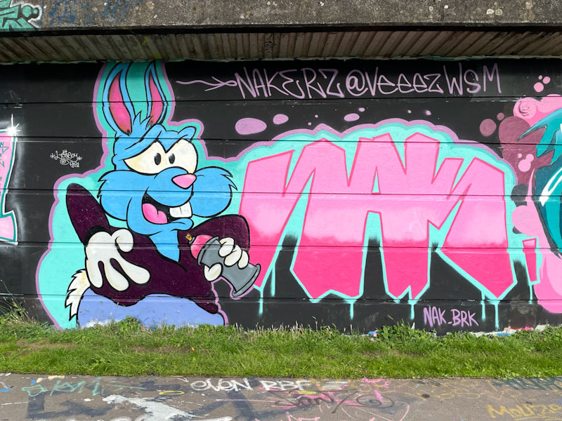
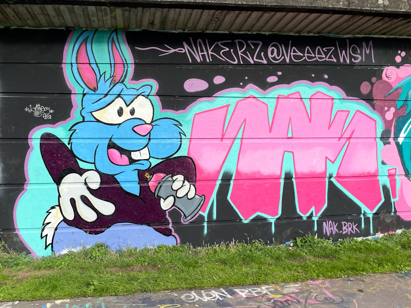
Enn Kay or NAK, has been knocking it out of the park lately and massively expanded his portfolio of characters in a very short space of time, adding strength to the maxim ‘practice makes perfect’. This piece was painted during Werm’s birthday paint jam and has quite brilliantly adopted the theme colours of blue and pink.
Enn Kay, Cumberland Basin, Bristol, August 2023
In this piece, Enn Kay has painted a blue cartoon rabbit, looking rather Disney to me, holding a pink spray can, which he has been using to paint the letters NAK. This is a common construct in street art, in which the protagonist has painted a part of the piece in which they exist. This is a beautifully finished piece that sits snugly with the others in this collaboration.
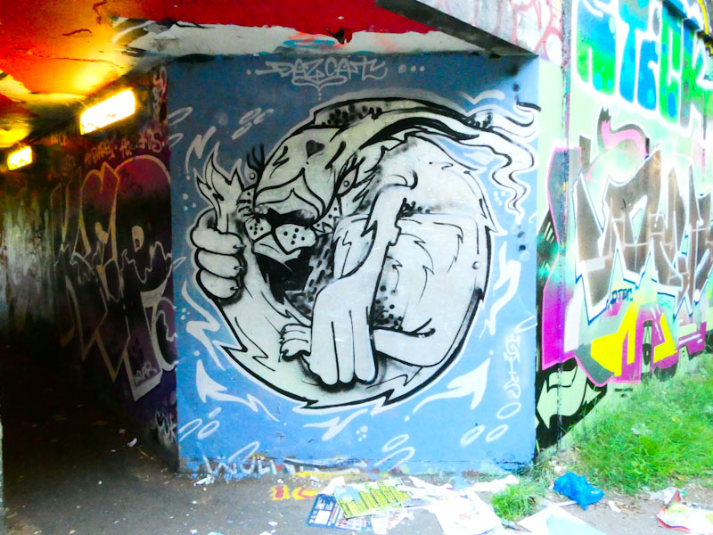
When I first encountered Daz Cat’s pieces, they were pretty much always portraits of cats, sometimes dogs, and reasonably basic, but with that Daz Cat style. Over time his work has become more sophisticated, and about 18 months ago reached a new level, each piece telling stories, rather than just a portrait.
Daz Cat, M32 roundabout, Bristol, June 2023
This one on the St Werburghs entrance to the roundabout, is a piece that uses the square space supremely well, and the illustrative rabbit (or cat with very long ears) curled up in a tight ball appears to be spinning. There is lots of movement here and even though it is painted in greyscale, it makes a strong impression. Who’d have thought he’d be producing stuff like this a few years ago. Great to see.
I was lucky enough to run into Hire and Cort when they were painting alongside each other on a rather lovely afternoon a week or two back. You don’t often get to see Hire’s work on this roundabout wall, so it was a pleasant surprise to see him painting there.
Hire, M32 roundabout, Bristol, April 2023
As I would always expect, his piece oozes quality and class. Set on a wonderful blue background, Hire has spelled out HIRE and added a wonderful angry bunny accompaniment. Just in passing, this photograph illustrates the weight of decades of paint that has been plastered on this wall and which ripples and bubbles – at some point large chunks of paint will tumble off the wall under its own weight.
Hire, M32 roundabout, Bristol, April 2023
The letters are outstanding, and their uniformity of design is touching on calligraffiti. Little puffy clouds are intertwined with the letters. Of course, Hire has given us the extra light of a bunny, that is like a mega-tag for the artist.
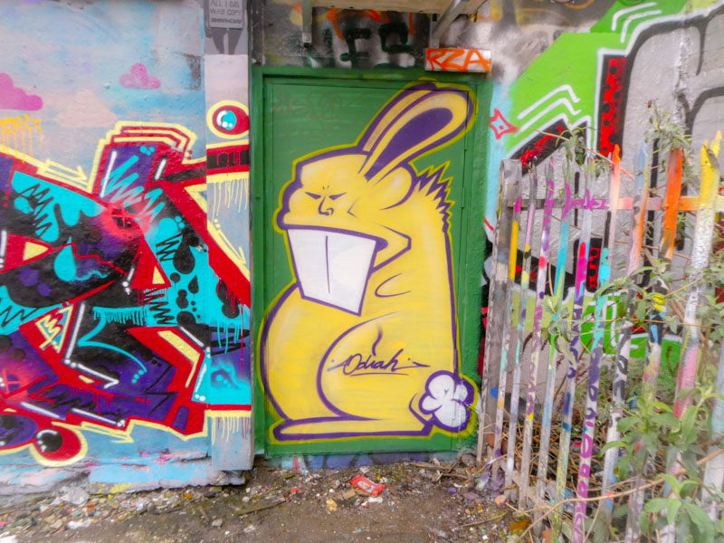
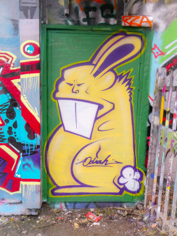
This door at the far end of the skate park gets quite a lot of attention from artists and taggers, and is a candidate for the ‘One Wall‘ series of posts that I do. This time it hosts a lovely rabbit piece from Hire. These are not to be confused with other rabbits that were a common feature in Bristol, until the artist, Eldey (followmyrabbits) was jailed for rape and attempted rape in 2021. Hire’s rabbits were the original Bristol rabbits and have an element of edge to them.
Hire, Dean Lane, Bristol, March 2023
A yellow rabbit on a green door is the stuff of children’s picture books, I had a particular favourite called ‘Go Dog Go’, which features coloured dogs and trees and so on… I digress. This is another fine rabbit from Hire in a long sequence going back to when I first started photographing graffiti and street art in Bristol.
How fantastic, a classic piece of Hire writing with the inclusion of one of his rabbit characters, still looking as unsettling as ever with its narrow eyes and huge teeth. I am so pleased that he continues with his work, albeit not as frequently as when I first encountered him. In this picture you might notice a rather irritating bit of fencing with a blue tarp attached to it. It has been in Dean Lane since they started developing the building next to the skate park, but it has been abandoned, and is really bloody irritating. I think it needs to be removed into the street, but it is more than a one-man job.
Hire, Dean Lane, Bristol, August 222
Hire’s letters have softened a little in recent months, but still have that characteristic sharp and pointy edge thing going on, always with an underlying edge or threat, which graffiti always lends itself to so well. I like this piece, it kind of reminds me of when I first met Hire several years ago.
It is unlikely, but it might have escaped your attention that I recently went on a short break to Porto, Portugal, with my daughter, and we had the most incredible time. No pressure, no worries and the freedom to wander round a city with absolutely no agenda or plan. This is the way to see incredible things and make great discoveries.
Like many great cities in Europe, Porto has a graffiti and street art scene, which although still quite young, is most impressive nonetheless. This is the first of several posts of street art from the trip.
Bordallo II, Porto, Portugal, June 2022
Of course, anyone who follows street art will have seen work by Bordallo II on digital media, but to come across a piece (completely by accident – it was my daughter who spotted it down a back street) and see it is the flesh is quite something else. Bordallo II, a Portuguese artist, creates his work from scraps of waste material which he attaches to a wall and paints to create extraordinary ‘installation sculptures’ of animals.
This piece on the south side of the Douro river depicts a rabbit in two halves, the left-hand side is dull and depressing, the right-hand side is colourful, vibrant and optimistic. The piece demonstrates the incredible skill of the artist to create something from nothing and generate different emotions from the viewer within the same work. One less artist on the bucket list.
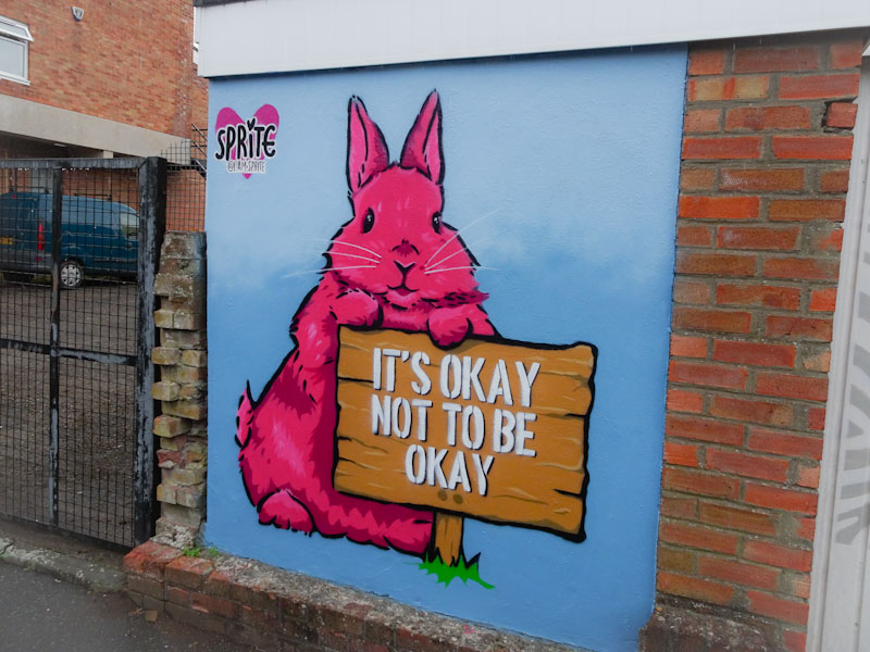
‘It’s okay not to be okay’ is a very contemporary message from Sprite for this year’s Upfest initiative. I think that it can only be a good thing when mental health messages are amplified through street art as it demonstrates that real progress is being made in this ‘Cinderella’ branch of medical healthcare.
Sprite, Stanley Street, Bristol, July 2021, Upfest 21
The pink rabbit is a really rather lovely stencil by the Brighton-based artist whose intention is to make people smile and I think she has certainly succeeded with this piece. Her work is very scalable and perfect for bombing a town or city with great messages. It would be good to see more of her work in Bristol.