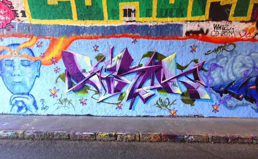
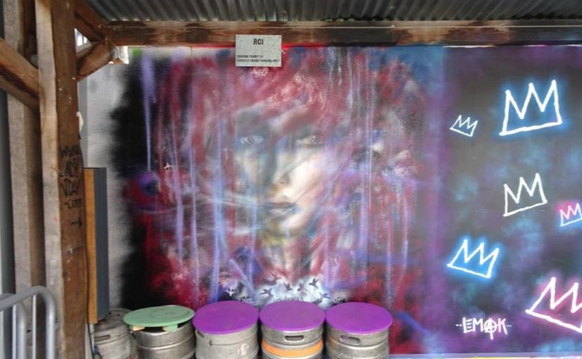
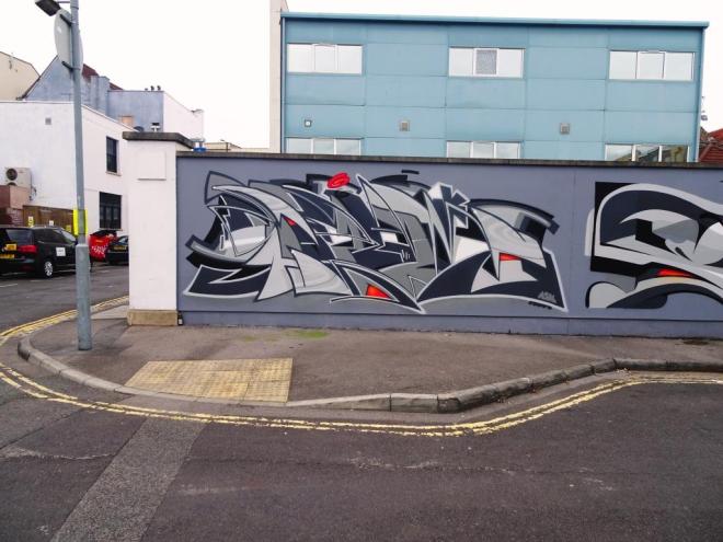
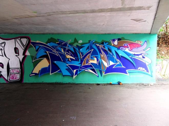
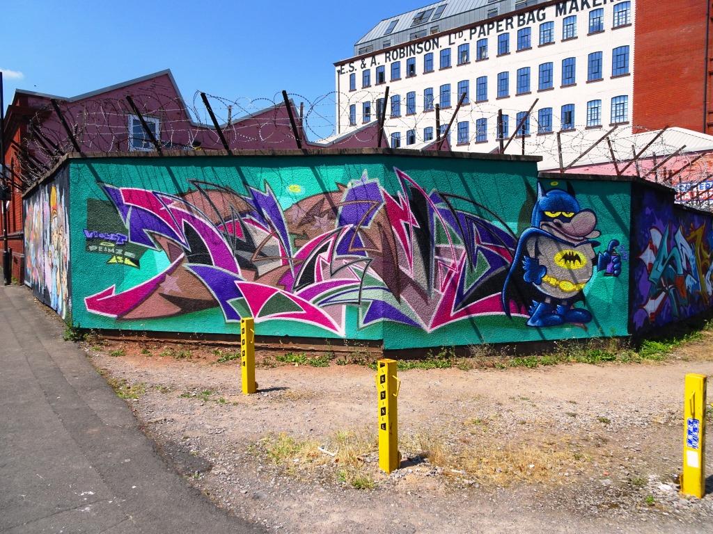
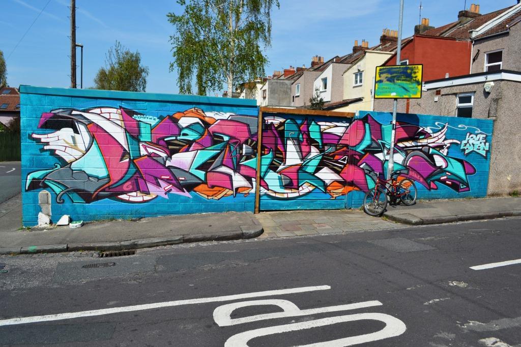
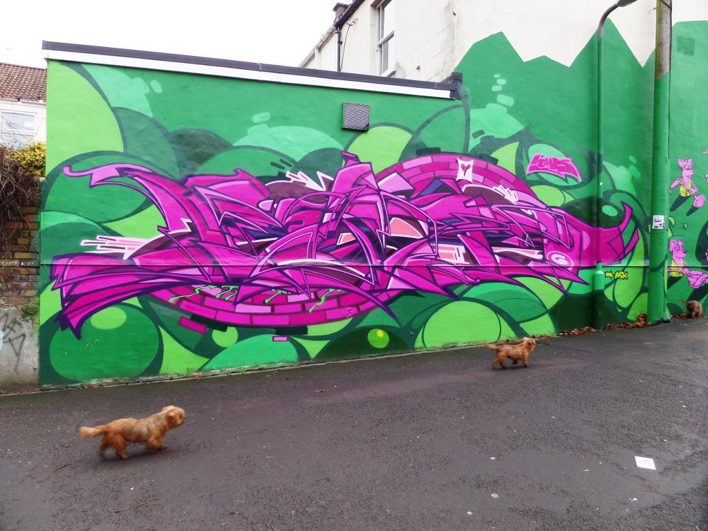
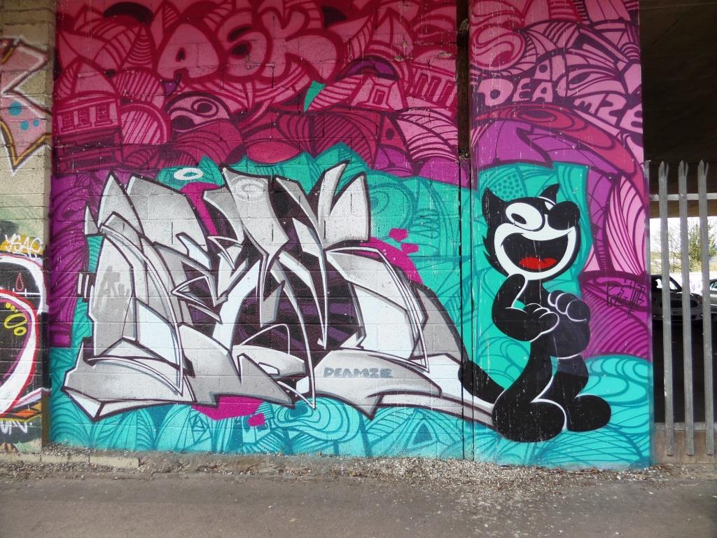
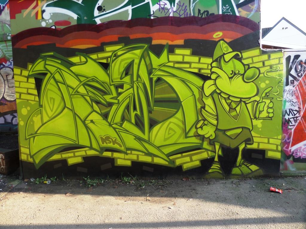
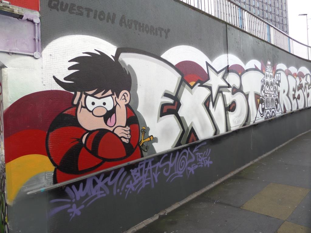
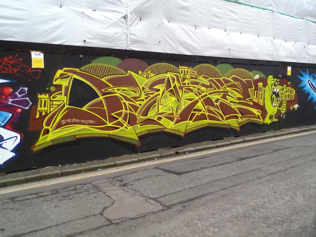
A collection of street art/graffiti art by Deamze
All photographs taken by Scooj

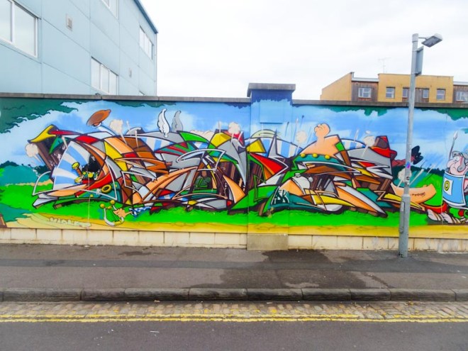


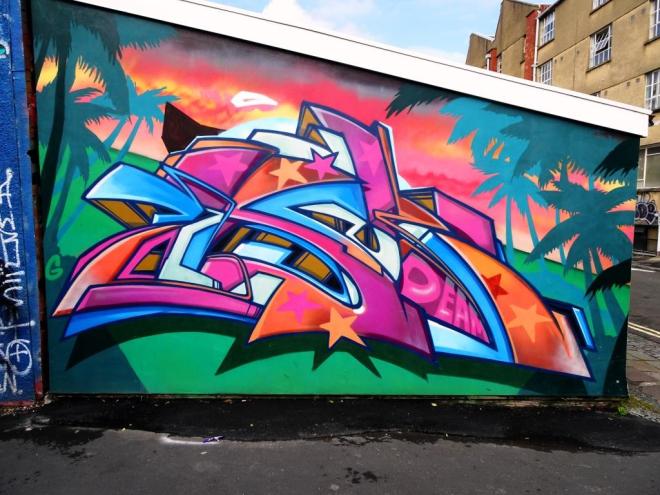

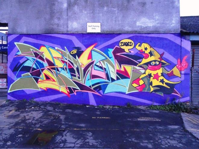
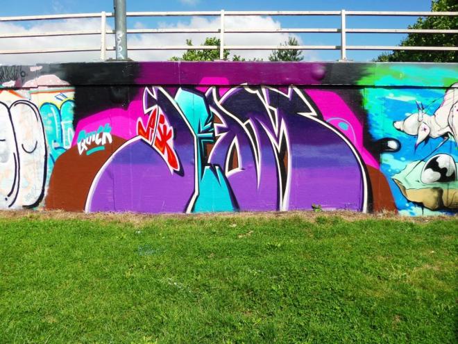

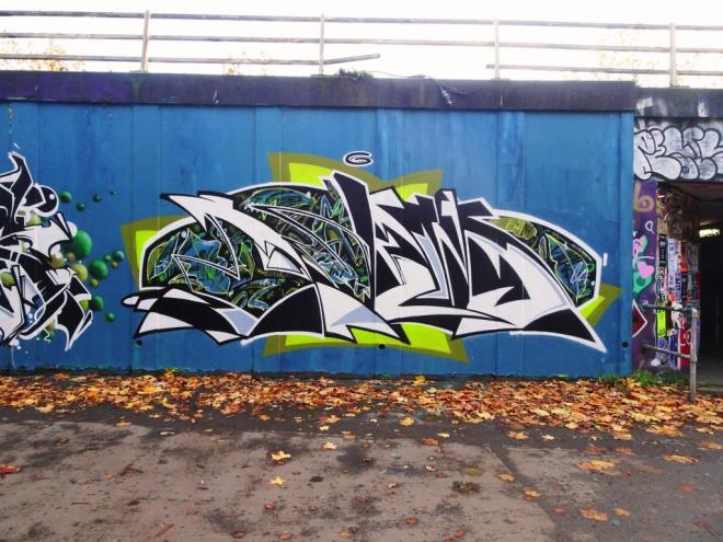
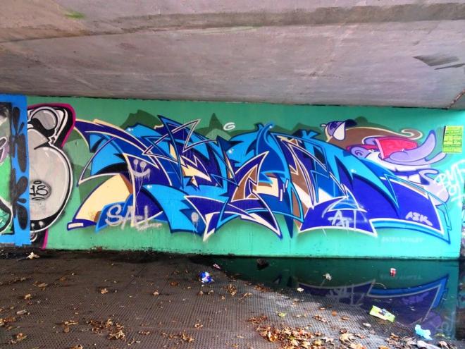





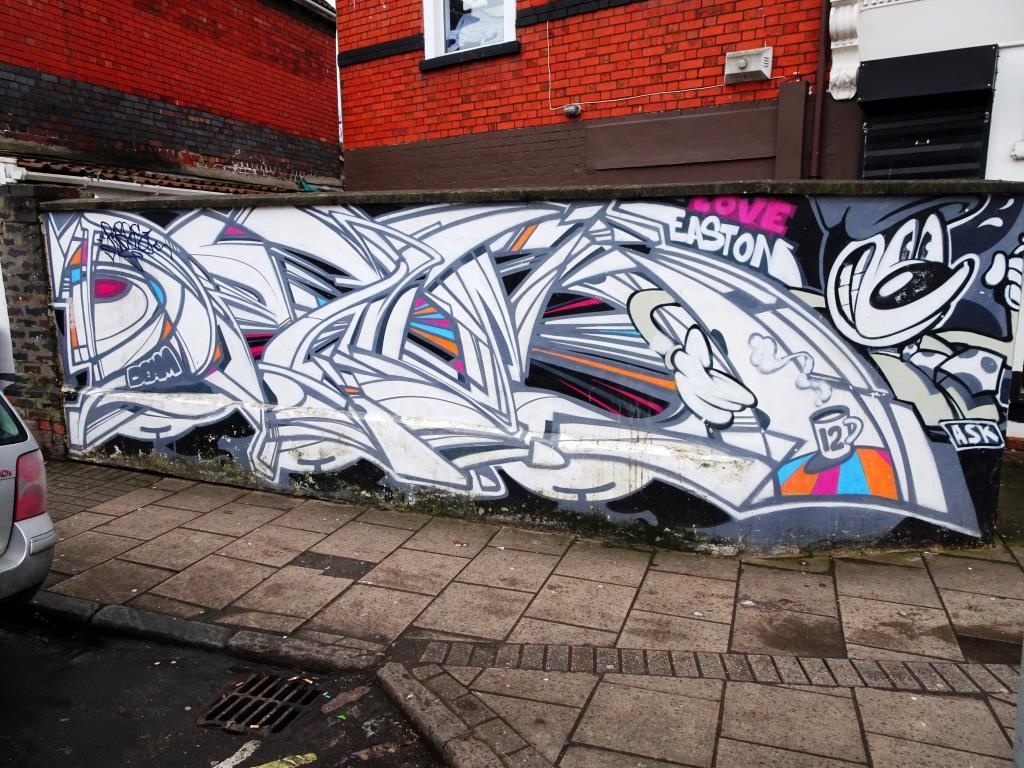
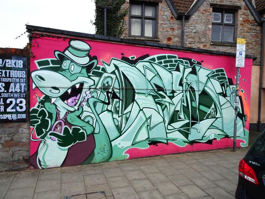


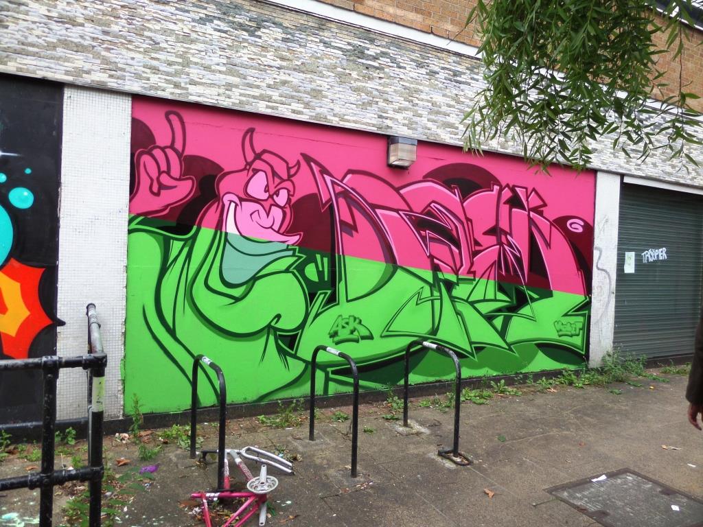


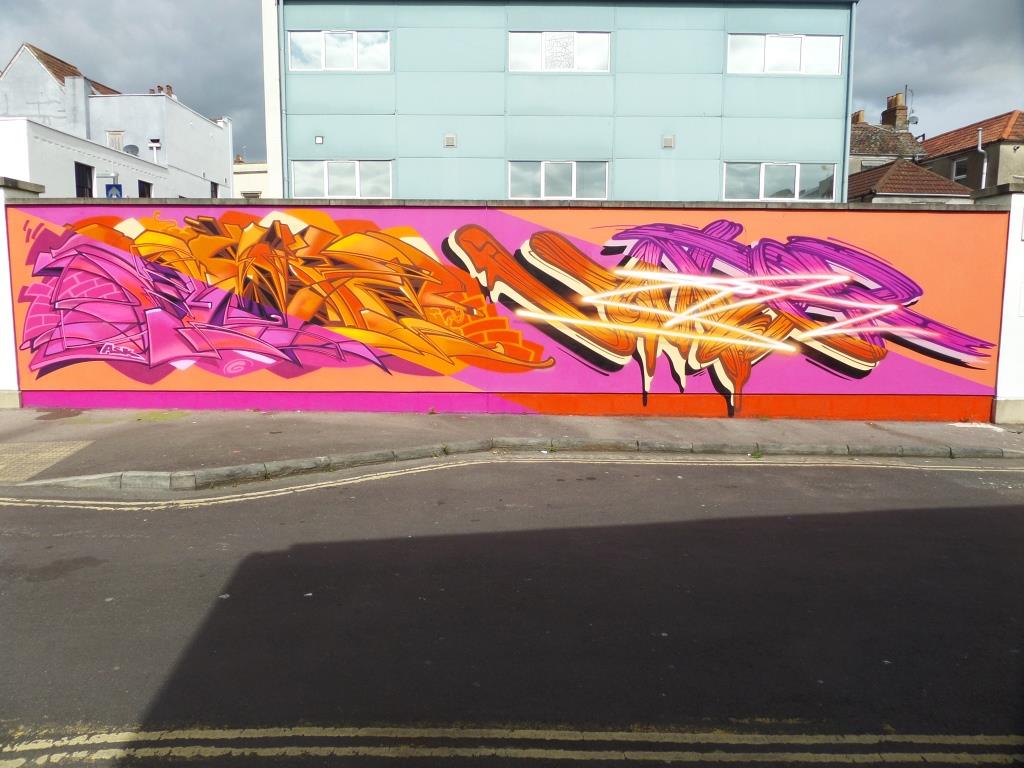



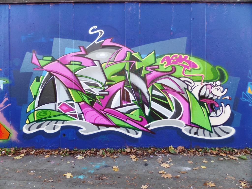
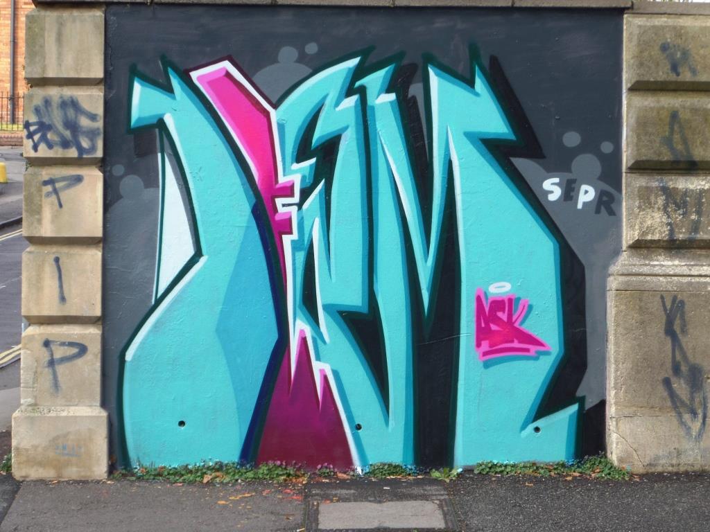

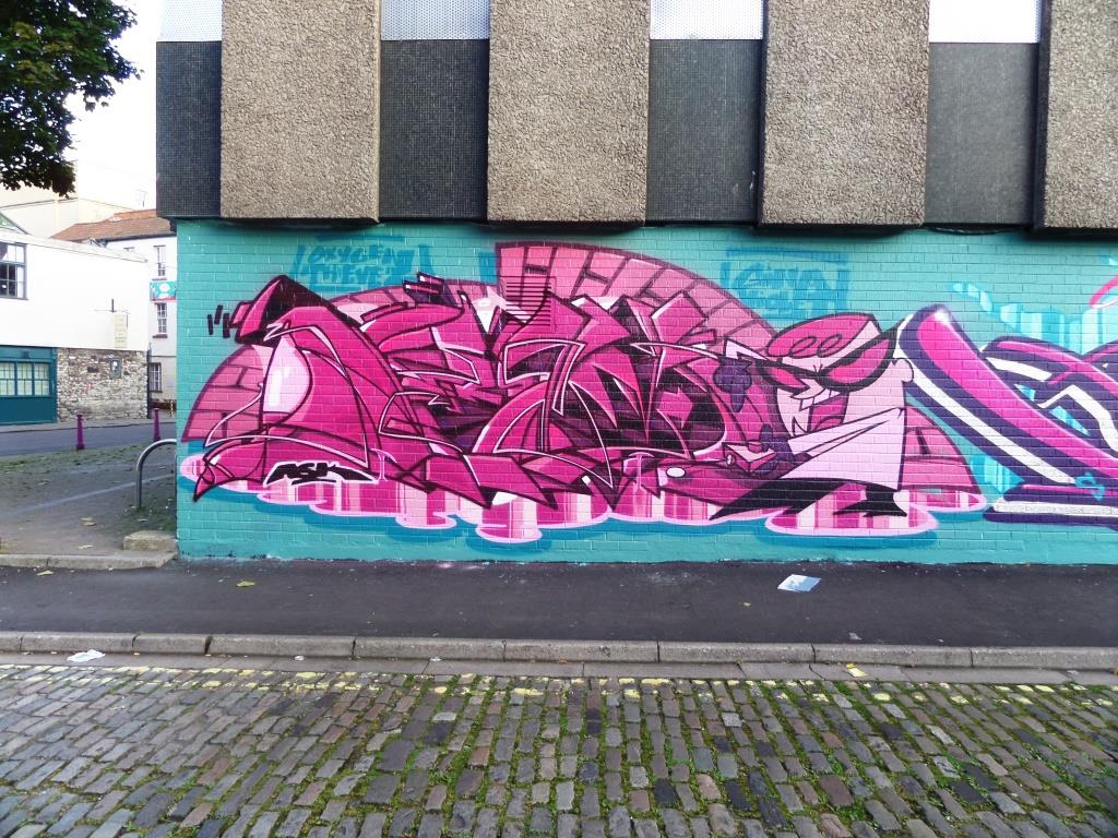

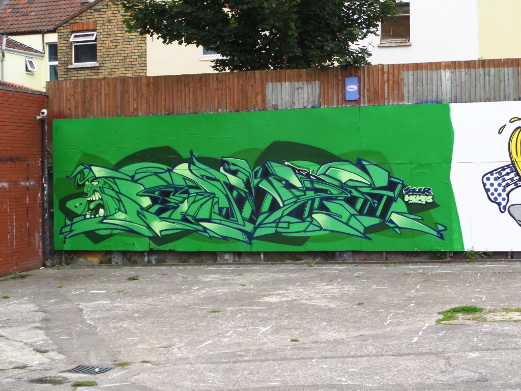
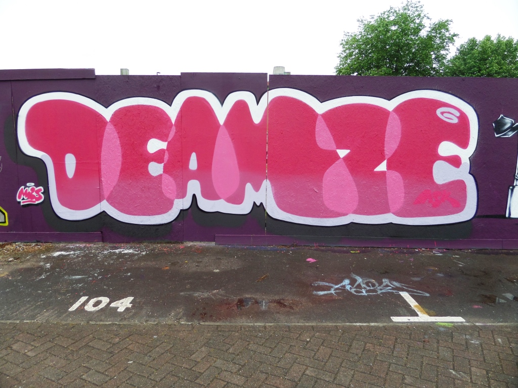

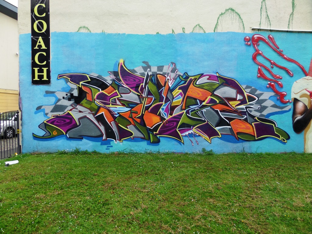
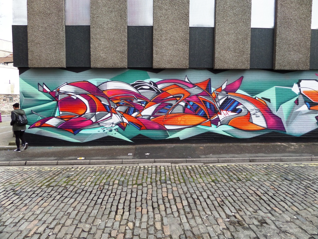
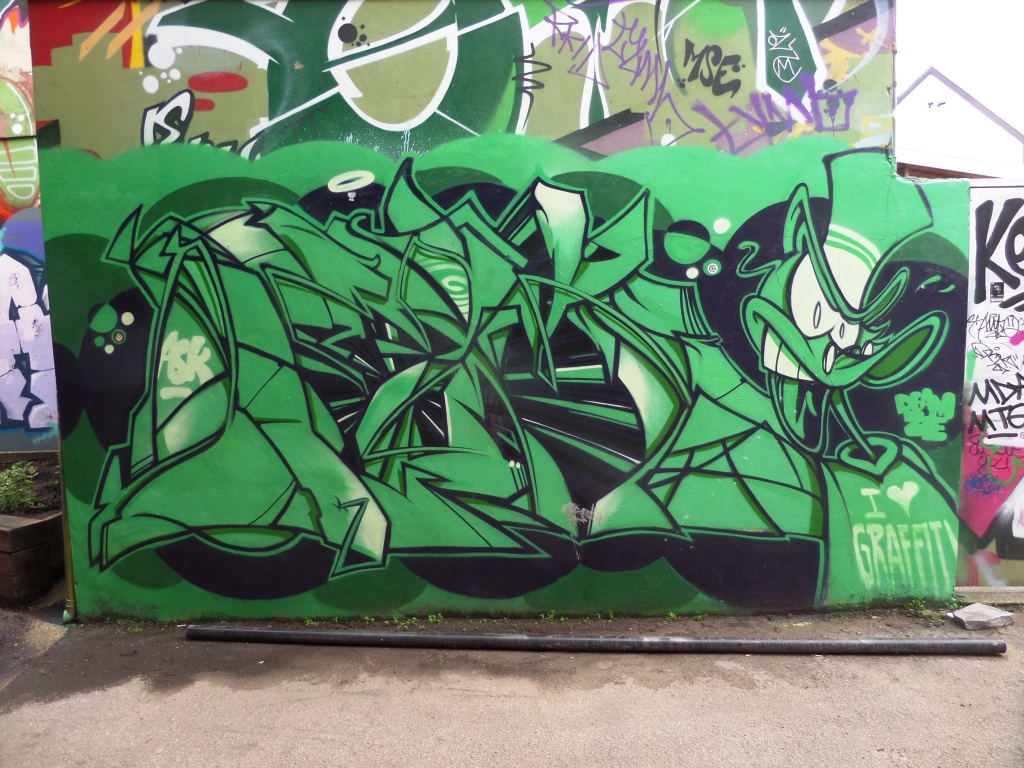
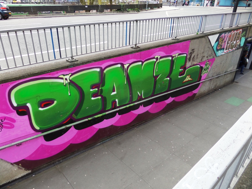
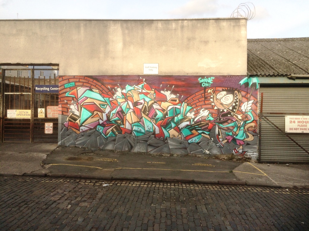
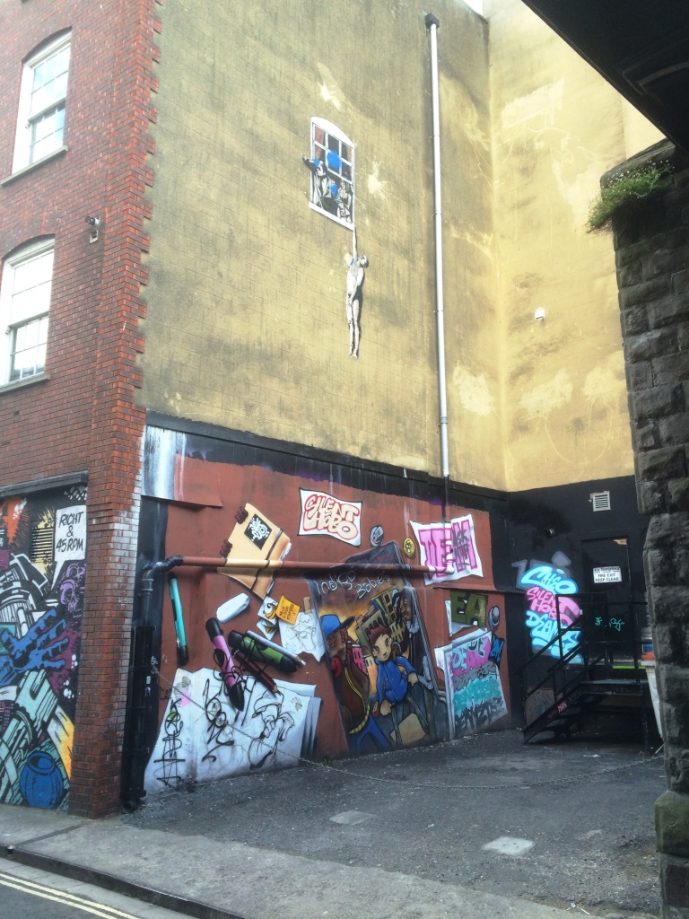
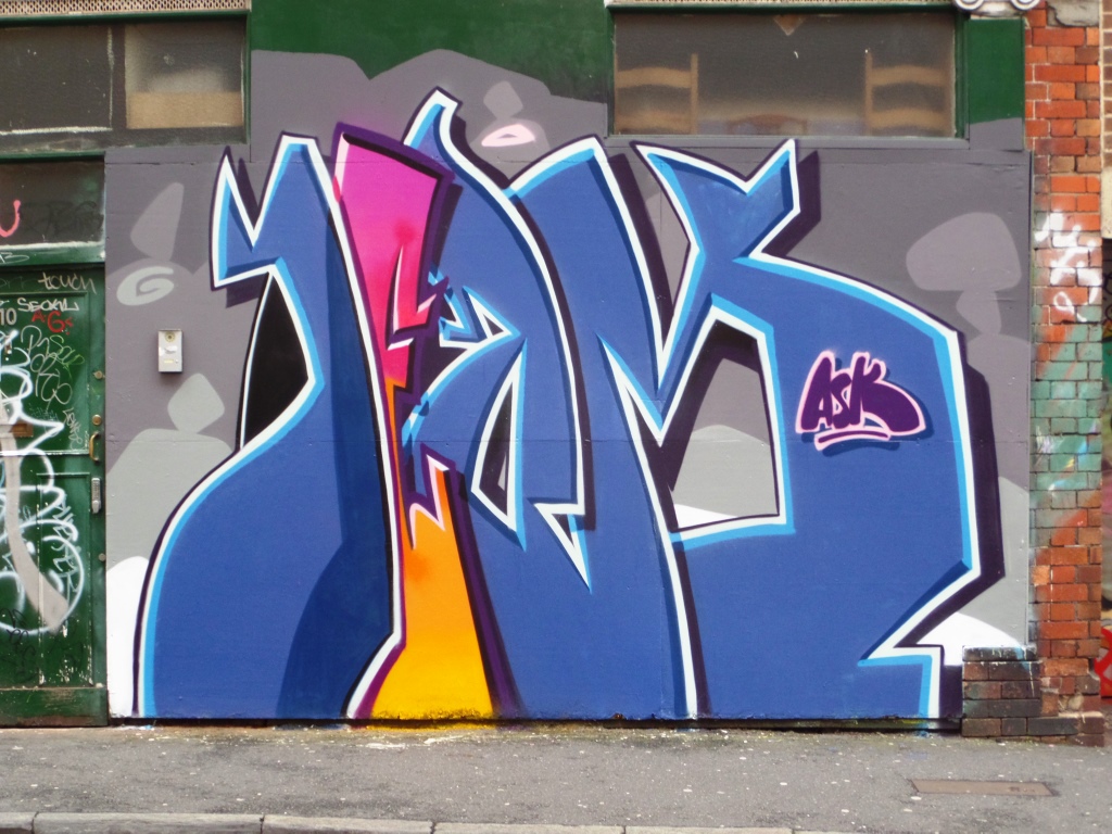
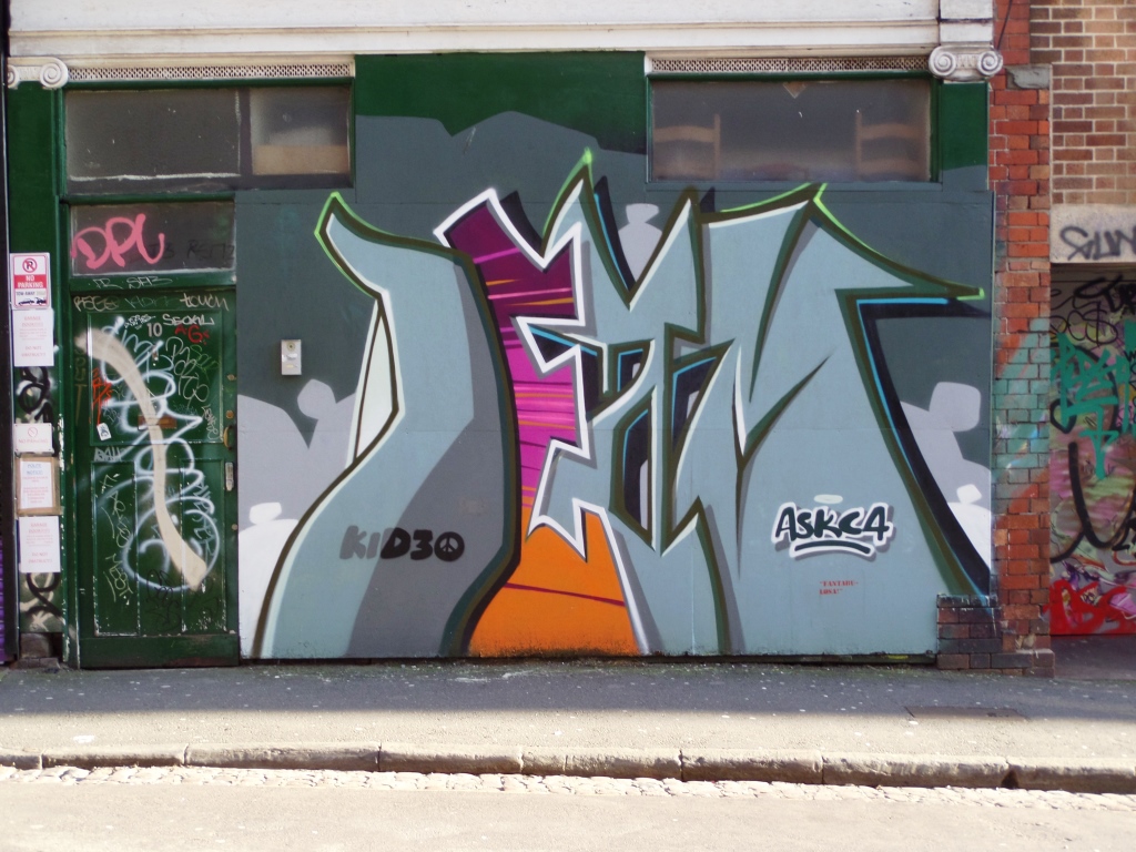
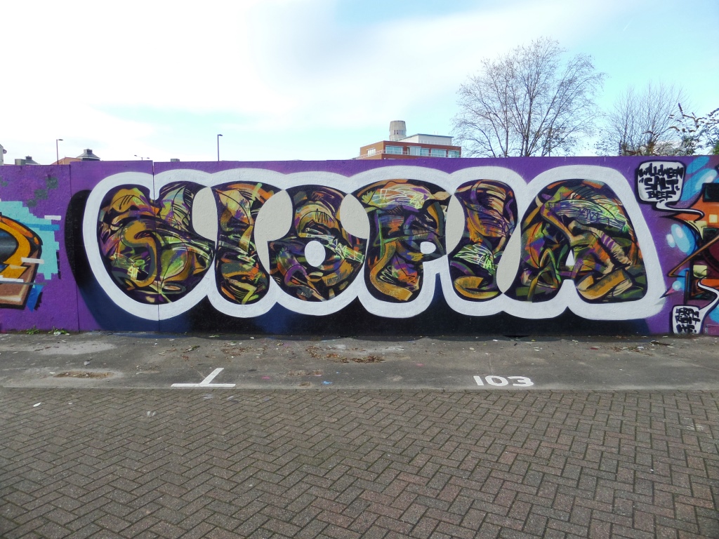
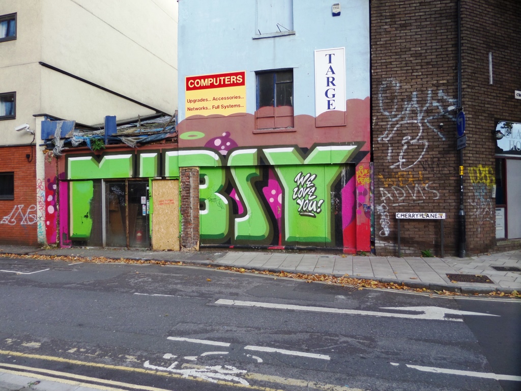

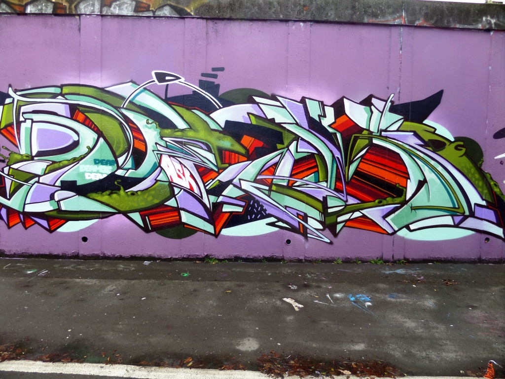

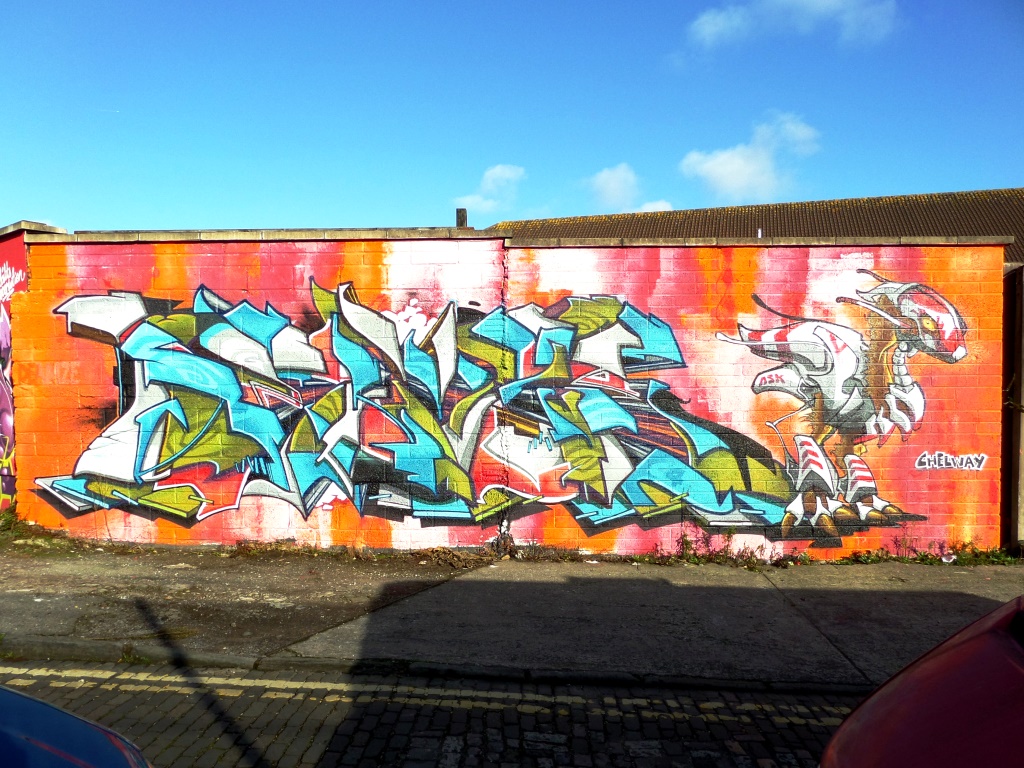
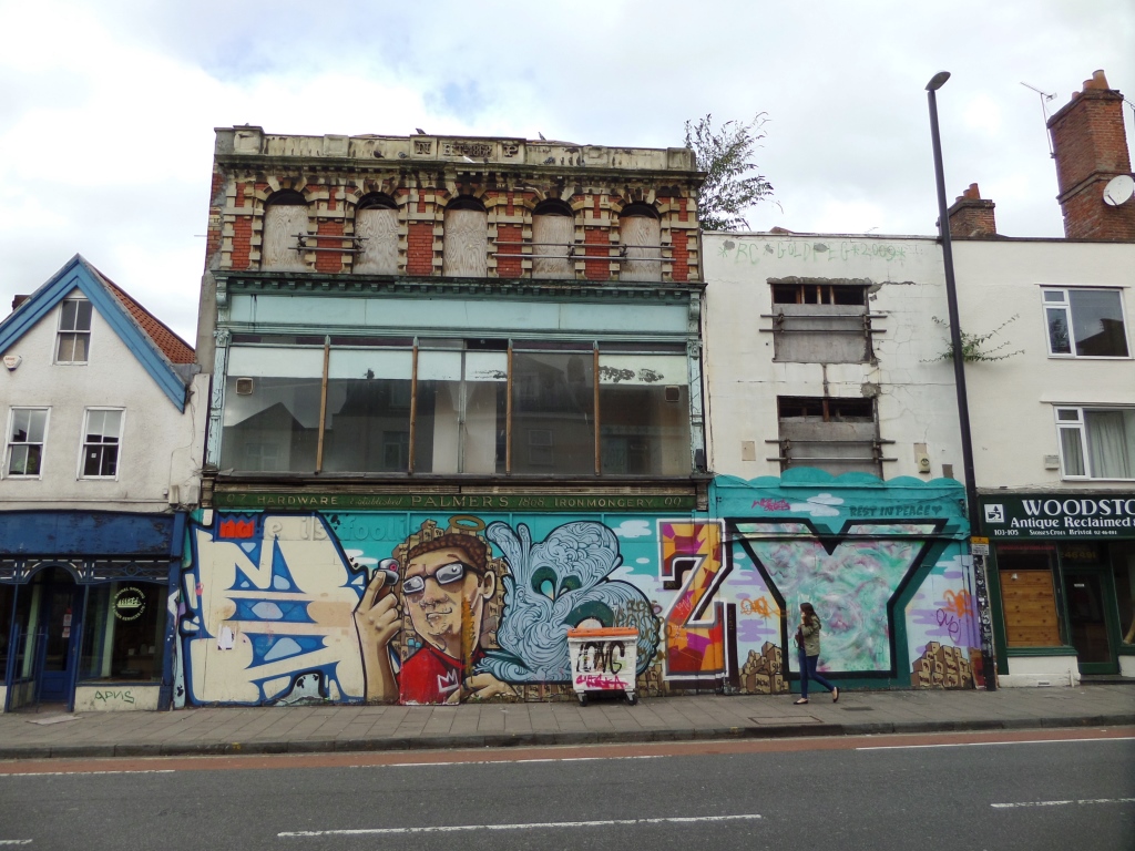
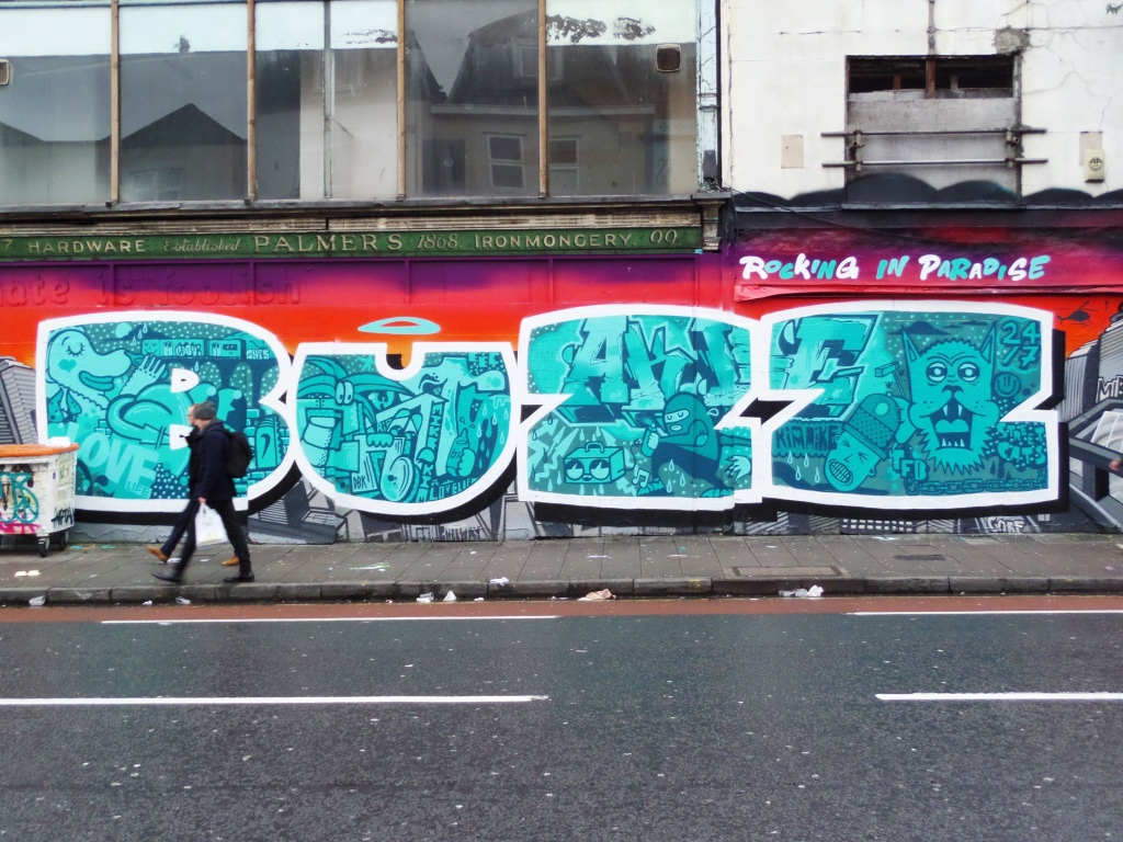


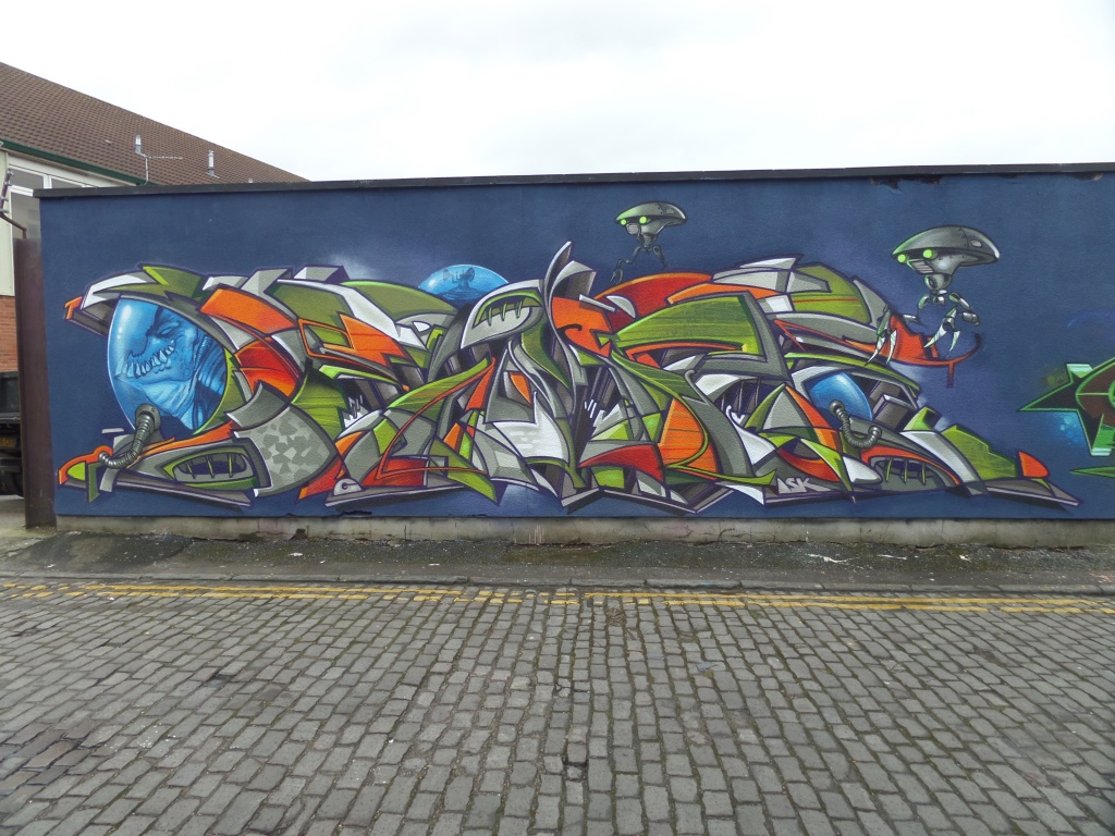
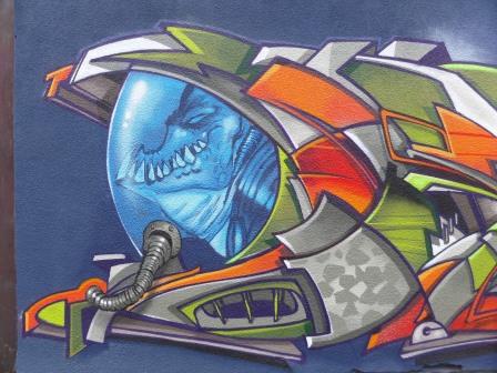
A collection of street art/graffiti art by Deamze
All photographs taken by Scooj
On my way home from my spray art lesson in the Upfest shop garden with Loch Ness, I made a quick diversion into Dean Lane because not to do so would be negligent. There were one or two new pieces, but best of all was bumping into Slim Pickings as he was finishing off a piece. The subject of this post is actually an old one of his from December last year which I thought I’d share, now that I am building an understanding of his work.

When Slim Pickings writes, and he has been spraying for 30 years, he sticks to the same motif with clean simple lines. The letters are TES (thank heavens I got there in the end – Slim Pickings put me through the ordeal of guessing the letters). He gave me plenty of tips about 3D work and told me that often, when he decorates the letters with patterns and the like it is often because he has some spray cans with a little bit of paint in them to finish off.
Because Slim Pickings works with the same letters, he knows exactly how much paint of each colour he will need. Kind of handy if you are travelling light. Besides being a really nice guy, I think his work makes complete sense to me and is always tidy and clean. Hats off to the man who until a couple of months ago was off my radar…d’oh.
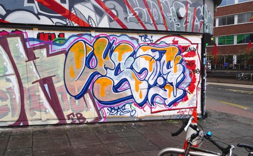
This is one from the archive byWhysayit, who now calls himself something entirely different, and who I am unable to find on Instagram any more. Out of convention and organisation of my blog and tags, I will continue to call him Whysayit or YSAE, which is what the letters spell out in his writing.
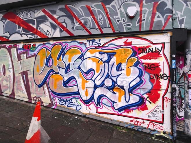
A quick one on the side of what used to be Meat Liquor on the corner of Thomas Street and Stokes Croft. Although it is quick, it is nicely worked and the lines are clean, only the white filling is a bit dodge…maybe he was running out of paint/time.
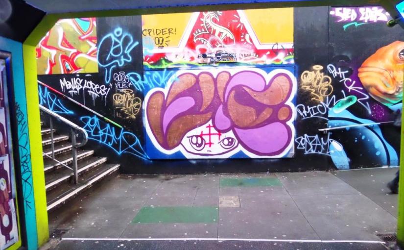
A quick one in The Bearpit from Face 1st going back a little. The main reason that I have posted this is because I remember at the time being incenced by the aggressive graffiti cross in the middle of the face with its far right connotations. When I see this kind of disruption, my immediate thought is ‘what kind of idiot would do this?’. I guess I still find myself constantly challenged by this mindless behaviour. I know that pretty much all artists expect this on the street, but it doesn’t necessarily make it right.

I don’t think I will ever tire of Face 1st’s work, and I get real pleasure out of each and every piece of his that I find.
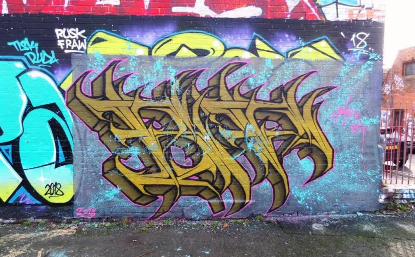
I have always been rather fond of Hire’s work, it is wildstyle writing with a gothic twist. In this piece I am not certain, but it looks like he might have written HIRE in reverse, more likely though is that he has written something else altogether – writing can be very tough to read at times.
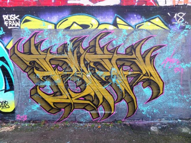
I like the colours he has selected and the depth of shading on his spiky letters. He’s also created a nice background, although it ends rather abruptly on the left hand side. Maybe he ran out of paint? A nice one from January.
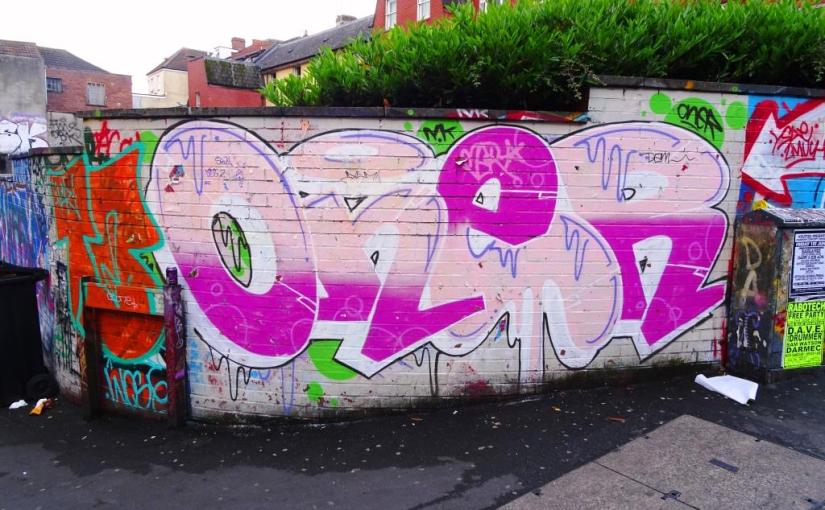
I realise that some of you might think that I am overdoing it a bit with the Oner thing – this is my fifth post from this writer since mid-May – but I think that both his artistry and productivity deserve it.
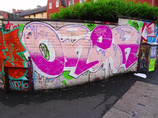
At first glance the piece may look a bit messy, but there is lots that is good about it. His lines are clean and he has cut in the edges of his letters really skillfully so that each is distinct from the next. His shading regime has been reversed on the ‘e’ with the dark pink at the top and the light pink underneath. He has added in some nice drip decoration and if you look closely you can see some subtle bubbles on his dark pink. I think I could learn a lot from this writer.
Another unmistakable feline portrait by Daz Cat, this one is on the path on the south side of the River Avon near Cumberland Basin. I don’t think that this is his best work, but even a quick one like this requires a lot of skill. I can say this with some authority, having hadf my first two hours with a spraycan earlier on today (as I write this post (about three days ago)).

I can’t quite figure out what the thing growing out of his face just above the mouth is, but it looks like a mouse tail to me. This is a great wall in a fine location, but not one that gets a lot of attention (I think). I’ll have to drop by soon for another look.
A yellow man in swimming trunks and a rubber duck’s head. This could only be the work of one man, and just in case you were in any doubt, he has rather helpfully signed the piece over the top. It is of course Face the Strange.

I’m not entirely sure when he pasted thie piece up, it looks quite old, but I don’t recall seeing it at Upfest 2017, so maybe he visited Bristol after that and put it up, or maybe I just hadn’t registered it before. It is a fine wheatpaste and appeals to my surreal tastes.
A whole bunch of artists from PWA and some others had a bit of a paint jam in St Werburghs tunnel a couple of weekends ago. This amazing piece of writing is from an artist I featured for the first time only a few weeks ago, jon Sikoh.

I think this is a stunning piece of 3D writing, thin and angular, with beautiful and subtle shadings. The decorations surrounding the piece help to fill in the surrounding sea of blue. Sikoh is a very tallented artist and I look forward to seeing more from him.
At the far end of the Tobacco Factory staff car park is this modest and ephemeral piece by Annika Pixie. It was painted during an annual weekend paint jam organised by Stephen Quick.
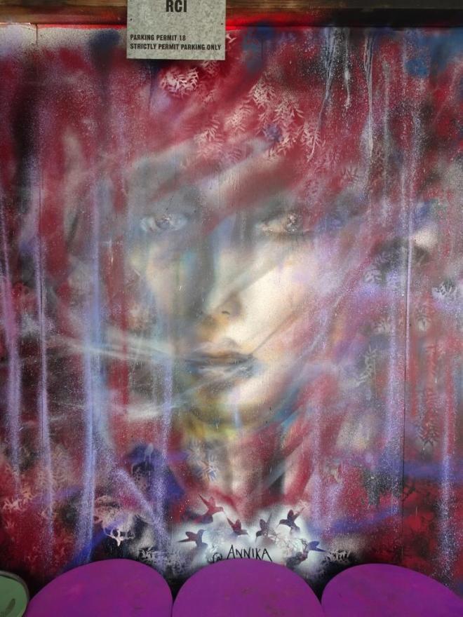
This wispish and haunting portrait is very much in the style that is associated with Annika. There are two things I particularly like about thuis piece…the veil-like see through curtain that sits between the subject and the viewer, and the nicely arranged stencils that surround the whole piece.