
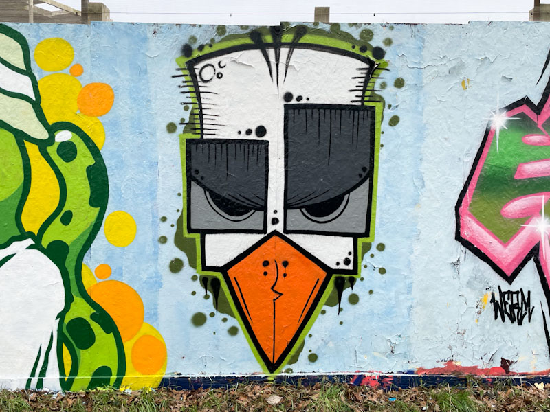
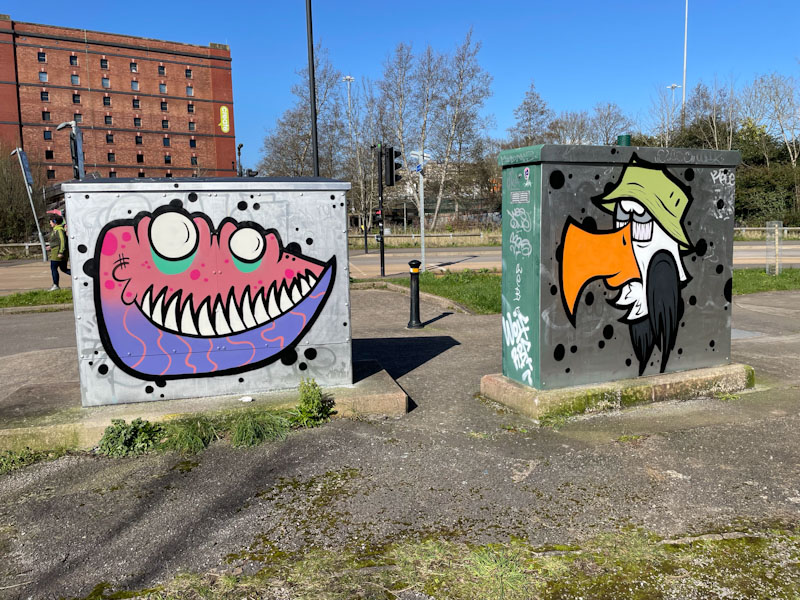
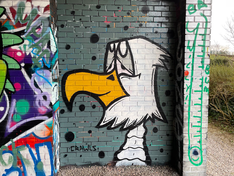
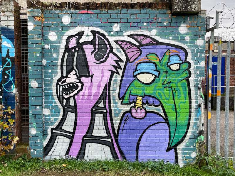
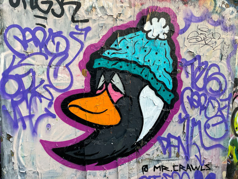
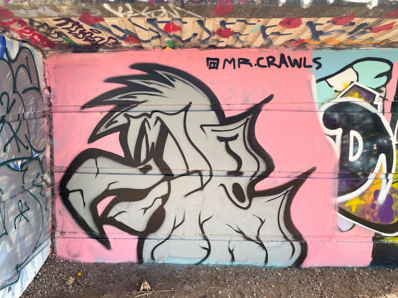
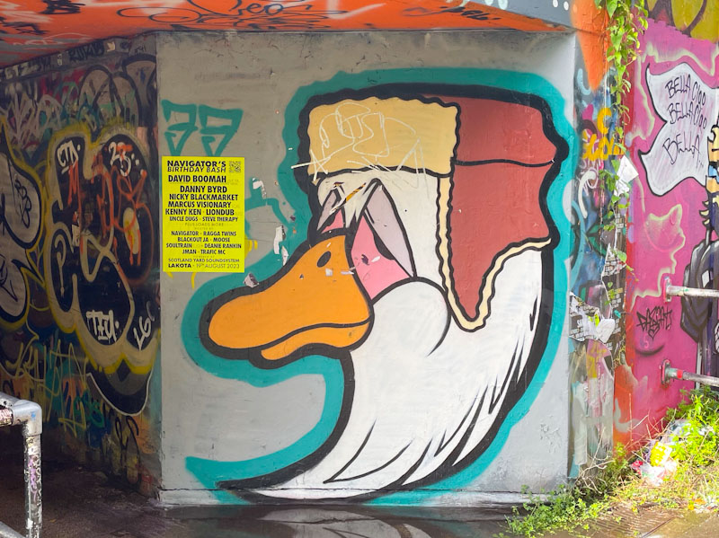
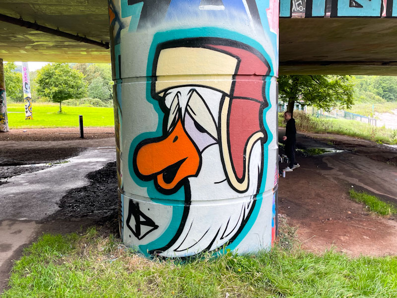
A gallery of fabulous character birds and monster pieces from the talented Mr Crawls
Instagram: @mr.crawls
All photographs by Scooj


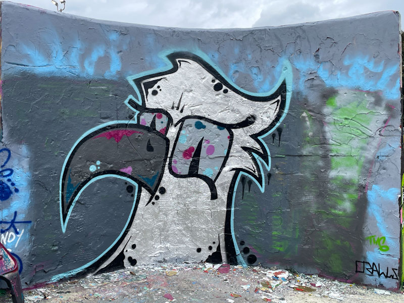


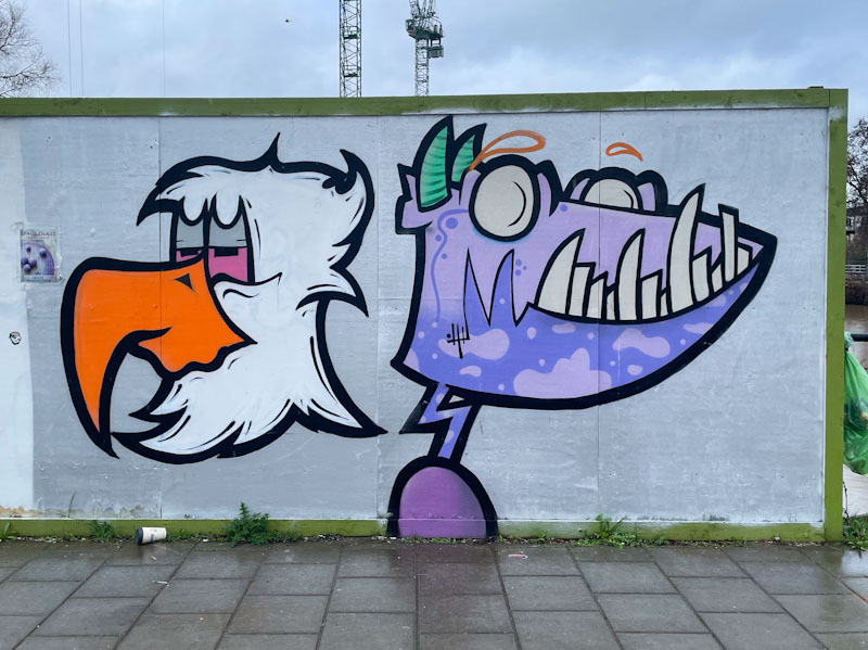


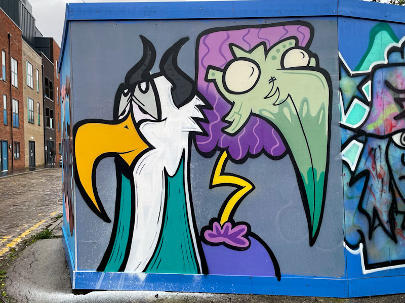

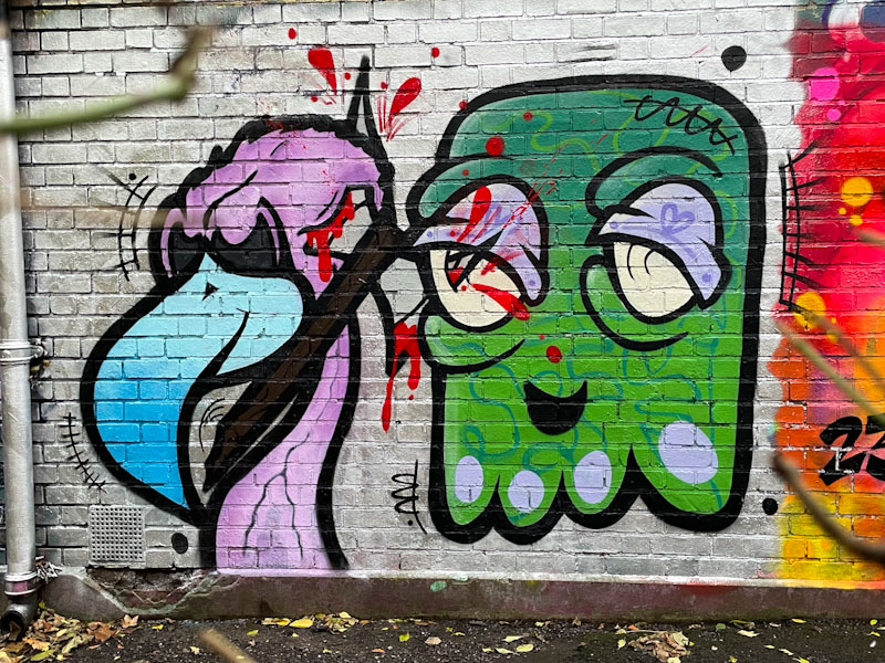
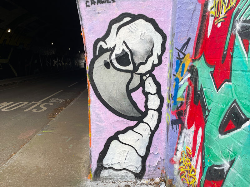

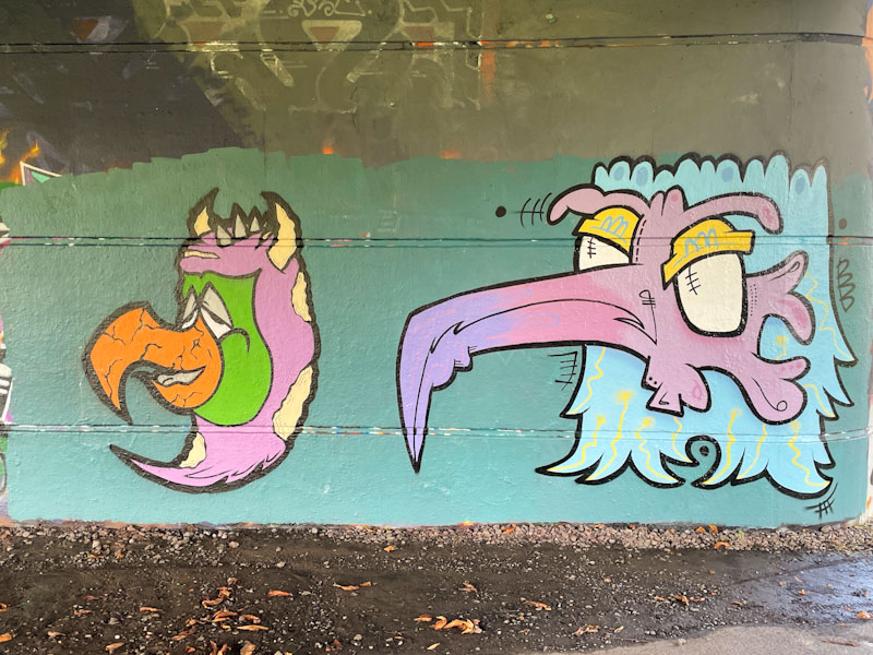

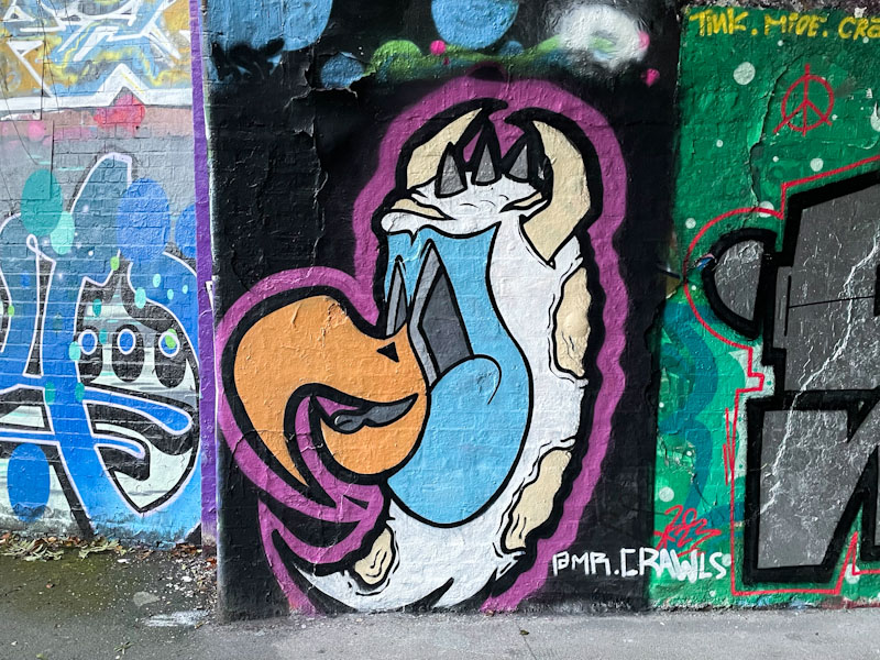


A gallery of fabulous character birds and monster pieces from the talented Mr Crawls
Instagram: @mr.crawls
All photographs by Scooj
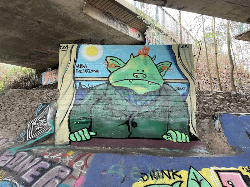
One of the favourite books of my youth was Fungus the Bogeyman by Raymond Briggs, an illustrator and author who wrote some of the finest and most touching comic strip books of the time. Fungus the Bogeyman spanned the generations very cleverly, and is full of witty puns and literary references. On starting this post, I have been searching for my copy of the book, but seem to recall I leant it to a cousin years ago. I might just have to buy myself a new copy.

Haka has captured the essence of Fungus the Bogeyman perfectly in this piece, and the spot itself is exactly the kind of place that you’d imagine the character to lurk on a damp, foggy night. As with all of his pieces featuring children’s characters, Haka has remained incredibly faithful to the original illustrations. My favourite piece of the year so far.

Ladies of the PWA crew have started the year with some real momentum, and have broadly had a busy period. This conflation piece from Desi and Lupa looks gorgeous in the evening sun. In my experience, it is quite unusual for two artists to merge their names and share a style in this way, and I have to say I rather like it. Within the crew, there are all sorts of combinations that would be fascinating to see, although I sense that this might be a bit of a one-off.
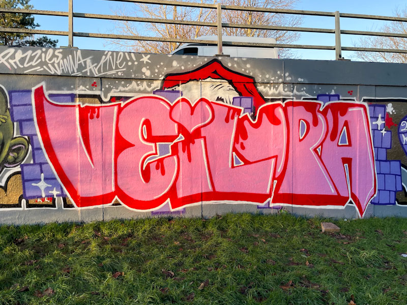
Desi has contributed the VEI, and probably L, and Lupa, the UPA. They have set the pink writing on a traditional purple brick wall background, and the Christmas hat from PWA’s Zake can still be seen behind the letters, providing some temporal context. A fine and true collaboration from Desi and Lupa.
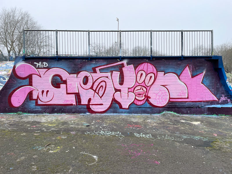
It brings me great joy when I come across new Kid Crayon pieces. He has been reasonably quiet over the last couple of years, which in a way is a good thing, because it signals that his work is going well, and being an artist/designer having plenty of work is always a positive.
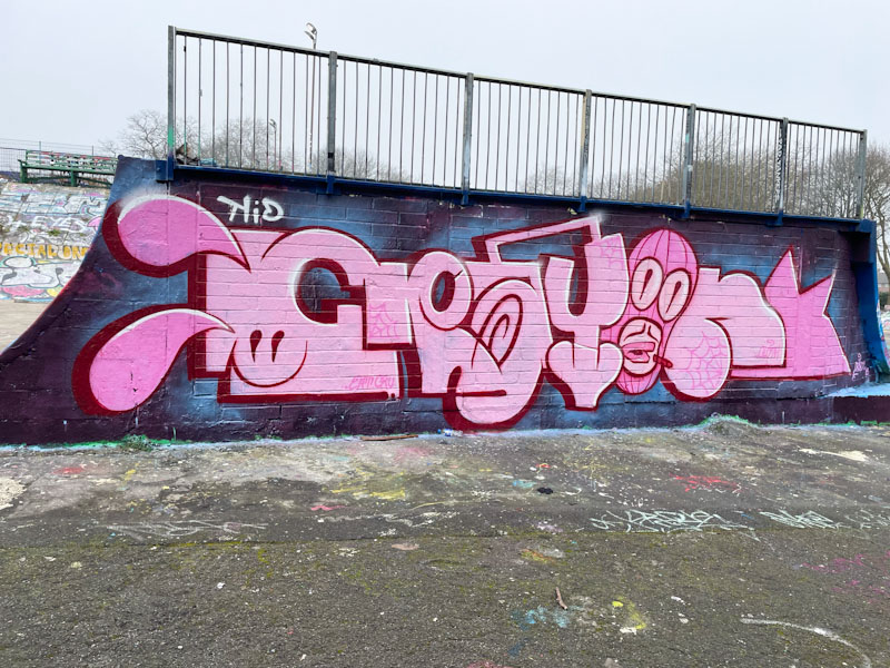
This wall used to have three alcoves in it, and in fairness, was quite difficult to paint. For whatever reason, the council decided to fill the alcoves with breeze blocks, and I have to say that the unintended consequence was this new long wall, which artists have been enjoying ever since. Kid Crayon has used the full length of the wall to paint his letters in hi favoured pink. Each letter is in a distinct style, where the ‘O’ is a masked character incorporating a floating crayon. A nice tidy piece and great way to start the year.
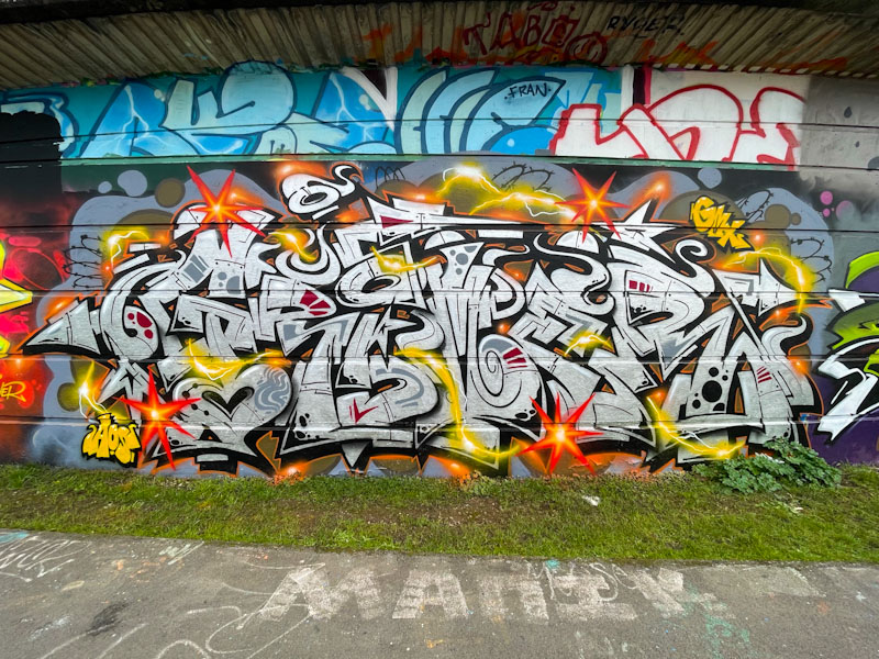
I met Grimes for the first time while he was laying down the foundations for this exceptional chrome piece. I have to say it is so much better than I was expecting it to turn out, which is saying something, because when it comes to Grimes’ work, the bar is already set pretty high. The artist is a lovely man, and we chatted for quite a while. One of the things I found out is that he has been living in Bristol for seven years, so I think I am going to have to revisit my archives to see if I can find any of his older work.

This piece simply oozes class, and energy. Sometimes Chrome pieces, although impressive, and ‘a thing’ they are prone to being a little on the dull side. Not so with this explosive piece by Grimes. The chrome letters, spelling Grime, are filled with some nicely worked traditional patterning, but it is the sparks and plasma threads running through the piece that take it to the next level. Excellent work from the graffiti writer of the moment (‘says who?’ says me!).
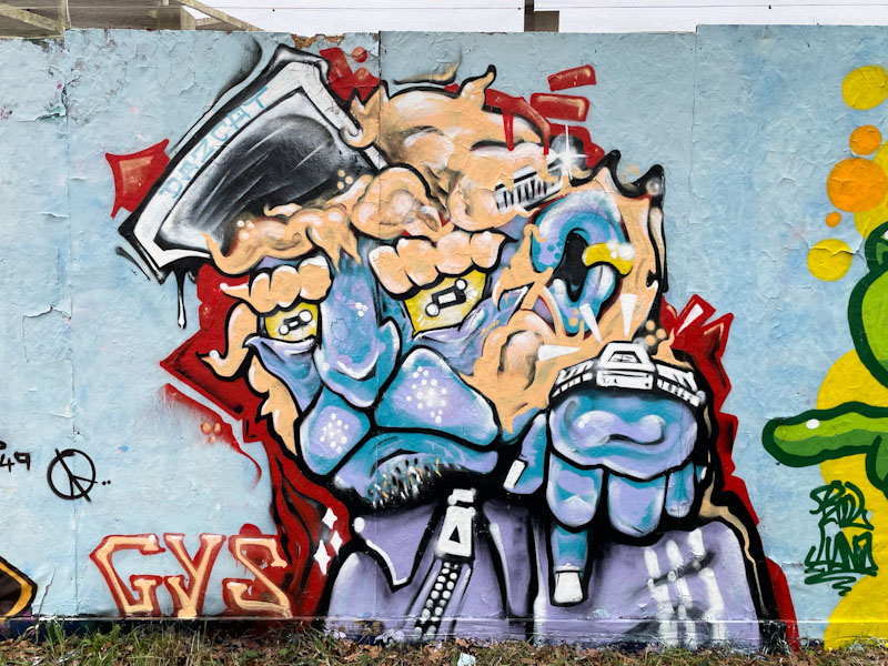
A few years ago, Daz Cat was painting charming cat portraits, but compared to the pieces he is turning out today, they were flat and unsophisticated and his work since then has elevated several levels. He is now turning out complex pieces that tell stories and have amazing depth to them.

This cat with ginger hair and plenty of attitude contains so many interesting features and details. I love the wristwatch and the zip on the tracksuit top, small things that add so much to the story. Also interesting is the creative border, which, rather than being a solid black line, is a dynamic red interface between the character and the background. A very nice piece from Daz Cat.
What a lovely clean and tidy piece this is from Benjimagnetic at the entrance to St Werburghs tunnel. Ordinarily, I would say that Benjimagnetic’s pieces spell out BEN, but I now know it says something different after Benjimagnetic corrected me the last time I mistakenly got it wrong.
What I like about Benjimagnetic’s work is the way he deconstructs and then reconstructs his writing, so that it is composed of loads of design elements that come together in a novel way. Another artist who uses a similar deconstruction technique is Minto. Great colours in this piece and overall a classy bit of writing.

Towards the end of the year, the collaborations from Dibz and Fade plus guests, dropped off significantly, and I have a feeling that Fade told me he was making a trip to America in the winter, and perhaps that was the reason. I am sure that this is only a temporary blip and that this collaboration marks the first of many in 2025
This time, Dibz and Fade have teamed up with Stivs, who has provided the centrepiece for this collaboration. In this piece, there is a clear themed palette giving off a rusty red vibe, combined with a deep white drop shadow. Fade has written his FADER letters with accuracy, and the shadow fill is either thin or patterned, and I can’t quite decide which.
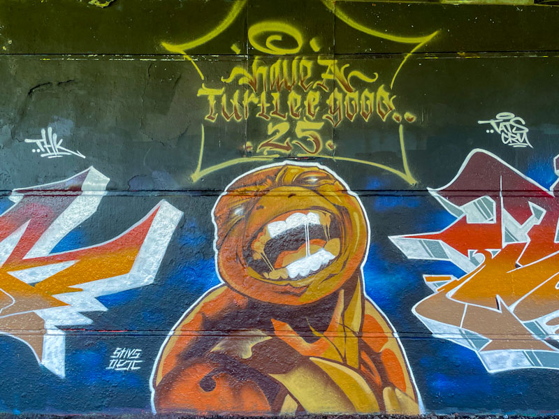
Stivs has provided the character interest in the centre with a magnificent Teenage Mutant Ninja Turtle portrait (he is going through a bit of a TMNT phase at the moment). The writing at the top says ‘Have a turtlee good 25’ giving away that this is a New Year collaboration piece.

Dibz rounds off the triptych with a reflection (in terms of colour and style) of Fade’s writing, and also has the same effect on the white drop shadow, which leads me to conclude that it is a deliberate, mottled pattern rather than thin paint, which makes sense really, because these masters of their craft would never be happy with substandard fills. A great way to begin the year.
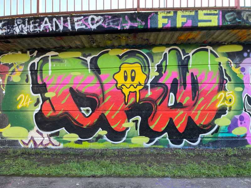
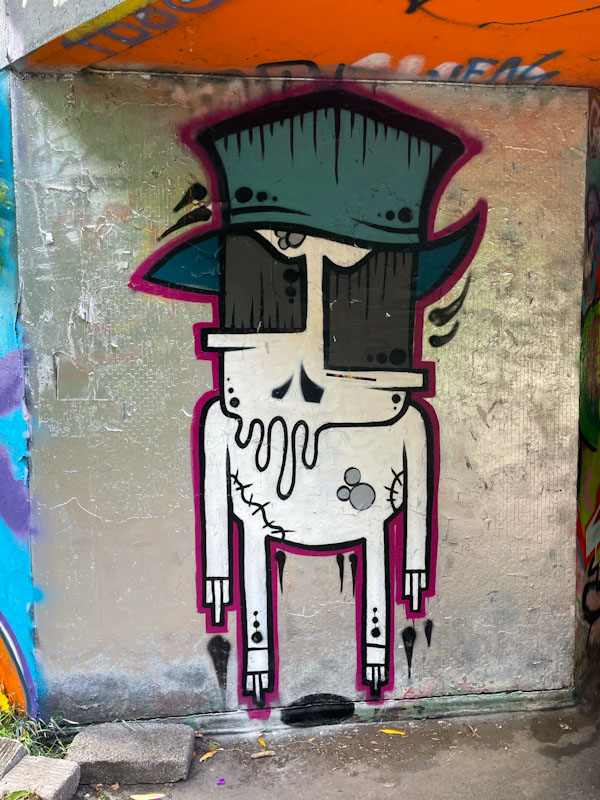
I have met Mr Draws a great many times, which is not surprising, given the frequency with which both of us are out and about in the more popular graffiti spots of Bristol. I can honestly say that he is a gentle and really decent man, who’s good nature comes out in his light-hearted writing.

This transition piece was painted at the end of 2024 and start of 2025 (I hope not on New Year’s Eve itself). Some nice letters spelling out DRAW, and a rather tired and emotional looking Smiley positioned in the centre of the piece, perhaps representing some exuberant celebrating and welcoming of 2025.

The new hoarding at the very top end of Stapleton Road has been colonised pretty quickly, and I can see it becoming a popular spot over the coming months. Omie and Jevoissoul have teamed up to paint one section of the virgin hoarding, and started off with a rather fetching pink background.
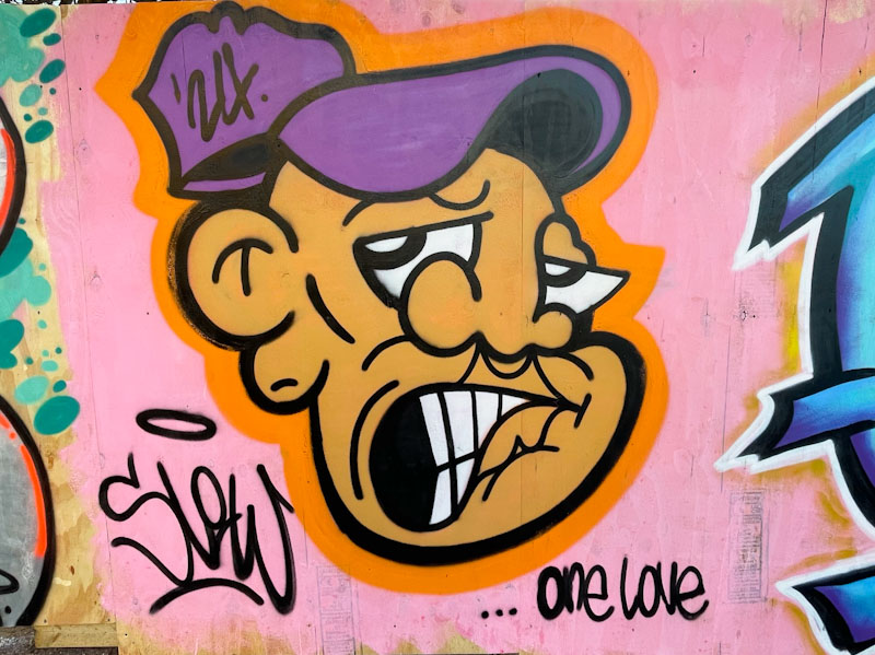
Jevoissoul is fast becoming one of the most active street artists in Bristol, with his stylised character faces and ‘SLOW’ writing appearing pretty much all over the city. Hardly a day passes without stumbling on another new piece. Since I first became aware of his work, his pieces have become much tighter, with strong, tidy black lines and solid fills. This is a good example of his improvement.

Having met Omie over the Christmas break, it is so nice now to visualise the face and person behind the great writing. What I particularly like about Omie’s work is that every piece is utterly unique and different from anything else I have seen by him before. His creativity is admirable. I like the colours and the brush-stroke effect he has achieved with this piece. I wonder how long this collaboration will remain before others get to test out this new spot.


