

.
Naked contorted
summer’s protective coat shed
winter’s agony
.
by Scooj
.
Naked contorted
summer’s protective coat shed
winter’s agony
.
by Scooj

This is another one from my archive. I was actually digging it out because of the piece by Nice One, which is sitting above a Solar piece. It is impossible to post one without the other, and so you are getting two for the price of one in this post. Solar is a reasonable active member of the PLB crew, and it is not so long ago that I posted a gallery of his work. This is a nice letter blocky piece from him, and I think he painted the PLB letters too.

Nestled on top of the Solar piece, Nice one has painted his Times New Roman font letters spelling out his name. Midway through the letters is an interesting character, looking like somebody from an age gone by. The black and white character is really well painted and something of a nice surprise. I don’t think, although I can’t be certain, that the pieces were painted as a collaboration nor even necessarily at the same time. I can’t be sure either, who painted the brick wall with water flowing from a pipe. Curious stuff.

I have tried to make a habit of posting all the Grimes pieces that I photograph, but on a recent trawl through my archives, I found this one from June this year. Remember June? It seems so very long ago. The central characteristic of all of Grimes’ work is the extraordinary sense of energy and movement he seems to inject into his graffiti writing.

This piece, although painted in darkish colours and affected by low light levels in the tunnel, manages to burst out from the wall, demanding attention. As ever, the piece is immaculately finished with strong, sharp borders, tidy fills and a superb orange drop shadow. 2024 has been the year of Grimes, and it has been a pleasure finding and posting his work.

Street art takes many forms, and encompasses so much more than graffiti writing and spray-painted portraits, characters or scenes. It is a broad church that encompasses murals using spray paint or other painting materials, paste-ups and installations large and small. Hardcore followers like to stick with spray paint work, but I like to find and write about all forms of street artwork, and this wonderful toadstool piece by Le Imposter Design is a perfect example of a modest hand-painted tiny mural.
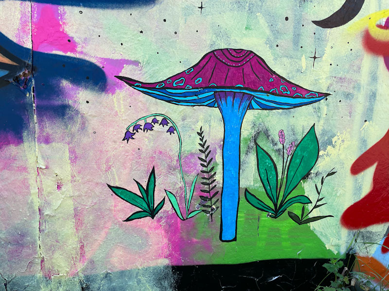
I have posted all the Le Imposter Design pieces that I have found (three so far), because I feel they help to represent this vast spectrum of street art in Bristol. Most of her work features plants or fungus, and this is a particularly nice example, with a purple-capped toadstool and some rather pretty ground plants and flowers. She has added some little stars, to add a little bit of context and atmosphere. The piece is small and low down on the hoarding. Blink and you would miss it. More to come from Le Imposter Design.

I think that May was a really busy month for street/graffiti art, the weather was pretty nice, and we had Upfest (Europe’s largest street art festival) in Bristol and I also had a trip to Leicester, so my May archive is still bursting at the seams with unpublished photographs of stunning art. One such piece that didn’t make it into Natural Adventures is this very special piece by Todoaciem.
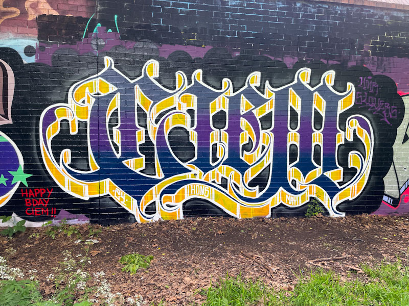
The calligraffiti which Todoaciem specialises in makes a refreshing change from the more stereotypical pieces that I normally encounter, where the form and precision of the letters and the drop shadow are paramount. It looks like this stunner was painted on Todoaciem’s birthday during a birthday paint jam. What a great way to celebrate.

You might be able to detect that I have been rooting around in my archives again, which I like to do every once in a while, because there are so many pieces that I’d like to share, but that get left behind. How this amazing collaboration from Conrico, Acer One and Andy Council ever got omitted I’ll never know, but I am making up for it now.


The three part piece is a wonderful co-creation in which all the distinctive elements come together seamlessly. The landscape background with hints of an oriental coastal scene is by Conrico and creates a wonderful setting for the letters of Acer One, that spell out WABI SABI in two sections either side of the centrepiece by Andy Council,
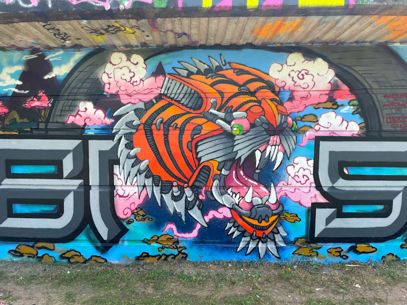
The central portrait of a roaring tiger has everything you’d expect from a piece by Andy council where each of the elements of the tiger are ‘stitched’ together to form a coherent and, frankly, stunning whole. I think that the rose pink clouds emphasising the tiger head were painted by Conrico. The overall collaboration is a triumph of three very different styles coming together to create something truly excellent.
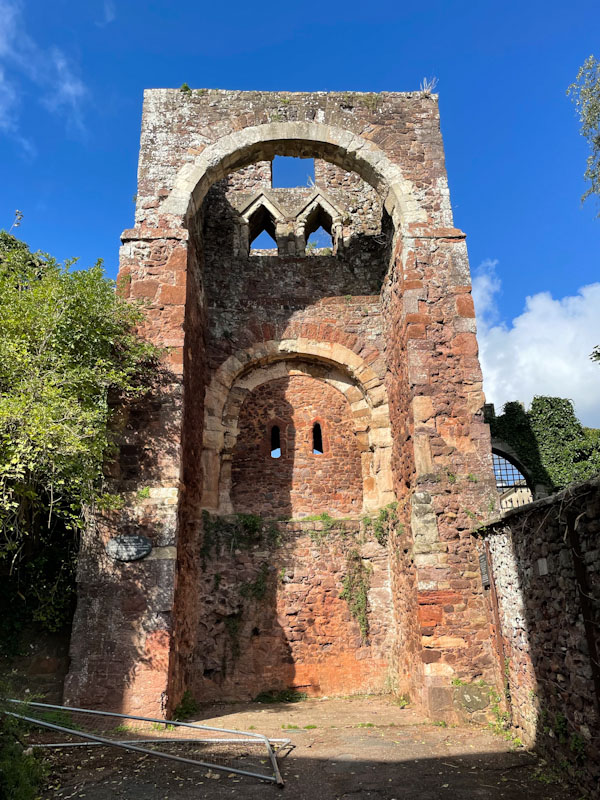
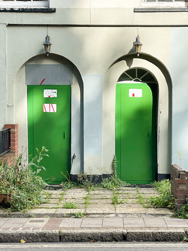
Doors 288 – Doors from Exeter, Devon – Part VI, October 2023
Can it really be 5 December already? This year has whooshed by at an alarming rate, and Christmas is just around the corner. I find this time of year quite tricky. The lack of daylight I am sure sets the tone, but my work also has a peak in December, as the teams I work with want to get everything lined up before the Christmas break, and while the Christmas period might then be ‘sorted’ and quiet for them, it is far from that for me and my team. I am also preparing for a crazy busy spring, although on the upside, I am likely to be ‘on tour’ again and should have the opportunity to visit some new towns and cities and snap up a few more doors.
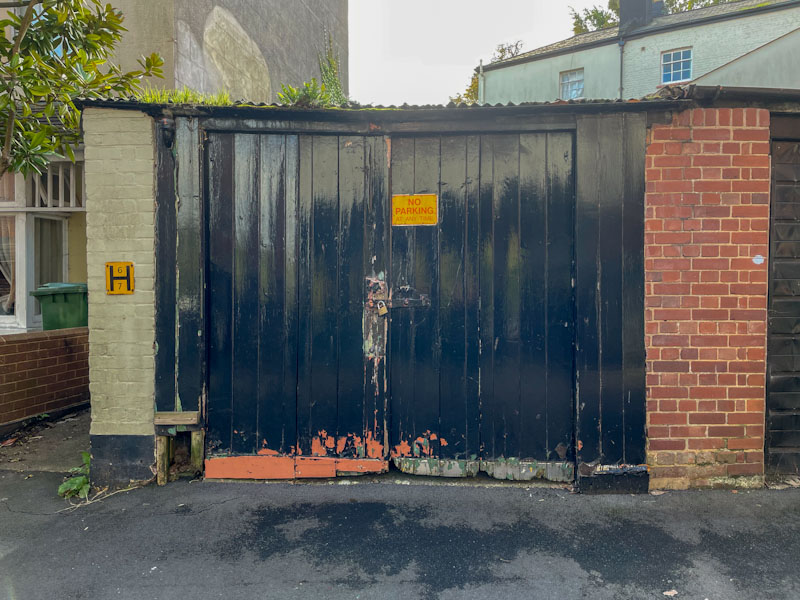
This is the penultimate selection from Exeter, which I have really enjoyed sharing with you. It is amazing just how much ground I covered and how many doors I photographed in a two-hour walk. Today’s doors are a bit of an eclectic mix, but pretty much presented in chronological order. Enjoy.


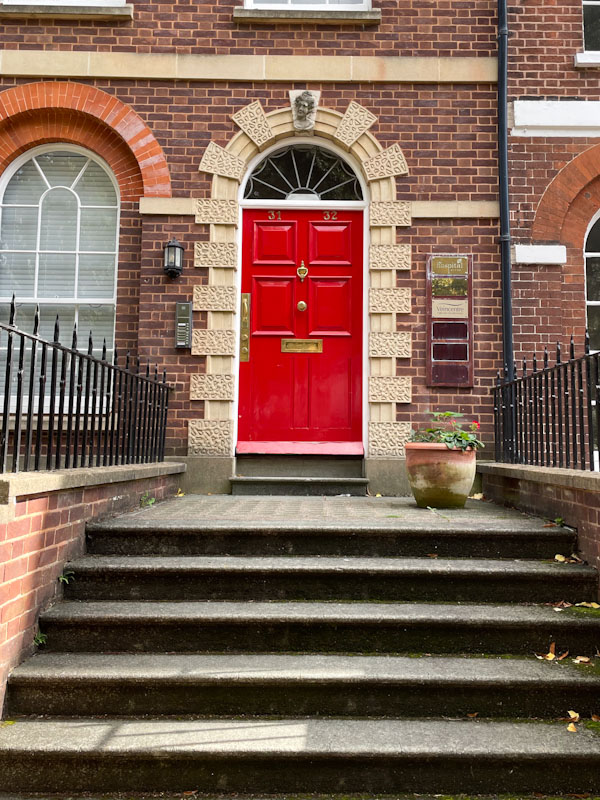

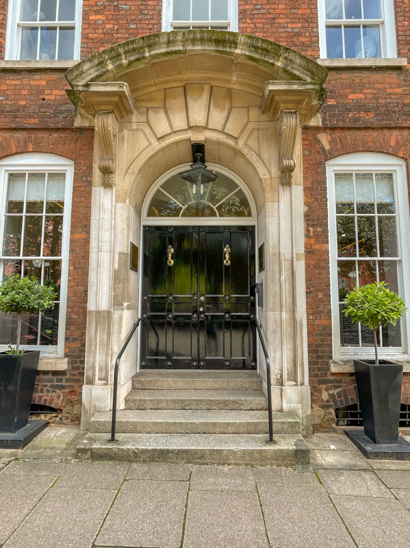

This last pair of doors definitely makes it into my top ten for the year, possibly even my top three, so I expect you’ll be seeing them again in my annual round up.
As I mentioned earlier, next time will be the final selection from Exeter, before moving on to something a little different. Thank you for your patience. I hope you have a fine weekend.
If you have made it this far, you probably like doors, and you really ought to take a look at the No Facilities blog by Dan Anton who has taken over the hosting of Thursday Doors from Norm 2.0 blog. Links to more doorscursions can be found in the comments section of Dan Anton’s Thursday Doors post.
by Scooj


I took these pictures back in May this year, but even then, I think this enormous mural by Silent Hobo and Logoe had been around for quite a while. I say it is by these two artists, but I only recognise Silent Hobo’s work, but perhaps Logoe was helping out. The piece is painted on a wall which is opposite a street food market and would account for the foodie theme.
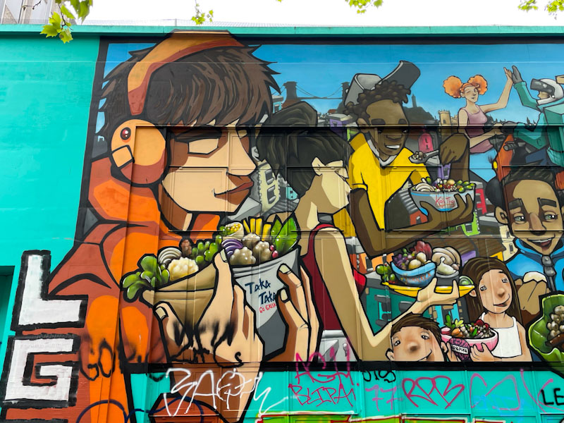
I have had to split the piece into two parts to showcase the vibrant scene. Silent Hobo’s is a real specialist in reflecting the mood and characters of youth culture in Bristol and has an obvious fondness for the city and its people. I find his pieces very touching.
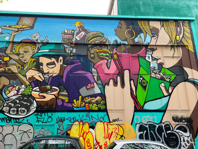
The contemporary piece offers a wonderful insight into the youth of the city, into fast/street food culture, and makes some references to place, for example, the Clifton Suspension Bridge in the top left. This is a busy, bustling blockbuster by Silent Hobo’s and Logoe, pity about the tagging on the lower sections.

One of the most rewarding things about writing a blog on street art and graffiti is that if you do it for long enough, you get to see new artists burst on to the scene and develop their ideas and improve their technique. An artist who has recently caught my eye is Astrea (formerly HNH), whose distinctive black and white designs are becoming more frequent and elaborate.

This is the first time I have seen Astrea add a portrait to her abstract patterns. The central character is a little bit unsettling, with star eye makeup and a tongue sticking out. The tongue looks like it has stitching running through it. The surrounding swirling design is very much in keeping with what we have seen before from Astrea. Great to see her gaining in confidence.

He doesn’t paint all that often these days, but when he does, Turoe certainly packs a punch. The gorgeous chrome letters spell out KATOE, which are set on a perfectly contrasting red background. But that isn’t enough for Turoe… he has created a wall through which the writing bursts. Imagine how the piece might look without the ‘stone wall’ artwork, it would feel altogether more ordinary.
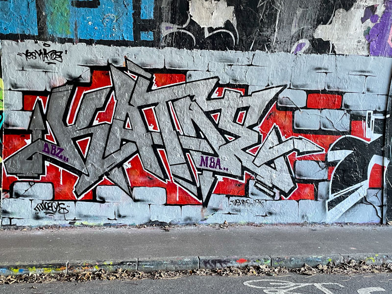
I am not too sure who Katoe is or what the shout-out is all about, but I love the way that the street art scene works, with artists recognising one another and paying tribute to friends and loved ones. As ever, a really classy piece from Turoe.


