.
Pretty confection
vicarious consumption
birthday cake ordered
.
by Scooj
.
Pretty confection
vicarious consumption
birthday cake ordered
.
by Scooj

I’m not sure that I have seen an Elvs/Dibz collaboration before, so this one in Dean lane recently is a bit of a rarity. The two have combined to share a colour scheme and theme, which I think is based on Disney’s Beagle Boys characters. These characters are familiar to me, but I don’t think I have ever read or watched anything with them in.

You can always tell a good collaboration when you don’t know who has painted certain bits of it, and while it is obvious who painted the writing, it is not so clear with regard to the characters. My guess would be that the two around the ELVS were by him, and the one popping out over the top of DIBZ was by Dibz. As always, Elvs’ writing is first class, and instantly recognisable with his very fat, elaborate lettering. The fill fades are pretty decent too.

Dibz is no stranger to writing/character combinations, and his skills are on show here. His wildstyle graffiti writing can be difficult to decipher if you don’t know what it says, but usually it is DIBZ, so you are on fairly safe ground. Talking of safes, there is a story in the piece, which involves the cracking of a safe using explosives. The character on the left is plunging the detonator, while the one on the right blocks his ears… the cartooniest of cartoon plots. This is a fabulous collaboration from two immensely talented artists.

Kosc is always on fire, whether it is his graffiti writing or his character pieces, he never disappoints. This is another outstanding piece of writing painted in day glow orange tones, a colour that he favours, but one that fades if left out inn the elements for too long.

The letters spell out Kosc and have his trademark ‘rivets’ in place at certain junctions in the lettering, making the whole thing look like a piece of metalwork. The transition of fill colours is exceptional, and the shading within each letter creates a fabulous 3D effect. I think that Kosc may have missed a bit of shading on the far left part of the letter ‘K’, a minor detail, but you can’t unsee it.

At first inspection, this ‘Goosebumps’ collaboration looks like it was painted by three artists; Hicks, Pekoe and Maes, and that would be a fair assumption, but there was another hand in the piece provided by Still, who I met with Maes while they were finishing off the piece. Pekoe and Hicka has just left, moments before I arrived.

To the left is a fabulous creepy piece of writing by Hicka, augmented by Still, who was adding some finishing touches the first time I passed by. There is a lovely bubbly organic feel to the letter fills, and the whole thing oozes from the wall. The clever purple shading gives it a bit of a 3D lift too.

Pekoe is always a delight, and her green portrait piece sits beautifully with the theme. The piece is a bit creepy, but also really attractive and I think that Pekoe has absolutely smashed it. The red lips and pupils of her eyes really stand out from the green skin tones, and the white zig-zags on the black hair give it a shiny look.

Finally on the right is some writing by Maes. You can probably tell that Maes is at the start of his journey with graffiti writing, but is doing really well. He was receiving some coaching from Still. His chunky letters have drips and dots and a little bit of what looks like snow-capping on the top left of each letter. With regular practice, I can see Maes improving, he certainly already is making his mark about the place. Overall this is a really decent collaboration.

Another instalment from the Burberry check paint jam in Sparke Evans Park, and this one is by Smak. The artist has really gone to town on this one and spread himself out a bit, with a truly awesome piece of graffiti writing.

You can make out the letters SMAK, although with all the patterning, if you didn’t know what you were looking for it could be a bit tricky. As you might expect, the technique and skill in this piece are second to none, and you are seeing graffiti writing at its absolute best. It is great to see a spike in activity from Smak.

Javiceus, to give Ceus his full name, has undergone as slight reinvention, and returned from his winter slumbers with a different look to his work, which is altogether lighter and more airy, if that makes sense. He continues to write the letters CEUS, but they somehow feel different.

There is a heavenly appearance to this piece, probably conveyed by a background of blue and white, looking a little bit like clouds on a sunny day. The letters in a light lilac colour are nicely formed and executed, with an orange disc, which looks a little like a disfigured smily face, making up the ‘E’. More in this style to come from Ceus very soon.

In this piece, part of a recent paint jam on the St Paul’s side of the roundabout, we see Laic217 at his magnificent best. A rather evil looking skeleton is set on a fabulous backdrop of church windows in true horror film style, brandishing a gold medallion with the letter L for Laic.

As with all his pieces, the folds of the fabric of the skeleton’s robe are beautifully painted and convey a texture that many artists struggle to portray. Light and shade play a large part in Laic217’s work, creating depth and perspective. This is an outstanding piece from the master of skeletons.
.
Sorting through boxes
the stench of cigarette smoke
I remember dad
.
by Scooj

In his own words, Mote has had a little bit of a quiet patch lately, although I have to say I hadn’t noticed as there is always so much of his work about the place to find. He assures me, though, that he has rediscovered his mojo and his enthusiasm for painting on the streets again, which can only be a good thing.
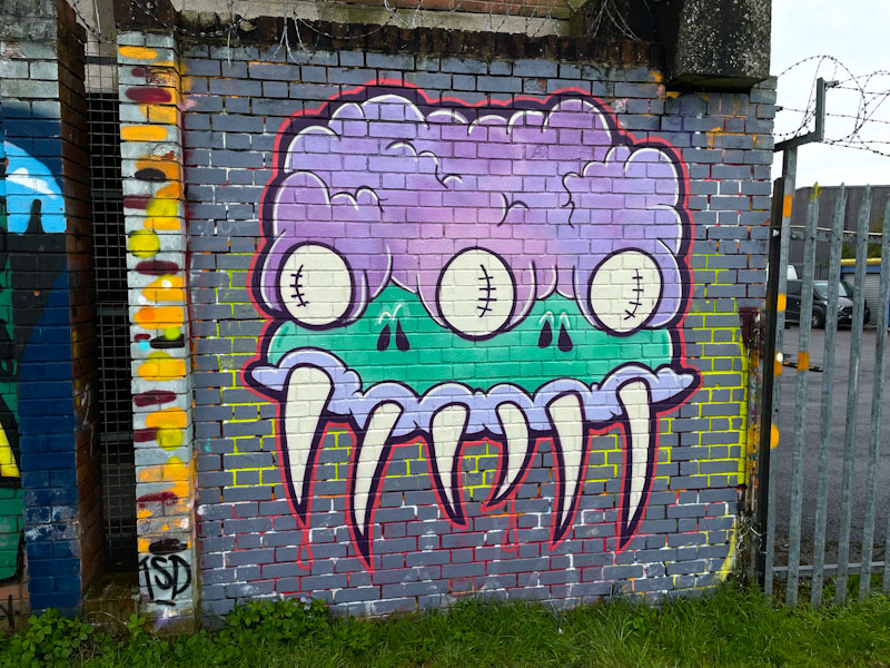
This is quite a large piece at the end of the wall in Peel Street Green, featuring another crazy, creative monster. The cartoon style used by Mote renders all of his characters as rather loveable, no matter how many nasty teeth or strange eyes they might have. Mote has left us with a very tidily painted and crisply finished piece here, which is great to see.

I mentioned a few days back that In hadn’t posted anything like as many pieces by Slim Pickings (TES) as I should have done over the last few years, so I set out to remedy that by doing a trawl through my archives. This is what I came up with, and this is just for 2021, so I expect to do another of these mini-galleries for subsequent years.
Writing TES, Slim Pickings (the name of his Instagram account when I first encountered his work) maintains the exact same general form for his letters, tinkering at the edges with colour changes and some other playful additions. Here are the pieces I should have posted before:


