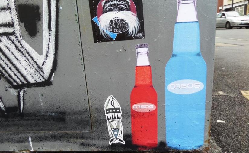
Somehow this seems to be the perfect wheatpaste pairing. The fabulous D7606 bottles that can be found in so many places and the enchanting one-off pieces that 23 Magpies leaves for explorers to find.
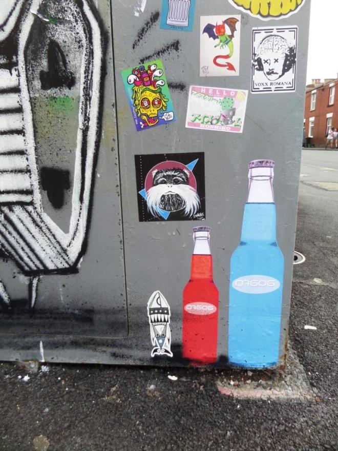
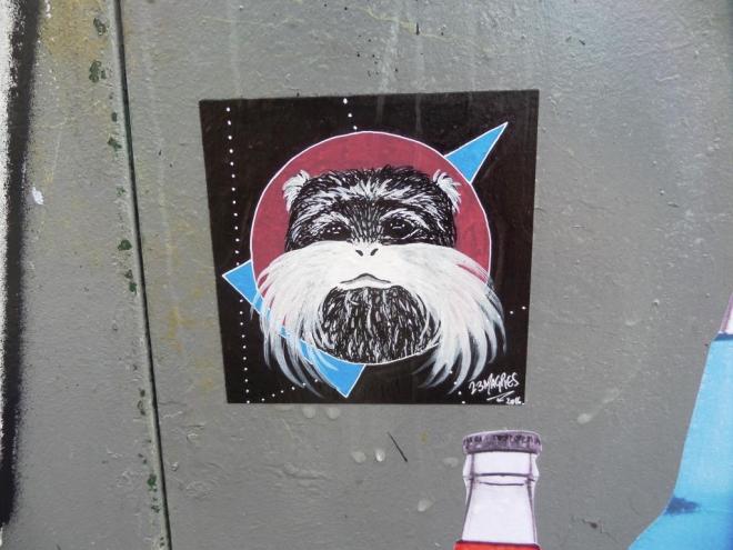
Somehow this seems to be the perfect wheatpaste pairing. The fabulous D7606 bottles that can be found in so many places and the enchanting one-off pieces that 23 Magpies leaves for explorers to find.
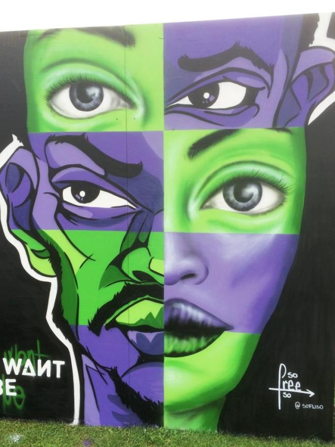
It was impossible not to notice this bright and arresting piece by Kier (Chiara Frei) at Upfest this year. The three panels spelled out the phrase ‘Be the one you want to be‘ showing three green and purple portraits with interchangeable face parts.
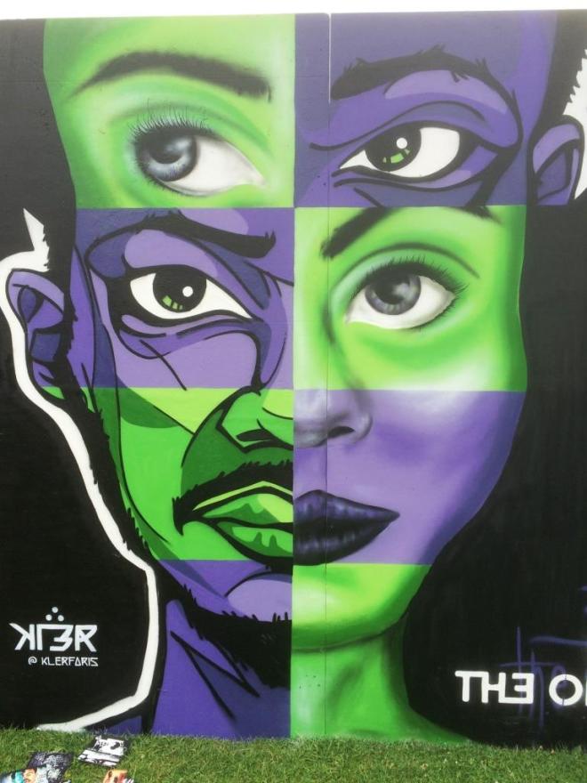
From her website, Chiara describes herself as a graphic designer who loves her job and is happy to learn new things. Beyond that she prefers not to say too much about herself.
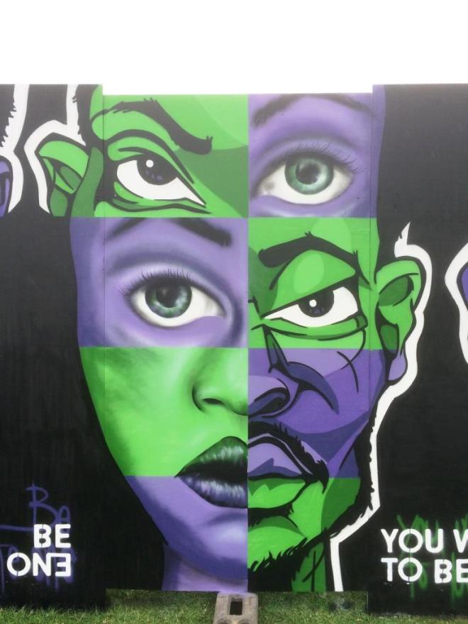
Her choice of colours and subject for Upfest meant that her piece really caught the eye. I went back to it two or three times, just to take another look. There was something about it.
I have featured Dale Grimshaw a few weeks ago with one of his Shoreditch pieces. Well, we were lucky enough in Bristol to have him pay us a visit for Upfest 2016.
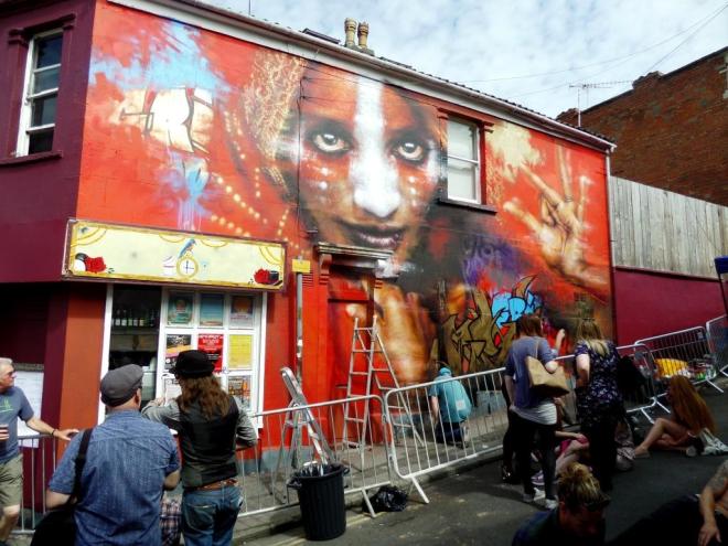
His works are instantly recognisable, usually being portraits of people from around the world, many of whom face political struggles. The faces are usually adorned with face paint, and the works are usually accompanied by a little piece of wildstyle writing.
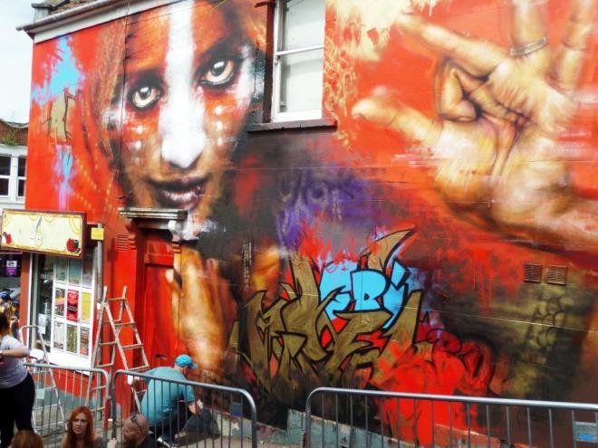
I managed to get a couple of pictures of Dale Grimshaw finishing off the piece on the Saturday, and I returned on the Sunday, and made subsequent visits to capture the finished article.

This work simply has to be admired, as do all of his works. Let’s hope for a quick return to Bristol.


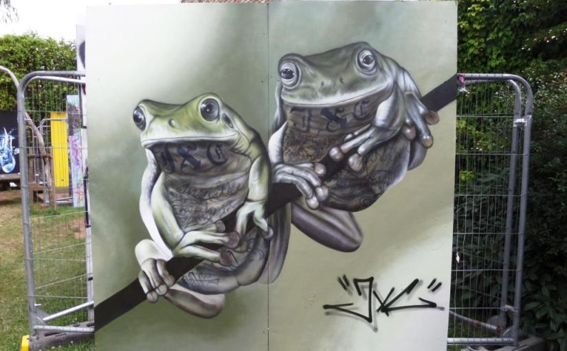
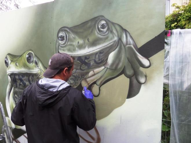
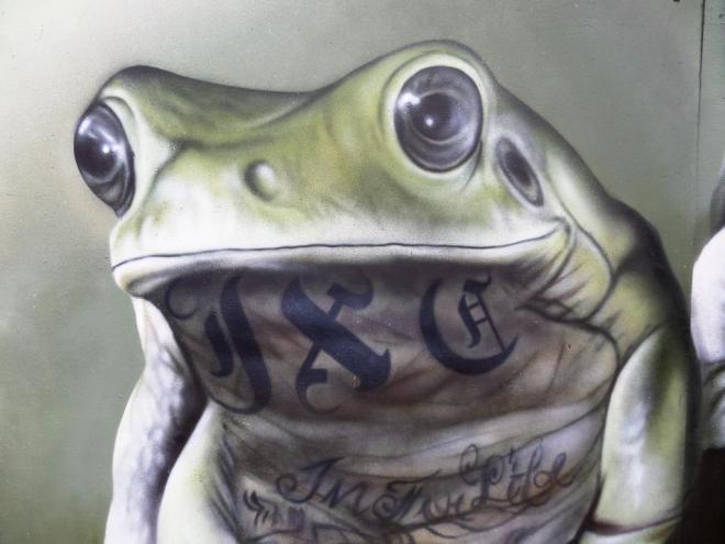
As a naturalist by training, I find it difficult not to be enthralled by these magnificent frogs painted by JXC at Upfest this year. I was lucky enough to see this piece half way through its creation and again on completion.

My favourite piece of the 2015 Upfest was the incredible geisha by Dan Kitchener on the wall of the Salvation Army shop. It was fantastic then to have DanK return to Bristol this year. His spot was slightly off the beaten track, and I didn’t find him until the Sunday when it was all a bit drizzly.

Dan Kitchener had pretty much stopped spraying for a while and was leaning over the lift and chatting to a friend when I took a couple of the pictures. He really wasn’t too impressed with the weather.

The piece, once it was revealed, turned out to be something of a reflection of the weather in which it was produced. In fact much of Dan Kitchener’s work creates the effect of wet night time scenes viewed through a car windscreen…or that is how it feels to me.

Looking closely at the woman with the umbrella, allows you to see that part of the picture away from all the distraction around it, and it is just beautiful. Step back and add in all the bright lights and you have the most vibrant scene.

I am always so impressed with his work, and I could look at these scenes he creates for hours, studying all the details and effects. It is hard to believe that he paints these things with spray cans. Yet another artist at the very top of his game.

This brilliant swirling ‘Bristol’ by Voyder really felt like the signature piece for this year’s Upfest. Visitors to the festival were queuing up to take selfies and group pictures in front of this piece. I wonder how many of them knew it was Voyder’s work – it matters not, they saw it for what it is, a joyful celebration of Bristol art.
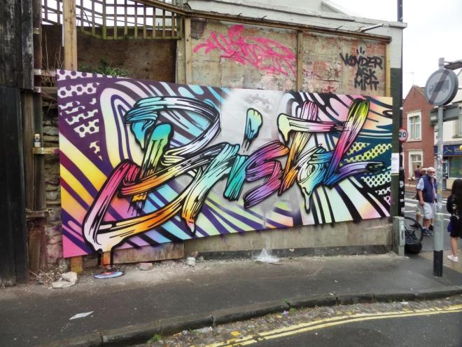
Voyder is a prolific graffiti artist and many of his pieces seem to be inaccessible, especially if you aren’t prepared to enter derelict sites, so it is especially nice to have one of his pieces in an area with high footfall. Around the time of upfest, Voyder was spraying quite a lot of these ribbon effect pieces, most memorably the Lichtenstein piece neat the Tobacco Factory, now long gone. This is just more stunning stuff from one of the best Bristol writers.
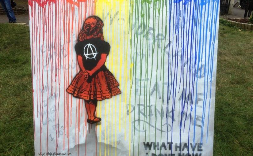
Well, here it is, the ‘official’ piece by What Have I Done Now. This Alice in Wonderland work seems to create a graffiti wall all on its own. An anarchic Alice (the piece is called ‘A is for Alice) stands looking at a colourful wall (with drips!) and casts a beautiful shadow. I can’t quite read the words on the left of the picture, but I think it says ‘curiouser and curiouser, (?) I am. Which way do I go?’ which is a slight corruption of the original quote.
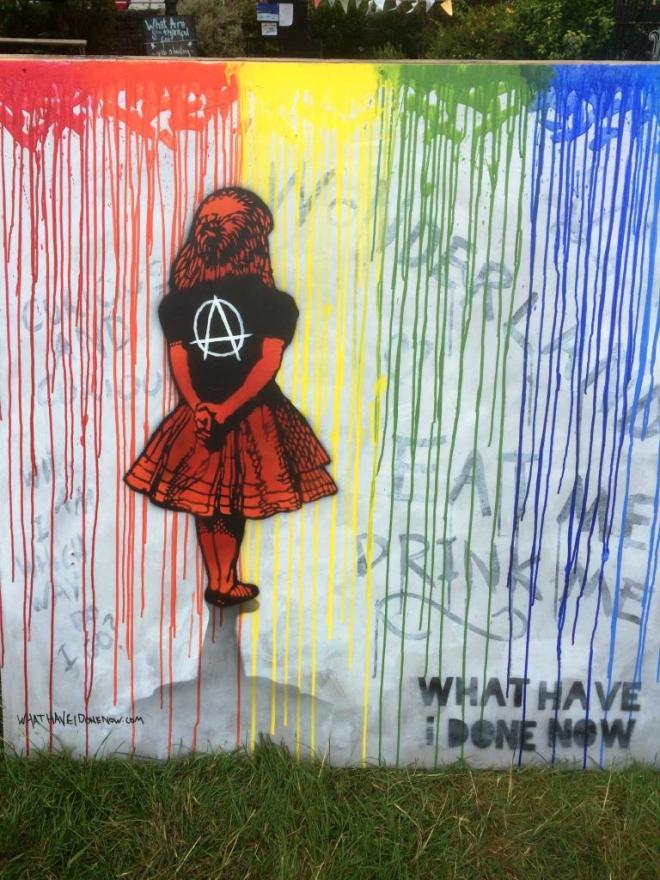
I am very fond of the Alice in Wonderland story, having read it more than once, but also having listened to the most incredible double album musical version of the book starring Karen Dotrice, Bruce Forsyth, Dirk Bogard, Tommy Cooper and many other incredible actors. I listened to this hundreds of times with my sister when we were kids. This artwork has sent me on a hunt for the album and, goodness me, the Interweb has come up trumps. I cannot tell you how happy I am to be able to listen to the album again after some forty years or so – you can hear it on YouTube here. I thoroughly recommend it. Happy now.
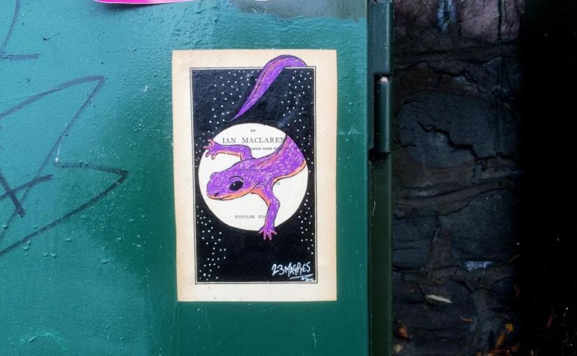
You may recall that I posted paste ups of a mouse and a cat by 23 Magpies recently. Well here is another one of the treats that she left behind at Upfest. This time, always on a wildlife theme, we are presented with a charming wheatpaste of a newt drawn onto the cover of an Ian Maclaren title page.
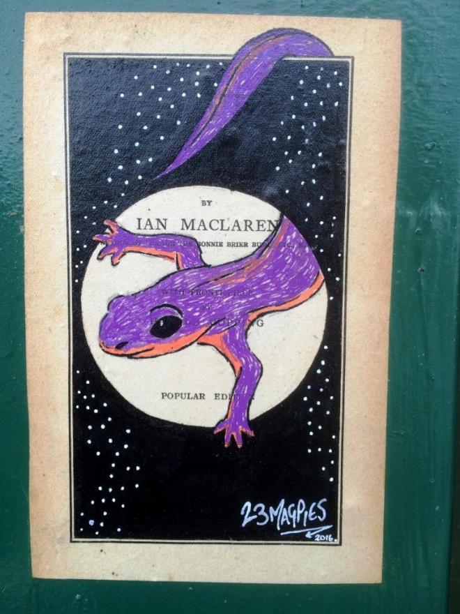
Beside the Bonnie Brier Bush was Ian Maclaren’s first story about rural Scottish life. I have no idea if this is of any significance to the piece by 23 Magpies, or if it is a random bit of book used as a background context for the little newt. Whatever the intention, the execution is once again excellent. I think there may be more to come from 23 Magpies in these Upfest posts.
There is something dark, political and edgy about What Have I Done Now’s work. His paste ups are full of menace, like this one (called laugh riot) of a riot police figure, waving a US flag and adorned with Mickey Mouse ears. Taking a swipe at some attitudes in a small wheatpaste without words is part of the skill of this kind of street art.

This is one for the fans of political street art, an art form that seems to be slightly out of vogue at the moment.
This wonderful piece appeared a few days after Upfest had ended, and I guess Feoflip decided to stick around and improve some bare walls. I really love this piece, the soft pastel colours give the piece the look of an illustration. The character looks like it has just walked off the pages of a children’s picture book. I would love to read that story.
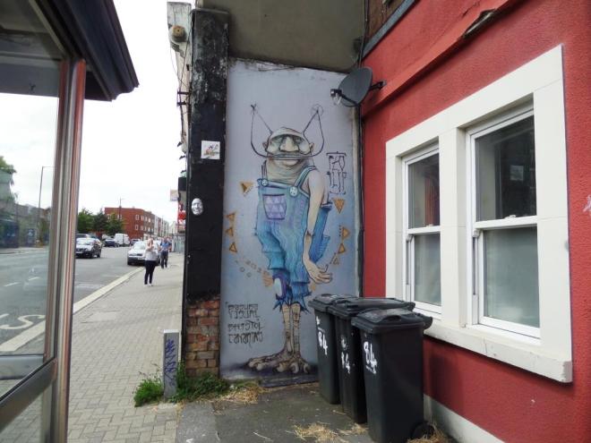
Feoflip was unknown to me before Upfest, but I have now seen several of his pieces all over Bristol, and will be sharing them over the coming weeks. He is fast becoming one of my favourite artists. I love the combination of organic and mechanical, it works very well, as with his piece at Ashton Gate School.
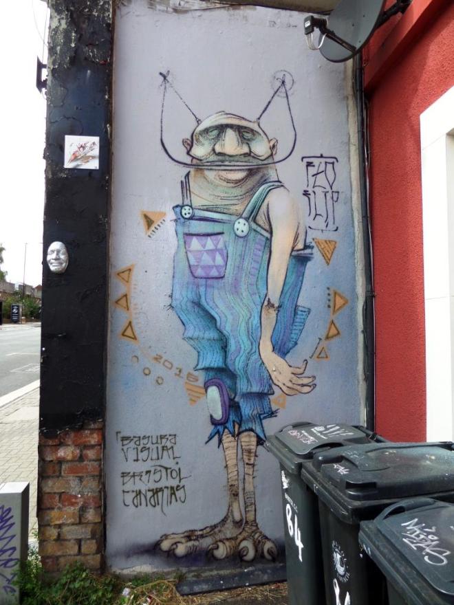
The more observant reader may also notice the Gregos mask just to the left of this piece which I wrote about last year.