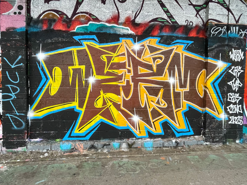
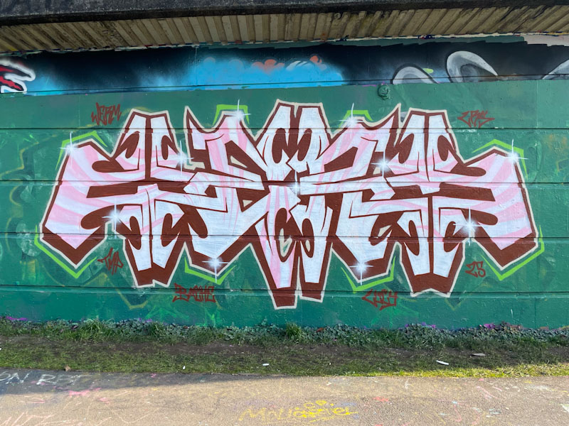
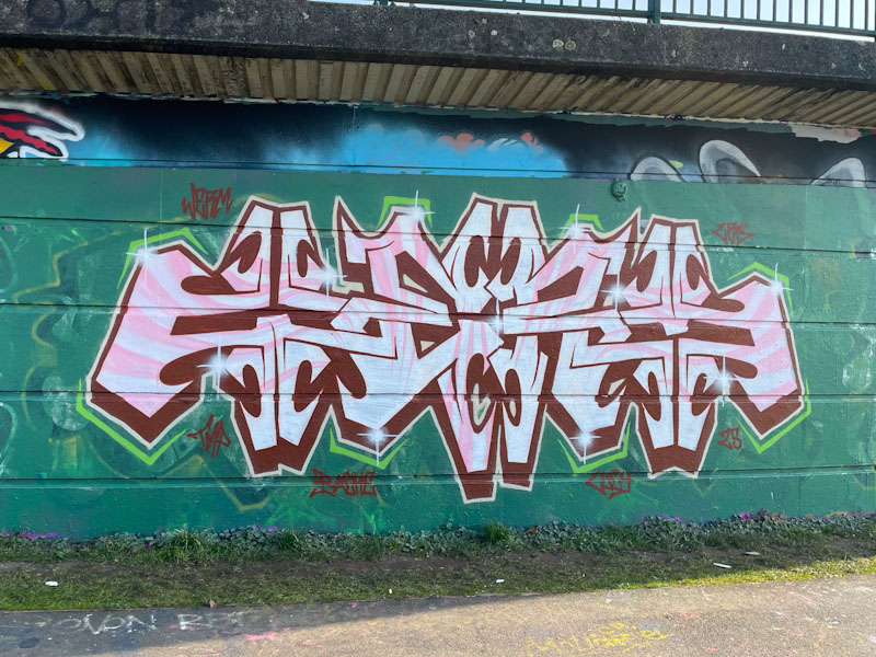
Now, regular readers will know that brown is my least favourite colour when it comes to graffiti writing, and it is a path I am unlikely to deviate from or be persuaded otherwise, so the selection of brown aside… this is a really nice tight piece by Werm.
Werm, M32 Cycle path, Bristol, April 2025
I rather like this letter style, which while keeping up the symmetry theme that Werm enjoys so much, also has something of a feel of Marvel or DC Comics about it, as if it should say ‘blam’ or ‘whack’ or something like that. Definitely a fun piece, well presented. Pity about the colour.
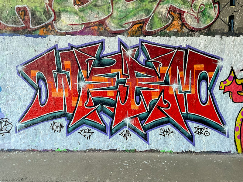
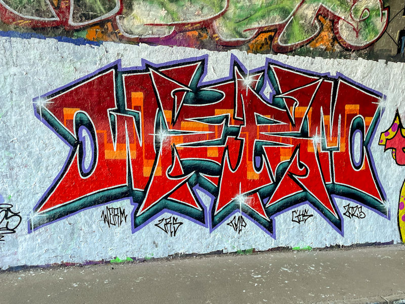
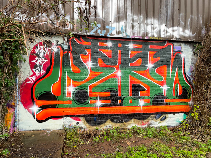
This is a delightfully clean and crisp piece by Werm, whose symmetrical pieces are a well known sight in the various graffiti spots around Bristol. I particularly like this one with its delightful colour scheme, and the boldness of it set on a white background.
Werm, St Werburghs, Bristol, April 2025
It is well worth getting up close and taking a proper look at the letter fills in this piece, the overall colour is a blend of reds from dark to light, and running through the midline is a wonderful continuous orange line… a golden thread through the piece. This is a very attractive piece by Werm, that unfortunately only lasted a short time.
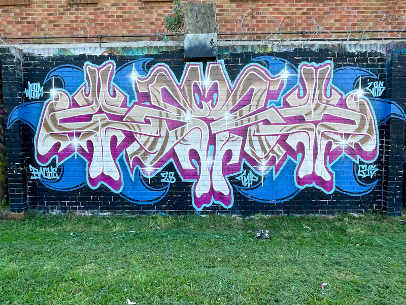
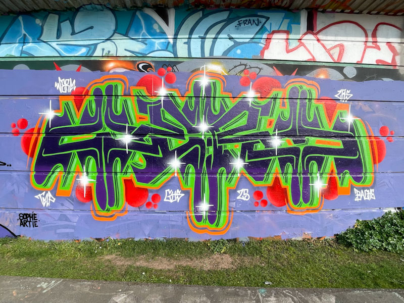
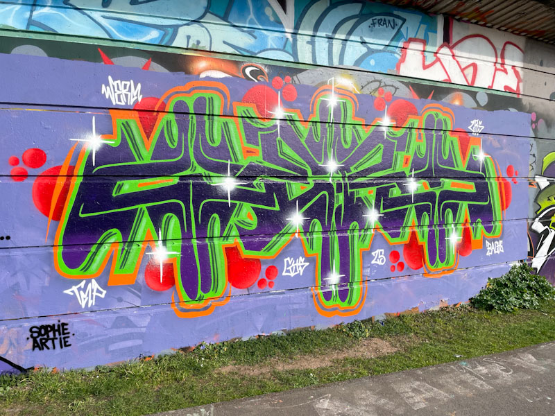
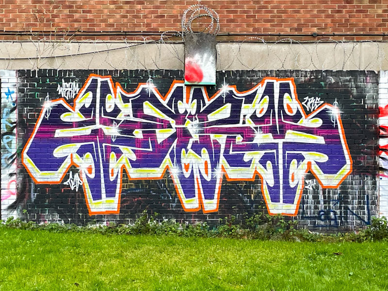
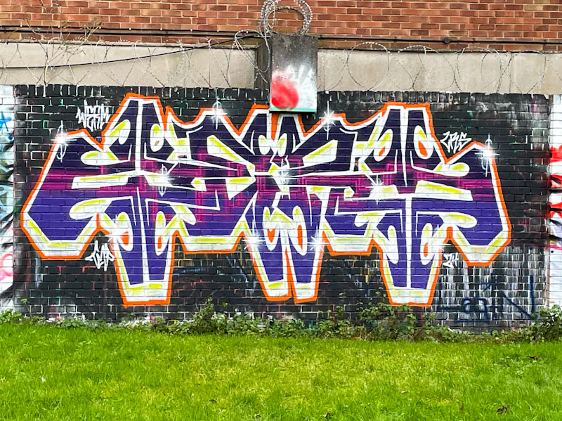
I am chronically short on time for today’s post, indeed I was short of time when I wrote it yesterday. This is another intricate bilaterally symmetrical piece piece from Werm, to bolster his catalogue of such pieces. I feel that he might move on to another theme before too long, especially as he has been painting these types of pieces for a while now.
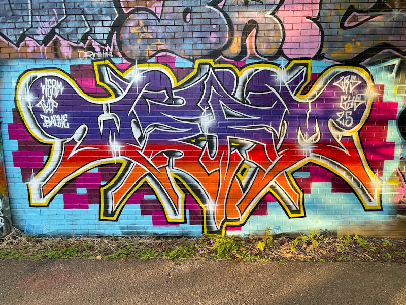
Werm, Peel Street Green, Bristol, April 2025
This set of letters spelling WERM are rather nicely filled with a white and off-white colour and a contiguous pattern that runs through the piece. A deep pink drop shadow is bordered with a blue line and the whole thing is set on a blue splash, also symmetrical. Nice work.
Tucked away behind the iron fence of the swimming pool at Dean Lane is this fabulous collaboration combination piece from Werm and Zake. Werm, more than adequately providing the symmetrical letters, and Zake offering a couple of different cheeky characters peering over the top of them.
Werm and Zake, Dean Lane, Bristol, April 2025
The horizontal band colour scheme, painted on an off-white background, works really well, and Zake has cleverly incorporated the band of colour into his characters. I’m not quite sure what it is about it, but this feels like a really classy piece to me, and I really like it.
Werm is becoming one of those consistent, drumbeat graffiti writers whose work is always there and reminds us what the Bristol street/graffiti art scene is all about. His current style takes us through his playing with symmetry of the letters WERM, forever striving for perfection.
Werm, River Avon, Bristol, March 2025
In addition to his beautifully presented letters, Werm has set the piece on a pattern of pixelated cubes, adding just enough interest to lift the piece. Unfortunately, the afternoon sun has crept into the right-hand half of these pictures, but that is a daily hazard when photographing street art… and bins, and parked cars etc.
Werm is continuing along his journey, experimenting with bilateral symmetry in his writing. The symmetry in this one is notable, but I think that it might be the colour scheme that initially attracts the eye, with some nice contrasting reds, greens and oranges.
Werm, Cumberland Basin, Bristol, March 2025
What baffles me about writers like Werm is how they manage to get everything ‘right’ if you know what I mean. For example, in this piece the green drop shadow veers off to the right, but it needs to be perfect across all the letters otherwise something would look out of kilter. I suppose the old adage, practice makes perfect, applies here, but it is still an admirable talent.
Today’s posts will have to be the quickest ever. I am staying in Godalming and running a workshop today and forgot to write the blog posts last night, so am squeezing these ones in before breakfast. This is a fine symmetrical piece by Werm on the long wall at Cumberland Basin.
Werm, Cumberland Basin, Bristol, February 2025
At first glance, this doesn’t look too much different from many of his other pieces, but look a little closer and you can see that the subtle fill to the letters is contiguous throughout all the letters, which is a tried and tested technique by graffiti writers, and executed really well here by Werm.
This is a neat and tidy piece of Winter writing from Werm painted in his symmetrical theme design. What is particularly attractive about this piece is that the proportions work really well, and it is really tight.
Werm, River Avon, Bristol, January 2025
Orange and green are common colour combinations in graffiti writing and are colours that work extremely well together. It looks like Werm too his time with this piece, as all the lines are nice and straight, the fills accurate and the highlights very nicely placed. First-class writing from Werm.
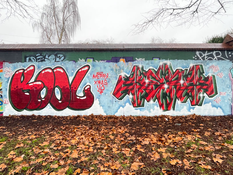
Kool Hand and Werm, Sparke Evans Park, Bristol, January 2025
I am tired, really tired. Returning to work from a week on leave is tough, and expectations on me are high. Over the Christmas period, I was informed that I would be ‘on loan’ to another team for 2 days a week. I was given no clear instruction, there was no discussion, and today I will be finding out what the tasks expected will be. I am unhappy about the situation, and it is causing me all sorts of unnecessary anxiety, but I will of course be professional and try to do the best job I can. My biggest concern is that I was already working at maximum capacity, and I am worried about the work I will have to drop, and the ‘clients’ I will have to let down. On a more cheery note (thank God I have street/graffiti art to lean on) here is a fine Christmas collaboration from Kool Hand and Werm.
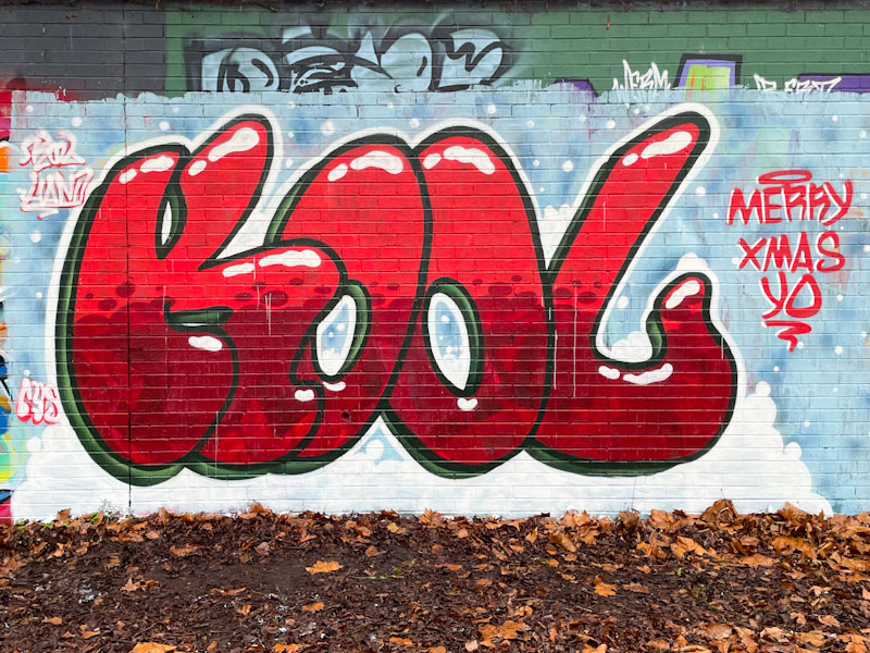
Kool Hand, Sparke Evans Park, Bristol, January 2025
A frosty, cold background is a fine setting for both pieces, and Kool Hand has gone for some big KOOL letters which are nicely filled and have some snowy white accents to give a little bit of a 3D perspective. Very festive.
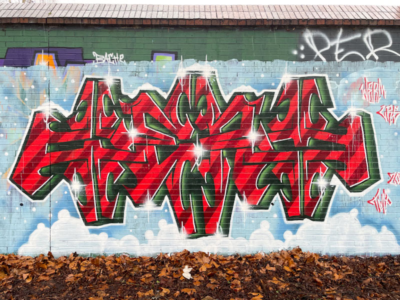
Werm, Sparke Evans Park, Bristol, January 2025
Werm presents his letters in the symmetrical form he has been painting throughout 2024, but it is the festive colour selection that is the talking point of this piece. The two-red colour stripes are slightly reminiscent (consciously or otherwise) of Christmas candy sticks, and the green 3D drop shadow completes the holiday mood. Some nice star bursts complete the piece very nicely indeed. A good Christmas piece in a year when there were fewer than usual around the city.
Werm has had a very good year in 2024, and tried out several new variants of his letters, sticking with some and abandoning others. This was a particular theme that saw him through most of the year, crafting the letters WERM into a bilaterally symmetrical pattern.
Werm, Peel Street Green, Bristol, December 2024
This one looks like it might have suffered a little at the hands of the weather, or the background wasn’t fully applied, which is a pity, because it distracts a little from the writing itself, demonstrating why backgrounds can be so important. It’ll be interesting to see if Werm moves on from this style in 2025.