I would say that over the last two years or so, the intake of ‘new’ artists in Bristol has far outweighed any losses, and we have a ‘net gain’ of talent. This is great news, although it makes things a little troublesome for me, as there is so much more art to photograph and catalogue than ever before, and it is difficult to give artists the exposure they deserve.
Grimes, Frome Side, Bristol, April 2024
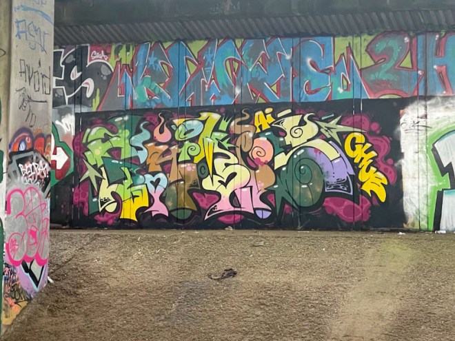
One of the newer artists to Bristol (at least on my radar) is Grimes, whose characteristically colourful and busy pieces have been brightening up spots all over the city. This piece underneath the M32 is typical of his work, full of letters and symbols, beautifully crafted and filled. I have loads of his pieces in my folders and will try to dig them out, as he has added something a little special to the Bristol mix.
Claro_que_sssnoh, Sparke Evans Park, Bristol, April 2024
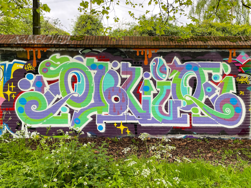
What stands out for me in this lovely piece of graffiti writing by Claro_que_sssnoh is the subtle colour selection and slight softening of his letter style. The writing runs smoothly, where often his letters can have a slightly staccato feel running through curvy to straight lines in abrupt fashion.
Claro_que_sssnoh, Sparke Evans Park, Bristol, April 2024
I am not entirely clear what the writing spells as I would usually expect to see HONS. Claro_que_sssnoh has managed to do just enough of a background and ‘sparkles’ to differentiate his piece from the pre-existing pieces on the wall, and drips ad further interest. For me though, it is the colours that shine. Nice work.
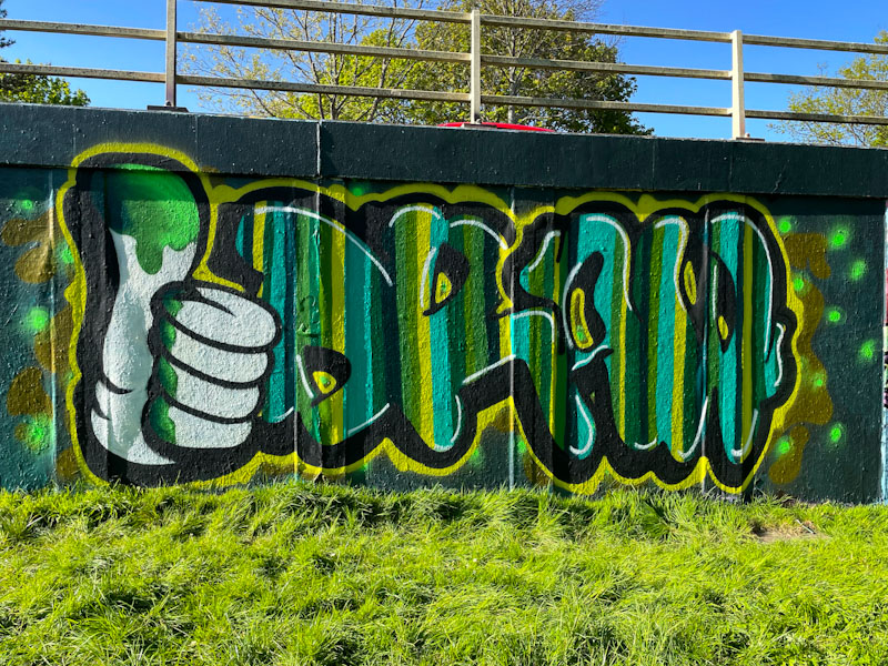
This is something a little different from Mr Draws, and I really rather like it. The colour scheme that he has selected works really well with the verdant spring growth at the base of the wall and the trees behind set on a stunning blue sky (something of a rarity this year).
Mr Draws, M32 roundabout, Bristol, April 2024
The character hand and letters combination looks really good and is nicely proportioned. This is so typically Mr Draws, and I can’t fully explain why, but his whole approach to graffiti writing is unconventional, which is great to see, as there is quite a lot of ‘Samey’ stuff out there. I love the hand, and I think that it is something he should bring into his work more often. A great piece from an artist I really like.
Fade, Dibz, Noise and and Awkward, Dean Lane, Bristol, April 2024
I am not sure that I have seen this wall painted as much as it has been over the last year or so, not just painted, but painted with so many high-quality pieces. This recent collaborative piece is by Fade, Dibz, Awkward and Noise.
Fade and Awkward, Dean Lane, Bristol, April 2024
The left-hand end of the wall is collaborative combination from Fade and Awkward. Starting with the latter, I think that this is the most extensive bit of work I have seen from him, with so much more than his usual mega-tag face. Here Awkward has included a complete character as well as some woodland beasties and flowers, with loads of little details. The character is wearing a Cheech Wizard hat and surreptitiously holding a spray can. Fade has painted some beautifully finished letters, acting as a central platform for Awkward’s decorations.
Dibz and Awkward, Dean Lane, Bristol, April 2024
The middle section is by Dibz with a combination of outstanding writing and a couple of characters… a Vaughn Bode Lizard and another masked character whose name I don’t know, both faithfully reproduced. There have been a whole ton of Vaughn Bode inspired pieces lately, and I guess it is a theme from World Wall Stylers or something like that.
Noise and Awkward, Dean Lane, Bristol, April 2024
Rounding off the wall and sticking with the colour theme, Noise, who seems to be enjoying a spate of collaborations, has produced another of his NOISE pieces composed of dense letters with stunning fills and transitions. Awkward makes another appearance with a character peeping over the ‘S’ along with a couple more woodland bugs. Altogether a wonderful piece from the foursome.
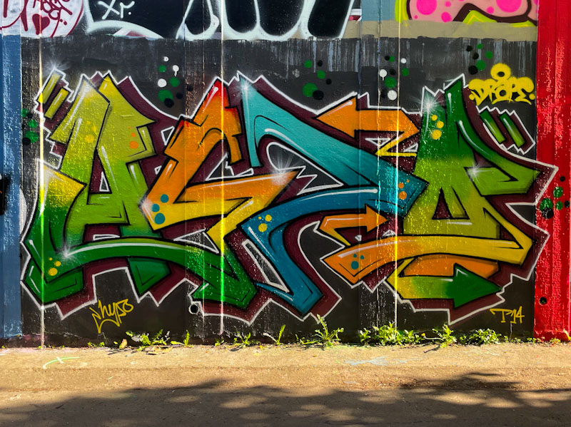
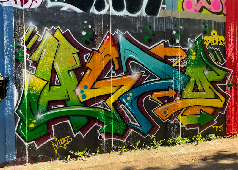
I have enjoyed immensely the vigour with which Hypo has upped his game over the last year or two, both in terms of the quality and quantity of his painting. Sticking with his HYPO letters, he has come up with a sequence of colourful and strong designs of which this is one of his more recent.
Hypo, M32 roundabout, Bristol, April 2024
Unfortunately I captured this piece on a late sunny afternoon, and there is a bit of glare, but it doesn’t hide the excellence of the artwork. The colour palette is really good and the transitions through greens to yellows and oranges and blue are really well done. some spots are added for decoration, but it is the overall design of the letters and the clean finishing that I am particularly attracted to in this piece. Great work from Hypo.
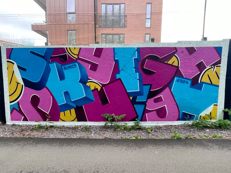
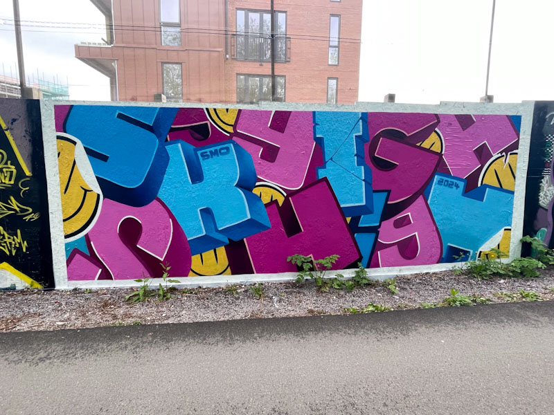
We are lucky that SkyHigh and Roo appear to have a strong association with Bristol – I believe that they have family here. This is good, because every time they come to visit, they drop a couple of pieces, which mixes things up nicely.
SkyHigh, Greenbank, Bristol, April 2024
This is a beauty from SkyHigh in which he has spelled out his name with several optional variations in how you choose to read it. The block letters, each in a different font/style, have loads of depth to them and are displayed in different orientations creating a kind of 3D collage effect. The tried and trusted pink and blue combination is a winner, and is augmented with some splashes of yellow in the form of smiley ‘stickers’. Tidy.
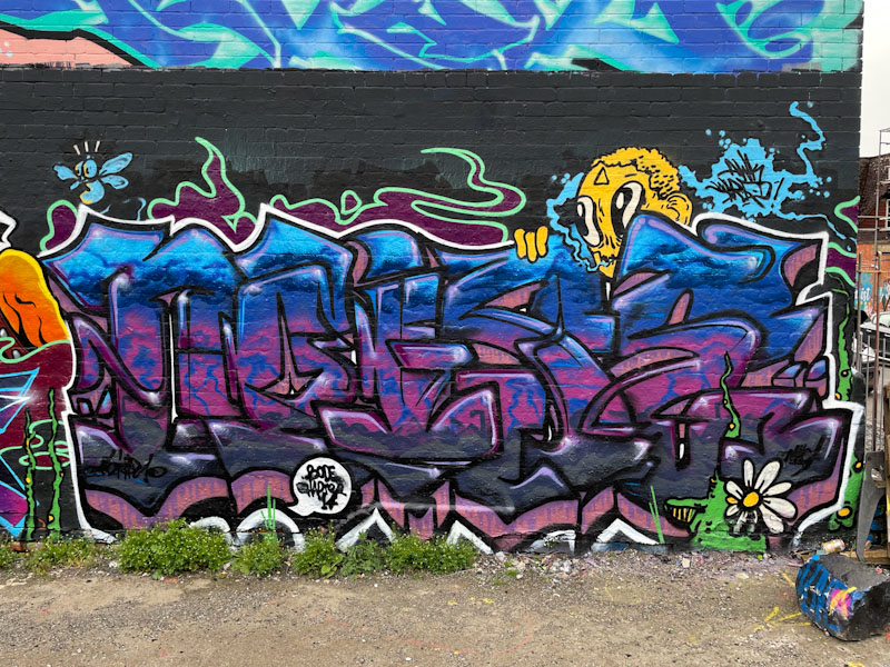
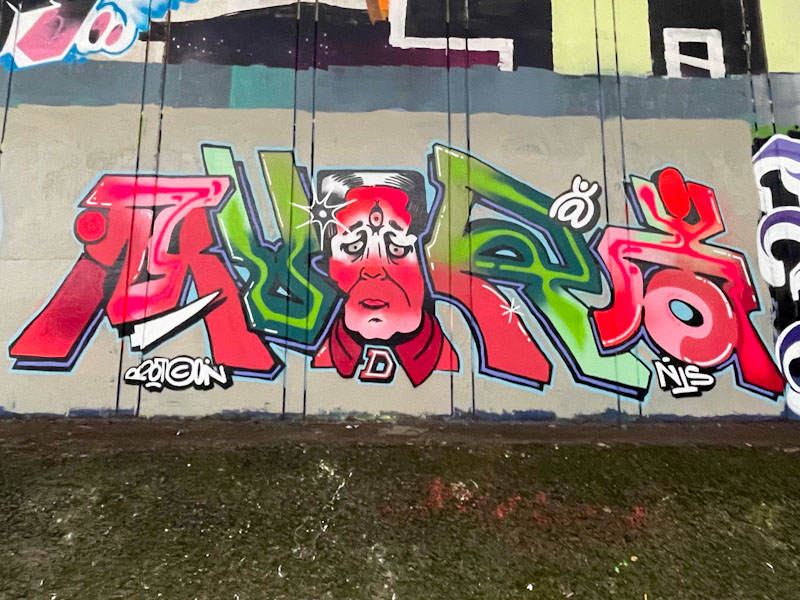
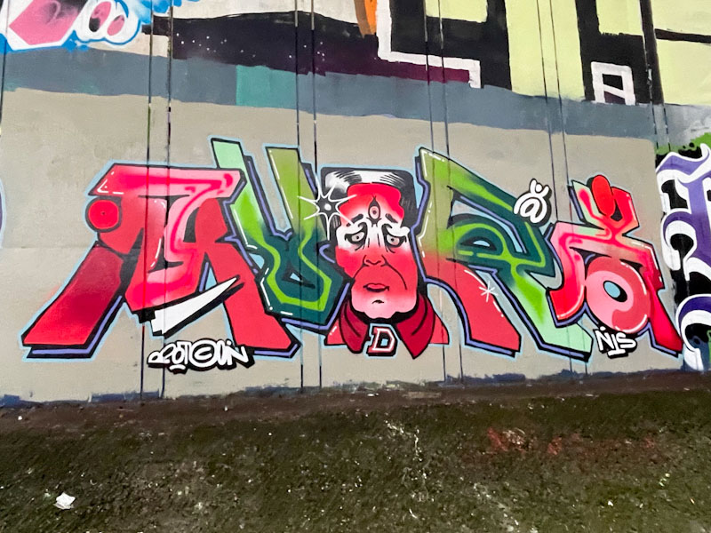
It feels like only a matter of months but is actually more than three and a half years since I first encountered Mudra’s work, and over that time it has improved immeasurably from the small character-based pieces to complex pieces of writing/character combinations.
Mudra, Frome Side, Bristol, April 2024
This piece underneath the M32 reminds me a little of Minto’s work, with its combinations. The colours red and green work well together and rather contradict the fashion industry maxim that ‘red and green should never be seen’. The letters are quite fancy and the face in the centre of the piece a little odd. Overall though, this is a nice piece that shows how the artist is constantly stretching himself.
When Logoe comes to Bristol from Wales where he lives, he tends to paint in the Eastville spots, so I imagine that he has friends who he can stay with in the area. This piece from a recent visit was painted underneath the M32 motorway, a spot that I don’t visit all that often because it is quite tricky to do with the dog.
Logoe, Frome Side, Bristol, April 2024
This piece, which has not photographed very well because of the light conditions, follows the classic Logoe formula. Some decent script writing, nicely filled and bordered, set on a contrasting background and sprinkled with oval spots. I think that brighter colours might have suited the spot better, but remains a fine piece of graffiti writing.
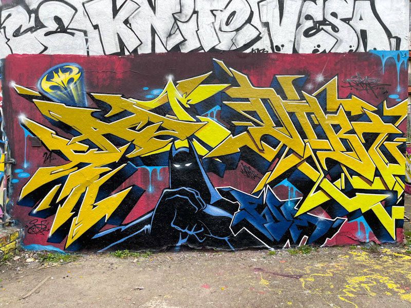
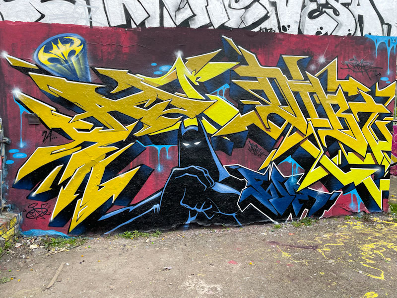
The machine that is Dibz and Fade continues to produce outstanding collaborations, and this one in Dean Lane is a cracker. The Dark Knight is a popular icon for street artists, and Dibz and Fade have gone with the darker variant of the caped crusader, unlike the comedic, lighter cartoonish options they might have gone with
Dibz and Fade, Dean Lane, Bristol, April 2024
When I asked Fade how I should attribute the artwork in their pieces, he suggested that where the lines become blurred, just label them Dibz and Fade. The writing is attributable, with Fade on the left and Dibz on the right, but the rest of the work is collaborative. A well-thought-out piece, tidily presented – what else would you expect?
A little while back, Logoe hit town again with another rash of wonderful script writing. This time, I wasn’t so quick to get all the pieces, and they tend not to last too long – perhaps a feature of the spots he chooses, but this one I did snap up, and it is a bit of a beauty.
Logoe, M32 roundabout, Bristol, April 2024
Once again, Logoe has written his name in a script style, although this time the letters are a little plumper and kinder than usual. There is a bit of a drip thing going on, which is always good to see, and the colour transition from green to yellow is nicely worked. The piece is finished off with the customary sprinkling of oval spots running through the middle. An eye-catching piece of graffiti writing.