.
The closure of the
North Sea sand eel fishery
err… I think that’s it
.
By Scooj
.
The closure of the
North Sea sand eel fishery
err… I think that’s it
.
By Scooj
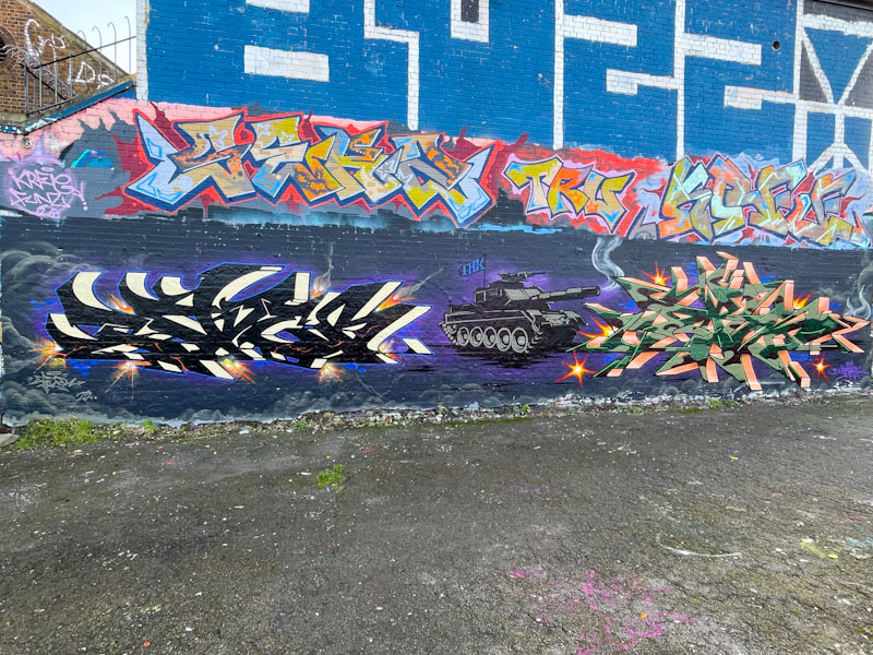
I caught up with Fade a couple of days ago, and he observed that I hadn’t posted much of his and Dibz’ work lately, He was right, but fortunately this collaboration was already in my pipeline, and is a timely reminder of their fantastic work. I would add that they have had a generally quiet start to the year, but are picking up the pace a bit now.
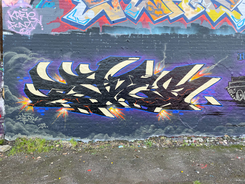
Unlike most of their collaborations, the three elements are a little bit fragmented. The writing from Dibz and Fade is distinct and there is no general colour theme, and the tank is a little bit out of context. Fade has gone for some beautifully finished letters, in the corners of which are a bunch of explosions. The writing is set on a nighttime cloudy sky.
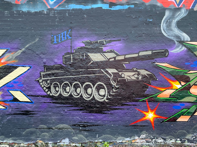
That brings me on to the tank, which I assume is a joint effort. I don’t quite know what the tank represents, but I guess you could take your pick – Gaza, Ukraine or even a metaphor for Trump’s wreckless and aggressive international policies. Maybe it is just a nice picture of a tank.

Dibz’ outstanding writing has a camouflage thing going on, but it is subtlely applied, and contrasts beautifully with the orange (but it looks like copper) 3D drop shadow. This wall has been a great place for Dibz and Fade to showcase their work, and recently, they have painted it again (keeping the tank intact) – to come soon.
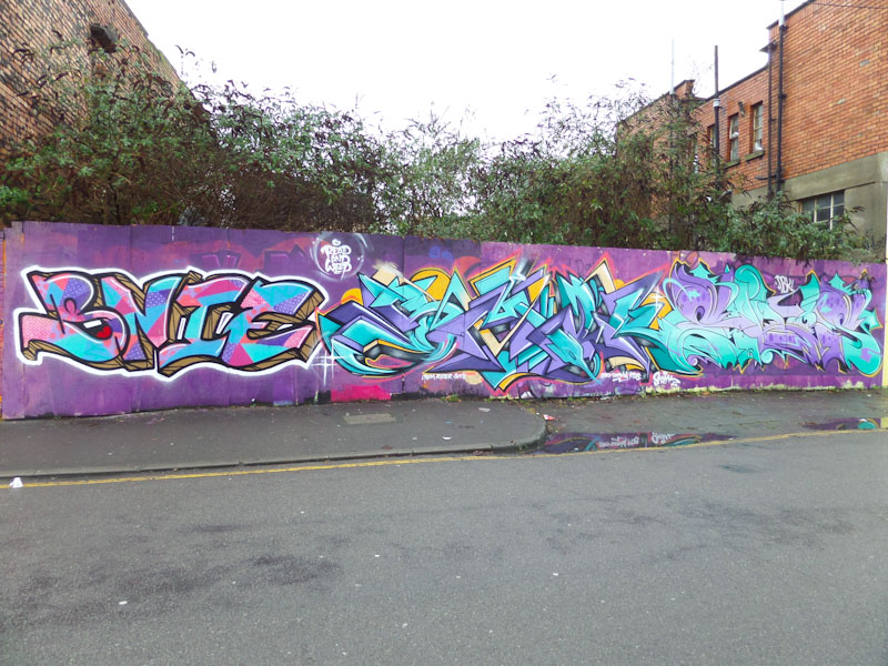
This is the third piece ‘rediscovered’ from dipping into my archive, and it is a fine collaboration from Bnie, Smak and Elvs. Once again, I am mystified by how it got left behind in the archive, but at least I am rectifying the situation by publishing it now.

Bnie’s work is always a joy. Her letters somehow work really well for graffiti writing – some combinations work much better than others. Here she has paid particular attention to some highly intricate fills, which I can only think were achieved using stencils. However they were realised, they are wonderfully technical and beautifully presented.
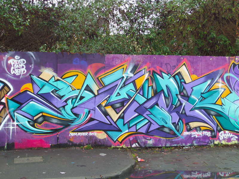
The middle piece is by Smak, whose work pretty much defines the ‘Bristol school’ of graffiti writing. Superb colours and a strong sense of flow through the piece, combining curves and straight lines skilfully. Simply an outstanding writer.
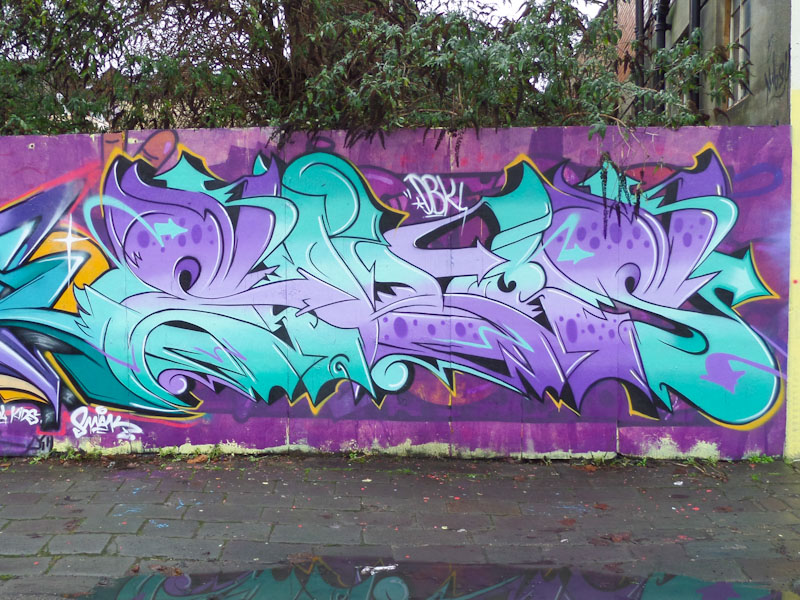
To the right is a fine piece by Elvs, whose work is so unique and distinct. He has worked so long and hard on his letters ELVS, that I would love to see what he could do with some other letters in his style – that would probably present a serious challenge and take him a little out of his comfort zone. Brilliant work from all three graffiti writers, demonstrating what their art form is all about.
.
We the powerless
armed only with dignity
speak truth to power
.
by Scooj

I know exactly why I never posted this piece at the time I photographed it. Although I was blown away by it, I didn’t know who the artist was, and so it remained in my archive unseen. I have revisited it several times over the years, but now feel confident enough in suggesting it is by Hemper.
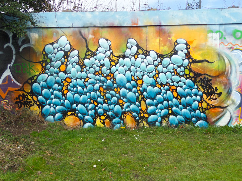
The location, the ASK tag, and the possibility that the disguised letters may spell HEMS and the sheer quality of the piece draws me to the conclusion that it is by Hemper. Whoever the artist, it remains one of my favourite pieces of crazy graffiti writing ever. Everything about it is near perfect, from concept to execution. Those stones/bubbles must have taken an age to paint, and the black ‘web’ draped around the letters is exceptional. The work of a genius.
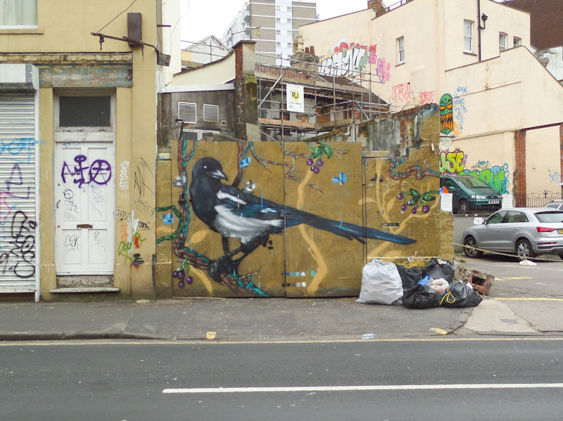
Every now and again, I like to delve into my archives to see if there are any pieces that somehow were overlooked at the time, and I am always surprised by what I find. The next few posts are from 2016 and include this beautiful magpie by Aspire.
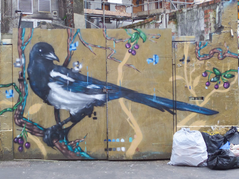
Aspire was one of my favourite Bristol artists in Bristol, and his depictions of birds in particular struck a chord with me as a trained naturalist. For a few short years, his work brightened up our streets before he packed his bags and moved to London, where I am told the streets are paved with gold. Fortunately, Aspire does return from time to time, but I miss his portfolio of stunning birds and their surroundings. As well as being a superb portrayal of a magpie, we also see evidence of his pixel clusters, something of a trademark for the artist. Those were the days!
Doors 297 – Doors of Peterborough (Part V), April 2024
So at last we come to my final selection of doors from Peterborough, which were taken in the Cathedral area and then passing on down towards the river Nene. While I very much enjoyed my wanderings around this historic Cathedral City, I was left with a bitter sense of urban deprivation in 2020s England, a legacy of 14 years of running down of public services, of impacts of Brexit, of Covid and of the rising costs of fuel. I have shown you one face of this city, but it is important to understand that it is not all ‘chocolate box’ views and stunning architecture.
My genuine wish is that our country rediscovers its sense of purpose, its compassion and its place in the European conversation. After all, who wouldn’t want to live in a better place that is business-like, kind and fair? Enjoy the doors:


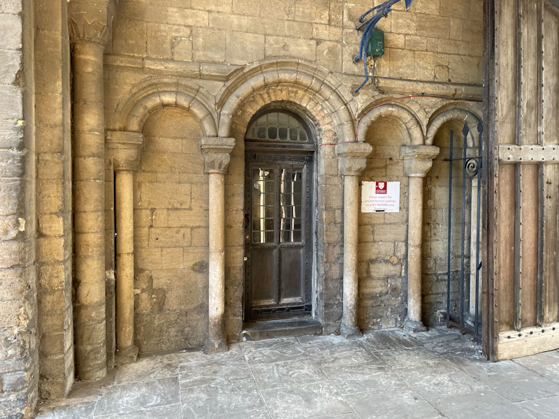


So that’s it from Peterborough, Adieu! I’ll have to think of what to share next from my archive, and will have fun doing so. May I wish you a happy weekend.
If you have made it this far, you probably like doors, and you really ought to take a look at the No Facilities blog by Dan Anton who has taken over the hosting of Thursday Doors from Norm 2.0 blog. Links to more doorscursions can be found in the comments section of Dan Anton’s Thursday Doors post.
by Scooj

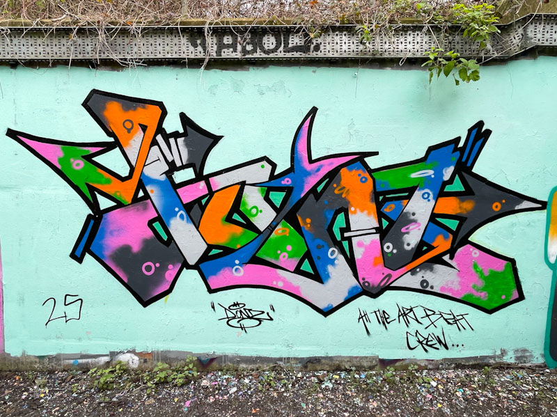
Donz is an interesting graffiti writer whose combination of letter shapes and, in particular, colour selections and fill patterns is quite unique. His work is further highlighted in this piece with the incorporation of a clean contrasting background buff.

The letters in this piece spell DONZ, and are beautifully contained within a clean black border. I think that what sets his work apart is his approach to his fills which are not blended, but rather, they are applied in contrasting splodges and decorated with complementary little circles. All I can say is that this is a very Donz look. We also have an introduction to the Art Beat Crew (ABC), which I haven’t noticed before.
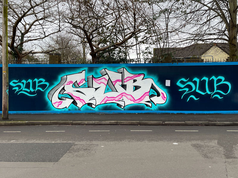
The great thing about a new graffiti spot, such as the long hoarding at Greenway Bush Lane, is that you can spread your wings a little and occupy as much space as you like without the awkwardness of painting over someone else’s work. Sub has ‘gone for it’ with his large SUB letters and a couple of smaller signatures, just in case you weren’t sure who he is.

Sub continues to develop his writing, and his familiar chunky letters and deep drop shadow (in two shades) are going from strength to strength. The pink plasma strip runs nicely through the letters, which in their monolithic form are rather flat. To me, it feels like he is locked a little into his format, and to go to the next level, he might need to try something different, and then import his discoveries back into his customary style. Having said that, he seems to be very happy doing what he is doing, and that is the most important thing.
.
Bullies love bullies
Trump sides with the aggressor
a cheap masquerade
.
by Scooj