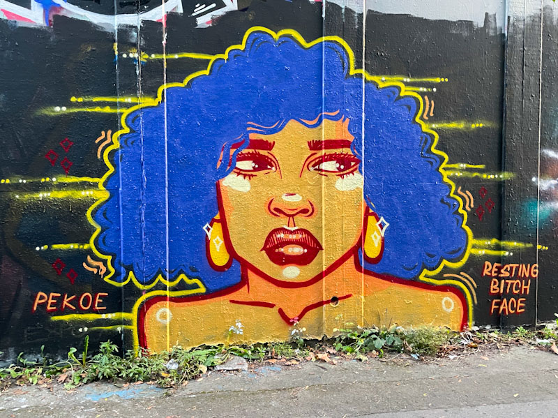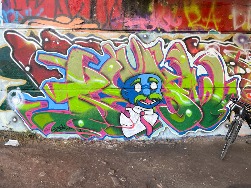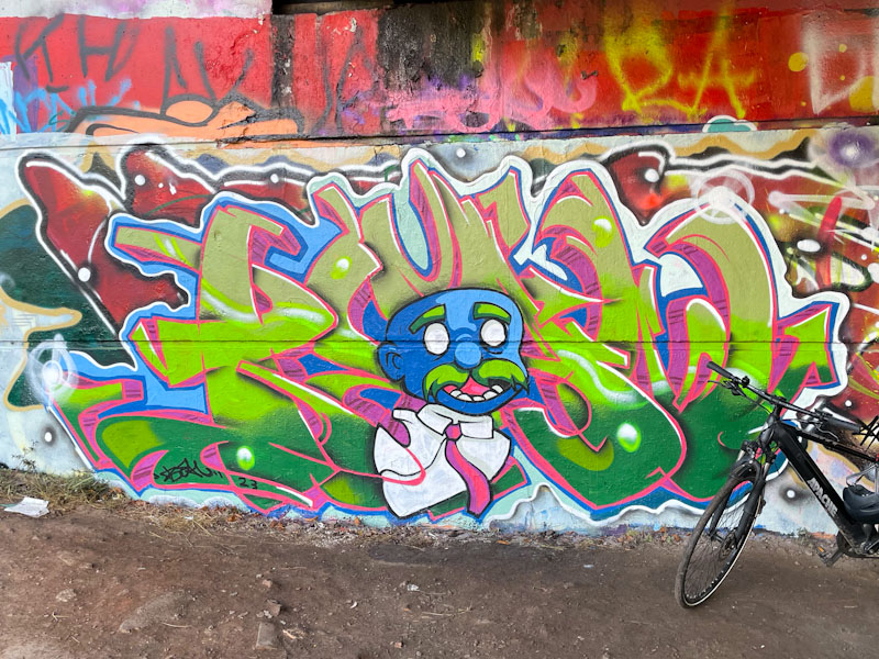
On our way home from Cornwall to Bristol, we stopped off in Exeter for a couple of hours while my friend had to deal with a flea crisis in his daughter’s student flat. I took the opportunity to wander about the city and using my street art sixth sense managed to find quite a few pieces, completely accidentally – no maps, no street art websites, nothing other than intuition and exploration.
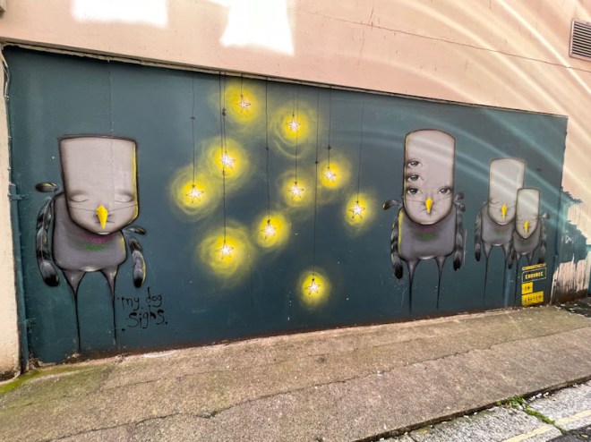
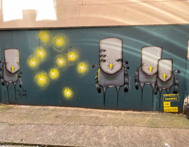
Walking up Fore Street, which becomes Exeter High Street, I spotted a narrow lane on the right (a must for psychogeographers) which I turned in to, and was rewarded with a spectacular wall curated by ‘Enhance in Exeter’, and this magnificent piece by My Dog Sighs. To say that it was unexpected is an understatement, but I was rather pleased with myself for sniffing it out. The piece must be relatively recent, painted within the last couple of years or so, because it features his pigeon characters, which are newish in his portfolio. The expressions on the pigeon’s faces are wonderful, and the subtle touch of the breast plumage colours is a special touch.
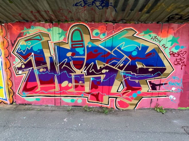
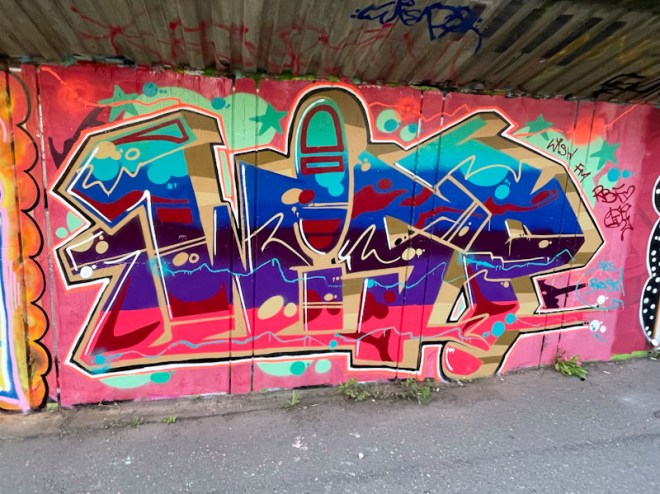
These are the best pictures I could get. The street is very narrow, and there was some reflected light pollution, but was nonetheless chuffed to bits. More to come from this two-hour meander.