
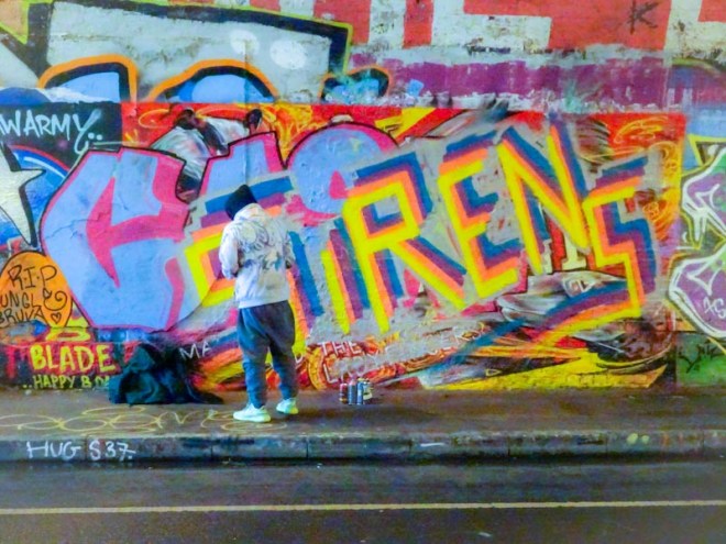
In memory of an artist who brought studio art onto the streets of Bristol. He will be greatly missed.
A complete series of Sirens blog posts on Natural Adventures can be read here.
All images by Scooj

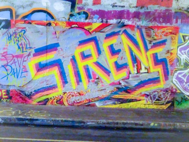


In memory of an artist who brought studio art onto the streets of Bristol. He will be greatly missed.
A complete series of Sirens blog posts on Natural Adventures can be read here.
All images by Scooj

Often painting with his LRS crew mates, Wxttsart continues to charm us with his unconventional graffiti writing style and funny word ‘MILK’. It always amuses me that anyone would write milk, and I’d love to know what the story of the genesis of these letters was.
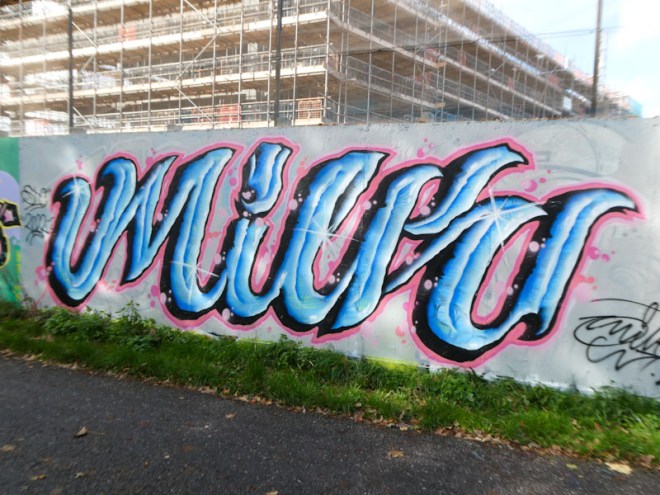
The colours light blue and pink go so well together, and Wxttsart has made great use of the match with some stunning blue letters bounded with a fine pink border. I would describe Wxttsart’s style as a mash up of anti-graffiti and calligraffiti, which is a rare achievement, because those two styles are probably at opposite ends of the writing spectrum. A refreshing piece from Wxttsart.
You will know by now that I have enjoyed the emergence and continued development of Mote over the last year or so. His monster characters have improved over that time and the finished product is becoming cleaner and tighter with each new piece.

This one is tucked away in the entrance of a closed down public toilet on the north side of Cumberland Basin. Mote certainly has a style all of his own that incorporates a monster with a solid fill, in this instance with a two-colour fade, and some crisp black lines creating the detail. Almost like giant doodles, Mote’s monsters are a welcome pick-me-up.

.
Unconventional
you brought fine art to our streets
unique perspective
.
by Scooj
.
In memory of Michael, AKA Sirens
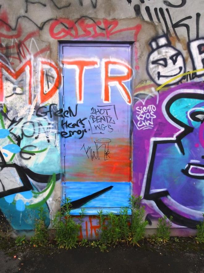
Doors 198 – Porto doors (Part 11)
I have managed to draw out doors from Porto for the whole of the summer, and this selection probably represents my penultimate gallery from a wonderful three days in the city back in May. There is no theme this week, just a random selection. Enjoy:


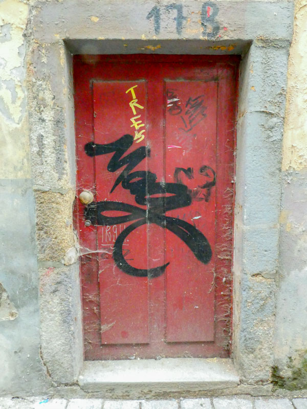

Soon I will be reverting to Bristol doors, street art/graffiti doors as well as a few doors from a summer holiday trip to Croatia.
If you have made it this far, you probably like doors, and you really ought to take a look at the No Facilities blog by Dan Anton who has taken over the hosting of Thursday Doors from Norm 2.0 blog. Links to more doorscursions can be found in the comments section of Dan Anton’s Thursday Doors post.
by Scooj
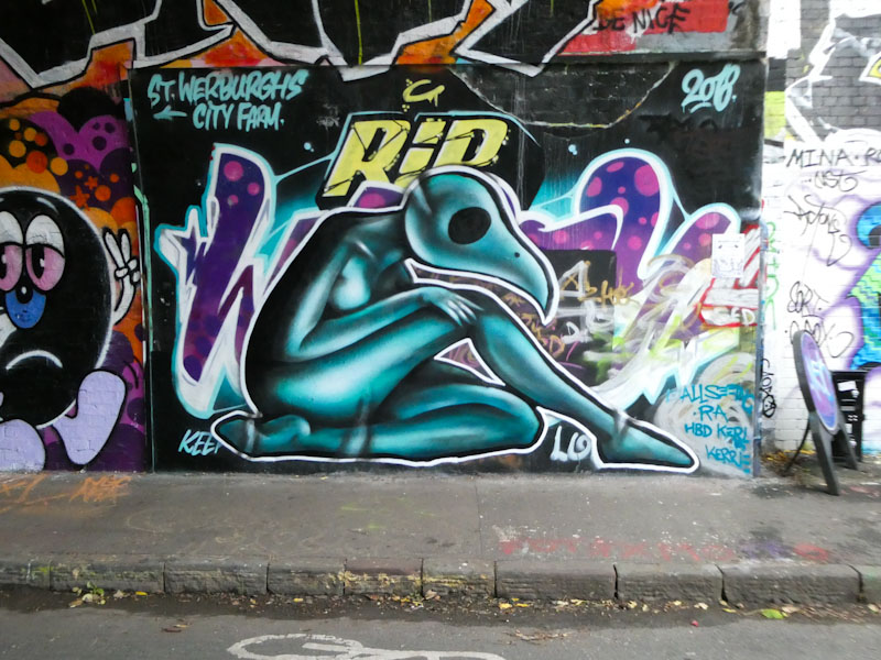
This spot at the entrance of St Werburghs tunnel has been ‘unavailable’ for a long time as it was home to a tribute piece. It was, however, recently dogged, which means that it can now be painted over, and first up is an occasional visitor to Bristol, Ra, or @allseeing.ra on Instagram.
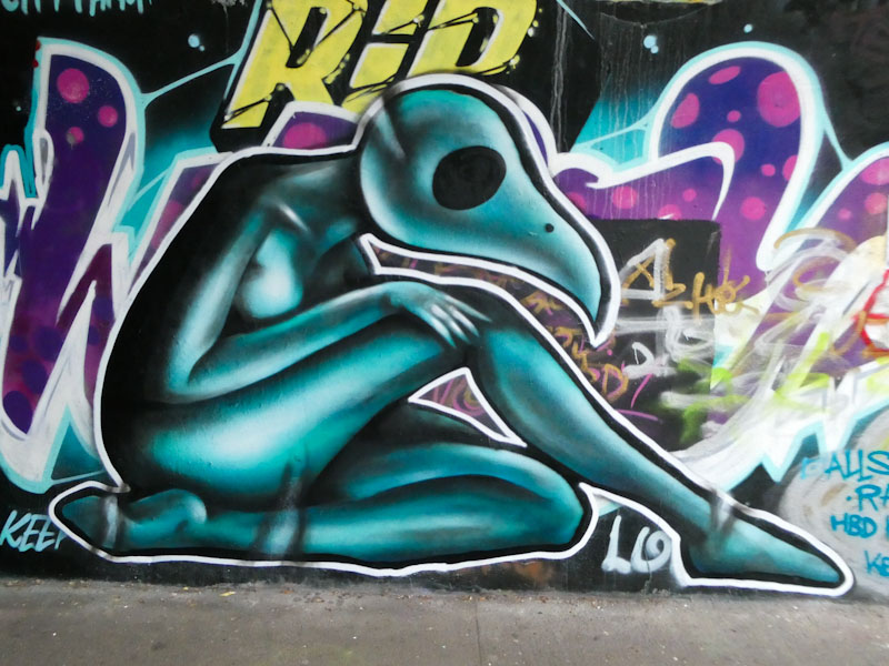
From recollection, Ra was the ancient Egyptian sun god and had a falcon’s head. This piece by Ra (contemporary street artist) is a modern take on the ancient deity and beautifully painted with expert shading to give depth to the figure. A striking piece. I look forward to Ra’s next visit to Bristol.
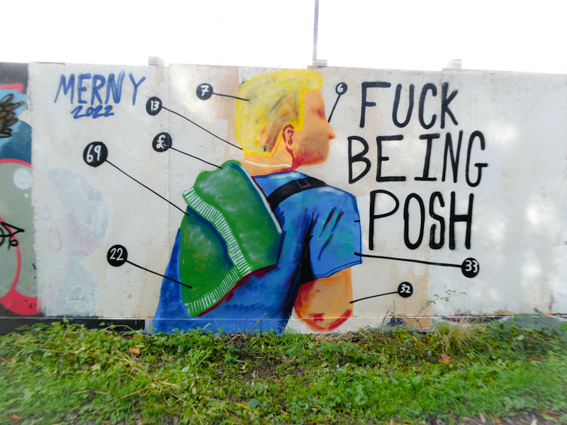
Merny manages to turn his pieces out quite regularly these days, and some last longer than others, but overall his presence and ‘brand’ in Bristol is constantly growing. This is an artist who never shies away from bold political statements and has become an important street commentator on the pressures and divides in our country. “F*ck being posh” is a clear illustration of the resentment of the gap between rich and poor getting ever more prominent under 12 years of Tory Government.

Merny’s work, although naive in style, is full of narrative, movement and interest. It is impossible to walk past his work and not pay attention. Alongside John D’oh, Merny reminds us about the political landscape in which we live. A great piece of social commentary art.
.
The good things in life
ever harder to pin down
live in the moment
.
by Scooj

Watching Mudra develop over the past couple of years has been one of the great pleasures in recording the street art scene in Bristol. From his early colourful portraits to his sophisticated style of writing, he has upped his game time and again and continues to improve with every piece.

The writing, in a magnificent palette of blue and yellow, spells out Mudra with a spectrum of styles and sizes for the letters, but somehow all very recognisably Mudra’s work. The monkey/house character in the middle of the piece is a bonus, and serves to add interest, without which the piece wouldn’t look complete. I love the yellow wedge too, a lovely effect.

This is an unexpected collaboration between Hika and Pekoe… unexpected because I don’t really know much about Hika, although I do know all about RBF’s Pekoe. The two have combined nicely and there is much to like about the collaboration.
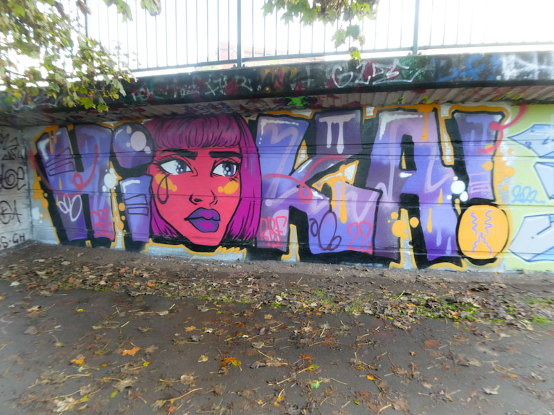
Hika’s letters might appear, on first inspection, to be a bit messy, but take a closer look and they are nice and clean with decent fills and a black 3D drop shadow. Some of the embellishments include red squiggles, and some rather nice yellow drips.
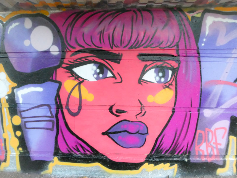
Regulars will know how much I admire Pekoe’s work, and this is a lovely portrait piece from her. Perhaps the most unusual thing about this one is the hairstyle. Pekoe’s portraits usually host big hair full of stars and shapes, but this one has a stylish short cut that works really well on the limited height of this space. Beautiful big eyes and a customary tear – great work from Pekoe. All in all, a really nice collaboration from this pair.


