.
Mantlepiece mayhem
clumsy cat-astrophy trip
woken with a start
.
by Scooj
.
Mantlepiece mayhem
clumsy cat-astrophy trip
woken with a start
.
by Scooj
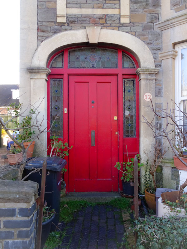
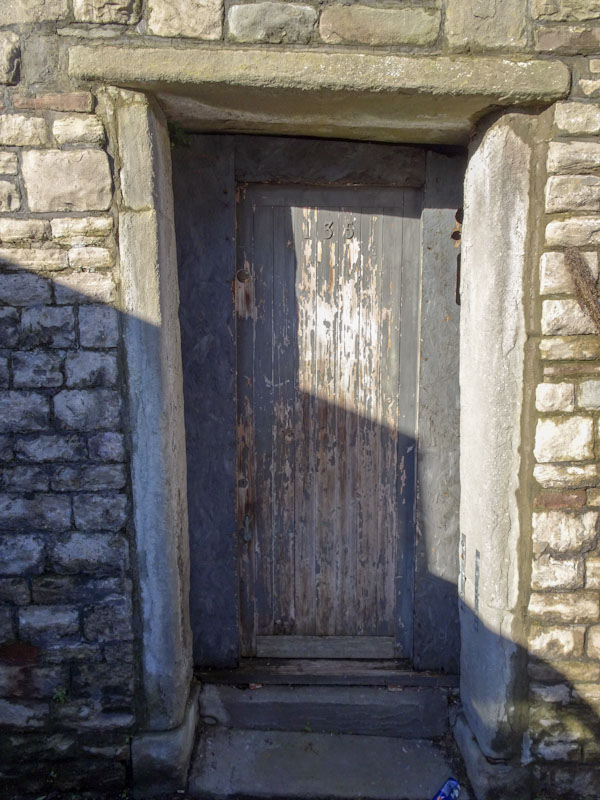
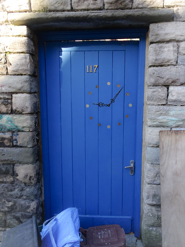
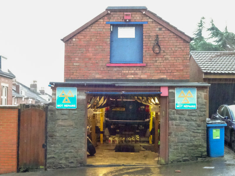
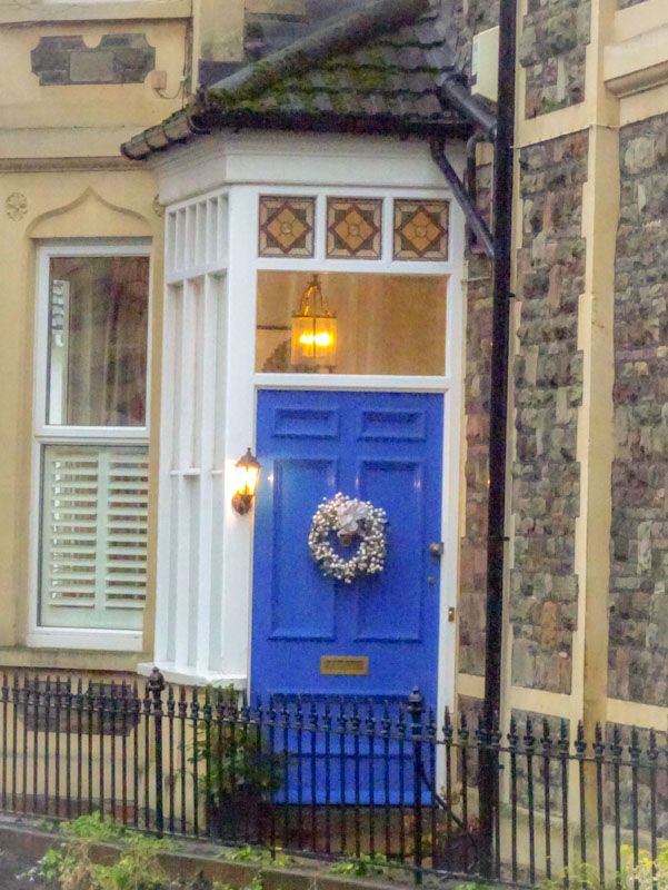
Doors 137 – yet more random doors from Bristol
It has been a very cold week, but at least it has been dry, and unlike the east of the country that has had considerable snowfall, it has not materialised here in Bristol. However it isn’t the weather that makes Thursday doors such a challenge at the moment, but the ongoing coronavirus lockdown, which for many doorsters means photographing local doors or raiding archives, or doing a bit of both.
This week, like last week, is a simple stroll around some doors not too far from where I live, and while they may not be all that interesting, at least they are not recycled from a previous post… although it might not be too long before that starts to happen. Enjoy…
Alas, that is all I can manage this week. Soon things will get better and I will be able to extend my range of doors a little.
If you have made it this far, you probably like doors, and you really ought to take a look at the No Facilities blog by Dan Anton who has taken over the hosting of Thursday Doors from Norm 2.0 blog. Links to more doorscursions can be found in the comments section of Dan Anton’s Thursday Doors post.
by Scooj
An oasis of colour in a desert of thick wet mud, and thank goodness for it, because the dog and I got filthy… if there hadn’t been any decent pieces on the battery walls I think I’d have been well miffed. But decent pieces there were and this one was a truly wonderful surprise from Hanski, who has recently hit the Bristol scene running.

With two Universities in Bristol, we have quite a large number of art students in the City, and some of them like to Chuck paint at walls… Hanski is one of them. Hanski’s work is like Cubism meets the 1980s, with tons of bright and bold colours and disaggregated features reassembled to create a new face. I am so much looking forward to a whole lot more from Hanski.
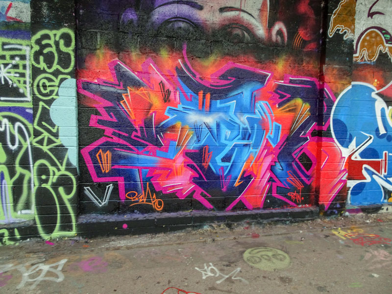
There are times when you have to just sit down and absorb a piece, to enjoy it to the maximum, and marvel at its splendour. This amazing piece by Sled One is one of those, and I don’t think that anything I write will actually add anything to the majesty of this work.
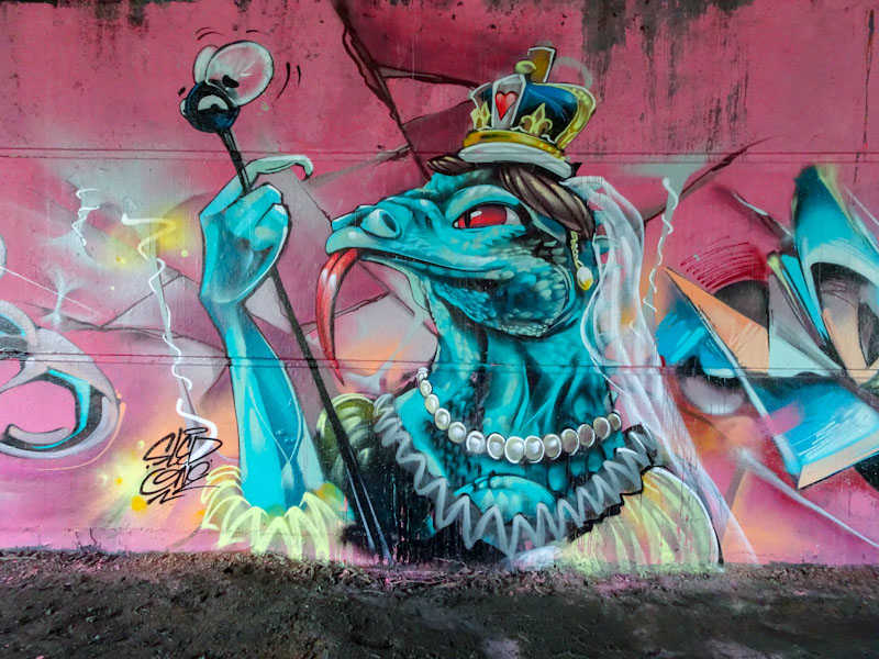
The regal character, part of a wider collaboration set on a pink background, is as unsettling as it is crazy. A lizard-like queen with a full set of pearls (is it Queen Victoria?) is holding a sceptre which looks like it has a fly on the end.
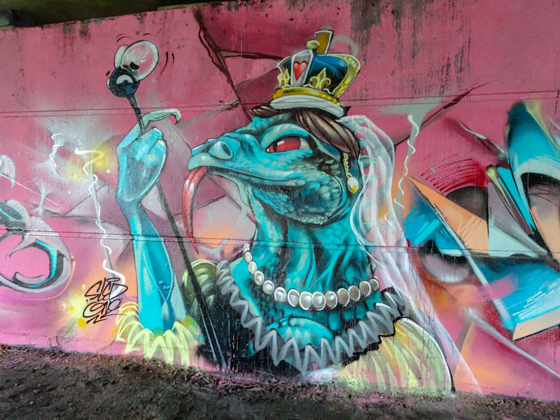
The surreal piece might be political commentary, or it might not, with Sled One it is customary to not really know what is going on. Accepting that there is a great story there somewhere is probably enough and we all have to let our imaginations run wild. I love this a lot.
.
Small compensation
a large box of chocolates
for a holiday
.
by Scooj
As gentrification marches on apace, there is a bit of a squeeze on the number of walls that artists can paint, and in North Bristol this is has been exacerbated by the loss of The Bearpit, which has become an inert, dead urban space that people pass through. Utilitarian and functional, but perceived to be safe, and the homeless people have been moved on to be homeless somewhere else. I have a feeling that the discredited Rudi Giuliani, who was praised at the time, moved the ‘bums’ out of Manhattan, without actually addressing the issue of homelessness. Perception is everything for politicians. Smoke and mirrors.
The point I was clumsily trying to make is that the M32 Cycle path is unlikely to be developed any time soon and has become more popular than ever for street artists and graffiti writers, whit a much higher turnover than a few years ago.
This is a very nice piece by Benjimagnetic, which has replaced a rather ordinary throw up that had trashed the Halloween piece from Smak last year. Benjimagnetic has been turning out pieces with alarming regularity lately and I am struggling to keep up with posting them, but at least I can now read them (I think) because mostly they say BEN. Always good to find a new Benjimagnetic piece.
It is all too easy to get trapped into visiting the places that you are familiar with and I have been guilty of not exploring too much around Bristol for about a year, for fairly obvious reasons. Every now and again though I have ventured into new territories, often on the back of seeing something on Instagram and setting off to find it. This wonderful piece by Dabuten Tronko is an artefact of one such mission, an added bonus, if you like.
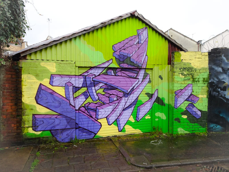
Although this piece was painted in 2019 it takes me back to the first pieces of his that I saw back in 2017, when his work had a strong theme of wooden rowing boats. Don’t ask me why, I mean who’d ever have thought they would be the subject of street art, but in the more than capable hands of Dabuten Tronko they have an intrinsic beauty and interest. He seems to favour the deconstruction of these little boats as much as intact versions.
This is an expertly painted piece, with amazing colours and superb definition between the subject and background. So happy to have discovered it, albeit rather late in the day.
.
An east-west divide
they have it and don’t want it
the snow is whiter…
.
by Scooj
I managed to take the dog for a very muddy walk last week up at Purdown. It is the first time I have been there for a while and there were quite a few nice pieces up there. It would appear that Zace has made himself at home up there and this is the first of several pieces by him I will be posting.

There is a simplicity about Zace’s work that keeps it real and unpretentious. Clean lines and single colour shading keeps a focus on the alien character set in a starry sky. A fun modest piece from Zace.
Many street artists and graffiti writers have dual or multiple personas when they throw paint at a wall. There are many reasons for this, for example sometimes it is to obfuscate their identity as most of this activity isn’t strictly legal, other times it is to separate out professional from personal identities. Here we have an artist who I have met before under a different name, but here he is with his new moniker ‘SERM’.
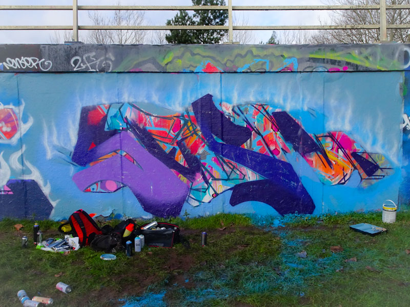
I was fortunate enough to bump into SERM when he was half way through painting this piece and we chatted for a little while. It is interesting to see how he works and that the little smoke wisps along the top of the piece are one of the first bits he paints, which is counterintuitive for a non-artist like me.

This is a very nice piece of writing with some great colour selections and the yellow 3D shadow works particularly well. I hope this is the first SERM of many.


