I am Stephen. I live in Bristol, UK. I decided to shorten my profile...to this: Wildlife, haiku, travel, streetart, psychogeography and my family. Not necessarily in that order.
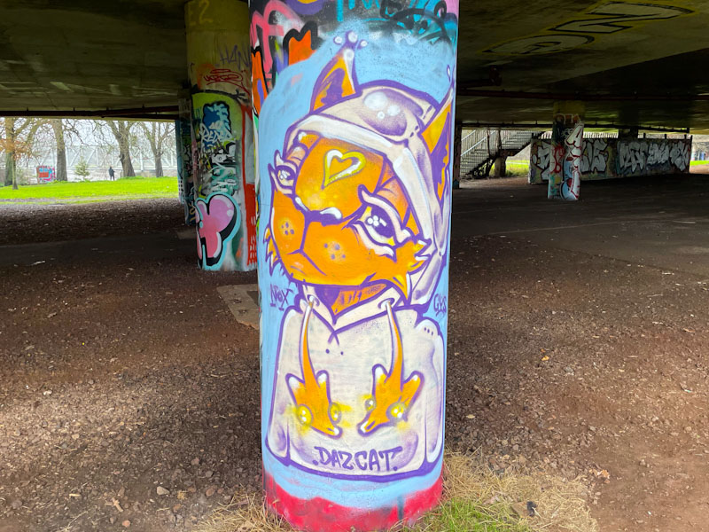
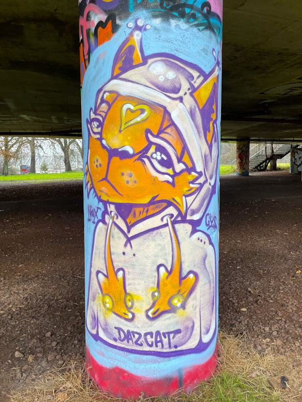
Unlike many other artists in Bristol, Daz Cat has had quite a productive winter. This column piece under Brunel was is an absolute delight, and typical of his constantly developing and improving work.
Daz Cat, Brunel Way, Bristol, January 2026
This lovely cat is wearing a white hoodie with fancy orange draw strings. There are slots for the ears, a lovely detail that demonstrates the thought that went into the piece. On the nose is a heart, which is one of several shapes that Daz Cat likes to paint; others include arrows and leafy designs. A lovely piece from one of my favourite Bristol street artists.
What a fun-packed weekend. Yesterday I drove back from Cornwall to Bristol after my workshop and then on from Bristol to London to stay with my wife’s brother and family before heading off to a football match this afternoon. Arsenal v Sunderland in case you are interested. It has left very little time for me to write blog posts, and this one was composed last night in Bristol between journeys.
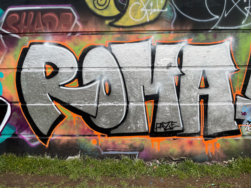
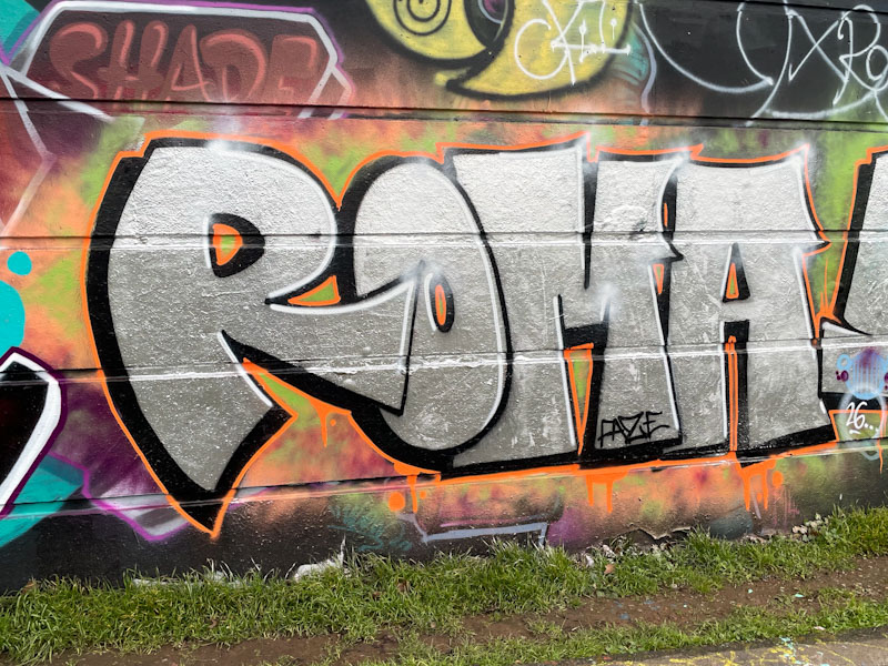
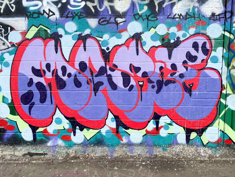
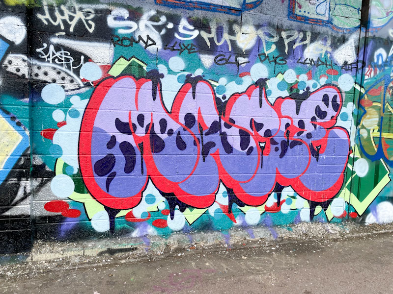
Roma, Cumberland Basin, Bristol, January 2026
Roma is another artist who writes in a simple and authentic manner using four letters. This is a wonderful chrome piece, set on a dusting of orange. I am seeing more and more of her pieces about the place, which can only be a good thing.
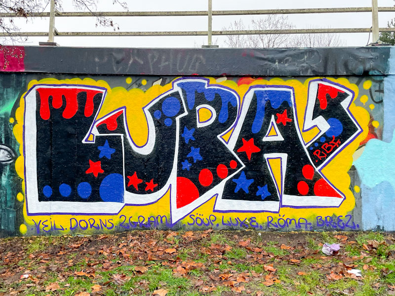
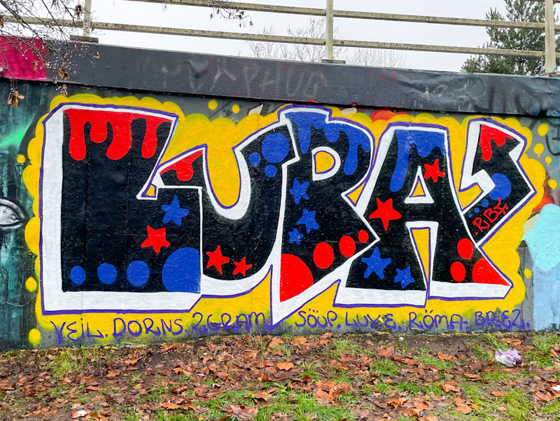
There is a simplicity and a joy in Lupa’s work, which makes me very happy. Often her pieces can be slightly untidy, but this one is really nicely finished, but maintains that grounded charm she achieves.
Lupa, M32 roundabout, Bristol, January 2026
Her letter shapes are great and the fills have a wonderful 1970s vibe to them, especially set on the contrasting yellow background. I love this piece… can you tell?
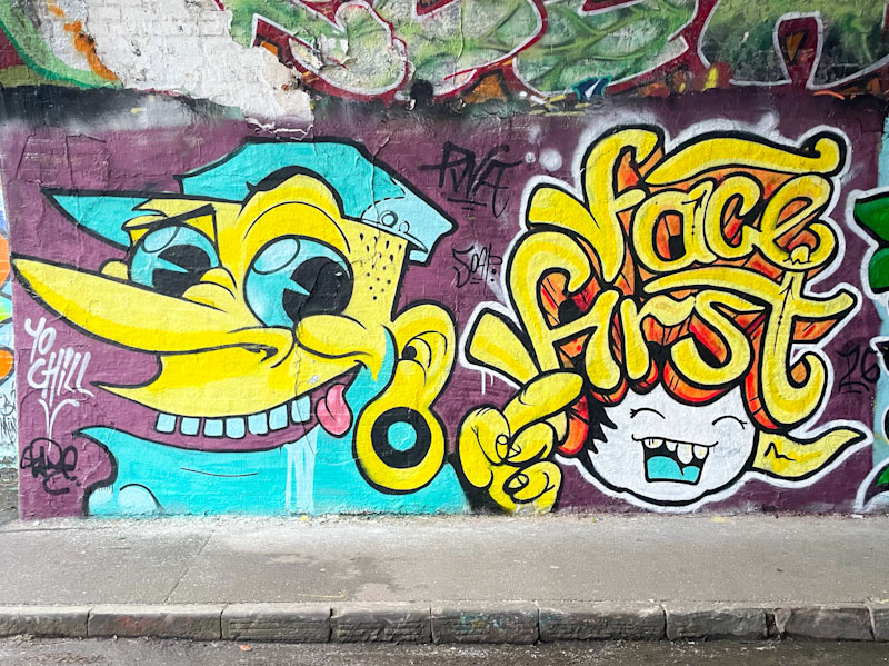
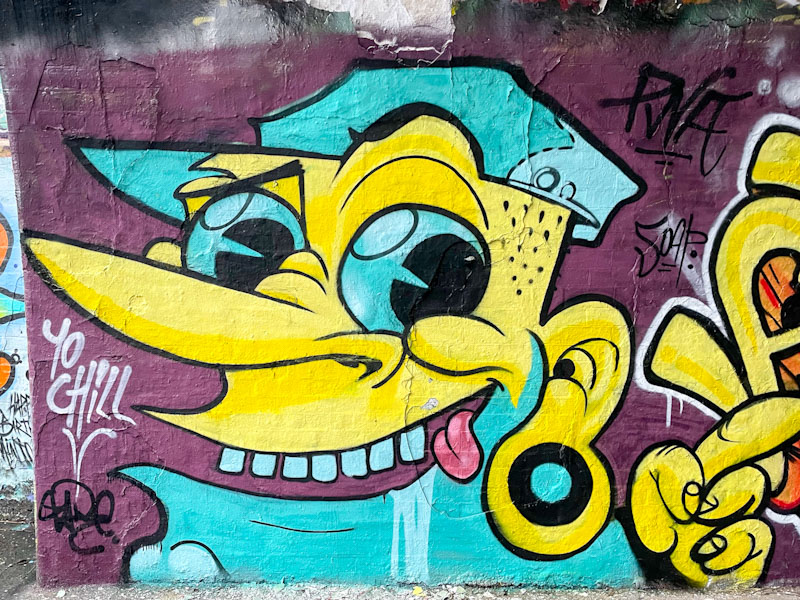
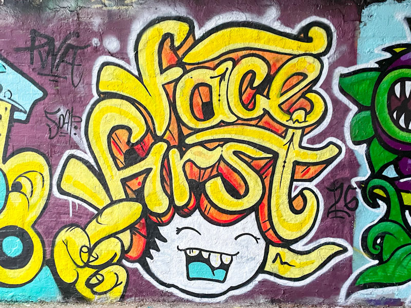
Zake and Face 1st, St Werburghs, Bristol, January 2026
A super quick post today, written last night because I’ll be running a workshop all day today. What a brilliant thing to see PWA faithfuls Zake and Face 1st meeting in Bristol together and creating this collaboration, especially as both have moved away from the city.
Zake, St Werburghs, Bristol, January 2026
Chill doing what Chill does with some superb colours. Although, had I looked a little more closely I would have seen that it is a piece by Zake in the style of Chill. So cool.
Face 1st, St Werburghs, Bristol, January 2026
Face 1st with one of his classic laughing girls with big hair spelling out his name. A superb and quite unexpected collaboration.
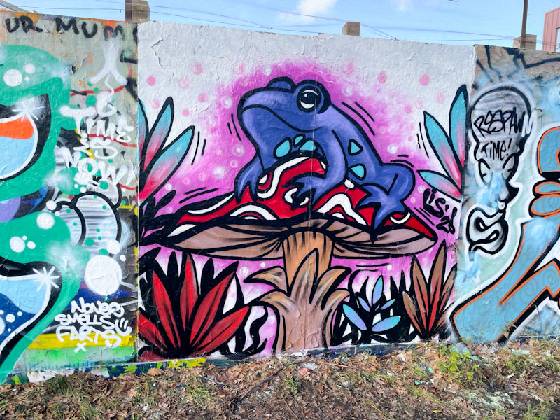
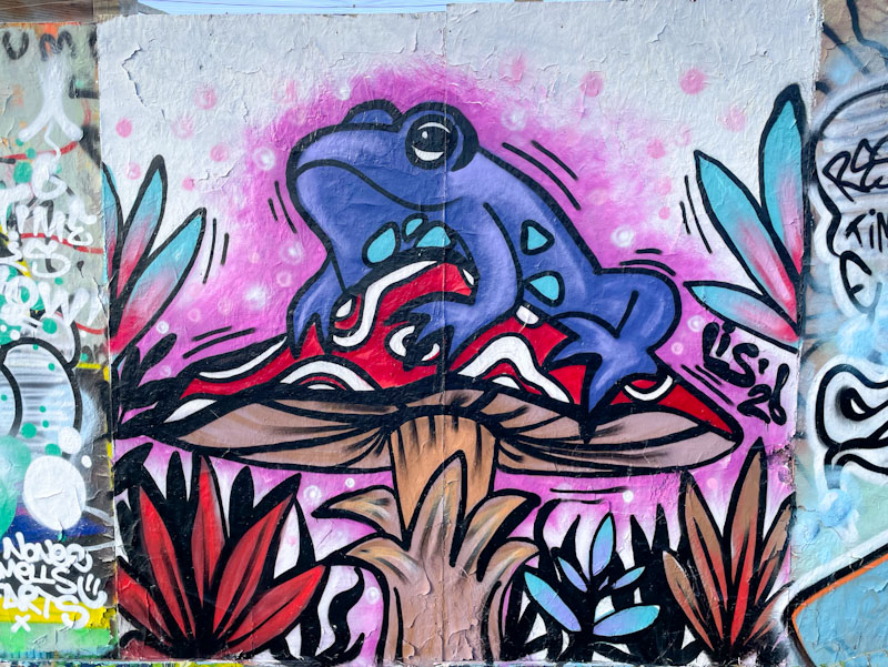
There was a definite slow-down in the amount of new street art work during January, probably thanks to the rather wet weather we have been having in Bristol. On the odd day when it hasn’t rained artists have been out and about, and this is a rather nice piece from Lis on the long hoarding at Greenbank.
Lis, Greenbank, Bristol, January 2026
The piece was painted alongside Weas, and it is not the first time these two have painted together. Who doesn’t like a frog perched on a toadstool? Especially one as well painted and characterful as this. As well as the frog and his throne, there is plenty of plant life accompanying them. A fine natural scene presented in a cartoonish style, and a great improvement/development on some of Lis’ early toadstool pieces.
I am really pleased to see this piece from Mage, because it is almost as if he has read some of my posts where I have repeatedly said that his letter choice lends itself to sharp-edged and quite clunky writing. Here he proves me wrong with the same letters written in a softer, almost bubble-like font.
Mage, M32 Cycle path, Bristol, January 2026
All the components are there, good letter design, a thought out fill pattern, great red drop shadow, and a little bit of decoration to distinguish the piece from the underlying graffiti. All in all a very nice piece of graffiti writing from Mage, who has surpassed the challenge of his letter choice.
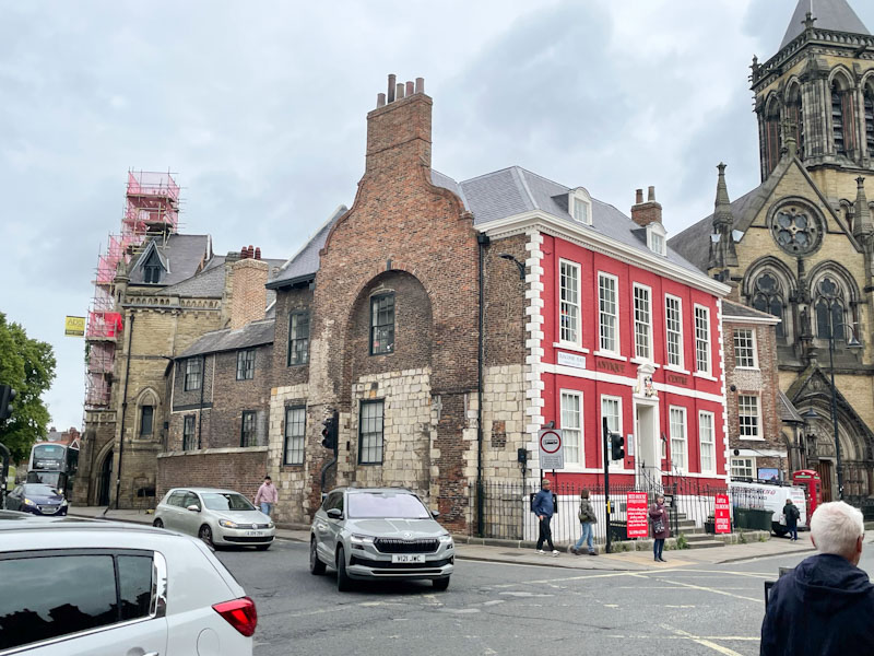
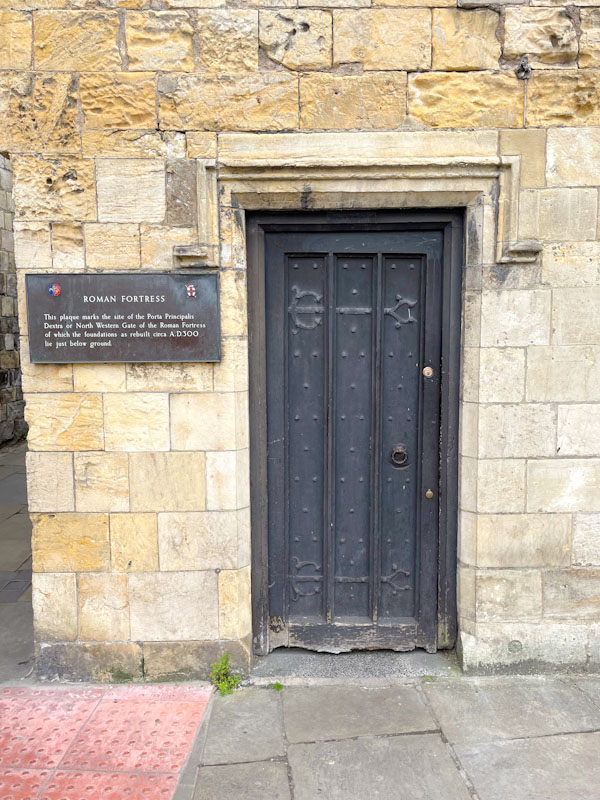
Doors 341 – Doors from the City of York (Part II), June 2024
Having spent a week away on a glorious holiday, I am now paying the price, with an avalanche of emails and backlog of work projects and requests keeping me very busy indeed. This afternoon I head off to Cornwall to run a workshop on Friday, leaving me little time to work and prepare blog posts, so I wrote this one last night.
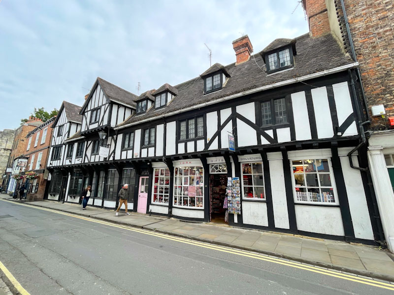
Back to some doors from the City of York, which is a truly incredible place if ever you get the chance to visit, but I would advise going during the spring or autumn, because it can get very crowded indeed in peak tourist season.
This set of doors were photographed during a random walk between the hotel I was staying at and the government office where I was having a team meeting. I hope you enjoy them.
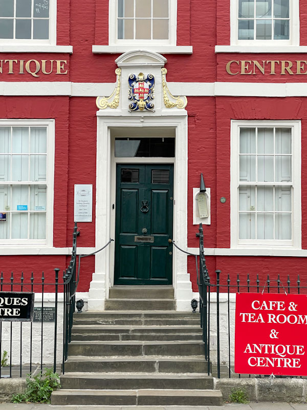
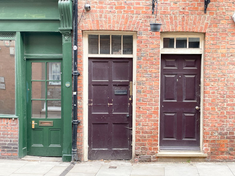
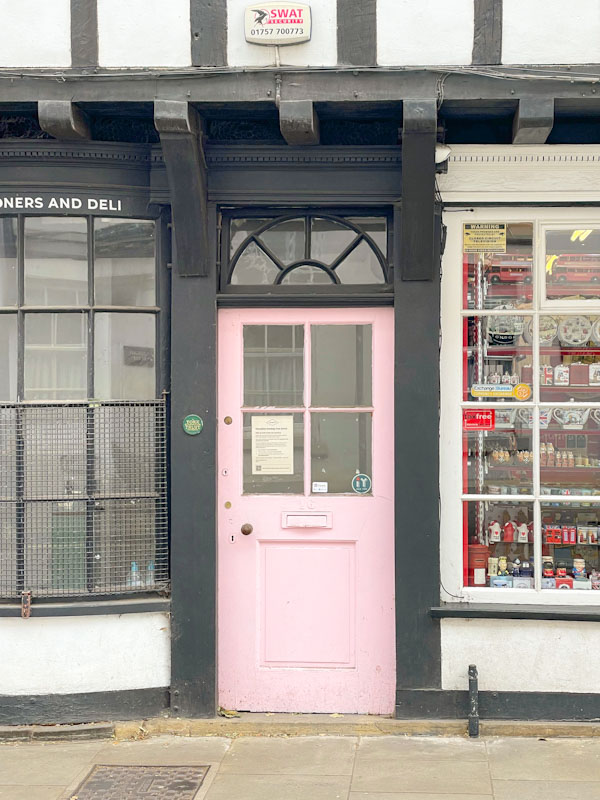
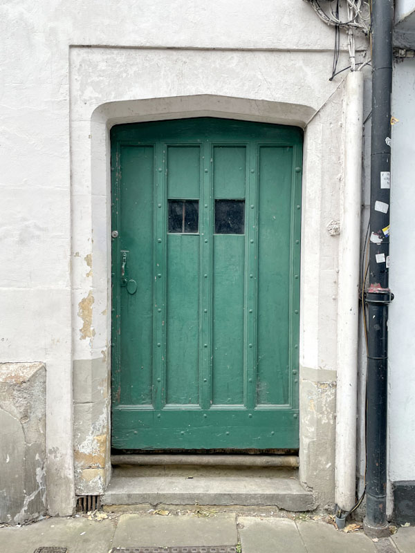
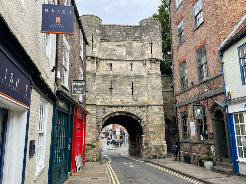
An interesting blend of architecture in the 17th century Red House, York, North Yorkshire, June 2024Steps and door of the Red House, York, North Yorkshire, June 2024Three adjacent doors, York, North Yorkshire, June 2024Large timber framed shop and doors, York, North Yorkshire, June 2024Pink shop door, York, North Yorkshire, June 2024Old green door, York, North Yorkshire, June 2024Bootham Bar gateway, York, North Yorkshire, June 2024Door and plaque marking the site of the Roman North West Gate, York, North Yorkshire, June 2024
More from York next time, may I wish you a happy weekend from a very damp Bristol.
If you have made it this far, you probably like doors, and you really ought to take a look at the No Facilities blog by Dan Anton who has taken over the hosting of Thursday Doors from Norm 2.0 blog. Links to more doorscursions can be found in the comments section of Dan Anton’s weekly Thursday Doors post and his Sunday recap.
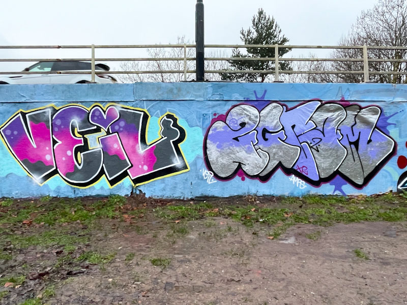
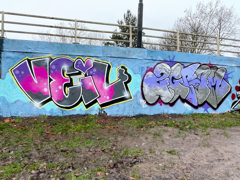
Desi and Mr Two Gram, M32 roundabout, Bristol, January 2026
Desi and Mr Two Gram are a couple who often paint together, and here is one of their recent collaborations. Their styles are quite different, and so the collaborative part of their work is limited to the fact that they paint side-by-side. To the left Desi has painted her VEIL letters presented beautifully which include her trademark heart.
Desi and Mr Two Gram, M32 roundabout, Bristol, January 2026
To the right Mr Two Gram has painted a chrome and purple piece, which although an unlikely combination, actually works rather well. I feel that Mr Two Gram is rather underrepresented on Natural Adventures, and ought to address that. His work is often quite low-key and modest, so perhaps I don’t pick up on it as much as I might. It is always great when these two get out and paint together.
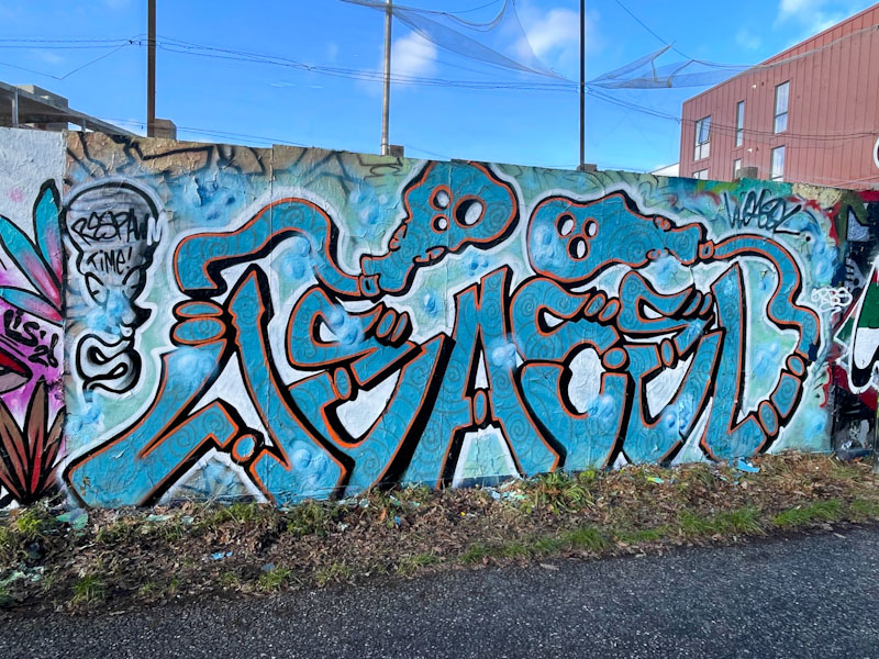
Although Weas’ (Weasel) work isn’t the most polished that you’ll see, because he tends to paint his little character tags rather quickly, he clearly has a talent which is evident in this piece of graffiti writing on the hoarding at Greenbank.
Weas (Weasel), Greenbank, Bristol, January 2026
His letters, spelling out WEASEL, are filled with subtle swirls on a blue base, creating a slightly psychedelic effect, and the orange border creates a clean finish, with a slender black 3D drop shadow rounding things off. He has managed to weave in a couple of his characters, and added a rather more crude one to the left. I rather like this piece, and would like to see more of these from Weas.
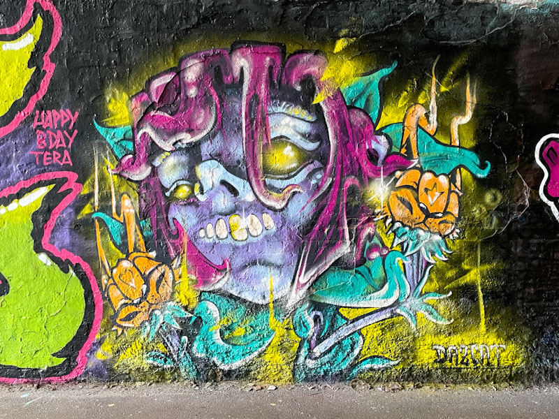
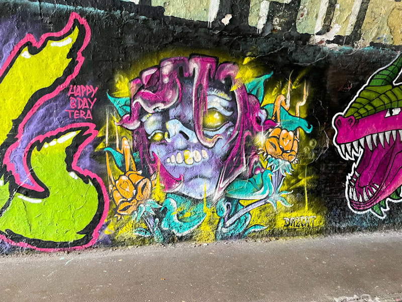
Wow, this is a superb on-message piece by Daz Cat painted to celebrate Tera’s birthday. As we know, Tera is rather fond of his scary horror pieces and so Daz Cat has leapt straight in there with a cat horror piece of his own.
Daz Cat, St Werburghs, Bristol, January 2026
Daz Cat has managed to capture a menacing look in this cat portrait piece, that has a tortured face. The cat creature appears to be emerging from a flower stem, and the two orange ‘hands’ are cat-like flower heads. This is a curious and imaginative piece by Daz Cat and a thoughtful contribution to the celebratory paint jam.