.
Mr President
obfuscation fools nobody
plenty to see here
.
by Scooj
.
Mr President
obfuscation fools nobody
plenty to see here
.
by Scooj
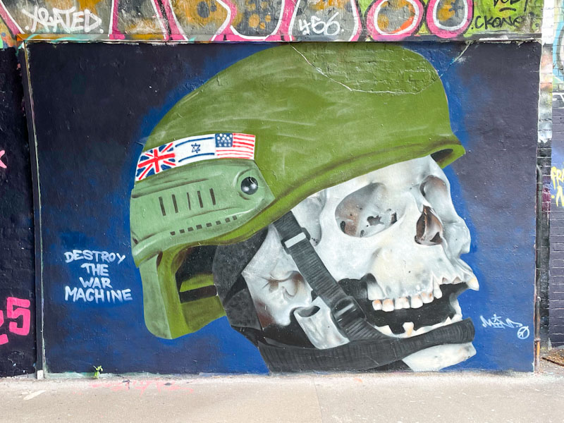
Mind 49 has always been an activist, and although his art has mellowed in recent years, his principles are still very much intact. This anti-war piece is striking, poignant and beautifully presented.

Skulls are a common motif/subject in street art and this is one of the very best examples I have ever seen. Mind 49 has captured the tones, shading and depth perfectly. Strangely, the helmet almost seems as though it is painted by a completely different artist. It is lacking in detail, the perspective is slightly out and the flags a bit untidy. I don’t know why this is, whether it is a deliberate device or that Mind 49 has absolutely cracked the skull and needs to work on helmets. It is a mystery.
The message to take home is clear. ‘Destroy the war machine’, which is directed at the UK, the USA and Israel. I could go into a long and thoughtful essay about the war in Palestine, and the impotence of voices that want an end to the killing and suffering. History will not look favourably on the genocide and the parallels with WWII concentration camps and justifications for extermination. Can’t people see the paradox? I’ll stop there. It upsets me too much.
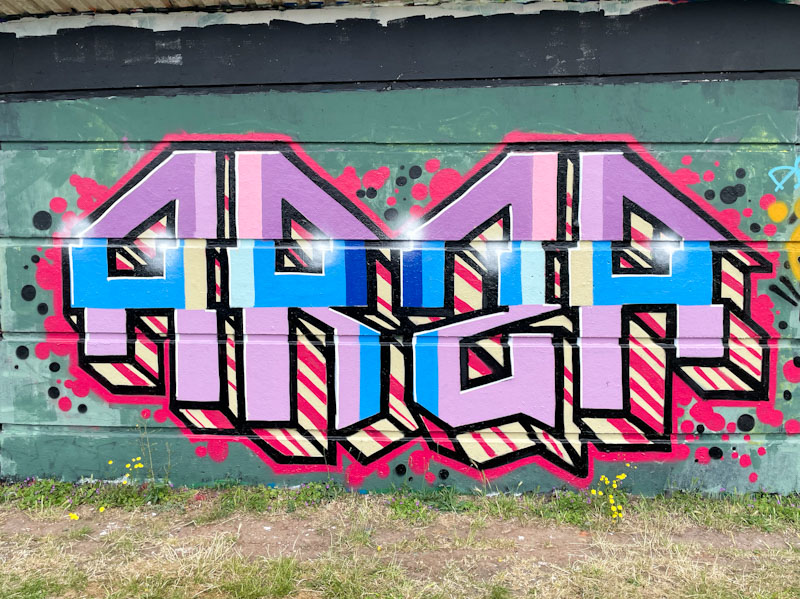
Every once in a while I take a trip through my archives and spot pieces that I failed to post first time round, and give them a second chance. This is a piece by Totosoapcity from a year ago, July 2024, before I knew his name, which is why I probably didn’t post it then.
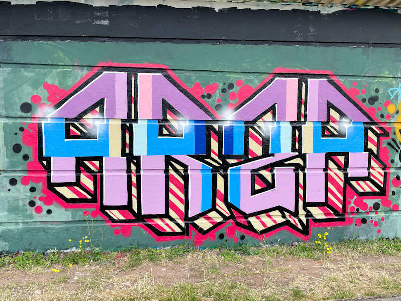
All of Totosoapcity’s pieces are instantly recognisable, because of the shape of his letters, which is quite unique, and doesn’t seem to deviate too much from piece to piece. I think the letters spell ARSA, with the ‘S’ reversed. In this piece he has gone form the trusty pink and blue combination with a cream and red striped drop shadow and red border with decorations. Decent, unusual and distinctive writing. Watch this space for more of his work from my archives.

I can’t think how many times Dibz and Fade have teamed up in the last couple of years, but it must be into dozens, and this piece shows the true nature of total collaboration, where both artists created this incredible work together, and it isn’t possible to know who painted what. Lots of crew shout-outs are scattered around the outside of the piece in pink. Wildstyle writing at its best.
The piece spells out, rather appropriately, ‘Wild Style Addicts’ which probably sums up these two rather well. The gold and purple colours complement one another well, and it all looks very neat and tidy on the black wall.
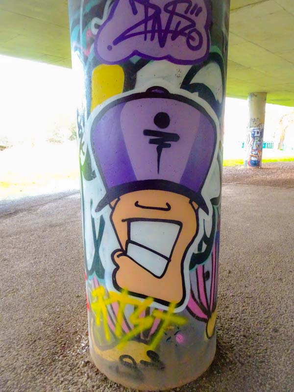
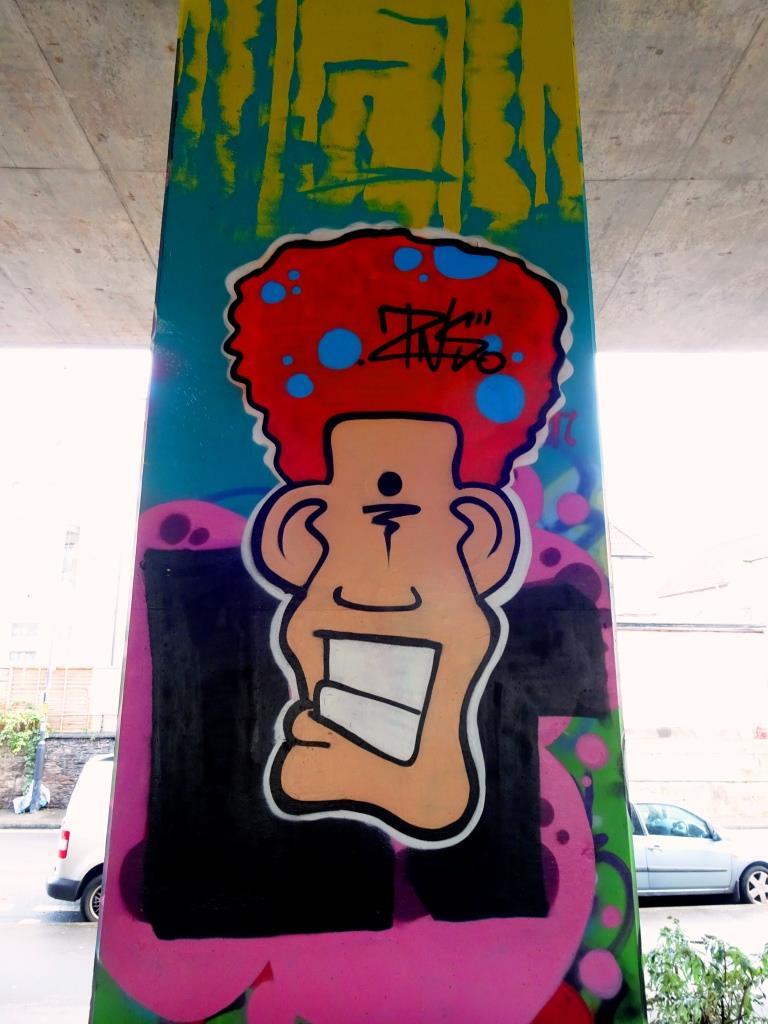
I will have mentioned that Zinso has been rather busy of late, and also that he appears to be relatively new to Bristol. How wrong am I? I was looking through archives and noticed that I have posted pieces by the artist way back in 2019 and 2020, but those were character pieces and not writing. I can’t believe that in the intervening years I haven’t noticed his work, so have to assume that he has found a new burst of energy and time recently

This is a rather neat piece of bubble writing with a really deep 3D drop shadow, lifting the piece nicely off the wall. The piece is really nicely finished and greatly superior to most bubble writing that I see, that is usually associated with quick throw ups. Loads more to come soon, and below are a couple of his pieces from a few years ago.
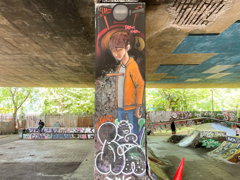
I wish I had photographed this piece before it got tagged up at the base, because it is another truly classy column piece by Silent Hobo underneath the M32. I have noticed that many of Silent Hobo’s recent pieces have a rather melancholic tone, and I wonder if he is expressing himself through his art and the stories it tells.
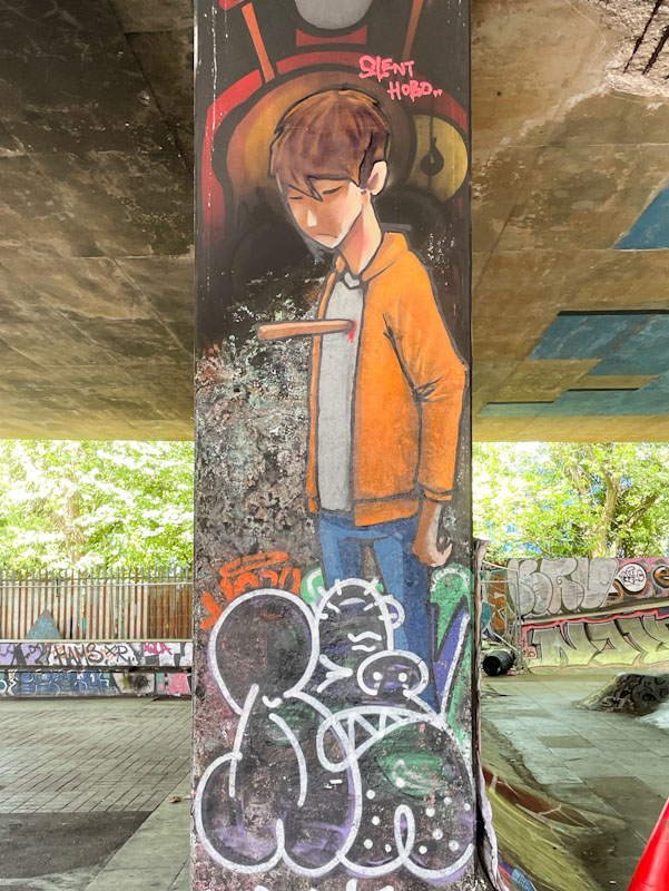
In this piece, a young man is looking rather sad, and has a wooden stake piercing his heart. I would interpret this as being heartbroken, but perhaps I am reading too much into it. What I can say is that Silent Hobo’s portrayal of Bristol youth and their preoccupations and joys is unparalleled.
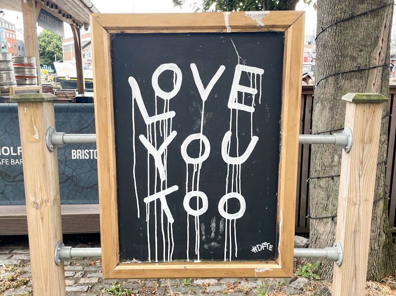
These are three small boards outside a café on Narrow Quay, which I assume are commissions, or at the very least, permitted by the establishment. The artist is #DFTE and illustrate perfectly his philosophical musings delivered in his singular letter style with plenty of drips.
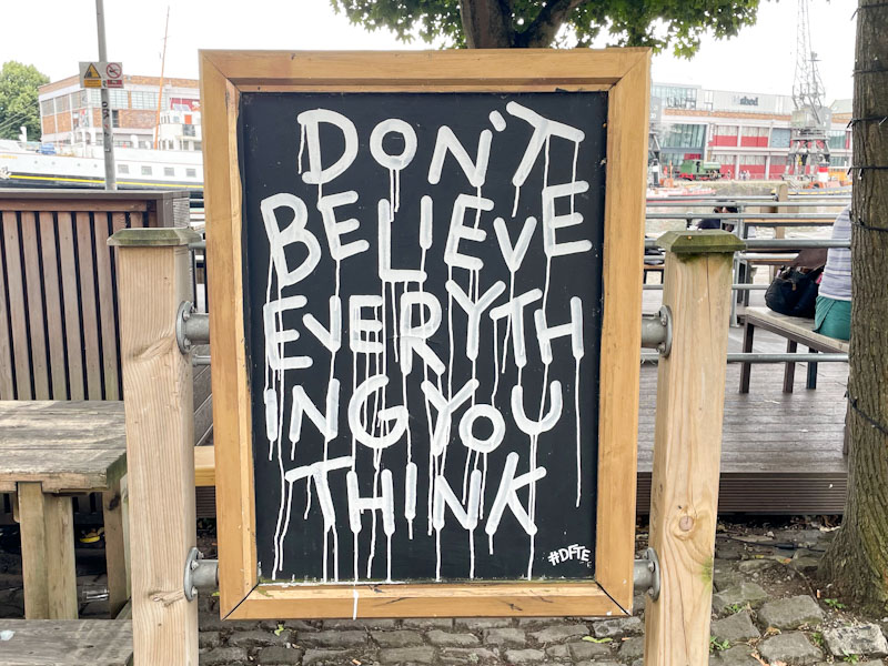
The first declares “love you too” presumably in response to a statement. The second is s little more challenging, and is perhaps a great reflective motto, “Don’t believe everything you think.
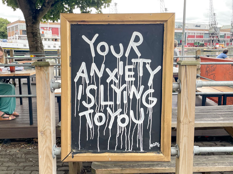
The third board in this trio, “Your anxiety is lying to you” is, I think trying to be helpful, but to anyone who suffers from anxiety, it probably just confuses and upsets – I can imagine tying oneself in knots over that statement. These original pieces represent a great way of integrating street art into our everyday lives. Nice work from #DFTE.
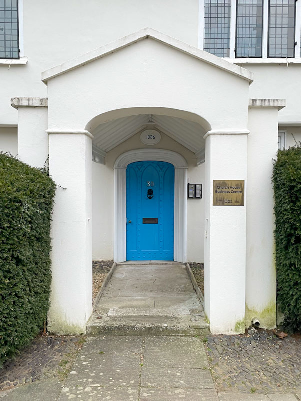
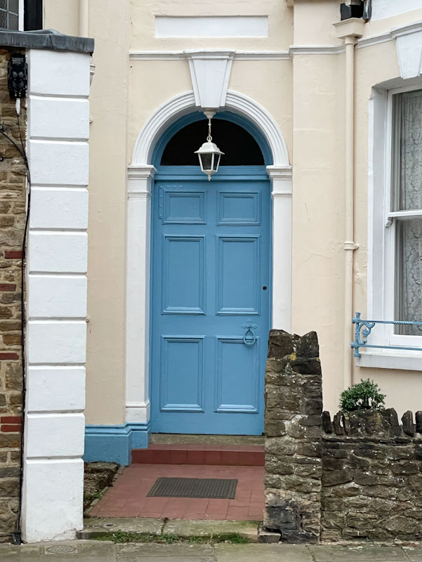
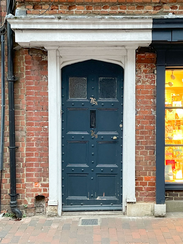
Doors 317 – Doors of Godalming, Surrey, March 2025 (Part III)
A quick one this morning as I haven’t left myself much time to write. This is the third selection of doors from Godalming, a small town in deepest Surrey, a place that on the face of it is reasonably affluent, and definitely has some lovely buildings dotted about the place. I hope you enjoy these doors:
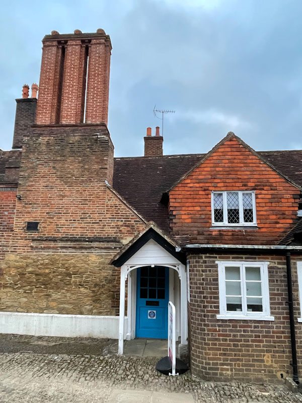


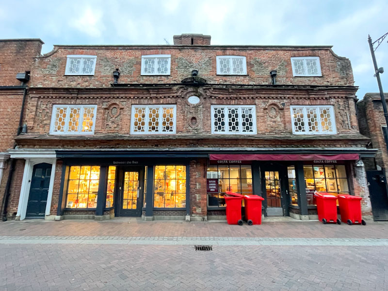
I rather like this selection of doors and the range of periods, but that last building is a beauty in my view. Here is an excerpt from a website called Geograph, about the building:
If you have made it this far, you probably like doors, and you really ought to take a look at the No Facilities blog by Dan Anton who has taken over the hosting of Thursday Doors from Norm 2.0 blog. Links to more doorscursions can be found in the comments section of Dan Anton’s Thursday Doors post.
![]()
.
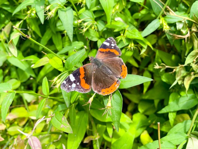
Dry spring and summer
a good year for butterflies
uplifting beauty
.
by Scooj
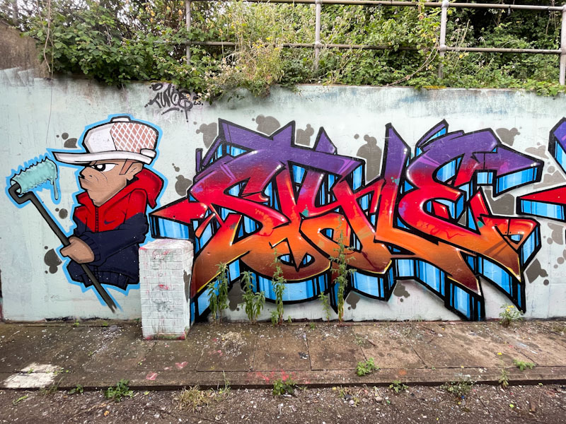
This is a wonderful old school combination piece painted at the L Dub spot by Turoe, although I think that the character might be by Veks. Everything about this oozes class and experience.

The character wearing a baseball cap has been buffing the wall with a roller, thus indicating a form of self-portraiture. The letters, spelling STYLE are perfectly filled with blended horizontal shades transitioning from purple through red and orange to brown. A striped 3D drop shadow rounds off this piece off nicely and create a metallic sheen effect.


