
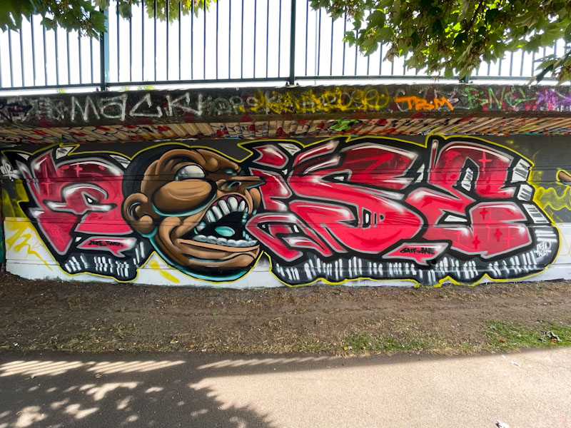
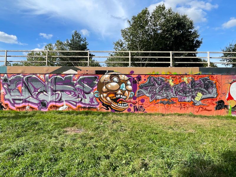
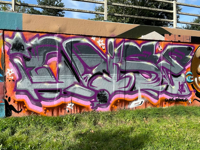
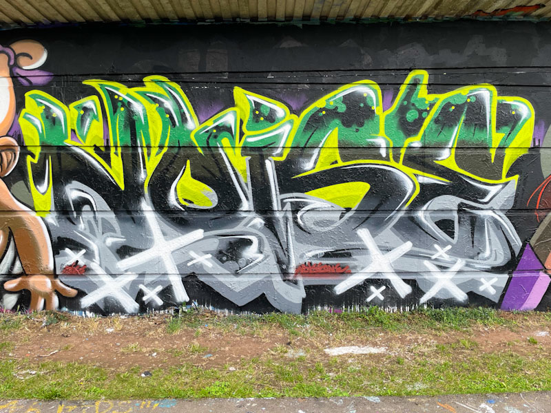
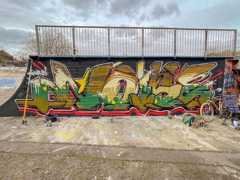
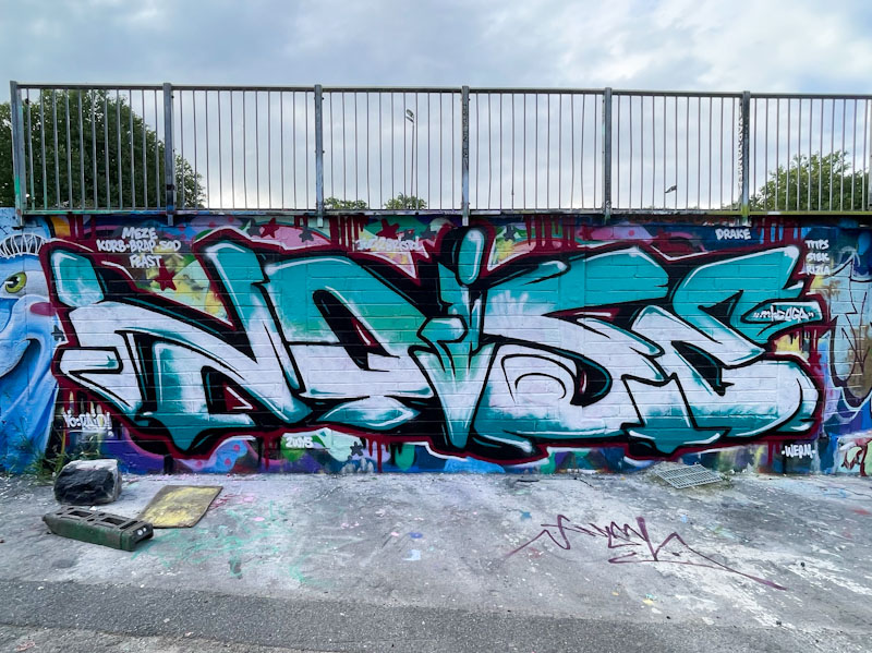
A gallery of graffiti writing from the outstanding Bristol-based writer, Noise.
Instagram: noise_mhc_uga_lrs
All photographs by Scooj

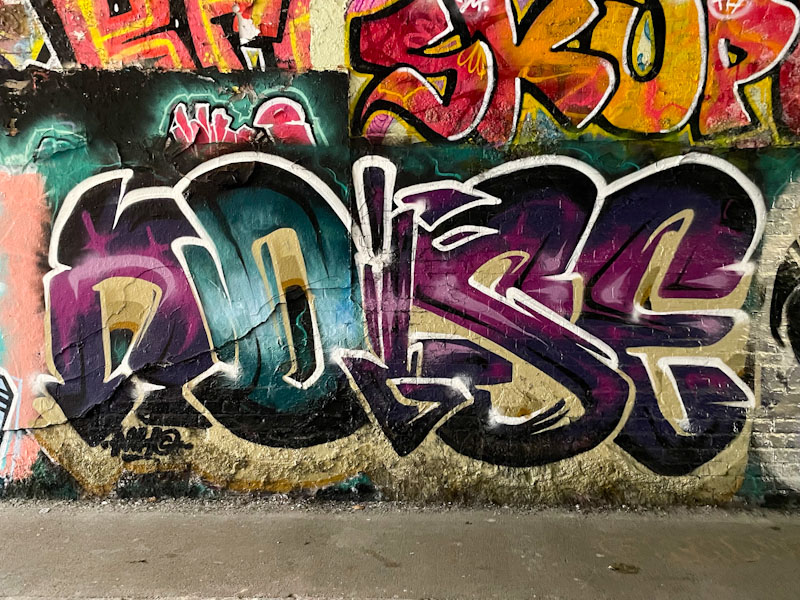


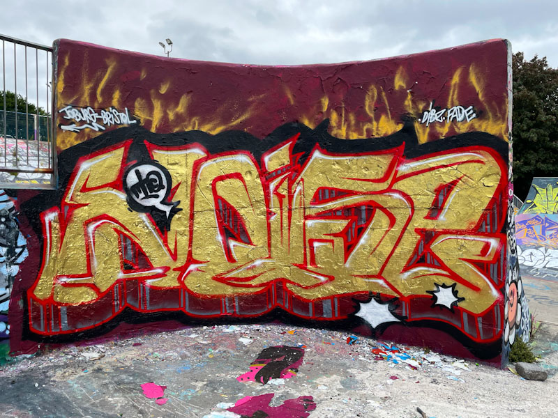


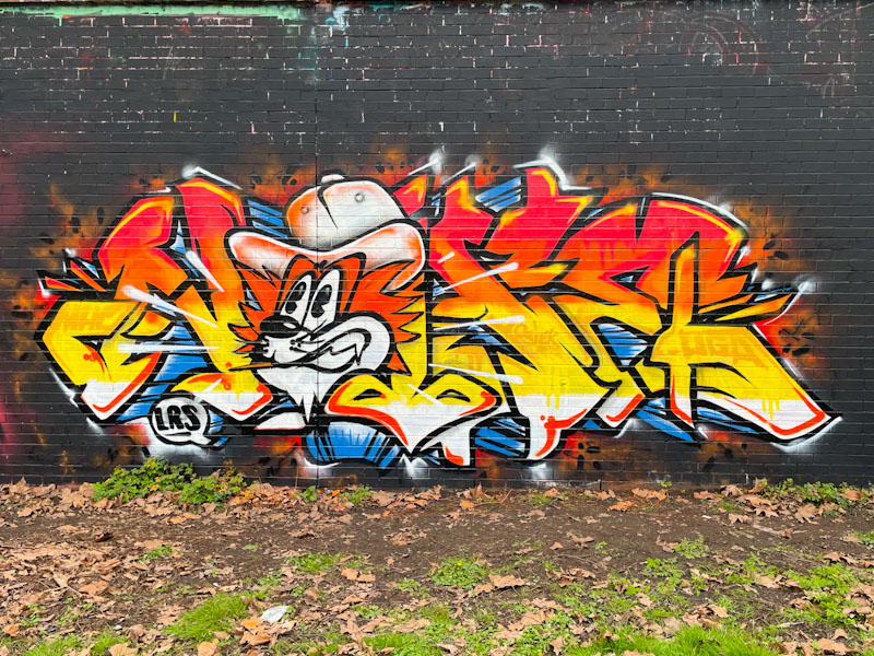


A gallery of graffiti writing from the outstanding Bristol-based writer, Noise.
Instagram: noise_mhc_uga_lrs
All photographs by Scooj
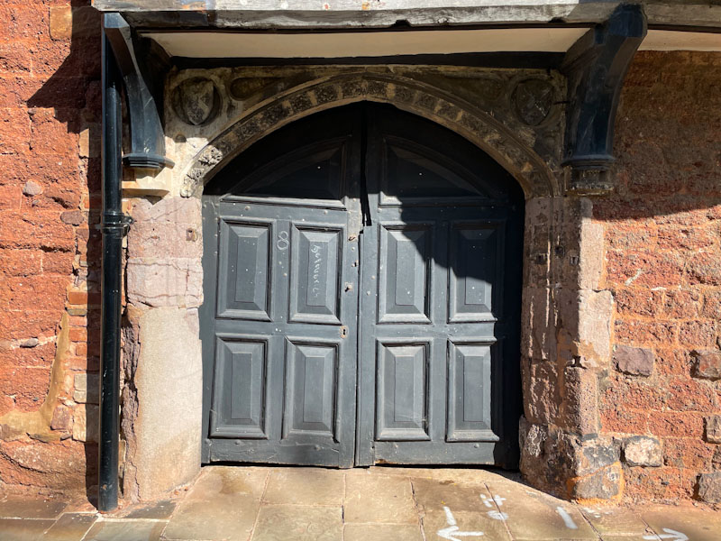
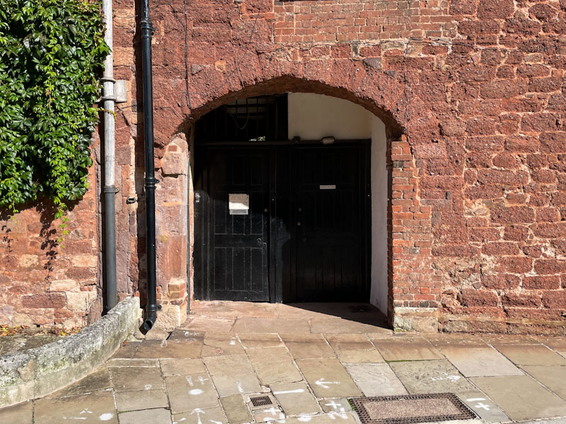
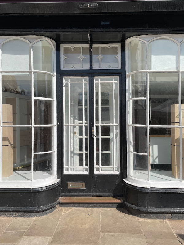
Doors 288 – Doors from Exeter, Devon – Part V, October 2023
At the time of publishing this post, I will be in a conference in Bristol, So I had to cobble this post together in a bit of a hurry last night. There is not too much to say about this week’s selection of doors, because it forms part of a long series of doors from the City of Exeter, all photographed during a two-hour walk back in October 2023. These doors were all from the area around Exeter Cathedral. I hope you enjoy them.
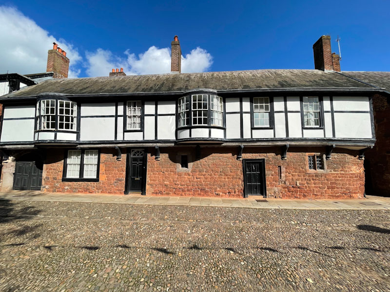

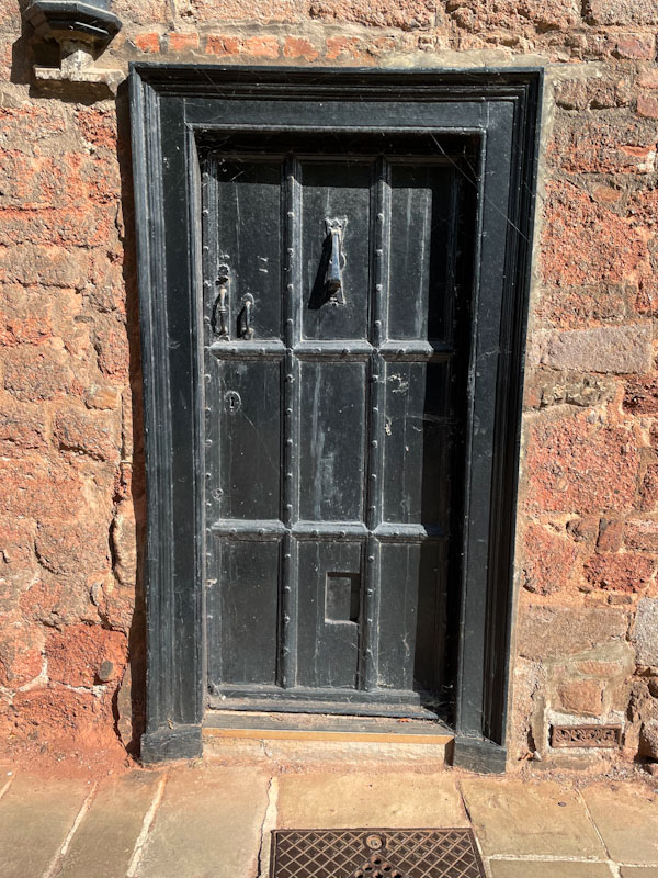

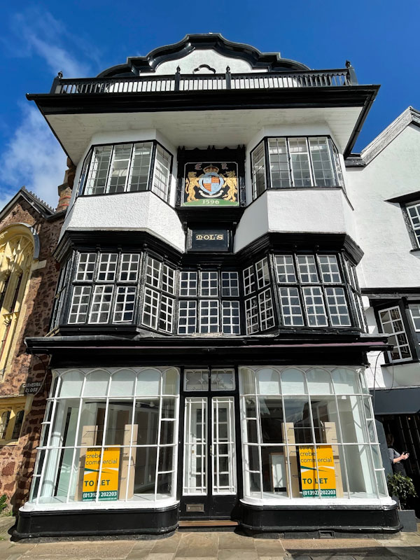
You can read more about Mol’s Coffee House here, it has an interesting history. That’s about it for this week. I’m sorry, but there are still a few more doors to share from Exeter next time. I wish you a fulfilled weekend.
If you have made it this far, you probably like doors, and you really ought to take a look at the No Facilities blog by Dan Anton who has taken over the hosting of Thursday Doors from Norm 2.0 blog. Links to more doorscursions can be found in the comments section of Dan Anton’s Thursday Doors post.
by Scooj


This is the second paste-up that I managed to find in Abbie Laura Smith’s latest blitz, and although I only found three pieces, I am sure that there would have been more. A little bit bedraggled, reflecting the damp conditions when I photographed this piece, the paste-up features a black and white image of a woman, reversed out in this instance, with writing incorporated throughout.
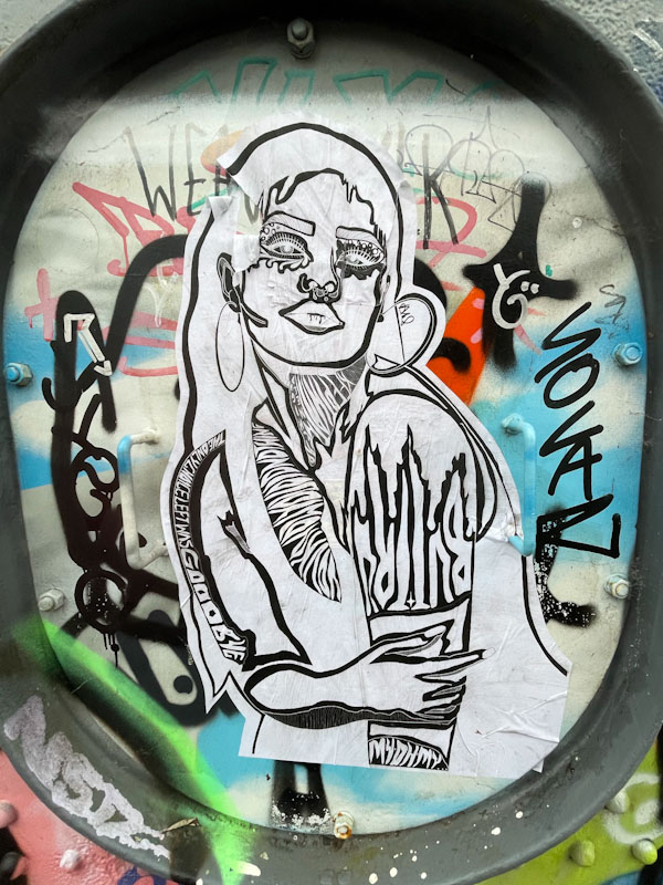
As with the last of her pieces that I posted, I can’t quite make out all the writing, but can pick up the odd line here or there, such as “The only chance left was goodbye” and “Keep that…”. Once again these might be sad or morose, but out of context it is difficult to know. Poignant pieces printed off on paper and pasted up in special places for the curious to look at.

At the moment, Bean is spending a lot of time away from Bristol, and only comes back for short periods, such is the student way of life. When he returns he manages to find a few moments to decorate the odd wall or two. This is fine piece in one of his favourite spots under Brunel Way.
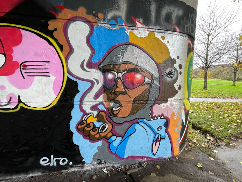
The piece is actually based on a photograph which Bean has included in his Instagram post about this portrait of ‘The Great Tear Gas Hoax: How a Kenyan protestor fooled the world’, which was a story about a guy who pretended he was inhaling the gas out of a tear gas canister. Bean has faithfully reproduced the moment in this beautifully painted piece, which is a slight departure from his more fantastical cartoon creations. Looking forward to Bean’s next visit, which might be around Christmas.
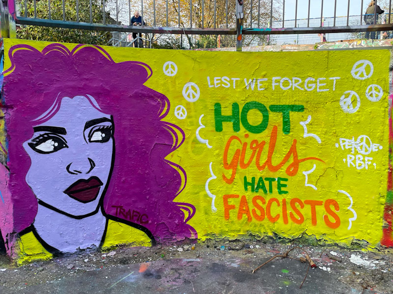
Prompted by the racist riots (#farageriots) earlier this year, Pekoe initiated this series of pieces, which present a complete rejection of racism and fascism in a cool and humorous way. I love it that Pekoe expresses herself in this way and in doing so helps people like me to know that I am not alone in feeling sadness at the lurch to the far right many citizens of the UK have made.
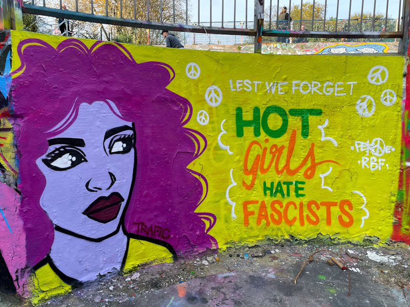
The combination piece features a Pekoe portrait, and the words “hot girls hate fascists”. The colours yellow and purple are an interesting combination, and they are actually colour opposites on a colour wheel. I love this series from Pekoe, and I hope she drops more of them… as she says, lest we forget.

The collaboration involving several artists under the M32, which is inspired by the World Wall Stylers challenge of the Japanese Animation ‘Ninja Scroll’, has turned out some highly memorable pieces, including this outstanding graffiti writing from Hire.

I’m not quite sure how he has done it, but Hire has managed to paint a fusion of his style with a strong Japanese influence. His signature, resembling Chinese character kanji (used in Japanese), mirrors the main piece, and is accompanied with the letters BF on the opposite side. The backdrop includes subtle hints at an ancient Japanese urban landscape. Cool piece.

This collaboration between Pura Decadencia and Desi is a sight for sore eyes, especially as neither artist seems to be painting very frequently at the moment. The glistening silver (chrome) and gold appearance is especially dazzling in the bright light of an autumn afternoon.
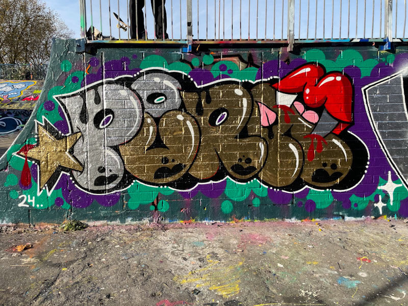
Pura Decadencia is a Spanish artist who appears to have settled in Bristol, along with so many of her contemporaries, which is great news for us. Her typically rounded letters are well presented, and no Pura Decadencia piece is complete without big lips and vampire fangs drawing blood somewhere on the piece.

Desi, who more commonly writes VEIL these days, has had quite a quiet year, but she is making up for it with this piece. Both artists have not only adopted the same colour scheme, but also used the same black patterning at the base of their letters. The shares bubble background rounds off the collaboration nicely.

This is not a pairing that I would necessarily have predicted, but on reflection, is is a good match, and I can see why these two, Kool Hand and Scrapyardspec, have collaborated. Both have opted for an orange colour theme, either by accident (Kool Hand’s orangutan is usually this colour, and Scrapyardspec often uses orange) or by design.
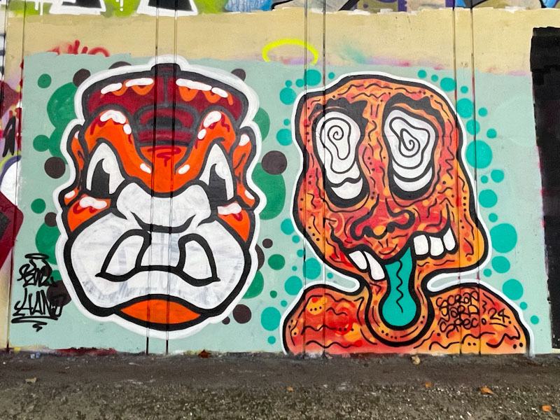
Kool Hand does what Kool Hand does with his familiar character, that he must be able to rattle off in his sleep. It is a pity that his white fill is a bit thin and there is some previous artwork bleeding through, some paints are thin, and there isn’t a lot you can do about it. To the right, Scrapyardspec has painted another of his zany wobbly characters, that we are seeing all over Bristol at the moment. Both artists have decorated the piece with spots, but in their own styles, rather than creating some kind of uniformity across both pieces (which I think might have sealed the collaboration a little better). Great to see these two pairing up.

I was lucky enough to bump into Endz just as he was finishing this piece off, and unfortunately for him, I delayed the completion by about twenty minutes, but we had a fun chat. I had to confess that I hadn’t seen any of his Endz pieces, or that if I had, they were deeply buried in my archives.
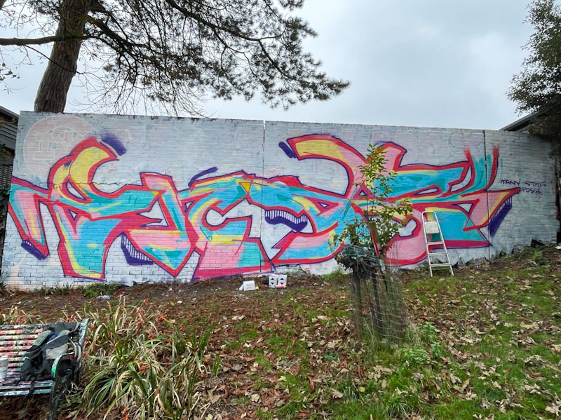
This is a large piece, larger than it might appear on a screen. The colourful letters spell ENDZ and have a fairly loose feel about them. The pastel shades are bound within a red border and feel bright, even on a dreary day, thanks to the white background. This is certainly an unusual piece of writing which suits the location really well.

I really like Zake’s enthusiasm for teaming up with any and pretty much every graffiti/street artist in the city. It is probably easier to list those he hasn’t painted with. Here he has teamed up with Hire to create this interesting combination collaboration.
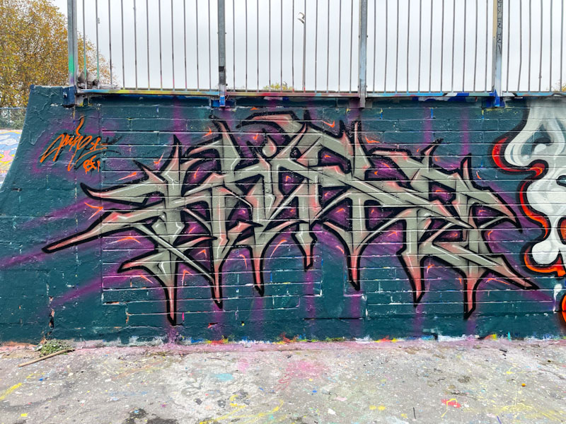
The writing on the left is by Hire and takes the form of his spiky angular letter style The letters, spelling HIRE and painted in a grey colour with rouge tints, has a hint of symmetry about it. I fear that the dark blue background rather dominates the piece and makes it a little hard to pick out the lettering, which would probably look better set on a different base colour.

Zake has painted another of his familiar round-face characters, so full of depth created by clever use of light and shade. The red underglow is so effective. The face is surrounded by plumes of smoke and white dots. The two pieces, although stylistically completely different, complement each other well.


