
.
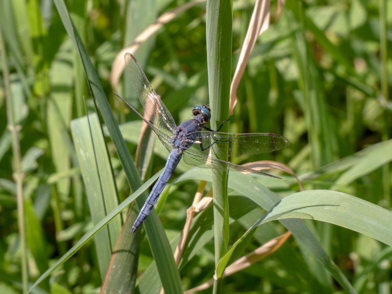
Back to the hard grind
my mind drifts to holidays
and a dragonfly
.
by Scooj
.
Back to the hard grind
my mind drifts to holidays
and a dragonfly
.
by Scooj
.
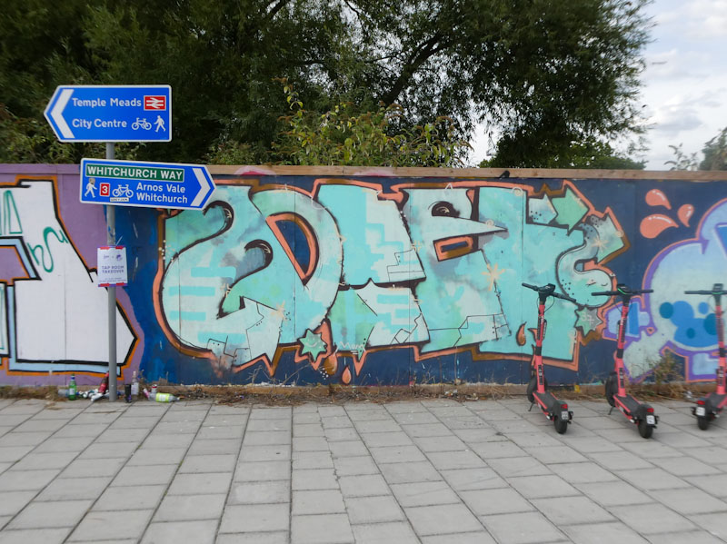
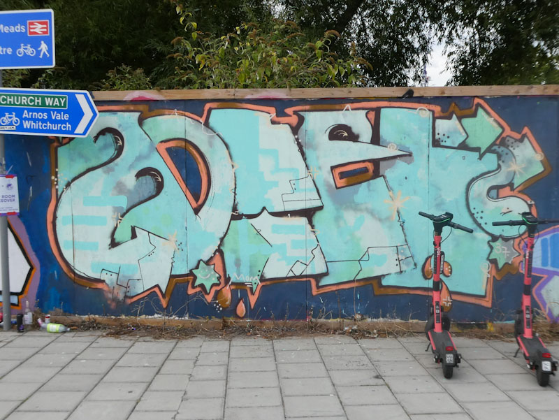
Sauron #ThickLizzie
unleashes hoards from Mordor
prepare for battle
.
by Scooj
The writing says MOTEL, don’t ask me why, but it is an interesting word to choose – perhaps it gives options for some good letter shapes. The artist has one of the best names on the scene – Dog Bless the Band – again don’t ask me where that comes from, sometimes it is better not to know these things as it takes away the mystery.
One of the things that is consistent with all the Dog Bless the Band pieces that I have seen is the complex fills in muted tones. These subtle patterns are a refreshing change from the often brash shapes and colours that most fills are made of. I like to think of these fills by Dog Bless the Band as ‘muddy’ but in a good way, if that makes sense. I always love finding his special and unique work.
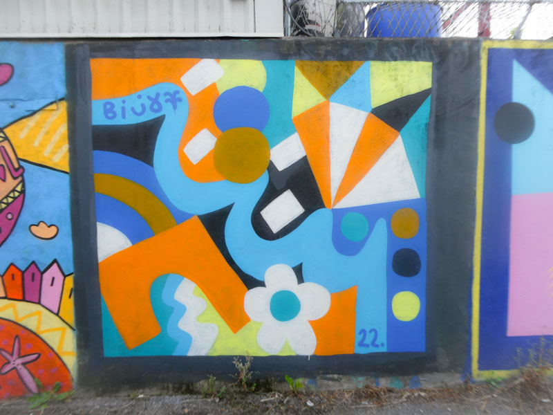
I have not posted many pieces from The Paintworks wall, which is a bit of a shame really, so I will try to change that if I can. This is a very nice abstract piece from Billy, full of colour and character, as you would expect from the artist. The wall is a little bit grubby, which suggests that the piece has been here for some while.
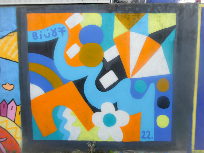
Billy always manages to create uplifting work, and the combinations of shapes and colours carefully slung together in this piece work well for me. The other thing I like about this piece is that it is nicely framed with a black border that helps us to focus on the art within it.
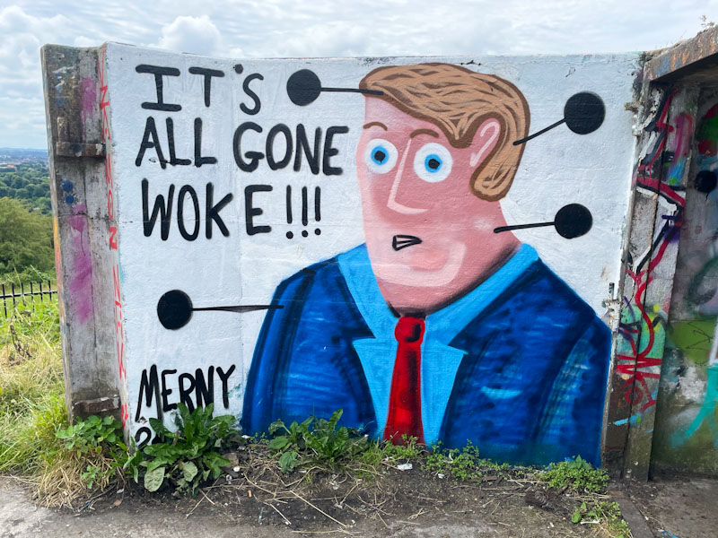
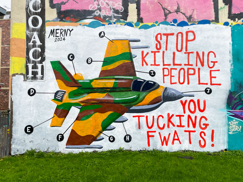
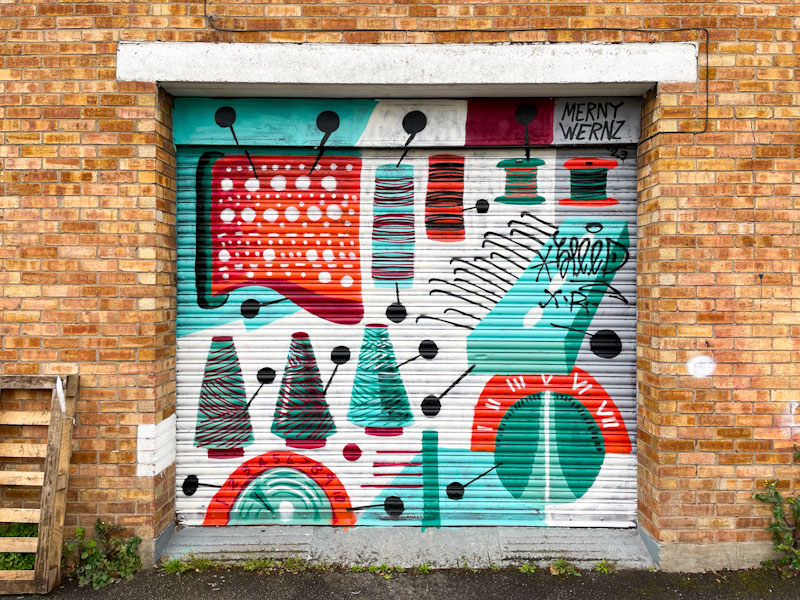
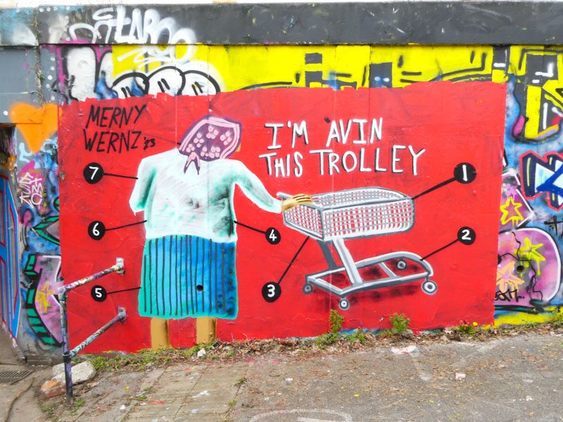
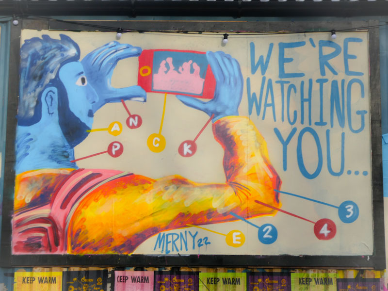
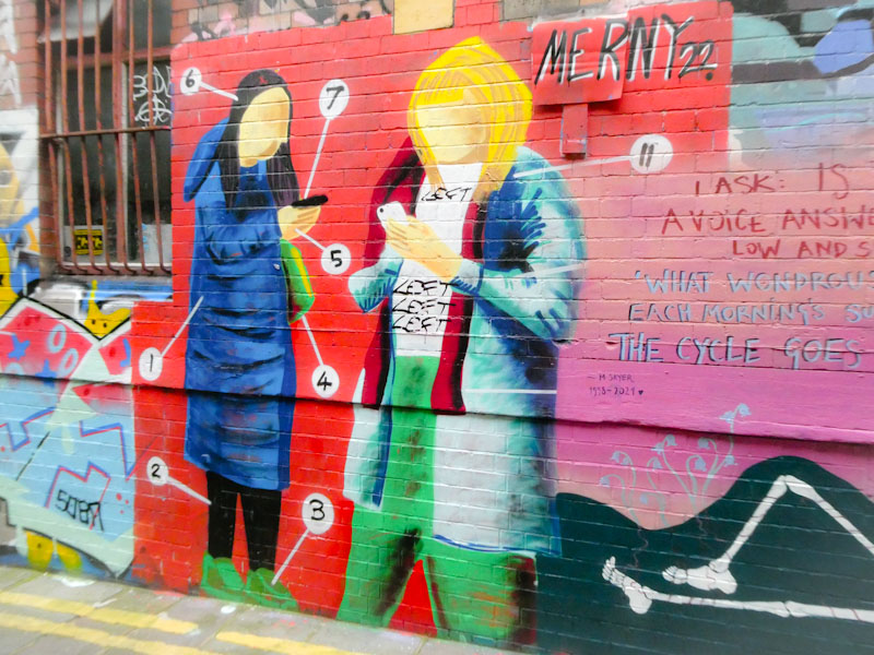
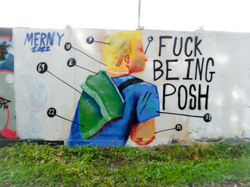
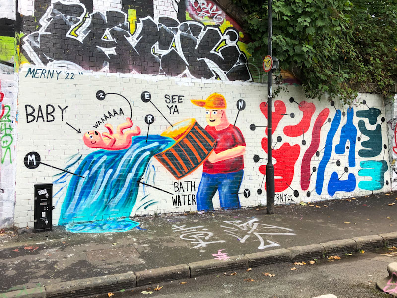
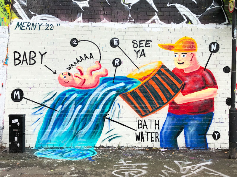
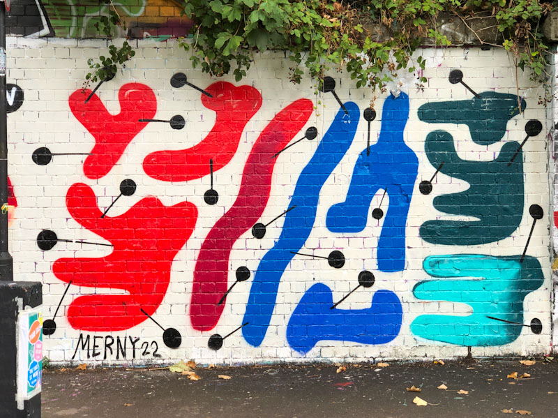
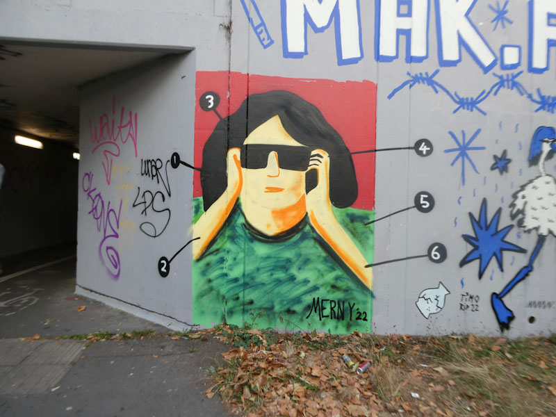
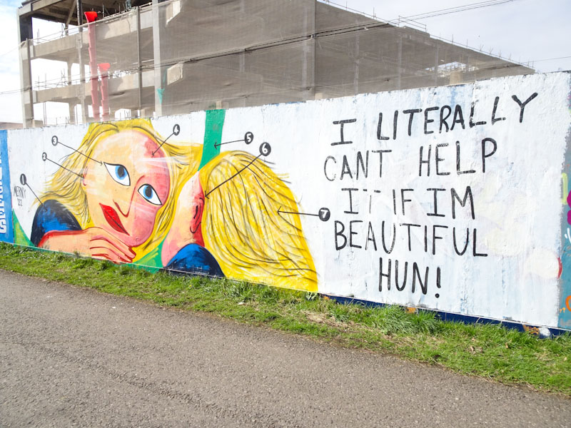
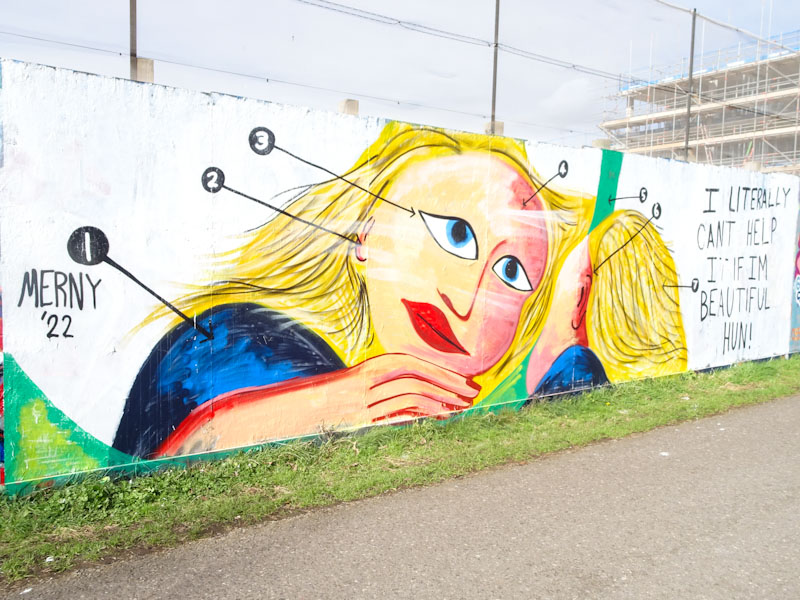
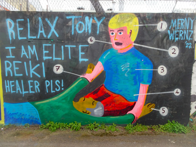
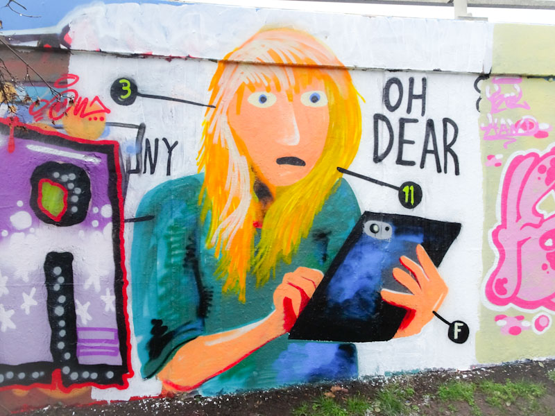
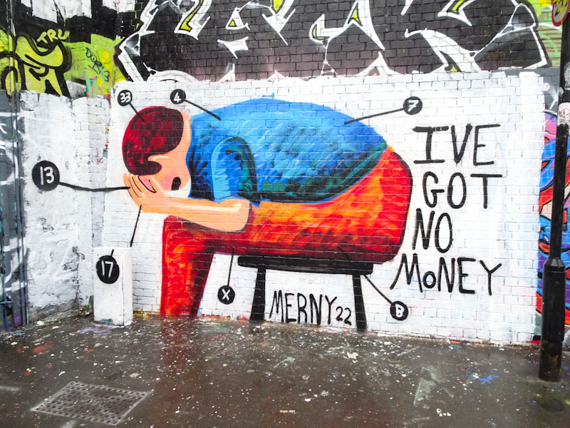
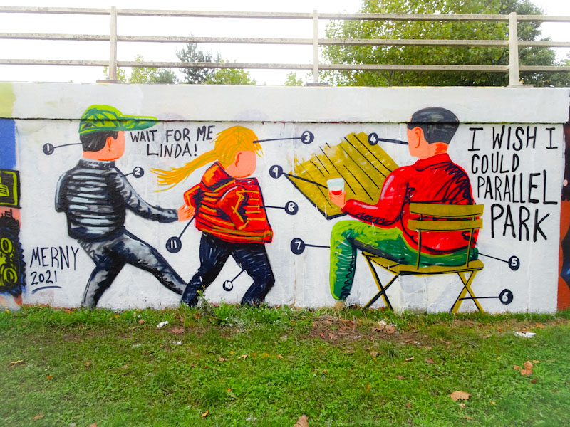
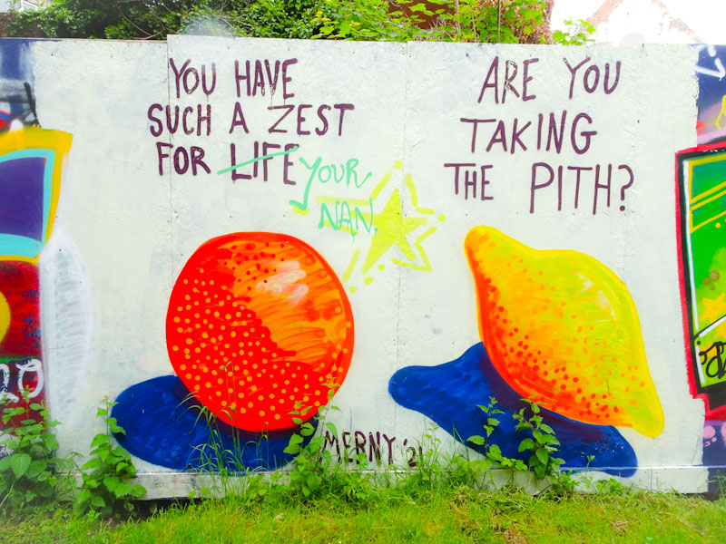
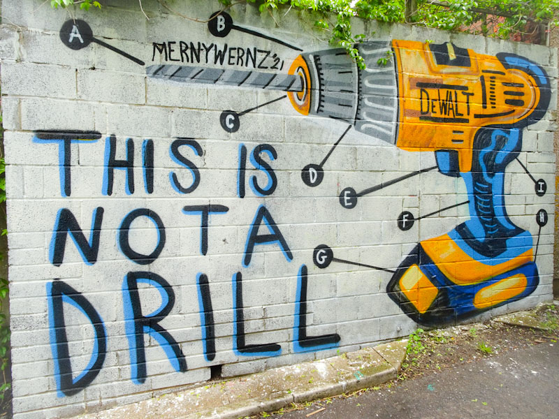
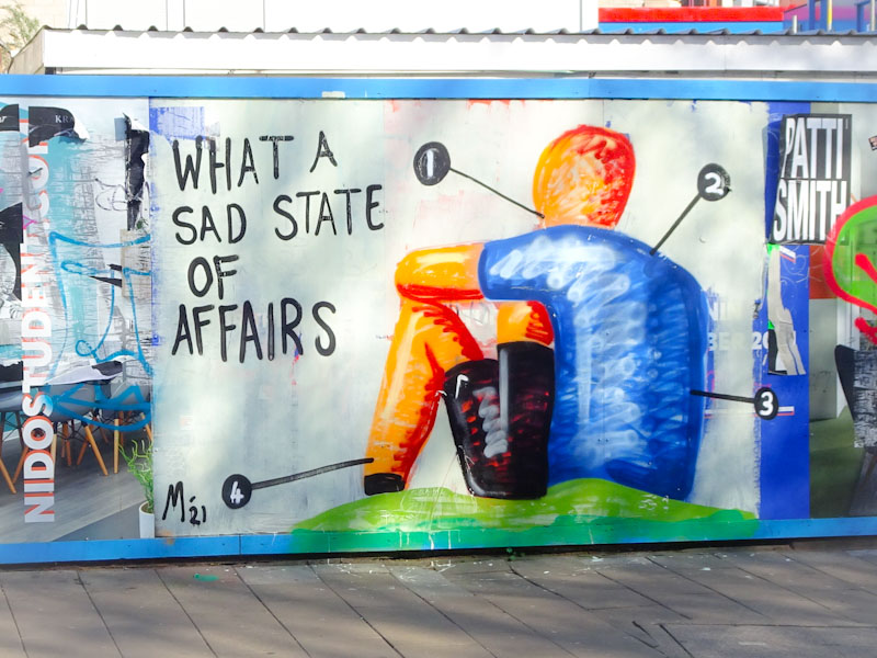
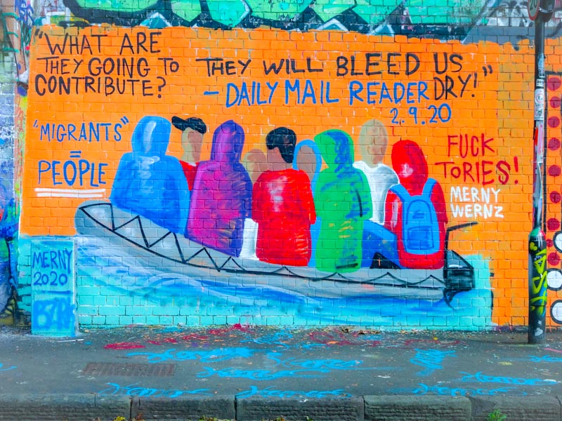
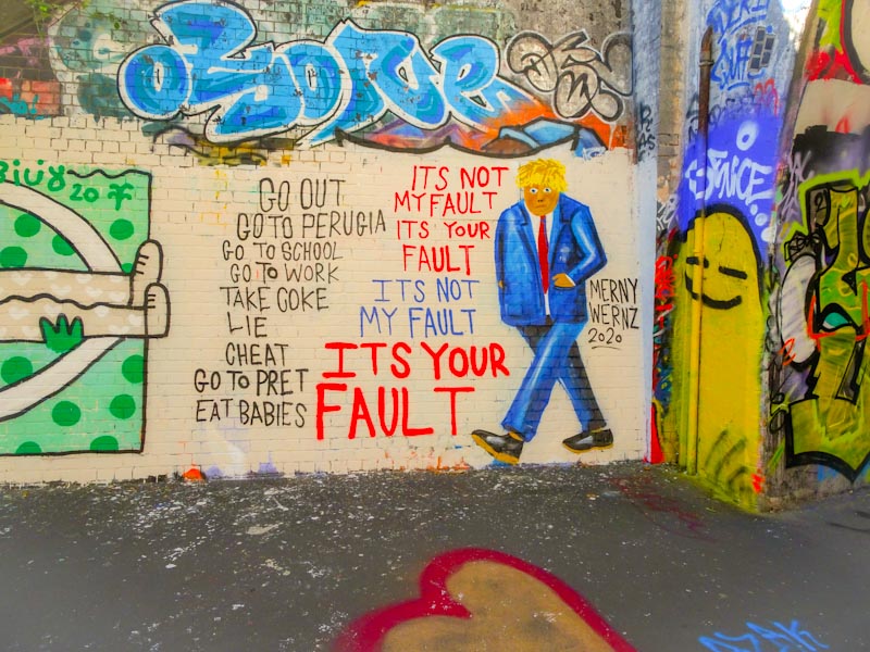
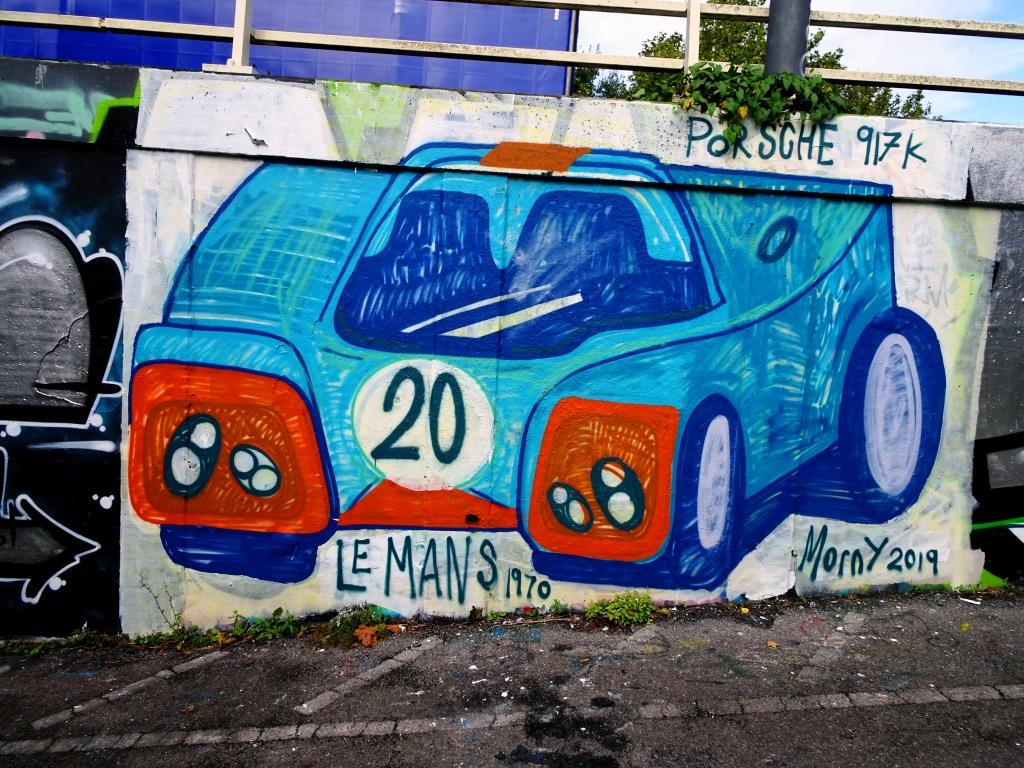
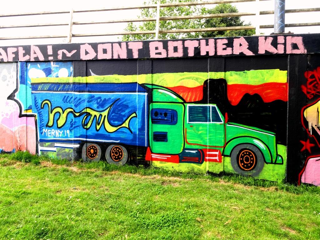
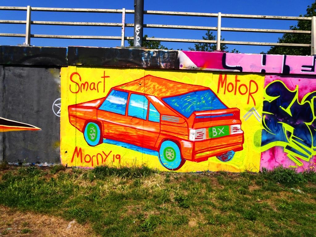
A gallery of brilliant work from Bristol street artist and illustrator Merny (Morny)
Instagram: @mernywernz
all photographs by Scooj


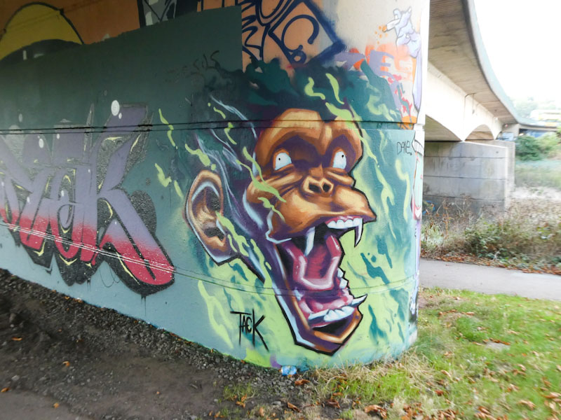
He’s been at it again, and at this rate, Tack Jucker is painting his way into a Natural Adventures gallery. Pretty much half of all the pieces I have seen by Tack Jucker feature apes of some kind, usually with a fairly aggressive facial eexpression, and this new one under Brunel Way falls into that category.
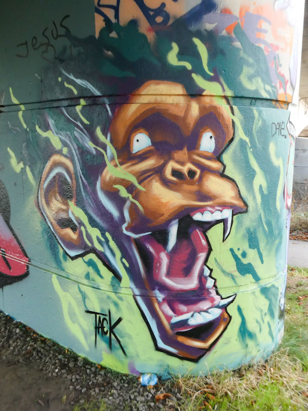
The little dots for pupils make this ape appear rather more unhinged than some of the other ones, and I am not sure whether the artist painted them or they are a tagged addition. There is plenty of movement, augmented by the green wisps and threat emanating from the bared teeth of the ape. Overall, this is another fine example of Tack Jucker’s work, which I am really enjoying.
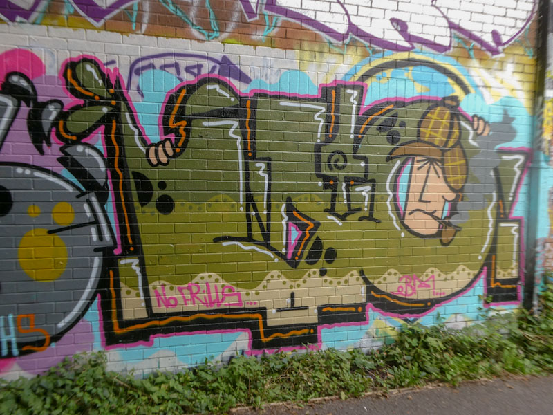
I may have mentioned recently that Biers has been absolutely smashing it recently, and this Sherlock Holmes piece alongside the river confirms this rich vein of form. You can see more from Biers in this recently updated gallery of his work.

What I like about Biers (the name he was using when I first became aware of him) is that although his style remains ostensibly the same, he manages to completely reinvent his letters, this evolution so far being – BIERS – OHYEAH – WD40 -. In the last two reincarnations, he has used the ‘O’ or ‘0’ to act as a frame for his character. In this piece he has cleverly incorporated green colours commensurate with the outdoor clothing (deer-stalker and macintosh) of Sherlock Holmes. A belter.
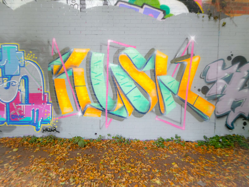
After what seems like a very long absence, Upfest apart, Rusk has been hitting Bristol pretty hard lately, perhaps encouraged by his pal Zesk, who has been visiting and with whom he has painted a couple of collaborative walls. Anything that gets Rusk out painting has to be good.
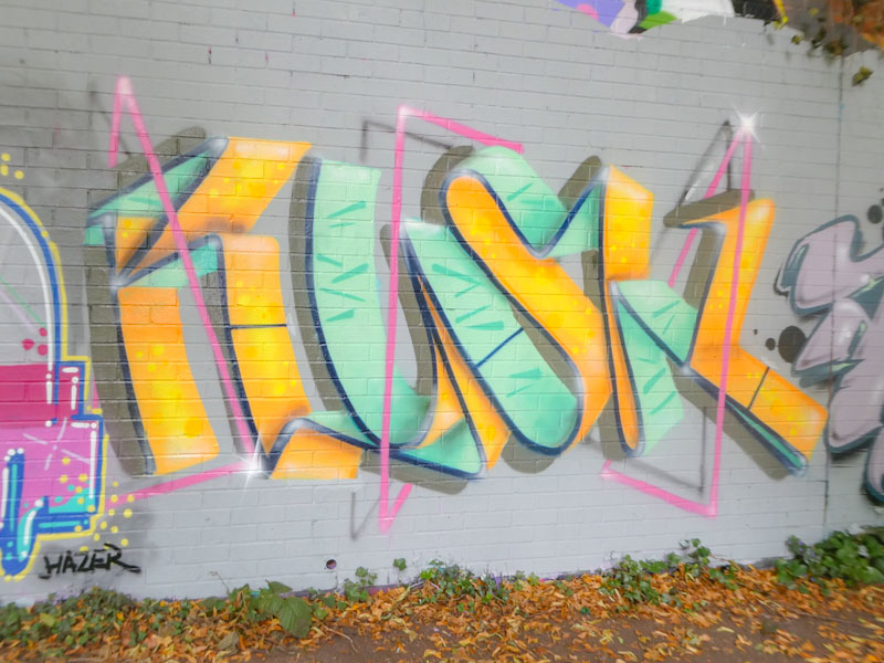
This is an unusual and really rather beautifully designed piece from the writer. Spelling our RUSK in ‘ribbon’ letters and augmented with an abstract pink accent line, there is a great sense of proportion, colour tones and overall freshness that makes this piece an absolute classic. Not edgy, not rough and ready, but intelligent, well-thought-out and artistic. This is a next-level piece from Rusk (in my view).
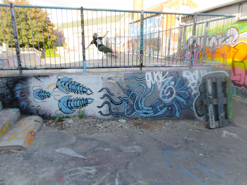
You have to be quick these days to photograph pieces before they get tagged. I decided to post this piece, by Andy Council, in spite of the tags, because most of it is intact. I completely missed another piece by Andy Council in collaboration with Ments in Cumberland Basin, which had been tagged and abused recently, after only a day or so. Furthermore, I get that it is a jungle out there and that there are ‘no rules’ but the toys who show so little respect are pathetic really, dissing artists whilst having zero talent of their own. Ever was it thus.
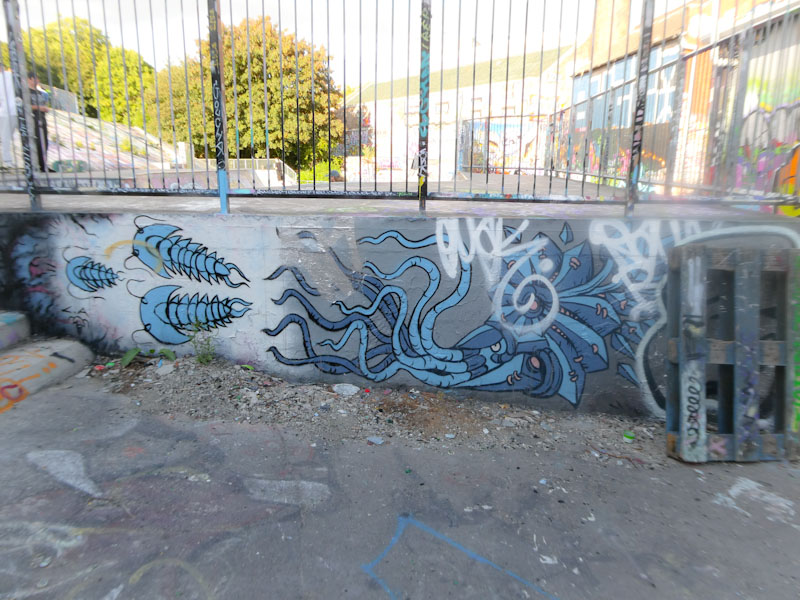
This is a lovely ‘quick one’, I imagine, from Andy Council with some trilobites and an ammonite – trademark creatures from the artist. I rather like the shot of the skater in the first photograph – Dean Lane at its best.

I think that I have photographed far more pieces by Desi than I have posted, and in my mind think I have posted more than I have. I will have to address this, as I’d like to do a gallery of her work, which is becoming more and more prominent about the place.
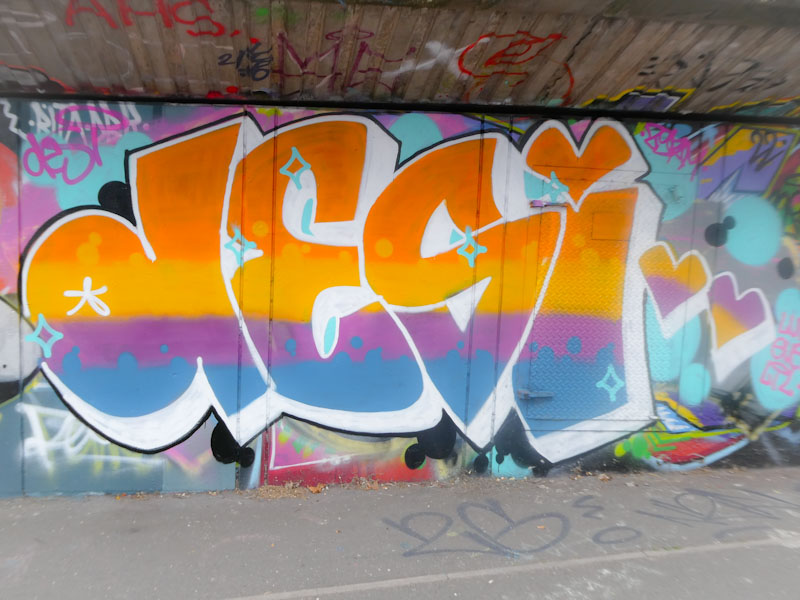
Desi has recently taken to using a second form of letters ‘VEIL’ which demonstrated her increasing confidence and experimentation. In this piece we return to the more familiar letters in which she presents four horizontally arranged colours, with quite hard transitions and some bubble decoration. Always great to see Desi’s writing.


