Once upon a show
watching children dance and sing
brings tears to my eyes.
by Scooj
Once upon a show
watching children dance and sing
brings tears to my eyes.
by Scooj
What a wonderfully clever piece this is from Fiva, who has used his trademark block letters to spell out his name but has repeated the word in a different font through the letters in a way that gives the whole thing a 3D look. This piece uses techniques that are used by Pref ID who is a master of this kind of visual wordplay.

As is often the case with Fiva’s work, he leaves us a character as additional interest in the piece. I really like his work and only wish he did more but realise that he, like many other street artists, is likely to have a real job and maybe family and can only get out to play when time and circumstance permit.
This Deamze burner photobombed a recent post of a Silent Hobo column, but in my view deserves a post all of its own. This writing is one of the forms that Deamze uses in his work. It is much simpler than his wildstyle work, but still has a clean and sharp look to it.

The colours and drift of shading work really nicely and the whole thing stands out and looks so fresh. You could give a hundred artists a can and a wall and ask them to recreate this, but none would be as good. At the top of his game.
.
I’m cutting it fine
trains are unreliable
meeting jeopardised.
.
by Scooj
Mr Klue, as I have mentioned before has been on a bit of a binge lately, and has produced as many pieces in the last couple of months as he has for the rest of the year. This is something that should be celebrated, as his work is emblematic of the down to earth Bristol street art scene.
This piece in the tunnel at St Werburghs by Mr Klue has an ephemeral, wispy, smokey quality to it. I think that the letters spell out KLUE, and the whole thing is a little different from his normal offering in that it is less complex somehow.
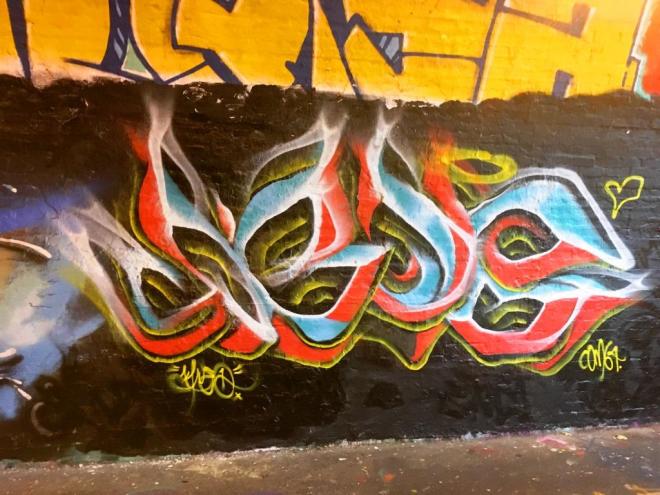
I guess that when writing letters, there is less freedom for the abstract artist…sure you can do swirls and twirls and disguise the letters, but they are still letters. With the free-form abstract work one usually sees from Mr Klue, there tends to be a little more richness, texture and content. Having said all that, I rather like this and the colour selection too works for me.
I think I suffer slightly from Laic217 withdrawal, which is only ever cured by seeing another of his pieces. Of all the amazing artists in Bristol, I probably get most satisfaction when I find a piece by Laic217. In no way does that diminish the other artists at all, it is just that I get a special buzz seeing his work. I suppose it is a bit like getting a special card in a set of ‘Match Attax’ cards – they’re all good, but you cherish the special one.

This is a fairly regular piece by Laic217, a skeleton character spraying and a nicely composed LAIC lettering. The piece was sprayed together with Cort, to the left and Ugar to the right. These three seem to enjoy spraying together, which is great for me as I like all of their work. I hope it is not too long before I get my next Laic217 fix.
I have only met Cort once, and that was about three weeks ago at the M32 roundabout – he was half way through a piece that I never saw completed, which is a pity (I have added it to the end of the post).

His work is truly unique, as each of his letters seems to take on characteristics distinct from those adjacent to it, so while there is a style here, there is no formula pattern of letter shapes etc. It is interesting to note (again from the added half-finished work) that he outlines the letters and then fills out the background, which even though I know that this is how things are done, I find counter-intuitive.

I am warming more and more with every piece I see from Cort, and I believe his work has come on a long way over the last three years or so.
The pedestrian/cyclist tunnels of the M32 roundabout are festooned with Face 1st pieces past and present, many of which I photograph, but never get round to posting. I was never going to let this one get away though.

In this piece, which was very difficult to photograph on account of the narrowness of the tunnel and light intrusion, we see two faces with quite different expressions. It looks like the one on the left is full of mischief and the one on the right looks rather sad.
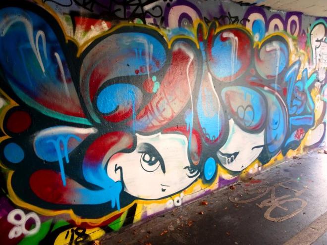
The hair of both the characters spells out FACE and for good measure the artist has added 1st at the right hand side. Another nice piece from this most prolific of artists.
Doors 55
Just a quick selection of graffiti/street art doors from a recent trip to Shoreditch in London. Enjoy!


by Scooj
Loads more amazing doors at: Thursday Doors – Norm 2.0


