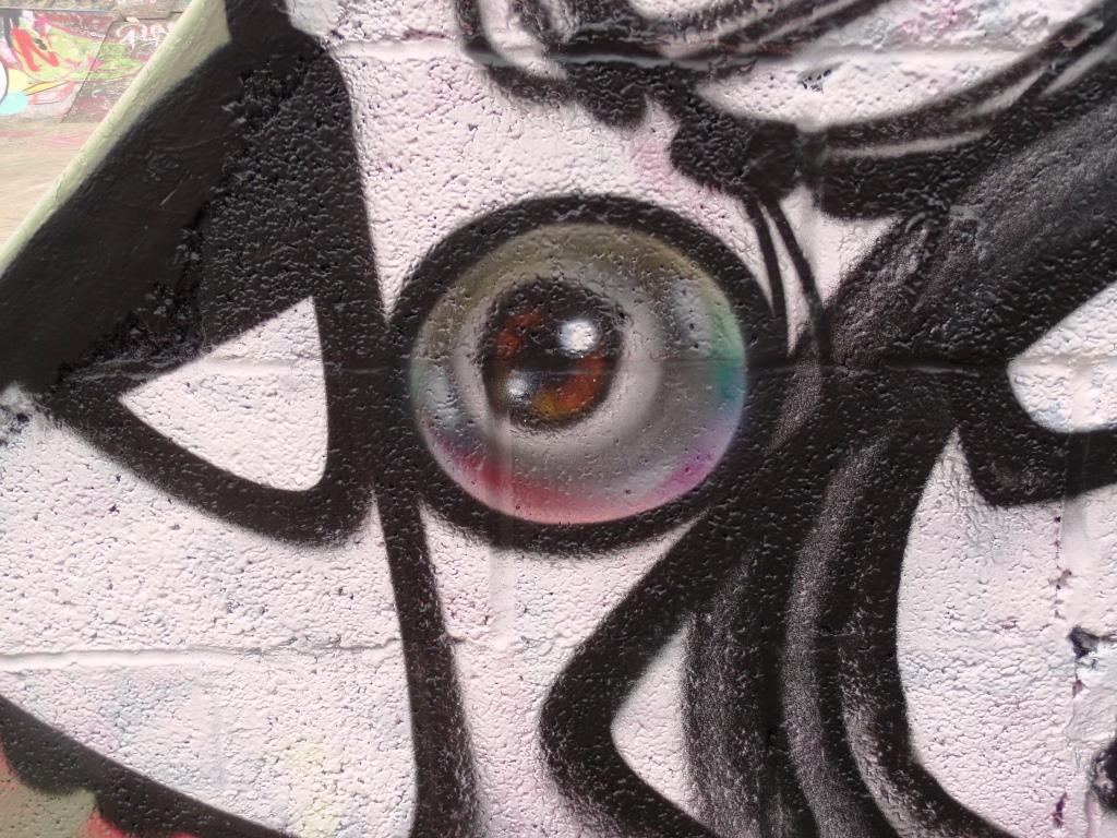
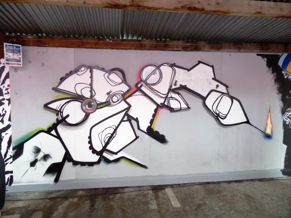
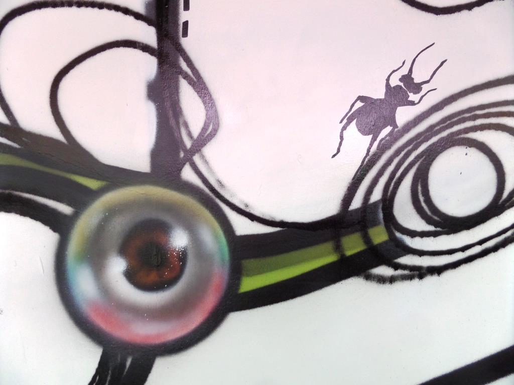
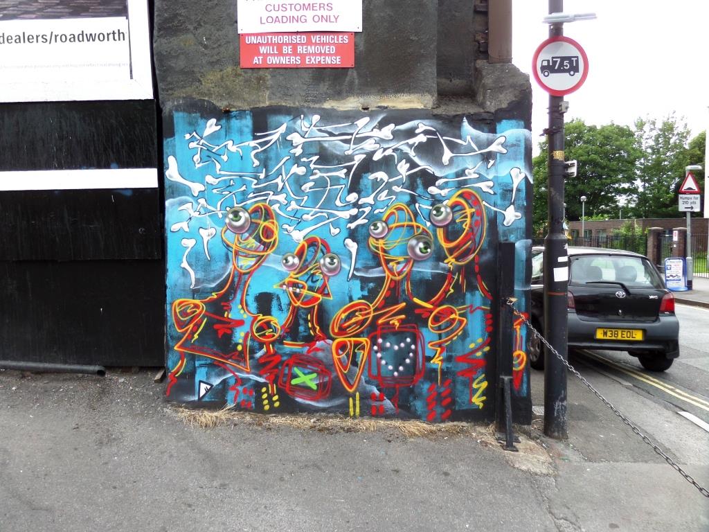
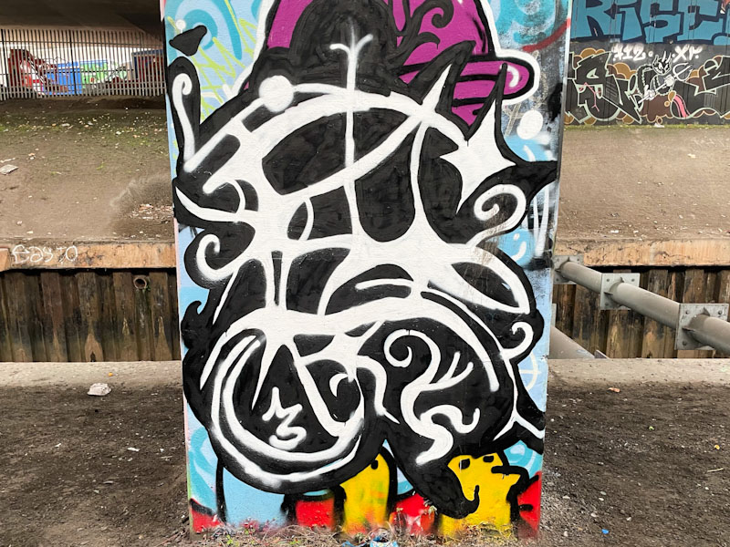
As you will know from yesterday’s post, I recently spent a weekend in Liverpool, and the old ‘graff radar’, which I thought I had turned off, swung into active duty. Not being familiar with the street/graffiti artists in Liverpool, it was comforting to come across this rather nice mural by Molly Mural, who has painted many times in Bristol, where she is based.
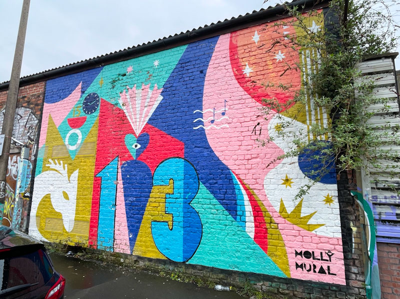
I’m not sure how long the mural has been there, but I guess a while, as some of the paint was chipping. The piece appears to be full of symbolism and stories and is centred around the numbers 1 and 3. The abstract piece is characteristically colourful, and after doing a little Interweb search, it turns out it was inspired by Taylor Swift’s ‘second era’ and her lucky number 13. You live and learn.