
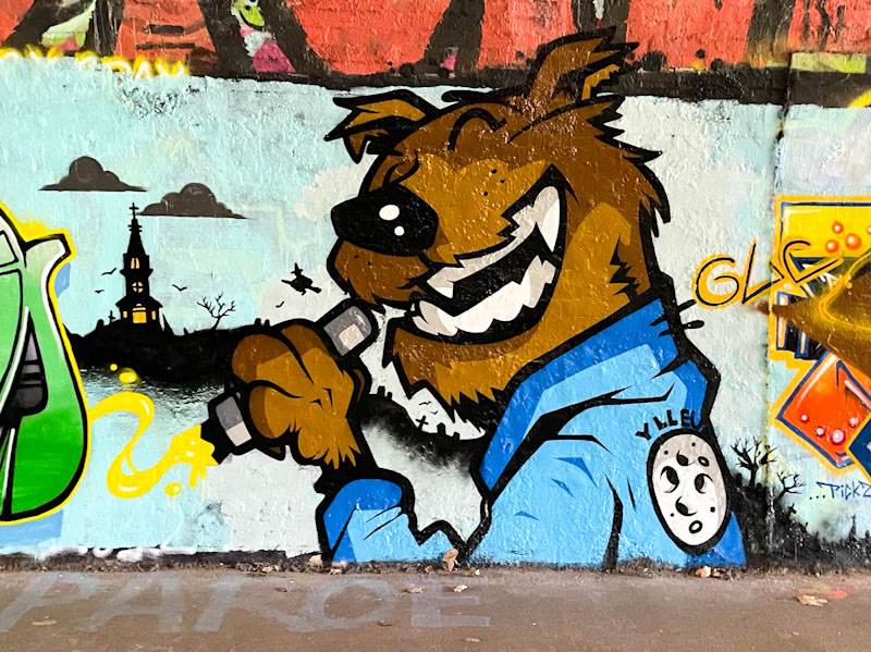
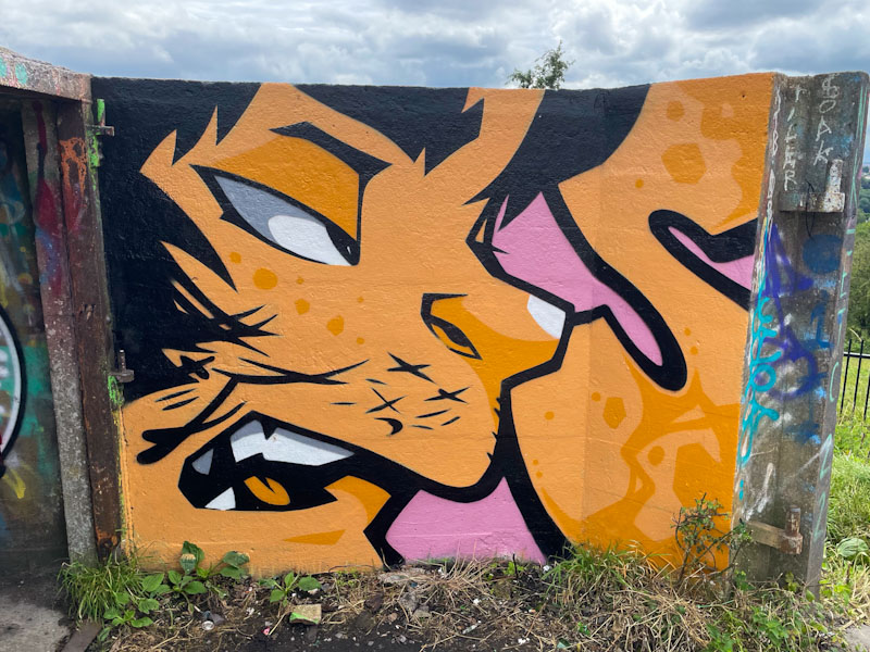
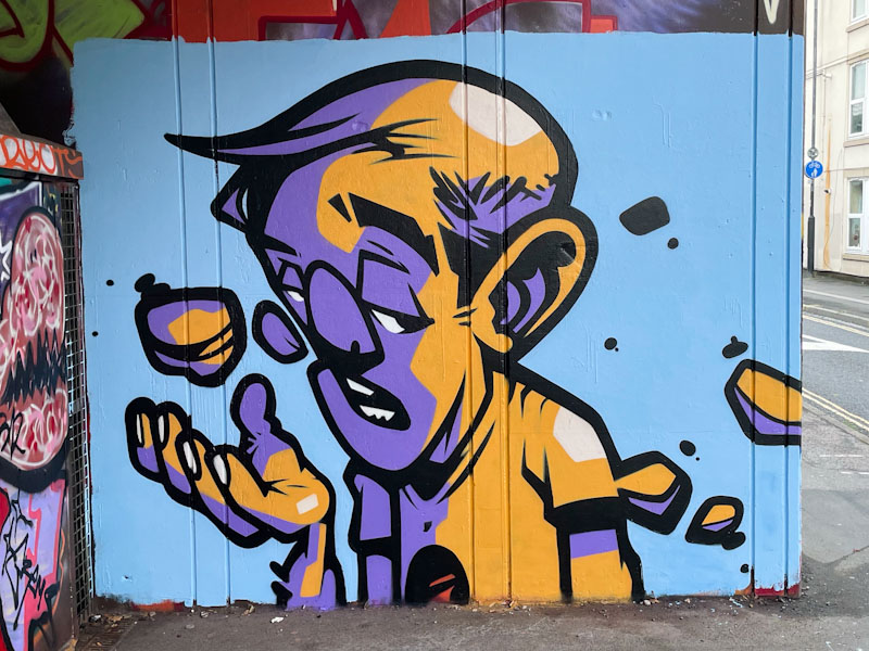
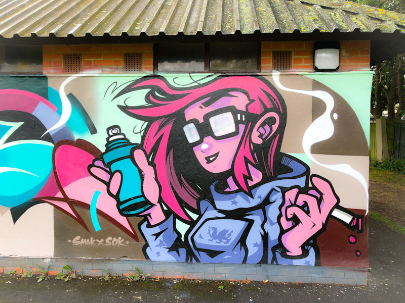
A gallery of incredible character pieces painted in a cartoon style by South Wales-based The Art of Sok.
Instagram: @theartofsok
Big Cartel: https://theartofsok.bigcartel.com
All photographs by Scooj

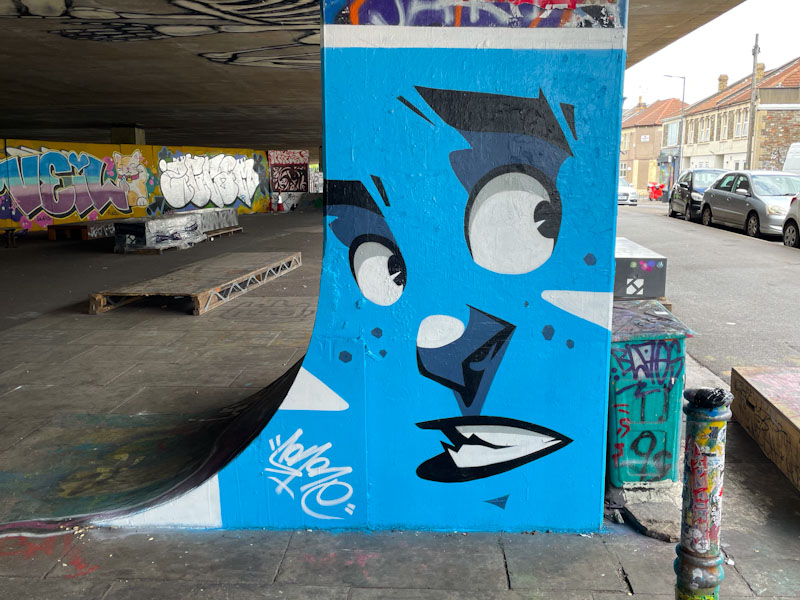


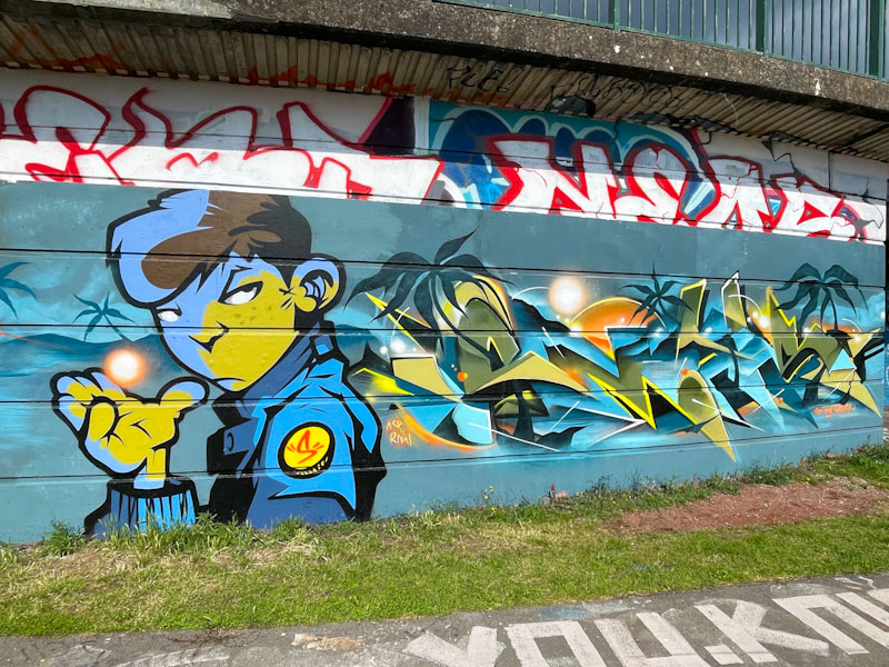


A gallery of incredible character pieces painted in a cartoon style by South Wales-based The Art of Sok.
Instagram: @theartofsok
Big Cartel: https://theartofsok.bigcartel.com
All photographs by Scooj
.
Military strength
is not a reflection of
moral decency
feeble justifications
fragile egomaniacs
.
by Scooj
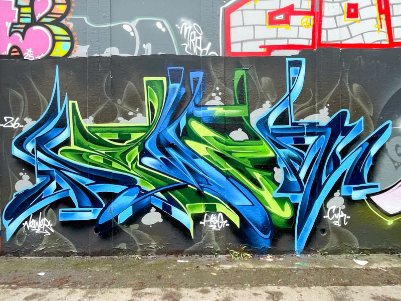
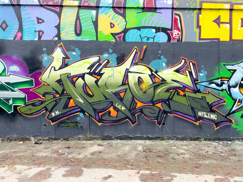
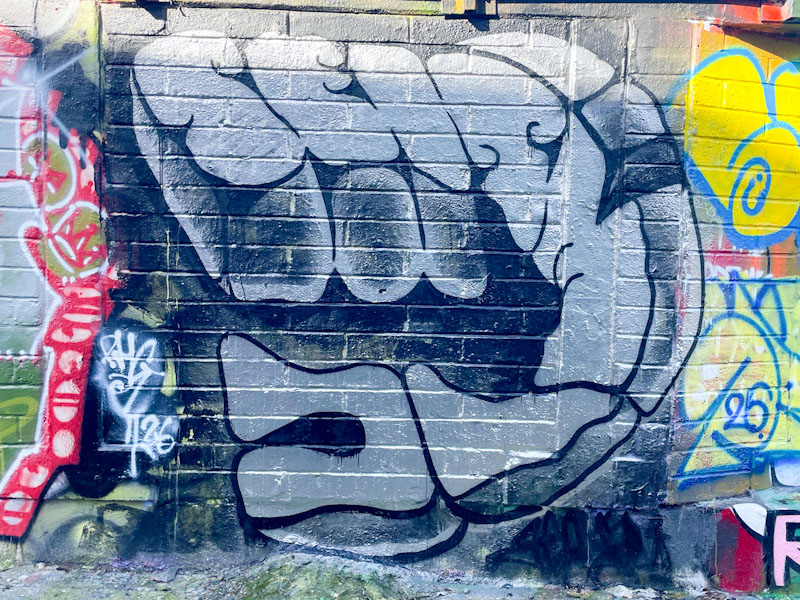
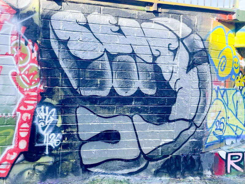
This is the last of five outstanding wildstyle graffiti writing pieces that were painted alongside each other a couple of weeks ago. This final piece is by Rakem, and is technically outstanding. While the letters are heavily disguised, they can be quite easily read if you know what to look for.
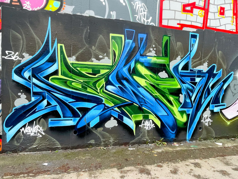
I don’t know the artist, and haven’t posted his work before. I have a feeling he might be from Cardiff, but am not sure. The work speaks for itself, and any description I offer wouldn’t do the piece justice. Fabulous work from all five artists:
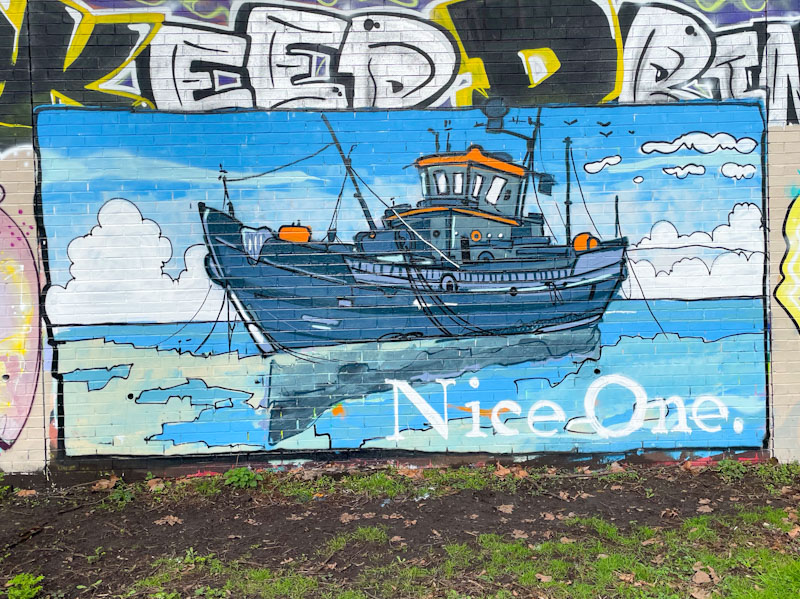
I make no secret of my admiration for Nice One’s work, and with this outstanding seascape he has gifted me my favourite piece of the year so far. I have history with fishing boats, and the marine environment more generally, so the content of this piece chimes perfectly for me.
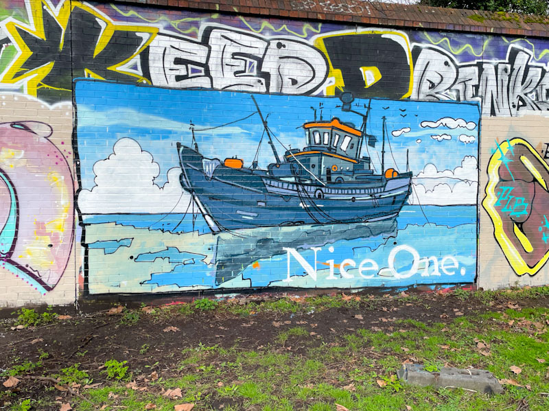
It is more than possible that this is the best piece I have seen from Nice One to date. There is a tranquillity about the calm sea and the bubbling clouds, and the proportions and presentation of the boat are perfect. This is so very different in both style and content from pretty much anything else we see in Bristol, and we are all better off for it. Bravo!

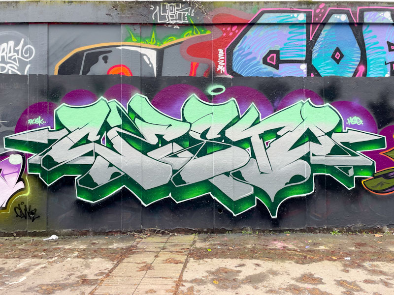
Nips has been super-busy recently, which is a good thing, because I love her work. Normally I wax lyrical about her fills, but in this instance it is a straightforward chrome fill, with some minimal black accent lines and spots.
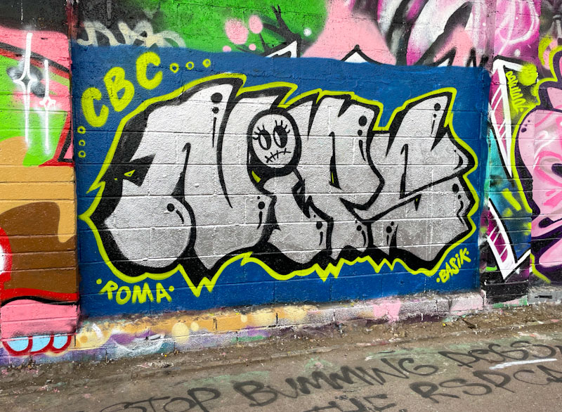
What makes this piece for me is the wall preparation of a dark blue background, and the vibrant lime green/yellow outline, which combine to help this piece stand out and shout. Imagine if there had been no background or strong border, the writing would be in danger of being absorbed by the wall altogether. A wonderful bold piece from Nips.
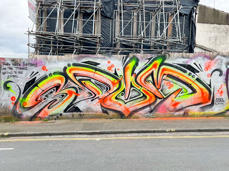
I feel particularly squeezed for time today, so this might be short. As you will know the lion’s share of my photographic street art trips are accompanied by my dog. We wander about in some of the less desirable places of the city and snap away. Occasionally he will pull me in a direction I wasn’t planning, but that may lead to a new discovery, and so it was when I found this modest piece by 3Dom.
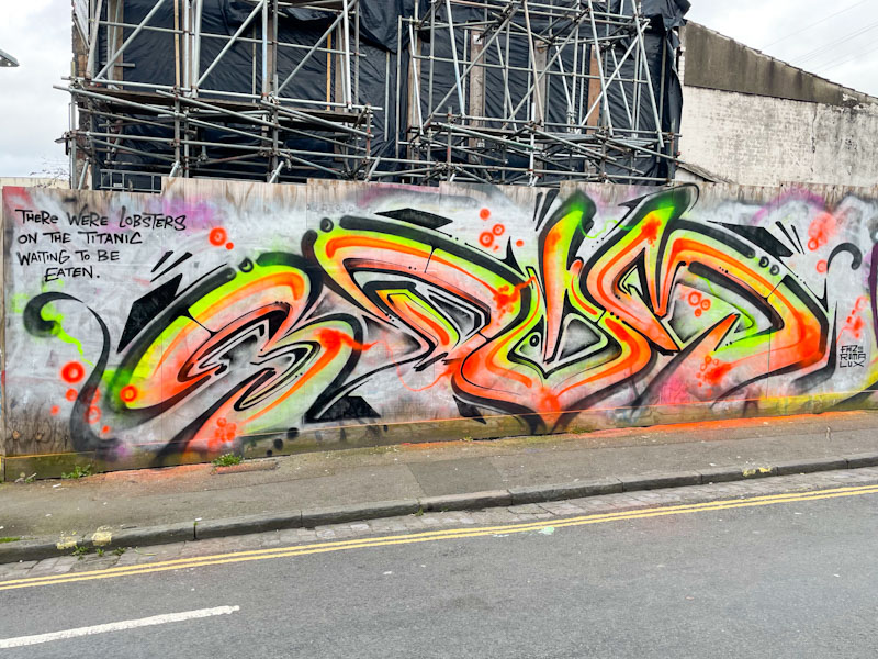
Painted on a rather grubby hoarding, the letters 3DOM can clearly be made out. I love his style of writing, which he has made all his own, and it is always immaculately presented. He includes the words ‘there were lobsters on the Titanic waiting to be eaten’, which I think means that there was a small and just breadcrumb of a positive outcome from the sinking of the Titanic – there might be a hint of class war in the sentiment too. My guess only – It isn’t a phrase I have heard before.
.
Anachronistic
our hereditary peers
time’s up your Lordship
.
by Scooj
On the (old) news that hereditary peers will no longer be a part of the UK’s parliamentary system from the end of this session. A few will be made lifetime peers as a concession, but their children will not be admitted to the chambers by birthright. Took a while, but got there in the end.
I was tipped-off by Jee See that he had painted this piece in Dean Lane, and a couple of days later he was painting on the roundabout, unfortunately I arrived at that one literally minutes too late, as someone was painting over his piece there. At least I got to this one in time.
I have enjoyed Jee See’s work for years now, having first met him a long time ago under the M32, while he was painting a column there. His SEISMIC pieces have become a signature design, in which he folds his letters on top of one another and makes them stand out with deep drop shadows. This one is painted in rather downbeat greys and blacks, but manages to command this end of the wall. Great to see Jee See out and about.
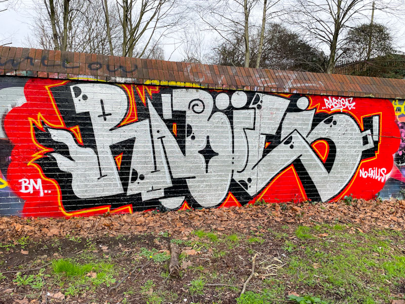
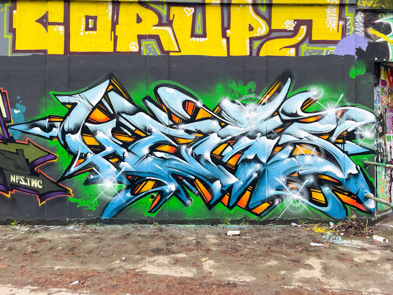
I knew from my Instagram feed that Biers has changes his letters recently from WD40 to RABIES, and this is the first piece that I have seen in his new persona. I have to say that I really like his choice and the enthusiasm that has come with it. Furthermore, I think it gives him more scope than his former WD40 option.
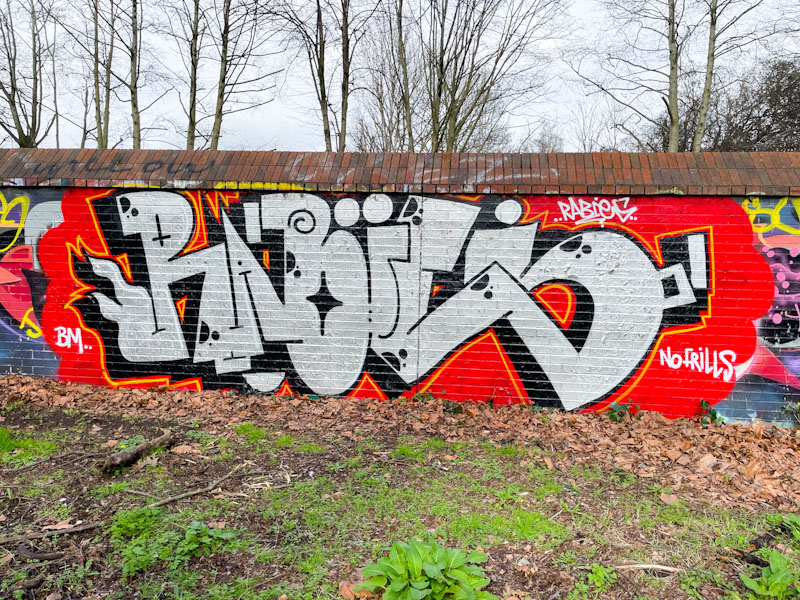
The letters in this wonderful chrome piece are a little unruly, in a good way. I also note that the second half of his letters BIES, isn’t too far away from BIERS, which are the letters I first associate with him. The sparse decoration in the letters is just the right amount, and the contrast with the red background separated only by the thinnest of yellow lines. This might signal the start of a refreshed Biers – I hope so.
.
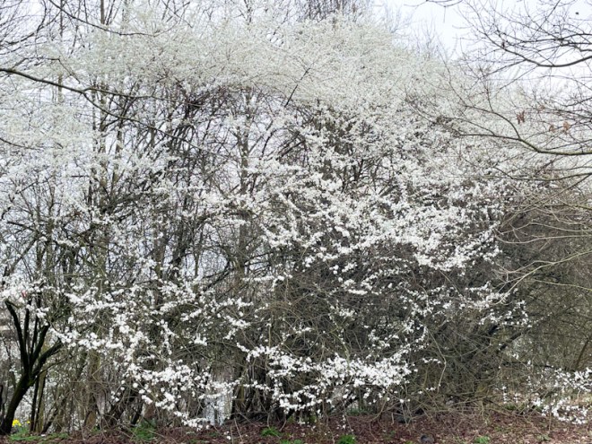
As if snow laden
stark barren branches and twigs
offer spring blossom
.
by Scooj


