.
Prolonged dry weather
laying foundations for drought
build those reservoirs.
.
by Scooj
.
Prolonged dry weather
laying foundations for drought
build those reservoirs.
.
by Scooj
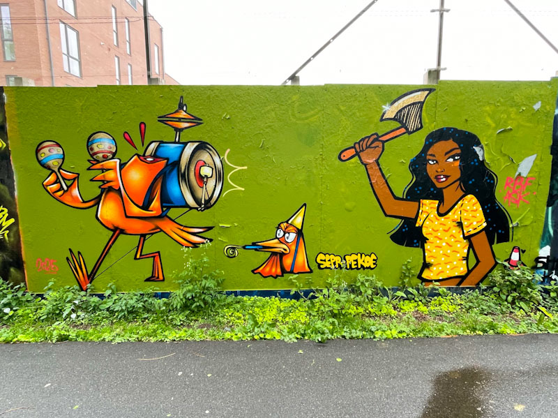
I’m not sure why, but I am always surprised (and thrilled) when I see collaborations between Pekoe and Sepr. Somehow in my head I don’t see them as natural collaborators, but how wrong I am. This delightfully witty piece on the long hoarding at Greenbank took me several attempts to get decent pictures. The fine weather we have been experiencing has a downside which is that full sun causes shadows to be cast everywhere. Eventually I took advantage of an overcast day and made my way to the spot.
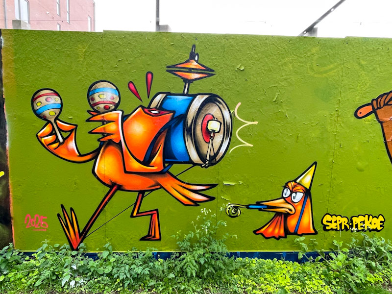
The combination tells a story of a headless chicken, and in the left hand side, Sepr has created one of his superb cartoon characters, in this case a ‘one chicken band’. Obviously the festive bird wasn’t to everyone’s taste and the decapitated body marches on as the head complete with party hat watches on.
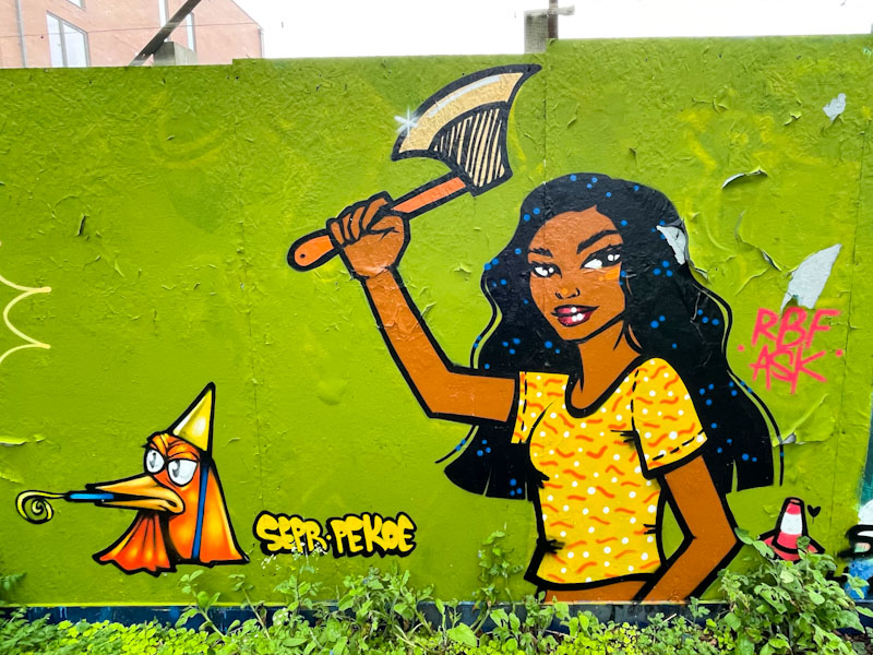
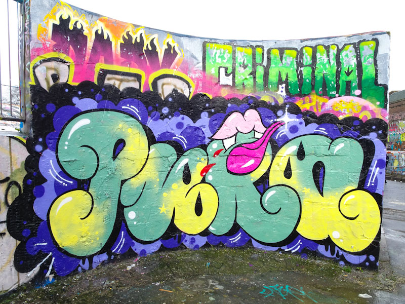
The perpetrator of the violent crime is a rather charming young woman wielding an axe, which makes one feel a little uncomfortable. Pekoe has done a great job here and unusually has painted more of a full character than her more usual head portrait. I have noticed that recently she has also been painting traffic cones in her pieces, like a little signature. The collaboration is witty, gruesome and really well painted. It would be great to see more of these story pieces from these great artists.

Every day, pretty much, I see graffiti and street art and every once in a while I see something by an artist I know and I think to myself ‘this is special, this is really classy’. This clever piece of combined writing and a portrait by Conrico left me feeling that this was special, definitely a ‘keeper’.
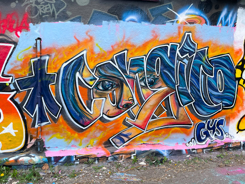
Conrico has painted his name, but instead of a solid or patterned fill, there is a portrait of a girl behind, as if you are peering through the letters to see her. The piece is expertly executed, but at the same time incredibly modest. No fanfare, no showing off, just a really great fusion piece.
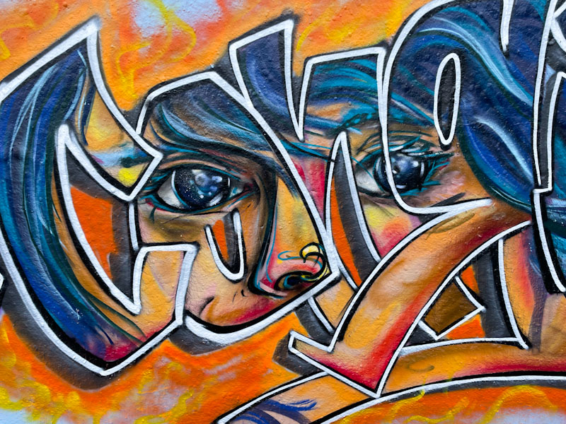
Conrico has been turning out some great pieces recently, and this one expands and continues the series. As ever, I look forward to more.
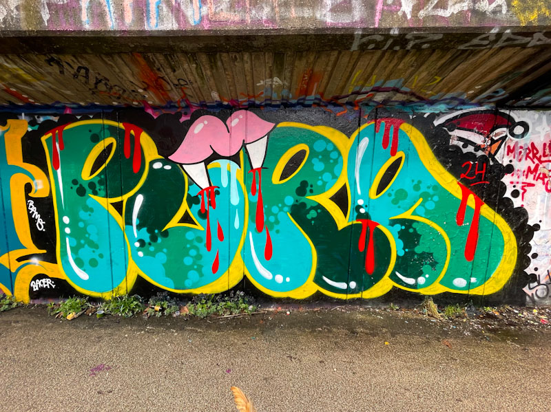
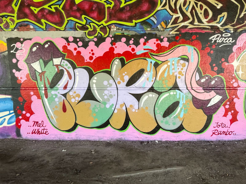
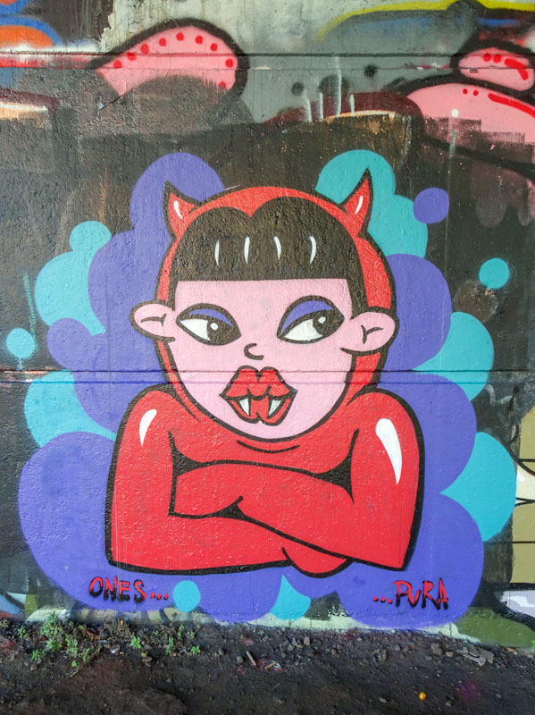
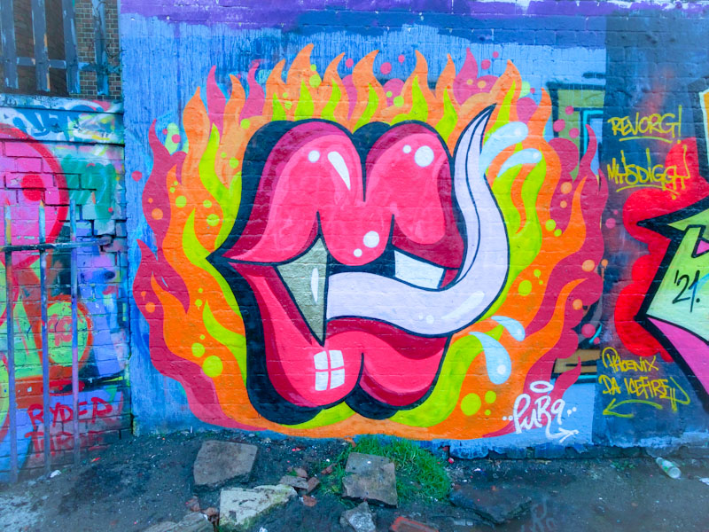
A gallery of fabulous graffiti writing and a selection of vampire teeth from Bristol/Spanish artist and tattooist, Pura Decadencia.
Instagram: puratattoos
All photographs by Scooj


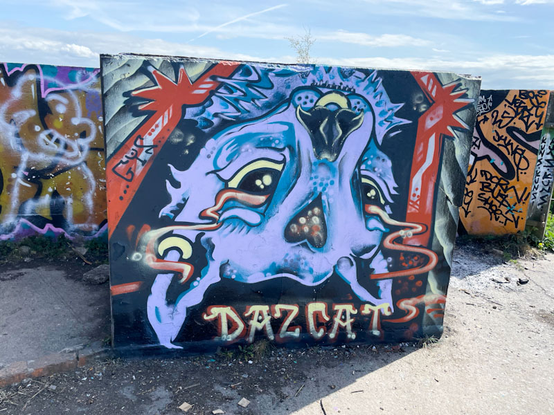
It would seem that Daz Cat is rather partial to the concrete blocks up at Purdown, and whyever not? The spot is a wonderful oasis away from the bustle of the streets and has some stunning views over the north and east of Bristol, the dog particularly likes it up there, perhaps it is the lure of the stinky goats.
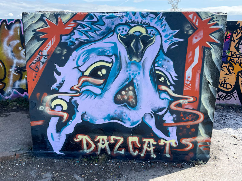
Daz Cat has switched things up a bit by painting this cat portrait upside down, which would completely goof me up, but I am not an artist, and maybe it is concepts like this that separate out the ways artists and non-artists see the world. The purple cat has a fine gold nose ring and a vapour trail from eyes to ears, which must be symbolic of something, and is an idea Daz Cat has used before. This is a fun piece from the cat supremo.

.
Three little piggies
curious to find out more
the dog sniffs the air…
.
by Scooj

Tucked away behind the iron fence of the swimming pool at Dean Lane is this fabulous collaboration combination piece from Werm and Zake. Werm, more than adequately providing the symmetrical letters, and Zake offering a couple of different cheeky characters peering over the top of them.

The horizontal band colour scheme, painted on an off-white background, works really well, and Zake has cleverly incorporated the band of colour into his characters. I’m not quite sure what it is about it, but this feels like a really classy piece to me, and I really like it.
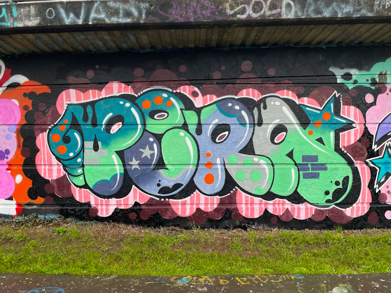
I have seen quite a few pieces by Totosoapcity in Bristol before, but hadn’t known who the artist was, so haven’t posted them. This could mark the opening of a little floodgate for when I do some digging in my archives, which I like to do from time to time. I’m not sure that Totosoapcity is from Bristol, but must be reasonably local I would think, because we see visits every few months.

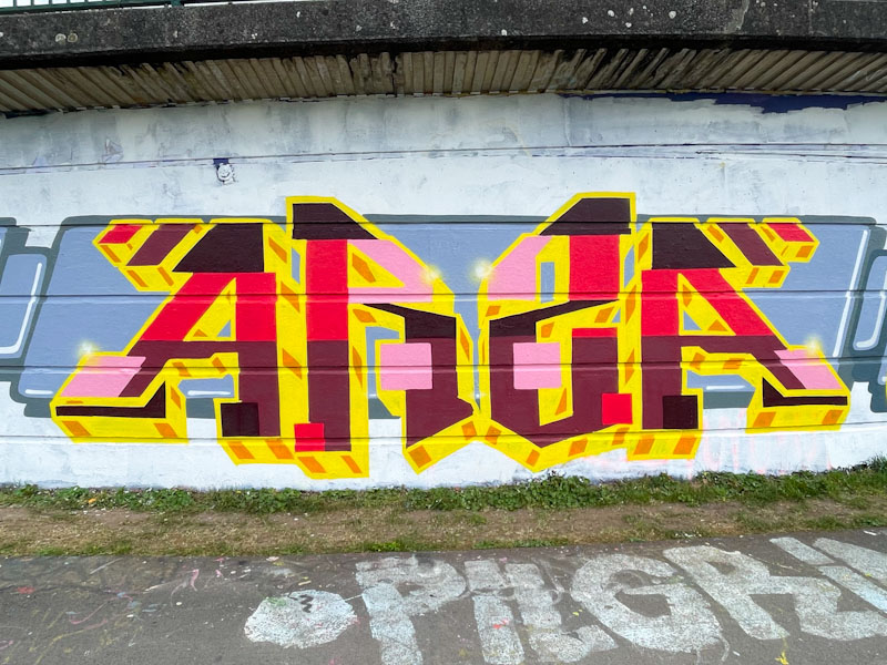
This piece is part of a large collaboration from a group of artists I am not too familiar with, but who have done a great job on this wall, selecting a themed colour approach to all their writing. I think the letters here spell ARS(Z)A, and have a pleasing symmetry to them. The red, pink, black, brown, yellow and orange colours are not my favourite combinations, but work reasonably well – not sure about the pink. They do, however, contrast perfectly with the themed grey banner background, which is consistent through the entire collaboration.
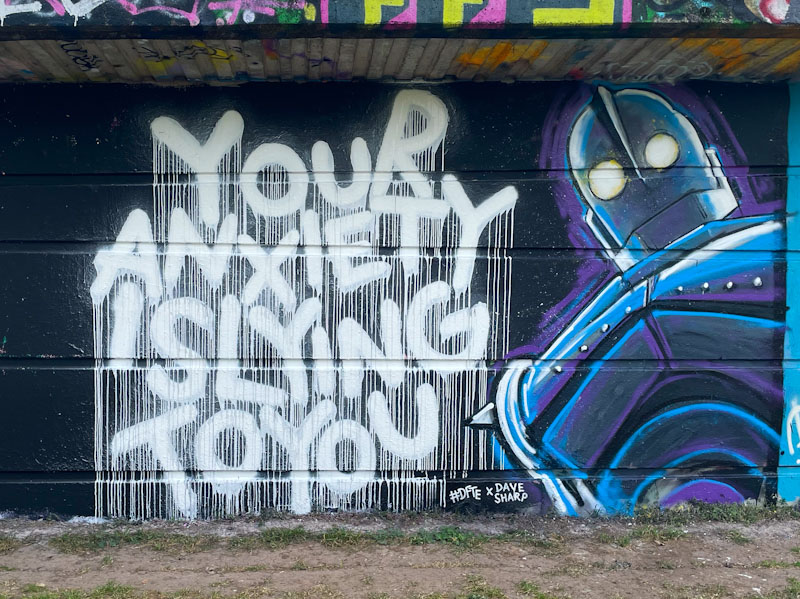
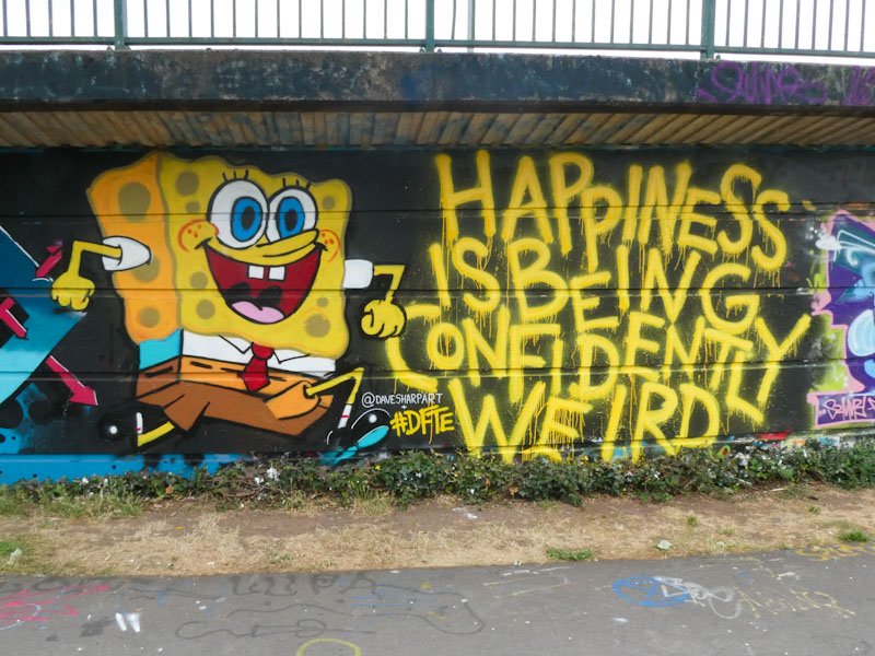
These two artists collaborated on almost this exact spot back in July 2022 – how time flies, I had it in my mind that it was last year. From what I can gather #DFTE and Dave Sharp are good friends, and this fine collaboration ‘anxious iron giants’ combines the distinctive writing of #DFTE with the artistic talents of Dave Sharp.
I would love to see more from #DFTE – the power of words is so beautifully presented with his unique style, going big on the drips, but he doesn’t seem to paint all that often. Dave Sharp, I don’t know much about, but he has captured the Iron Giant robot really well, perhaps tinged with a little anxiety… who knows. Their combination works really well, and as a bonus, here is their last one…
Oh dear! Mr Crawls’ gull is looking a bit glum in this piece on the long hoarding at Greenbank. Painted on a favoured chrome background, the usually happy or cheeky gull looks like he is down in the dumps. It is clever that Mr Crawls can portray different emotions with tweaks to his ‘archetypal’ bird.

The stylised cartoon character has a downturned (mouth) bill and heavy-lidded eyes, dripping with sadness. The piece is really well presented and clean and tidy, and another in a wonderful series of character pieces by Mr Crawls.


